- Power BI forums
- Updates
- News & Announcements
- Get Help with Power BI
- Desktop
- Service
- Report Server
- Power Query
- Mobile Apps
- Developer
- DAX Commands and Tips
- Custom Visuals Development Discussion
- Health and Life Sciences
- Power BI Spanish forums
- Translated Spanish Desktop
- Power Platform Integration - Better Together!
- Power Platform Integrations (Read-only)
- Power Platform and Dynamics 365 Integrations (Read-only)
- Training and Consulting
- Instructor Led Training
- Dashboard in a Day for Women, by Women
- Galleries
- Community Connections & How-To Videos
- COVID-19 Data Stories Gallery
- Themes Gallery
- Data Stories Gallery
- R Script Showcase
- Webinars and Video Gallery
- Quick Measures Gallery
- 2021 MSBizAppsSummit Gallery
- 2020 MSBizAppsSummit Gallery
- 2019 MSBizAppsSummit Gallery
- Events
- Ideas
- Custom Visuals Ideas
- Issues
- Issues
- Events
- Upcoming Events
- Community Blog
- Power BI Community Blog
- Custom Visuals Community Blog
- Community Support
- Community Accounts & Registration
- Using the Community
- Community Feedback
Register now to learn Fabric in free live sessions led by the best Microsoft experts. From Apr 16 to May 9, in English and Spanish.
- Power BI forums
- Forums
- Get Help with Power BI
- Desktop
- Re: Create a multi-ring chart
- Subscribe to RSS Feed
- Mark Topic as New
- Mark Topic as Read
- Float this Topic for Current User
- Bookmark
- Subscribe
- Printer Friendly Page
- Mark as New
- Bookmark
- Subscribe
- Mute
- Subscribe to RSS Feed
- Permalink
- Report Inappropriate Content
Create a multiple ring chart
Hi guys,
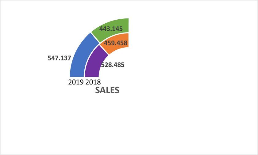
I am trying to create the following ring chart in Power BI,
How can I create it?
Thanks in advance.
Regards.
Solved! Go to Solution.
- Mark as New
- Bookmark
- Subscribe
- Mute
- Subscribe to RSS Feed
- Permalink
- Report Inappropriate Content
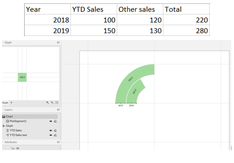
Tried it out in Charticulator. How does this look? I wasn't able to export the visual at the moment, or would have attached a link to it.
Regards,
Pat
Did I answer your question? Mark my post as a solution! Kudos are also appreciated!
To learn more about Power BI, follow me on Twitter or subscribe on YouTube.
@mahoneypa HoosierBI on YouTube
- Mark as New
- Bookmark
- Subscribe
- Mute
- Subscribe to RSS Feed
- Permalink
- Report Inappropriate Content
I tried it, and it initially looked the same. For the Index, Year, and Value fields, pull down the arrow and choose Don't Summarize to get it looking right. Also, the second/upper bar is there but can't be seen as it has same color as background and white text (if i change background color, i see the text but not the bar). You'll need to fix that too.
Regards,
Pat
Did I answer your question? Mark my post as a solution! Kudos are also appreciated!
To learn more about Power BI, follow me on Twitter or subscribe on YouTube.
@mahoneypa HoosierBI on YouTube
- Mark as New
- Bookmark
- Subscribe
- Mute
- Subscribe to RSS Feed
- Permalink
- Report Inappropriate Content
Hi @mahoneypat,
Thank you very much for everything, now my chart looks good.
Now I just need to create a measure Switch to try to work with real values calculated from another data tables.
Regards.
- Mark as New
- Bookmark
- Subscribe
- Mute
- Subscribe to RSS Feed
- Permalink
- Report Inappropriate Content
Here is a link to the chart file. Hopefully it helps. I haven't seen a response on the GitHub issue I posted yet.
https://drive.google.com/file/d/14zhNLZ7EKZmP2svnfndiMT8s1T_MT5wJ/view?usp=sharing
Regards,
Pat
Did I answer your question? Mark my post as a solution! Kudos are also appreciated!
To learn more about Power BI, follow me on Twitter or subscribe on YouTube.
@mahoneypa HoosierBI on YouTube
- Mark as New
- Bookmark
- Subscribe
- Mute
- Subscribe to RSS Feed
- Permalink
- Report Inappropriate Content
There @mahoneypat,
I am having problems to open the document because it says the format is not .chart
If I open to .chart I can open the table but I can visualize the chart.
Regards.
- Mark as New
- Bookmark
- Subscribe
- Mute
- Subscribe to RSS Feed
- Permalink
- Report Inappropriate Content
@PwrBI01 FYI that I found a work around for the error on Charticulator. By adding a constant category on the other axis, I was able to export polar scaffold charts again. Since there is just a single value on that axis (and the label is hidden), the chart looks the same. I made the chart both ways (with the two measures pivoted and unpivoted) and export the pbiviz, chart file, and template file. All 6 files are in this folder.
https://drive.google.com/drive/folders/1HlThCwUeR-Lkp2H7qmoBoSuMM7yFOQrq?usp=sharing
Regards,
Pat
Did I answer your question? Mark my post as a solution! Kudos are also appreciated!
To learn more about Power BI, follow me on Twitter or subscribe on YouTube.
@mahoneypa HoosierBI on YouTube
- Mark as New
- Bookmark
- Subscribe
- Mute
- Subscribe to RSS Feed
- Permalink
- Report Inappropriate Content
Hi @mahoneypat,
Thank you very much for the files.
I created the chart on Charticulator with the changes I told you, as you can see:
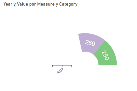
The main problem is that when I export it to a 'Power BI Custom Visual' it appears like this on Power BI:
Do you know how to export it in a correct format to open it?
The file is this one: https://drive.google.com/file/d/168zyYh-NDpGdnyI8qPMRozWskSZ7emho/view?usp=sharing
Thanks in advance.
Regards.
- Mark as New
- Bookmark
- Subscribe
- Mute
- Subscribe to RSS Feed
- Permalink
- Report Inappropriate Content
FYI that PowerBI.tips also hosted a version of Charticulator but it is an older version. This one didn't have the error I was seeing. It doesn't have as many format options available in Power BI when you use it, but it works. I attached the pbiviz. FYI that I built it with data in this format. Note too that with visuals from Charticulat you need to add an index column to your data so each row has a unique value to be used in the Granularity field.
|
Category |
Measure |
Value |
|
A |
YTD |
200 |
|
A |
Total |
300 |
|
B |
YTD |
150 |
|
B |
Total |
175 |
Here is the link to the pbiviz file. https://drive.google.com/file/d/1oO14R7ye1Th5gotMqiiFUtQU0yFDNyD_/view?usp=sharing
Regards,
Pat
Did I answer your question? Mark my post as a solution! Kudos are also appreciated!
To learn more about Power BI, follow me on Twitter or subscribe on YouTube.
@mahoneypa HoosierBI on YouTube
- Mark as New
- Bookmark
- Subscribe
- Mute
- Subscribe to RSS Feed
- Permalink
- Report Inappropriate Content
There @mahoneypat,
Thank you very much for the visual.
I need to do small changes on it, could you please send me it to open it with charticulator?
I have problems when the sales of 2019 are higher than 2018 (because I want 2018 to have 90º). I have solved this making the chart with 180º and introducing a third measure (called blank) that I will put with no colour when I use it, but I don't know how to make the size of the categories depending on their values and another small changes.
Thanks in advance and sorry for the inconvenience.
Regards.
- Mark as New
- Bookmark
- Subscribe
- Mute
- Subscribe to RSS Feed
- Permalink
- Report Inappropriate Content
It is harder to build it starting with data structured like that, but doable. Requires adding two marks to the glyph and connecting them. I built it that way too, but got the same error when I tried to export the pbiviz. I put an issue report in on GitHub for Charticulator but don't know how soon will get a response and if there is a workaround.
FYI that it is easier to building having a table of 4 rows, 3 columns (Year, Measure (YTD or Total), and Value). Then you just use Measure for the Fill color field.
Regards,
Pat
Did I answer your question? Mark my post as a solution! Kudos are also appreciated!
To learn more about Power BI, follow me on Twitter or subscribe on YouTube.
@mahoneypa HoosierBI on YouTube
- Mark as New
- Bookmark
- Subscribe
- Mute
- Subscribe to RSS Feed
- Permalink
- Report Inappropriate Content
I rebuilt it to get around the error, but for some reason this particular visual is throwing an error when I try to export. I will let you know if I can build it a little differently and get it to export.
Regards,
Pat
Did I answer your question? Mark my post as a solution! Kudos are also appreciated!
To learn more about Power BI, follow me on Twitter or subscribe on YouTube.
@mahoneypa HoosierBI on YouTube
- Mark as New
- Bookmark
- Subscribe
- Mute
- Subscribe to RSS Feed
- Permalink
- Report Inappropriate Content
Hi again @mahoneypat,
I am trying to create the chart with Charticulator but I don't know how to put the measures 'YTD Sales' and 'Other sales' together, can you help me please?
Thanks in advance,
Regards.
- Mark as New
- Bookmark
- Subscribe
- Mute
- Subscribe to RSS Feed
- Permalink
- Report Inappropriate Content
- Mark as New
- Bookmark
- Subscribe
- Mute
- Subscribe to RSS Feed
- Permalink
- Report Inappropriate Content
Tried it out in Charticulator. How does this look? I wasn't able to export the visual at the moment, or would have attached a link to it.
Regards,
Pat
Did I answer your question? Mark my post as a solution! Kudos are also appreciated!
To learn more about Power BI, follow me on Twitter or subscribe on YouTube.
@mahoneypa HoosierBI on YouTube
- Mark as New
- Bookmark
- Subscribe
- Mute
- Subscribe to RSS Feed
- Permalink
- Report Inappropriate Content
Hi @mahoneypat,
It seems great for me, if there is possible I would appreciate if you can send me the visual. If not, I will try to create it when I have time.
Thank you very much.
Regards.
- Mark as New
- Bookmark
- Subscribe
- Mute
- Subscribe to RSS Feed
- Permalink
- Report Inappropriate Content
It should work but you will need a category column. You have to add a table that has YTD and Total values in a column and then maybe a IF/SWITCH measure to return the right calculation. I may take a shot at a charticulator visual later. Will update if so.
Regards,
Pat
Did I answer your question? Mark my post as a solution! Kudos are also appreciated!
To learn more about Power BI, follow me on Twitter or subscribe on YouTube.
@mahoneypa HoosierBI on YouTube
- Mark as New
- Bookmark
- Subscribe
- Mute
- Subscribe to RSS Feed
- Permalink
- Report Inappropriate Content
If you can't find an existing visual, this should be possible with Charticulator.
Can You Say "Charticulator"? - I Knew You Could - Portland Power BI UG - YouTube
Regards,
Pat
Did I answer your question? Mark my post as a solution! Kudos are also appreciated!
To learn more about Power BI, follow me on Twitter or subscribe on YouTube.
@mahoneypa HoosierBI on YouTube
- Mark as New
- Bookmark
- Subscribe
- Mute
- Subscribe to RSS Feed
- Permalink
- Report Inappropriate Content
Hi @mahoneypat,
First of all, thank you for your answer.
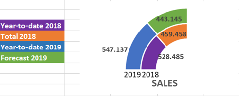
Do you know if there a way to create it not having categories?, I would insert measures with the final result if possible. I send you the chart I want to create (I forgot to insert the legend in the previous one).
I am looking for an existing chart, but if there is no possible I will try to create it with the tool you have sent me if there is possible.
Regards.
- Mark as New
- Bookmark
- Subscribe
- Mute
- Subscribe to RSS Feed
- Permalink
- Report Inappropriate Content
@PwrBI01 , see if Sunburst can fit in your need
https://appsource.microsoft.com/en-us/product/power-bi-visuals/wa104380767?tab=overview
or Advanced Donut Visual
https://appsource.microsoft.com/en-us/product/power-bi-visuals/WA104380858?tab=overview
or Advanced Pie and Donut - xViz
https://appsource.microsoft.com/en-us/product/power-bi-visuals/WA200001917?tab=overview
Microsoft Power BI Learning Resources, 2023 !!
Learn Power BI - Full Course with Dec-2022, with Window, Index, Offset, 100+ Topics !!
Did I answer your question? Mark my post as a solution! Appreciate your Kudos !! Proud to be a Super User! !!
- Mark as New
- Bookmark
- Subscribe
- Mute
- Subscribe to RSS Feed
- Permalink
- Report Inappropriate Content
- Mark as New
- Bookmark
- Subscribe
- Mute
- Subscribe to RSS Feed
- Permalink
- Report Inappropriate Content
@PwrBI01 , also these two ?
or Advanced Donut Visual
https://appsource.microsoft.com/en-us/product/power-bi-visuals/WA104380858?tab=overview
or Advanced Pie and Donut - xViz
https://appsource.microsoft.com/en-us/product/power-bi-visuals/WA200001917?tab=overview
Microsoft Power BI Learning Resources, 2023 !!
Learn Power BI - Full Course with Dec-2022, with Window, Index, Offset, 100+ Topics !!
Did I answer your question? Mark my post as a solution! Appreciate your Kudos !! Proud to be a Super User! !!
Helpful resources

Microsoft Fabric Learn Together
Covering the world! 9:00-10:30 AM Sydney, 4:00-5:30 PM CET (Paris/Berlin), 7:00-8:30 PM Mexico City

Power BI Monthly Update - April 2024
Check out the April 2024 Power BI update to learn about new features.

| User | Count |
|---|---|
| 108 | |
| 100 | |
| 78 | |
| 64 | |
| 58 |
| User | Count |
|---|---|
| 148 | |
| 111 | |
| 94 | |
| 84 | |
| 67 |


