- Power BI forums
- Updates
- News & Announcements
- Get Help with Power BI
- Desktop
- Service
- Report Server
- Power Query
- Mobile Apps
- Developer
- DAX Commands and Tips
- Custom Visuals Development Discussion
- Health and Life Sciences
- Power BI Spanish forums
- Translated Spanish Desktop
- Power Platform Integration - Better Together!
- Power Platform Integrations (Read-only)
- Power Platform and Dynamics 365 Integrations (Read-only)
- Training and Consulting
- Instructor Led Training
- Dashboard in a Day for Women, by Women
- Galleries
- Community Connections & How-To Videos
- COVID-19 Data Stories Gallery
- Themes Gallery
- Data Stories Gallery
- R Script Showcase
- Webinars and Video Gallery
- Quick Measures Gallery
- 2021 MSBizAppsSummit Gallery
- 2020 MSBizAppsSummit Gallery
- 2019 MSBizAppsSummit Gallery
- Events
- Ideas
- Custom Visuals Ideas
- Issues
- Issues
- Events
- Upcoming Events
- Community Blog
- Power BI Community Blog
- Custom Visuals Community Blog
- Community Support
- Community Accounts & Registration
- Using the Community
- Community Feedback
Register now to learn Fabric in free live sessions led by the best Microsoft experts. From Apr 16 to May 9, in English and Spanish.
- Power BI forums
- Forums
- Get Help with Power BI
- Desktop
- Create a drill down on stacked chart
- Subscribe to RSS Feed
- Mark Topic as New
- Mark Topic as Read
- Float this Topic for Current User
- Bookmark
- Subscribe
- Printer Friendly Page
- Mark as New
- Bookmark
- Subscribe
- Mute
- Subscribe to RSS Feed
- Permalink
- Report Inappropriate Content
Create a drill down on stacked chart
Hi,
I have some sample data as shown:
| Site | Ready | Not Ready | Training | Break | Other |
| A | 78% | 22% | 0% | 5% | 16% |
| B | 57% | 43% | 0% | 6% | 37% |
| C | 56% | 44% | 0% | 1% | 43% |
| D | 94% | 6% | 0% | 0% | 6% |
Where 'Site': Call Center Site,
Ready: % of time agents are in a ready state
Not Ready: % of time agents are in a not ready state (further broken down by 'Training', 'Break' and 'Other' states)
I want to show a stacked graph that shows a proportion of time in Ready vs Not Ready State; and when drilled down on Not Ready, it should show proportions of Training, Break and Other states. The Excel equivalent of this would be a pie of a pie chart, but I am stuck when I try to do this in PowerBI. Any advice would be helpful. Thanks!
Solved! Go to Solution.
- Mark as New
- Bookmark
- Subscribe
- Mute
- Subscribe to RSS Feed
- Permalink
- Report Inappropriate Content
Hi @shankulk
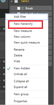
First, You may try to use 'New hierarchy' for 'Not Ready' Column.
Then use 'Add to hierarchy' for 'Trainning','Break‘,'Other' columns to add the 3 columns to 'Not ready' hierarchy.
Last, drag the columns as below:
Regards,
Cherie
If this post helps, then please consider Accept it as the solution to help the other members find it more quickly.
- Mark as New
- Bookmark
- Subscribe
- Mute
- Subscribe to RSS Feed
- Permalink
- Report Inappropriate Content
Hi,
I have some sample data as shown:
| Site | Ready | Not Ready | Training | Break | Other |
| A | 78% | 22% | 0% | 5% | 16% |
| B | 57% | 43% | 0% | 6% | 37% |
| C | 56% | 44% | 0% | 1% | 43% |
| D | 94% | 6% | 0% | 0% | 6% |
Where 'Site': Call Center Site,
Ready: % of time agents are in a ready state
Not Ready: % of time agents are in a not ready state (further broken down by 'Training', 'Break' and 'Other' states)
I want to show a stacked graph that shows a proportion of time in Ready vs Not Ready State; and when drilled down on Not Ready, it should show proportions of Training, Break and Other states. The Excel equivalent of this would be a pie of a pie chart, but I am stuck when I try to do this in PowerBI. Any advice would be helpful. Thanks!
- Mark as New
- Bookmark
- Subscribe
- Mute
- Subscribe to RSS Feed
- Permalink
- Report Inappropriate Content
Hi @shankulk
First, You may try to use 'New hierarchy' for 'Not Ready' Column.
Then use 'Add to hierarchy' for 'Trainning','Break‘,'Other' columns to add the 3 columns to 'Not ready' hierarchy.
Last, drag the columns as below:
Regards,
Cherie
If this post helps, then please consider Accept it as the solution to help the other members find it more quickly.
Helpful resources

Microsoft Fabric Learn Together
Covering the world! 9:00-10:30 AM Sydney, 4:00-5:30 PM CET (Paris/Berlin), 7:00-8:30 PM Mexico City

Power BI Monthly Update - April 2024
Check out the April 2024 Power BI update to learn about new features.

| User | Count |
|---|---|
| 113 | |
| 97 | |
| 85 | |
| 70 | |
| 61 |
| User | Count |
|---|---|
| 151 | |
| 121 | |
| 104 | |
| 87 | |
| 67 |


