- Power BI forums
- Updates
- News & Announcements
- Get Help with Power BI
- Desktop
- Service
- Report Server
- Power Query
- Mobile Apps
- Developer
- DAX Commands and Tips
- Custom Visuals Development Discussion
- Health and Life Sciences
- Power BI Spanish forums
- Translated Spanish Desktop
- Power Platform Integration - Better Together!
- Power Platform Integrations (Read-only)
- Power Platform and Dynamics 365 Integrations (Read-only)
- Training and Consulting
- Instructor Led Training
- Dashboard in a Day for Women, by Women
- Galleries
- Community Connections & How-To Videos
- COVID-19 Data Stories Gallery
- Themes Gallery
- Data Stories Gallery
- R Script Showcase
- Webinars and Video Gallery
- Quick Measures Gallery
- 2021 MSBizAppsSummit Gallery
- 2020 MSBizAppsSummit Gallery
- 2019 MSBizAppsSummit Gallery
- Events
- Ideas
- Custom Visuals Ideas
- Issues
- Issues
- Events
- Upcoming Events
- Community Blog
- Power BI Community Blog
- Custom Visuals Community Blog
- Community Support
- Community Accounts & Registration
- Using the Community
- Community Feedback
Register now to learn Fabric in free live sessions led by the best Microsoft experts. From Apr 16 to May 9, in English and Spanish.
- Power BI forums
- Forums
- Get Help with Power BI
- Desktop
- Create a clustered column chart with summarize tab...
- Subscribe to RSS Feed
- Mark Topic as New
- Mark Topic as Read
- Float this Topic for Current User
- Bookmark
- Subscribe
- Printer Friendly Page
- Mark as New
- Bookmark
- Subscribe
- Mute
- Subscribe to RSS Feed
- Permalink
- Report Inappropriate Content
Create a clustered column chart with summarize table
Hi.
I have a table called journal and then I created a summarize table -> newTable = SUMMARIZECOLUMNS('journal'[TrackerID]; "StartTime"; MAX('journal'[StartTime]);"totalDuration"; SUM('journal'[DurationConnected]);"Outbound"; MAX('journal'[Outbound]);"PhoneNumber"; MAX('journal'[PhoneNumber])).
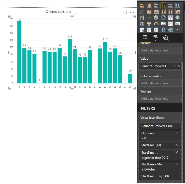
The new table gives me the amount of offered calls (as seen in graph below).
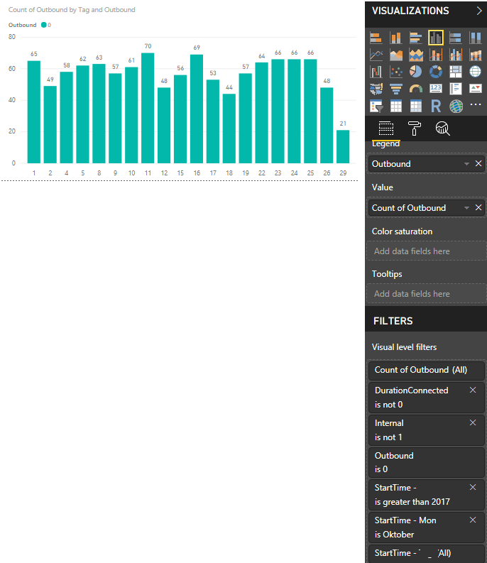
I get the amount of answered calls from the journal table (ordinary table with values):
How can I put these 2 charts in one clustered column chart?
Thanks for any support.
Solved! Go to Solution.
- Mark as New
- Bookmark
- Subscribe
- Mute
- Subscribe to RSS Feed
- Permalink
- Report Inappropriate Content
Hi @Anonymous,
Please refer to the steps below.
1. Your dates have time part. Since you don't analysis time here, we add a new column to tables [journal] and [newTable].
StartTimeNew = newTable[StartTime].[Date]
2. Create a date table.
Calendar = CALENDARAUTO()
3. Establish relationships.
4. Create the Table visual.
Best Regards,
Dale
If this post helps, then please consider Accept it as the solution to help the other members find it more quickly.
- Mark as New
- Bookmark
- Subscribe
- Mute
- Subscribe to RSS Feed
- Permalink
- Report Inappropriate Content
Hi @Anonymous,
We need to establish relationships to connect these tables. It seems the Axis is [TrackerID]. I would suggest you create a table that is full of [TrackerID] then establish relationships among them. The final result is the Axis is 'New Table'[TrackerID].
Can you share a sample file? The solution could be more clear.
Best Regards,
Dale
If this post helps, then please consider Accept it as the solution to help the other members find it more quickly.
- Mark as New
- Bookmark
- Subscribe
- Mute
- Subscribe to RSS Feed
- Permalink
- Report Inappropriate Content
Hi @Anonymous,
Please refer to the steps below.
1. Your dates have time part. Since you don't analysis time here, we add a new column to tables [journal] and [newTable].
StartTimeNew = newTable[StartTime].[Date]
2. Create a date table.
Calendar = CALENDARAUTO()
3. Establish relationships.
4. Create the Table visual.
Best Regards,
Dale
If this post helps, then please consider Accept it as the solution to help the other members find it more quickly.
Helpful resources

Microsoft Fabric Learn Together
Covering the world! 9:00-10:30 AM Sydney, 4:00-5:30 PM CET (Paris/Berlin), 7:00-8:30 PM Mexico City

Power BI Monthly Update - April 2024
Check out the April 2024 Power BI update to learn about new features.

| User | Count |
|---|---|
| 113 | |
| 97 | |
| 85 | |
| 70 | |
| 61 |
| User | Count |
|---|---|
| 151 | |
| 121 | |
| 104 | |
| 87 | |
| 67 |


