- Power BI forums
- Updates
- News & Announcements
- Get Help with Power BI
- Desktop
- Service
- Report Server
- Power Query
- Mobile Apps
- Developer
- DAX Commands and Tips
- Custom Visuals Development Discussion
- Health and Life Sciences
- Power BI Spanish forums
- Translated Spanish Desktop
- Power Platform Integration - Better Together!
- Power Platform Integrations (Read-only)
- Power Platform and Dynamics 365 Integrations (Read-only)
- Training and Consulting
- Instructor Led Training
- Dashboard in a Day for Women, by Women
- Galleries
- Community Connections & How-To Videos
- COVID-19 Data Stories Gallery
- Themes Gallery
- Data Stories Gallery
- R Script Showcase
- Webinars and Video Gallery
- Quick Measures Gallery
- 2021 MSBizAppsSummit Gallery
- 2020 MSBizAppsSummit Gallery
- 2019 MSBizAppsSummit Gallery
- Events
- Ideas
- Custom Visuals Ideas
- Issues
- Issues
- Events
- Upcoming Events
- Community Blog
- Power BI Community Blog
- Custom Visuals Community Blog
- Community Support
- Community Accounts & Registration
- Using the Community
- Community Feedback
Register now to learn Fabric in free live sessions led by the best Microsoft experts. From Apr 16 to May 9, in English and Spanish.
- Power BI forums
- Forums
- Get Help with Power BI
- Desktop
- Create a Daily Status Stacked Chart with Start- an...
- Subscribe to RSS Feed
- Mark Topic as New
- Mark Topic as Read
- Float this Topic for Current User
- Bookmark
- Subscribe
- Printer Friendly Page
- Mark as New
- Bookmark
- Subscribe
- Mute
- Subscribe to RSS Feed
- Permalink
- Report Inappropriate Content
Create a Daily Status Stacked Chart with Start- and Enddate
Hello,
I have a question. I would like to build a daily stacked chart with the amount of open cases divided by status. The problem is that I only have a start- and enddate for the status.
My dataset looks as follows:
Case | Status | Startdate Status | Enddate Status |
X | C | 4-1-2022 | 5-1-2022 |
X | B | 2-1-2022 | 4-1-2022 |
X | A | 1-1-2022 | 2-1-2022 |
Y | B | 2-1-2022 | 3-1-2022 |
Y | A | 1-1-2022 | 2-1-2022 |
Z | A | 4-1-2022 | 5-1-2022 |
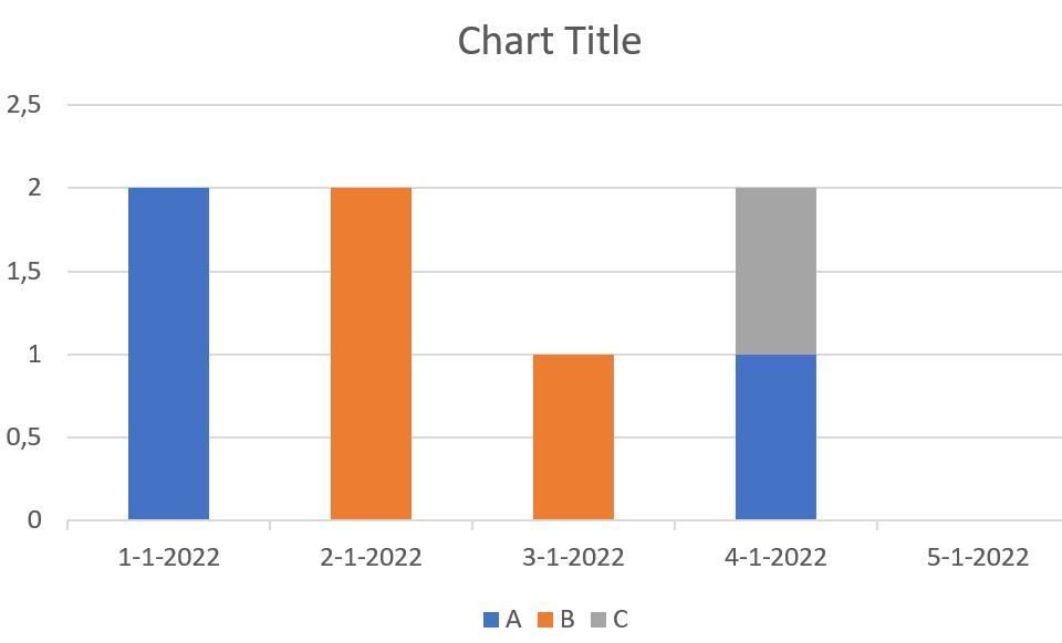
And my output should look something like this:
Is this possible?
Thanks!
Solved! Go to Solution.
- Mark as New
- Bookmark
- Subscribe
- Mute
- Subscribe to RSS Feed
- Permalink
- Report Inappropriate Content
Hi , @MattJacob
According to your description, you want to "Create a Daily Status Stacked Chart with Start- and Enddate".
Here are the steps you can refer to :
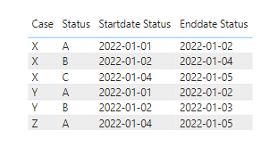
(1)This is my test data:
(2)We need to create a date dimension date table as the X-axis:
Date = CALENDAR(FIRSTDATE('Table'[Startdate Status]),LASTDATE('Table'[Enddate Status]))We do not need to create any relationship between two tables.
(3)Then we can create a measure:
Measure = var _cur_date= MAX('Date'[Date])
var _t =FILTER('Table' , 'Table'[Startdate Status]<= _cur_date  && 'Table'[Enddate Status]> _cur_date)
return
COUNTROWS(_t)
(4)We can put the fields on the visual and we can meet your need:
Thank you for your time and sharing, and thank you for your support and understanding of PowerBI!
Best Regards,
Aniya Zhang
If this post helps, then please consider Accept it as the solution to help the other members find it more quickly
- Mark as New
- Bookmark
- Subscribe
- Mute
- Subscribe to RSS Feed
- Permalink
- Report Inappropriate Content
Thank you! This worked!
- Mark as New
- Bookmark
- Subscribe
- Mute
- Subscribe to RSS Feed
- Permalink
- Report Inappropriate Content
@MattJacob , check if this can help
Power BI Dax Measure- Allocate data between Range: https://youtu.be/O653vwLTUzM
or
Power BI: HR Analytics - Employees as on Date : https://youtu.be/e6Y-l_JtCq4
https://community.powerbi.com/t5/Community-Blog/HR-Analytics-Active-Employee-Hire-and-Termination-tr...
Microsoft Power BI Learning Resources, 2023 !!
Learn Power BI - Full Course with Dec-2022, with Window, Index, Offset, 100+ Topics !!
Did I answer your question? Mark my post as a solution! Appreciate your Kudos !! Proud to be a Super User! !!
- Mark as New
- Bookmark
- Subscribe
- Mute
- Subscribe to RSS Feed
- Permalink
- Report Inappropriate Content
Thank you! I learned a lot from the videos, but the other reply was a bit more helpful for my case.
Helpful resources

Microsoft Fabric Learn Together
Covering the world! 9:00-10:30 AM Sydney, 4:00-5:30 PM CET (Paris/Berlin), 7:00-8:30 PM Mexico City

Power BI Monthly Update - April 2024
Check out the April 2024 Power BI update to learn about new features.

| User | Count |
|---|---|
| 114 | |
| 97 | |
| 85 | |
| 70 | |
| 61 |
| User | Count |
|---|---|
| 151 | |
| 121 | |
| 104 | |
| 87 | |
| 67 |


