- Power BI forums
- Updates
- News & Announcements
- Get Help with Power BI
- Desktop
- Service
- Report Server
- Power Query
- Mobile Apps
- Developer
- DAX Commands and Tips
- Custom Visuals Development Discussion
- Health and Life Sciences
- Power BI Spanish forums
- Translated Spanish Desktop
- Power Platform Integration - Better Together!
- Power Platform Integrations (Read-only)
- Power Platform and Dynamics 365 Integrations (Read-only)
- Training and Consulting
- Instructor Led Training
- Dashboard in a Day for Women, by Women
- Galleries
- Community Connections & How-To Videos
- COVID-19 Data Stories Gallery
- Themes Gallery
- Data Stories Gallery
- R Script Showcase
- Webinars and Video Gallery
- Quick Measures Gallery
- 2021 MSBizAppsSummit Gallery
- 2020 MSBizAppsSummit Gallery
- 2019 MSBizAppsSummit Gallery
- Events
- Ideas
- Custom Visuals Ideas
- Issues
- Issues
- Events
- Upcoming Events
- Community Blog
- Power BI Community Blog
- Custom Visuals Community Blog
- Community Support
- Community Accounts & Registration
- Using the Community
- Community Feedback
Register now to learn Fabric in free live sessions led by the best Microsoft experts. From Apr 16 to May 9, in English and Spanish.
- Power BI forums
- Forums
- Get Help with Power BI
- Desktop
- Create Sub Table to Map Time Range
- Subscribe to RSS Feed
- Mark Topic as New
- Mark Topic as Read
- Float this Topic for Current User
- Bookmark
- Subscribe
- Printer Friendly Page
- Mark as New
- Bookmark
- Subscribe
- Mute
- Subscribe to RSS Feed
- Permalink
- Report Inappropriate Content
Create Sub Table to Map Time Range
I have a table which consists of a DateTime range. I want to graphically count the # of records that fall into that time range by the hour.
Table:
trx_no, trx_begin_dt, trx_en_dt, Start Date, Start Time
Start Date & Start Time are just separated from trx_begin_dt
The target should look something like this: https://imgur.com/G6NNI5M
But what I get by graphic the trx_begin_dt is this: https://imgur.com/a/H54eh6n
My idea was to create a calculated table which would consist of a single record for each hour used to acheive the desired graph, but I don't know how to go about doing it. I was hoping someone could might be able to help me go about acheiving this kind of table, or if there was another way of doing it.
Like this: https://imgur.com/a/LEVYH9j
Solved! Go to Solution.
- Mark as New
- Bookmark
- Subscribe
- Mute
- Subscribe to RSS Feed
- Permalink
- Report Inappropriate Content
Hi @v-yuta-msft ,
I was able to achieve the desired affect with a sub table in power query.
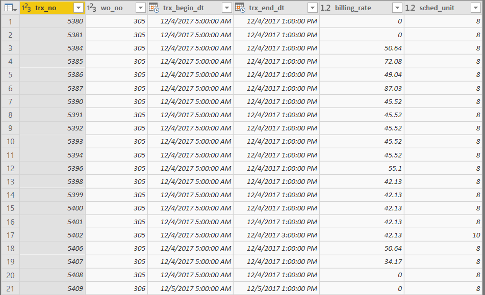
The table in question looks like this:
trx_no: transaction ID
trx_begin_dt: Start DateTime
trx_end_dt: End DateTime
sched_unit: # of hours in the booking (i.e End - Start)
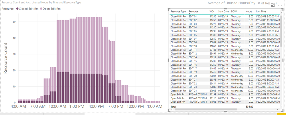
Each record represents a scheduled booking of a resource. I want to graph the utilization of resources hourly. I was able to achieve this effect by creating a sub table from the original table. Using List.Numbers basically make a list of numbers from 0 to # hours in 15 minute increments. i.e 2 Hr booking = {0, 1, 2, 3, 4, 5, 6, 7}. Then Table.ExpandListColumn to repeat the record for each number in the list. Then calculate dt_point which will be the Start Time + (15 minutes * sched_unit_index) used as a data point in the graph. The final graph will be a count of dt_point.
#"Added sched_unit_index" = Table.AddColumn(#"Filtered Rows", "sched_unit_index", each List.Numbers(0, 4*[sched_unit])),
#"Expanded" = Table.ExpandListColumn(#"Added sched_unit_index", "sched_unit_index"),
#"Added dt_point" = Table.AddColumn(Expanded, "dt_point", each [trx_begin_dt]+#duration(0,Number.RoundDown([sched_unit_index]*0.25),60*([sched_unit_index]*0.25-Number.RoundDown([sched_unit_index]*0.25)),0))
This query results in:
The graph (x: dt_point, y: resource count):
- Mark as New
- Bookmark
- Subscribe
- Mute
- Subscribe to RSS Feed
- Permalink
- Report Inappropriate Content
@Anonymous ,
Could you share more details about what which columns/measures/calculate columns are used in the stacked bar chart and what does the table structure look like?
Community Support Team _ Jimmy Tao
If this post helps, then please consider Accept it as the solution to help the other members find it more quickly.
- Mark as New
- Bookmark
- Subscribe
- Mute
- Subscribe to RSS Feed
- Permalink
- Report Inappropriate Content
Hi @v-yuta-msft ,
I was able to achieve the desired affect with a sub table in power query.
The table in question looks like this:
trx_no: transaction ID
trx_begin_dt: Start DateTime
trx_end_dt: End DateTime
sched_unit: # of hours in the booking (i.e End - Start)
Each record represents a scheduled booking of a resource. I want to graph the utilization of resources hourly. I was able to achieve this effect by creating a sub table from the original table. Using List.Numbers basically make a list of numbers from 0 to # hours in 15 minute increments. i.e 2 Hr booking = {0, 1, 2, 3, 4, 5, 6, 7}. Then Table.ExpandListColumn to repeat the record for each number in the list. Then calculate dt_point which will be the Start Time + (15 minutes * sched_unit_index) used as a data point in the graph. The final graph will be a count of dt_point.
#"Added sched_unit_index" = Table.AddColumn(#"Filtered Rows", "sched_unit_index", each List.Numbers(0, 4*[sched_unit])),
#"Expanded" = Table.ExpandListColumn(#"Added sched_unit_index", "sched_unit_index"),
#"Added dt_point" = Table.AddColumn(Expanded, "dt_point", each [trx_begin_dt]+#duration(0,Number.RoundDown([sched_unit_index]*0.25),60*([sched_unit_index]*0.25-Number.RoundDown([sched_unit_index]*0.25)),0))
This query results in:
The graph (x: dt_point, y: resource count):
Helpful resources

Microsoft Fabric Learn Together
Covering the world! 9:00-10:30 AM Sydney, 4:00-5:30 PM CET (Paris/Berlin), 7:00-8:30 PM Mexico City

Power BI Monthly Update - April 2024
Check out the April 2024 Power BI update to learn about new features.

| User | Count |
|---|---|
| 110 | |
| 99 | |
| 80 | |
| 64 | |
| 57 |
| User | Count |
|---|---|
| 145 | |
| 110 | |
| 91 | |
| 84 | |
| 66 |


