- Power BI forums
- Updates
- News & Announcements
- Get Help with Power BI
- Desktop
- Service
- Report Server
- Power Query
- Mobile Apps
- Developer
- DAX Commands and Tips
- Custom Visuals Development Discussion
- Health and Life Sciences
- Power BI Spanish forums
- Translated Spanish Desktop
- Power Platform Integration - Better Together!
- Power Platform Integrations (Read-only)
- Power Platform and Dynamics 365 Integrations (Read-only)
- Training and Consulting
- Instructor Led Training
- Dashboard in a Day for Women, by Women
- Galleries
- Community Connections & How-To Videos
- COVID-19 Data Stories Gallery
- Themes Gallery
- Data Stories Gallery
- R Script Showcase
- Webinars and Video Gallery
- Quick Measures Gallery
- 2021 MSBizAppsSummit Gallery
- 2020 MSBizAppsSummit Gallery
- 2019 MSBizAppsSummit Gallery
- Events
- Ideas
- Custom Visuals Ideas
- Issues
- Issues
- Events
- Upcoming Events
- Community Blog
- Power BI Community Blog
- Custom Visuals Community Blog
- Community Support
- Community Accounts & Registration
- Using the Community
- Community Feedback
Register now to learn Fabric in free live sessions led by the best Microsoft experts. From Apr 16 to May 9, in English and Spanish.
- Power BI forums
- Forums
- Get Help with Power BI
- Desktop
- Re: Create Histogram using Quartiles
- Subscribe to RSS Feed
- Mark Topic as New
- Mark Topic as Read
- Float this Topic for Current User
- Bookmark
- Subscribe
- Printer Friendly Page
- Mark as New
- Bookmark
- Subscribe
- Mute
- Subscribe to RSS Feed
- Permalink
- Report Inappropriate Content
Create Histogram using Quartiles
Hi Everyone,
I am looking at creating a histogram that will show the average tenure of employees by quartiles.
I used the below code to try and get quartiles however I can't seem to use this in a bar chart to mimic a histogram. So basically I would like the quartiels across the bottom of the histogram/bar chart as the X axis and then count of employees that fall into each bucket.
The other issue I noticed with the below code is I seem to have to pull in Tenure into the table in order for the below calculation to show the quartiles. I would like a user to be able to select different locations and then get the quartiles for that location.
I also want to apply this to employee wages as well but am using tenure as a test.
Quartile Avg Tenure =
VAR FirstQ =
    PERCENTILEX.INC (
        ALL ( 'DimEmployees'[Tenure] ),
        'DimEmployees'[Tenure],
        .25
    )
VAR SecondQ =
    PERCENTILEX.INC (
        ALL ( 'DimEmployees'[Tenure] ),
        'DimEmployees'[Tenure],
        .50
    )
VAR ThirdQ =
    PERCENTILEX.INC (
        ALL ( 'DimEmployees'[Tenure] ),
        'DimEmployees'[Tenure],
        .75
    )
VAR ThisVal =
    SELECTEDVALUE ( 'DimEmployees'[Tenure] )
RETURN
    IF (
        ThisVal <= FirstQ,
        1,
        IF (
            ThisVal > FirstQ
                && ThisVal <= SecondQ,
            2,
            IF ( ThisVal > SecondQ && ThisVal <= ThirdQ, 3, 4 )
        )
    )
- Mark as New
- Bookmark
- Subscribe
- Mute
- Subscribe to RSS Feed
- Permalink
- Report Inappropriate Content
Hi @Anonymous ,
Can you please share a dummy file? If you can't, please share some sample data and your expected results that will make us understand clearly about your requirement.
Please see this post regarding How to Get Your Question Answered Quickly:
https://community.powerbi.com/t5/Community-Blog/How-to-Get-Your-Question-Answered-Quickly/ba-p/38490
Best Regards,
Xue Ding
If this post helps, then please consider Accept it as the solution to help the other members find it more quickly.
Xue Ding
If this post helps, then please consider Accept it as the solution to help the other members find it more quickly.
- Mark as New
- Bookmark
- Subscribe
- Mute
- Subscribe to RSS Feed
- Permalink
- Report Inappropriate Content
@v-xuding-msft , how is this? and thanks for the reply.
sample data:
Employee ID Tenure Location
abc .4 A
def 1.2 B
g .5 B
h 5 A
i 4.2 B
Expected Results:
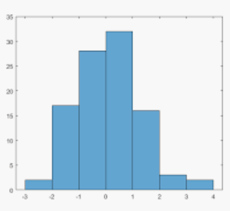
These are assigned quartiles dynamically which I can then put into a histogram. So above another column of Quartiles/percentiles would be added but it can change depending on what location(s) you choose. The histogram can be a bar chart but would look somethign like below. Where the X axis are the quartiles and the Y axis is the employee count.
Does this help?
Helpful resources

Microsoft Fabric Learn Together
Covering the world! 9:00-10:30 AM Sydney, 4:00-5:30 PM CET (Paris/Berlin), 7:00-8:30 PM Mexico City

Power BI Monthly Update - April 2024
Check out the April 2024 Power BI update to learn about new features.

| User | Count |
|---|---|
| 116 | |
| 102 | |
| 78 | |
| 76 | |
| 49 |
| User | Count |
|---|---|
| 145 | |
| 108 | |
| 107 | |
| 89 | |
| 61 |

