- Power BI forums
- Updates
- News & Announcements
- Get Help with Power BI
- Desktop
- Service
- Report Server
- Power Query
- Mobile Apps
- Developer
- DAX Commands and Tips
- Custom Visuals Development Discussion
- Health and Life Sciences
- Power BI Spanish forums
- Translated Spanish Desktop
- Power Platform Integration - Better Together!
- Power Platform Integrations (Read-only)
- Power Platform and Dynamics 365 Integrations (Read-only)
- Training and Consulting
- Instructor Led Training
- Dashboard in a Day for Women, by Women
- Galleries
- Community Connections & How-To Videos
- COVID-19 Data Stories Gallery
- Themes Gallery
- Data Stories Gallery
- R Script Showcase
- Webinars and Video Gallery
- Quick Measures Gallery
- 2021 MSBizAppsSummit Gallery
- 2020 MSBizAppsSummit Gallery
- 2019 MSBizAppsSummit Gallery
- Events
- Ideas
- Custom Visuals Ideas
- Issues
- Issues
- Events
- Upcoming Events
- Community Blog
- Power BI Community Blog
- Custom Visuals Community Blog
- Community Support
- Community Accounts & Registration
- Using the Community
- Community Feedback
Register now to learn Fabric in free live sessions led by the best Microsoft experts. From Apr 16 to May 9, in English and Spanish.
- Power BI forums
- Forums
- Get Help with Power BI
- Desktop
- Re: Create Bar Chart based on Measures when sourci...
- Subscribe to RSS Feed
- Mark Topic as New
- Mark Topic as Read
- Float this Topic for Current User
- Bookmark
- Subscribe
- Printer Friendly Page
- Mark as New
- Bookmark
- Subscribe
- Mute
- Subscribe to RSS Feed
- Permalink
- Report Inappropriate Content
Create Bar Chart based on Measures when sourcing data from a Power BI Dataset.
Hi All,
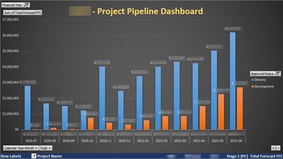
Client requirement is to create a Bar Chart with a comparison between the forecast totals for the Project Identifier with an Approval Status as Development and Deliver as below. He is able to achieve this in Excel as per the 1st screenshot.
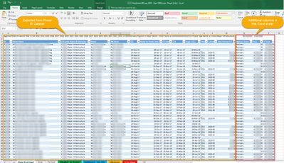
If 'Ready for Tender Date' is BEFORE 01st of Current Month, then the Approval Status is classified as 'Development' and if it is either 01st or AFTER 01st of Current Month, then the Approval Status is classified as 'Deliver'. Screenshot below for your reference.
Data is being sourced from a Certified Power BI Dataset, therefore, I don't have much options except to create DAX Measures and Data Modeling is of no use anyways!
I created a Measure as below to get a column into a table visual.
MPD Project Stage =
IF (
NOW () < MAX ( Project[Ready for Tender Date] ),
"Development",
"Delivery"
)
Client is able to achieve
Even tried and successfully split this column by using 2 Measures to get only Development and Delivery into 2 separate columns but couldn't use any of these in Columns Charts.
I've tried to use Q@A Visual just in case it picks up something but no use.
Someone mentioned SWITCH and SELECTEDVALUE will do the magic but not quite sure how to go about with it!
Has anyone come across this scenario and how did you get to a solution?
Any help in this regards is greatly appreciated.
Thanks, B


Solved! Go to Solution.
- Mark as New
- Bookmark
- Subscribe
- Mute
- Subscribe to RSS Feed
- Permalink
- Report Inappropriate Content
Hi, @Bhoga
It is unsupported to create calculated column for a Power BI dataset live connection data source. And you need to put a column instead of a measure in the 'Axis' of the bar chart. I'd like to suggest you create a calculated column in the Power BI dataset and then connect to it.
Best Regards
Allan
If this post helps, then please consider Accept it as the solution to help the other members find it more quickly.
- Mark as New
- Bookmark
- Subscribe
- Mute
- Subscribe to RSS Feed
- Permalink
- Report Inappropriate Content
Helpful resources

Microsoft Fabric Learn Together
Covering the world! 9:00-10:30 AM Sydney, 4:00-5:30 PM CET (Paris/Berlin), 7:00-8:30 PM Mexico City

Power BI Monthly Update - April 2024
Check out the April 2024 Power BI update to learn about new features.

| User | Count |
|---|---|
| 114 | |
| 99 | |
| 82 | |
| 70 | |
| 61 |
| User | Count |
|---|---|
| 149 | |
| 114 | |
| 107 | |
| 89 | |
| 67 |
