- Power BI forums
- Updates
- News & Announcements
- Get Help with Power BI
- Desktop
- Service
- Report Server
- Power Query
- Mobile Apps
- Developer
- DAX Commands and Tips
- Custom Visuals Development Discussion
- Health and Life Sciences
- Power BI Spanish forums
- Translated Spanish Desktop
- Power Platform Integration - Better Together!
- Power Platform Integrations (Read-only)
- Power Platform and Dynamics 365 Integrations (Read-only)
- Training and Consulting
- Instructor Led Training
- Dashboard in a Day for Women, by Women
- Galleries
- Community Connections & How-To Videos
- COVID-19 Data Stories Gallery
- Themes Gallery
- Data Stories Gallery
- R Script Showcase
- Webinars and Video Gallery
- Quick Measures Gallery
- 2021 MSBizAppsSummit Gallery
- 2020 MSBizAppsSummit Gallery
- 2019 MSBizAppsSummit Gallery
- Events
- Ideas
- Custom Visuals Ideas
- Issues
- Issues
- Events
- Upcoming Events
- Community Blog
- Power BI Community Blog
- Custom Visuals Community Blog
- Community Support
- Community Accounts & Registration
- Using the Community
- Community Feedback
Register now to learn Fabric in free live sessions led by the best Microsoft experts. From Apr 16 to May 9, in English and Spanish.
- Power BI forums
- Forums
- Get Help with Power BI
- Desktop
- Crate a bar graph with stacked values and drill do...
- Subscribe to RSS Feed
- Mark Topic as New
- Mark Topic as Read
- Float this Topic for Current User
- Bookmark
- Subscribe
- Printer Friendly Page
- Mark as New
- Bookmark
- Subscribe
- Mute
- Subscribe to RSS Feed
- Permalink
- Report Inappropriate Content
Crate a bar graph with stacked values and drill down
Hello,
I am trying to create a visual with stacked bar graphs but I am not capable of finding a Power BI visual that satiesfies my requierements.
The idea is the following:
X-axis: by the current Month filtered (this one is easy), having one bar per calculated measure (three in total: Sales, Budget and Previous Year Sales).
The values to display are from data in a two-level hierarchy: the general type and the specific element. The values must be stacked first in the general type and, with the data drilldown, go to the specific elements (5 in each type)
Y axis: the amounts, in thousand (the easy part).
So it needs a 3 level hierarchy (Month, Type, Element) to drilldown, with 3 calculated measures as bars, stacked. Any ideas on how to solve it or any custom visual I can use for this purpose?
Power BI built-in graphs are limited and they do not offer this kind of graph as far as I have seen, either I have a stacked but with just one value (for example, Sales) and no drilldown.
Regards,
- Mark as New
- Bookmark
- Subscribe
- Mute
- Subscribe to RSS Feed
- Permalink
- Report Inappropriate Content
Hi @Anonymous,
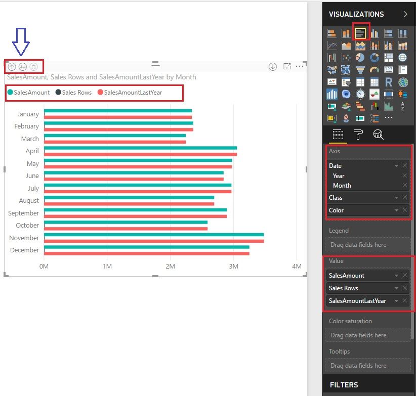
You can try "Clustered bar chart". As you can see from the snapshot, the date, class, color are three different types and different things. You can drill down to another type.
Best Regards!
Dale
If this post helps, then please consider Accept it as the solution to help the other members find it more quickly.
- Mark as New
- Bookmark
- Subscribe
- Mute
- Subscribe to RSS Feed
- Permalink
- Report Inappropriate Content
Thanks for your response!
This chart almost suits me, but not quite. This is the result I am getting:
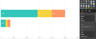
This is the result I need:
It is still missing the stacked part, to see in one line how the different types are distributed.
Regards,
Antonio
- Mark as New
- Bookmark
- Subscribe
- Mute
- Subscribe to RSS Feed
- Permalink
- Report Inappropriate Content
Hi Antonio,
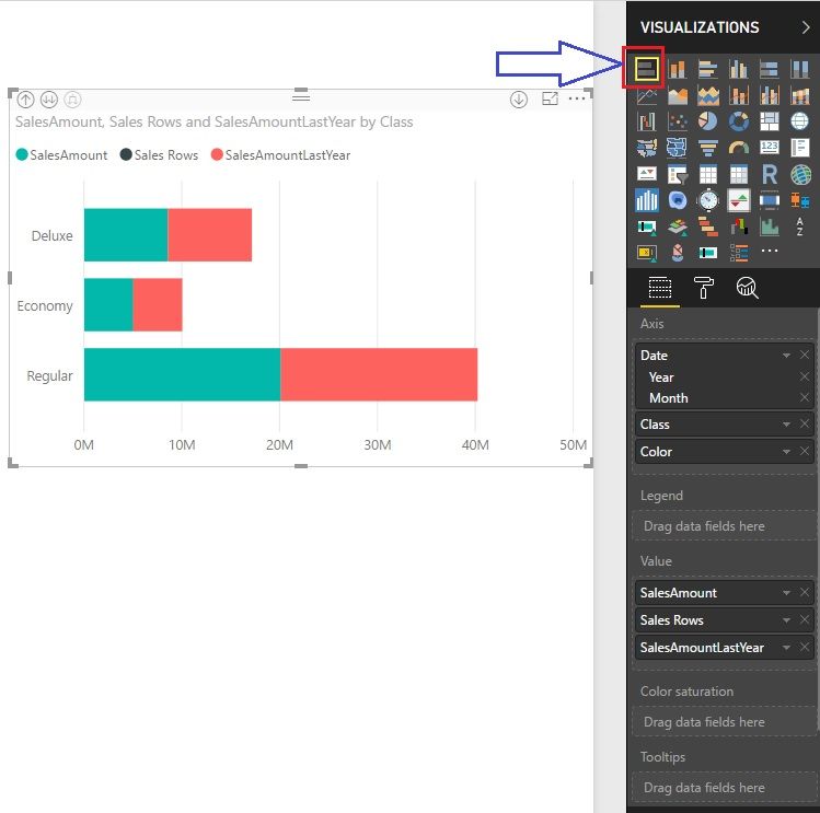
How about "Stacked bar chart".
Best Regards!
Dale
If this post helps, then please consider Accept it as the solution to help the other members find it more quickly.
- Mark as New
- Bookmark
- Subscribe
- Mute
- Subscribe to RSS Feed
- Permalink
- Report Inappropriate Content
Thanks again for your response!
The problem with that one is that it stacks the Values (Sales, Budget, Previous Year) by Type / Element, not the other way around (stack the Type /Element by Sales, Budget and Previous Year, having 3 stacked columns representing the proportion of each Value):
Regards,
Antonio
Helpful resources

Microsoft Fabric Learn Together
Covering the world! 9:00-10:30 AM Sydney, 4:00-5:30 PM CET (Paris/Berlin), 7:00-8:30 PM Mexico City

Power BI Monthly Update - April 2024
Check out the April 2024 Power BI update to learn about new features.

| User | Count |
|---|---|
| 106 | |
| 93 | |
| 75 | |
| 62 | |
| 50 |
| User | Count |
|---|---|
| 146 | |
| 109 | |
| 106 | |
| 88 | |
| 61 |


