- Power BI forums
- Updates
- News & Announcements
- Get Help with Power BI
- Desktop
- Service
- Report Server
- Power Query
- Mobile Apps
- Developer
- DAX Commands and Tips
- Custom Visuals Development Discussion
- Health and Life Sciences
- Power BI Spanish forums
- Translated Spanish Desktop
- Power Platform Integration - Better Together!
- Power Platform Integrations (Read-only)
- Power Platform and Dynamics 365 Integrations (Read-only)
- Training and Consulting
- Instructor Led Training
- Dashboard in a Day for Women, by Women
- Galleries
- Community Connections & How-To Videos
- COVID-19 Data Stories Gallery
- Themes Gallery
- Data Stories Gallery
- R Script Showcase
- Webinars and Video Gallery
- Quick Measures Gallery
- 2021 MSBizAppsSummit Gallery
- 2020 MSBizAppsSummit Gallery
- 2019 MSBizAppsSummit Gallery
- Events
- Ideas
- Custom Visuals Ideas
- Issues
- Issues
- Events
- Upcoming Events
- Community Blog
- Power BI Community Blog
- Custom Visuals Community Blog
- Community Support
- Community Accounts & Registration
- Using the Community
- Community Feedback
Register now to learn Fabric in free live sessions led by the best Microsoft experts. From Apr 16 to May 9, in English and Spanish.
- Power BI forums
- Forums
- Get Help with Power BI
- Desktop
- Re: Crate Bar Chart using R Visual
- Subscribe to RSS Feed
- Mark Topic as New
- Mark Topic as Read
- Float this Topic for Current User
- Bookmark
- Subscribe
- Printer Friendly Page
- Mark as New
- Bookmark
- Subscribe
- Mute
- Subscribe to RSS Feed
- Permalink
- Report Inappropriate Content
Crate Bar Chart using R Visual
Hello, I am having some trouble using the R visual to create a bar chart. Yes, I know I could do it with the vanilla tool, but because of certain end user requests, I can't use it because it lacks certain aesthetics. So, I thought I would try using the R visualization.
I have a table with lots of transactional data, 'Monthly'. 7 of the columns in this table record the volumes made on a day-of-week basis; MON_VOL, TUE_VOl, .... FRI_VOL, SAT_VOL. I want the sums of each of these DOW volumes to be its own vertical bar, with a label pertaining to the DOW; "Mon", "Tue", ...
I also want the sums to be responsive to a date slicer. Will this be the case by default, since in theory only the data filtered by the data slicer should go to the R visual, or will I have to code that as well?
I know very little about R, so I would apprecite any help you can provide.
I did some googling when I thought of the idea, and this is what I have so far:
1) It looks like I'll have to tell R that each of those columns is a column (they're objects?).
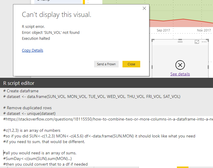
The main obstacle I'm having to getting started is that I keep getting the error: "object not found"
2) Then I'll have to have it sum each column.
3) Then I can actually create the barplot:
barplot(dataset, main="Day of Week Volume",
xlab="Day of Week")
The greyed out section of the code was provided by Power BI. These are some notes I had from a discussion with a friend who dabbles in R.
Addition: Getting a little closer now. Still not sure what's going on:
- Mark as New
- Bookmark
- Subscribe
- Mute
- Subscribe to RSS Feed
- Permalink
- Report Inappropriate Content
Hi @jengwt,
Try the demo in the attachment, please. The names aren't the legend in your expected result.
bar_names <- c("MON", "TUE", "WED", "THU", "FRI", "SAT", "SUN")
bar_height <- unlist(dataset[1, ])
barplot(dataset, main = "Day of Week Volumn", xlab = "Day of Week", height = bar_height, width = 3000, col = 'red', beside = FALSE, names.arg = bar_names)
Best Regards,
Dale
If this post helps, then please consider Accept it as the solution to help the other members find it more quickly.
- Mark as New
- Bookmark
- Subscribe
- Mute
- Subscribe to RSS Feed
- Permalink
- Report Inappropriate Content
@v-jiascu-msft Dale,
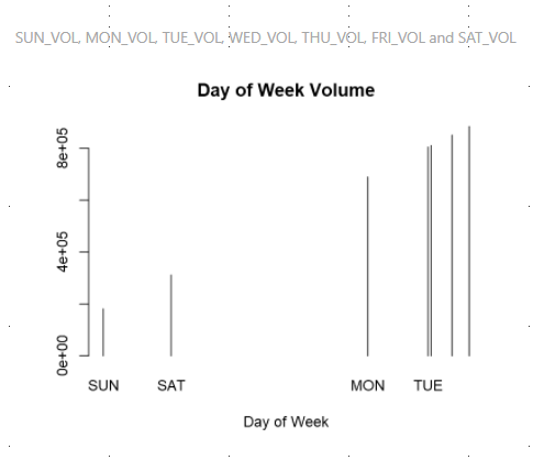
Thank you for the suggestion. However, using that code, I get the following result, which was very similar to one of the ones that I posted in the OP. Also, I notice that the data seems to be in ascending order, rather than by the order in which they were coded into the visual, or the labels. Is there a way to change this?
- Mark as New
- Bookmark
- Subscribe
- Mute
- Subscribe to RSS Feed
- Permalink
- Report Inappropriate Content
Hi @jengwt,
Can you share your data? A dummy one is enough? It would also be great if you can share the expected result?
Best Regards,
Dale
If this post helps, then please consider Accept it as the solution to help the other members find it more quickly.
- Mark as New
- Bookmark
- Subscribe
- Mute
- Subscribe to RSS Feed
- Permalink
- Report Inappropriate Content
@v-jiascu-msft No, a dummy chart will not work. The chart needs to update depending on the selections of the user.
Let me see what I can put together for you as far as dummy data.
Helpful resources

Microsoft Fabric Learn Together
Covering the world! 9:00-10:30 AM Sydney, 4:00-5:30 PM CET (Paris/Berlin), 7:00-8:30 PM Mexico City

Power BI Monthly Update - April 2024
Check out the April 2024 Power BI update to learn about new features.

| User | Count |
|---|---|
| 109 | |
| 99 | |
| 77 | |
| 66 | |
| 54 |
| User | Count |
|---|---|
| 144 | |
| 104 | |
| 102 | |
| 87 | |
| 64 |


