- Power BI forums
- Updates
- News & Announcements
- Get Help with Power BI
- Desktop
- Service
- Report Server
- Power Query
- Mobile Apps
- Developer
- DAX Commands and Tips
- Custom Visuals Development Discussion
- Health and Life Sciences
- Power BI Spanish forums
- Translated Spanish Desktop
- Power Platform Integration - Better Together!
- Power Platform Integrations (Read-only)
- Power Platform and Dynamics 365 Integrations (Read-only)
- Training and Consulting
- Instructor Led Training
- Dashboard in a Day for Women, by Women
- Galleries
- Community Connections & How-To Videos
- COVID-19 Data Stories Gallery
- Themes Gallery
- Data Stories Gallery
- R Script Showcase
- Webinars and Video Gallery
- Quick Measures Gallery
- 2021 MSBizAppsSummit Gallery
- 2020 MSBizAppsSummit Gallery
- 2019 MSBizAppsSummit Gallery
- Events
- Ideas
- Custom Visuals Ideas
- Issues
- Issues
- Events
- Upcoming Events
- Community Blog
- Power BI Community Blog
- Custom Visuals Community Blog
- Community Support
- Community Accounts & Registration
- Using the Community
- Community Feedback
Register now to learn Fabric in free live sessions led by the best Microsoft experts. From Apr 16 to May 9, in English and Spanish.
- Power BI forums
- Forums
- Get Help with Power BI
- Desktop
- County and Numerical Labels in ArcGIS Map Visual |...
- Subscribe to RSS Feed
- Mark Topic as New
- Mark Topic as Read
- Float this Topic for Current User
- Bookmark
- Subscribe
- Printer Friendly Page
- Mark as New
- Bookmark
- Subscribe
- Mute
- Subscribe to RSS Feed
- Permalink
- Report Inappropriate Content
County and Numerical Labels in ArcGIS Map Visual | Power BI
Hello, I am fairly new to expermenting with arcGIS on Power BI and I was hoping to get some help.
I am looking for a way to show a County color coded map based on the Number of Applications, and show County's name AND a Numerical Value (Number of applications) as the labels. It seems I can only do one label, not both at the same time. I don't want to rely on "Tooltips" because this report will be exported as a PDF and sent to many users as part of a newsletter, so hovering over a county won't mean anything once exported.
My table is structured this way:
| Agency Name | Staff Name | Application Type | Zip Code | County |
| Agency Name 1 | Staff 1 | Type 1 | 98409 | Pierce |
| Agency Name 1 | Staff 1 | Type 2 | 98408 | Pierce |
| Agency Name 1 | Staff 2 | Type 3 | 98409 | Pierce |
| Agency Name 1 | Staff 2 | Type 2 | 98409 | Pierce |
| Agency Name 1 | Staff 2 | Type 2 | 98115 | King |
| Agency Name 1 | Staff 3 | Type 2 | 98040 | King |
| Agency Name 2 | Staff 4 | Type 3 | 98070 | King |
| Agency Name 2 | Staff 4 | Type 2 | 98012 | Snohomish |
| Agency Name 2 | Staff 4 | Type 1 | 98270 | Snohomish |
| Agency Name 2 | Staff 4 | Type 1 | 98270 | Snohomish |
I created a measure that counts the number of applications:
Count of Applications = COUNTA('Table'[Agency Name])
Then I tried to create a measure that concatenates the [County], a line break and the [Count of Applications], but it doesn't work and I think it has to do with the fact that the count is a calculation and that there are many values in the County column.
My next step was to try creating a calculated column:
MapLabels =
'Table'[County]&"
"&CALCULATE(SUM('Table'[Count of Applications]), ALLEXCEPT('Table','Table'[Agency Name]))
This actually worked visually but all the numbers are wrong.
I am not sure what other steps I can take. Should I reformat my table by grouping? Is there a better way to calculate concatenated values? any ideas?
Solved! Go to Solution.
- Mark as New
- Bookmark
- Subscribe
- Mute
- Subscribe to RSS Feed
- Permalink
- Report Inappropriate Content
Hi @escarzl1
You can also create a color measure, then put the measure to the color field
e.g
Measure = SWITCH(TRUE(),SELECTEDVALUE('Table'[Country])="Pierce","Green",SELECTEDVALUE('Table'[Country])="King","Red")
Best Regards!
Yolo Zhu
If this post helps, then please consider Accept it as the solution to help the other members find it more quickly.
- Mark as New
- Bookmark
- Subscribe
- Mute
- Subscribe to RSS Feed
- Permalink
- Report Inappropriate Content
UPDATE:
I modified the Map Labels calculated column like this:
MapLabels =
'Table'[County]&"
"&CALCULATE(SUM('Table'[Count of Applications]), ALLEXCEPT('Table','Table'[Agency],'Table'[County]))
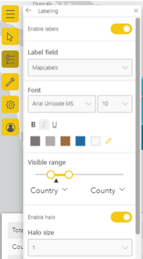
I insterted the [MapLabels] in the tooltip and used the tooltip as a label in the map settings:
This seemed to work when I filter the map by certain Agencies, but not by every Agency.
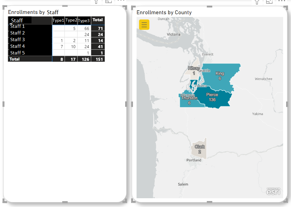
Example 1: The numbers on the table on the left add up to the numbers on the Map
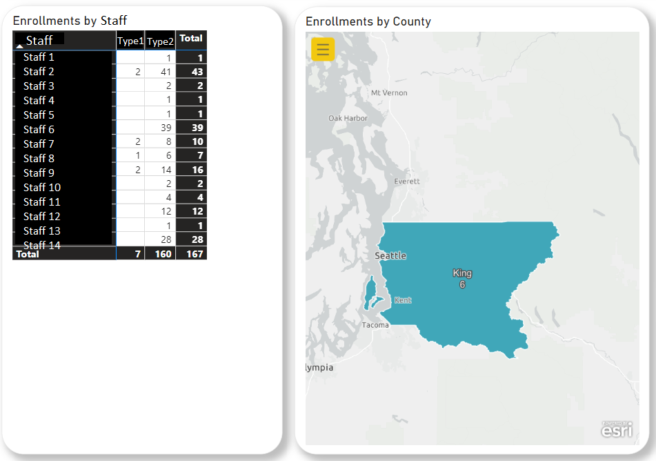
Example 2: I selected a different Agency in the filter and the numbers on the table don't add up to what is shown in the Map
Can someone help me understand what can be fixed on my [MapLabels] calculation?
- Mark as New
- Bookmark
- Subscribe
- Mute
- Subscribe to RSS Feed
- Permalink
- Report Inappropriate Content
Hi @escarzl1
The calculated column is a static value and cannot be dynamiclly changed by the filter, so you can transfer the calculated column to a measure.
MapLabels =
'Table'[County]&"
"&CALCULATE(SUM('Table'[Count of Applications]), FILTER(ALL('Table'),[Agency Name]in VALUES('Table'[Agency Name])&&[Country]=SELECTEDVALUE('Table'[County])))
Then set the measure to as a label in the map settings
Best Regards!
Yolo Zhu
If this post helps, then please consider Accept it as the solution to help the other members find it more quickly.
- Mark as New
- Bookmark
- Subscribe
- Mute
- Subscribe to RSS Feed
- Permalink
- Report Inappropriate Content
Thank you for looking into this! I tried it out but I am getting this error message:
A single value for column 'County' in table 'Table' cannot be determined. This can happen when a measure formula refers to a column that contains many values without specifying an aggregation such as min, max, count, or sum to get a single result.
It is highlighting the very first reference as the error:
MapLabels =
'Table'[County]&"
"&CALCULATE(SUM('Table'[Count of Applications]), FILTER(ALL('Table'),[Agency Name]in VALUES('Table'[Agency Name])&&[Country]=SELECTEDVALUE('Table'[County])))
I modified it by adding MAX to the 1st column reference and it fixed the Map labels themselves:
MapLabels =
MAX('Table'[County])&"
"&CALCULATE(SUM('Table'[Count of Applications]), FILTER(ALL('Table'),[Agency Name]in VALUES('Table'[Agency Name])&&[Country]=SELECTEDVALUE('Table'[County])))
Now the part that doesn't work is the color coding! Seems like no matter what, each county is now colored the same color. Not sure why the Map Labels would affect the color-coding on the map when the color coding is based on the [Count of Applications] values all by themselves. Any ideas?
- Mark as New
- Bookmark
- Subscribe
- Mute
- Subscribe to RSS Feed
- Permalink
- Report Inappropriate Content
Hi @escarzl1
You can also create a color measure, then put the measure to the color field
e.g
Measure = SWITCH(TRUE(),SELECTEDVALUE('Table'[Country])="Pierce","Green",SELECTEDVALUE('Table'[Country])="King","Red")
Best Regards!
Yolo Zhu
If this post helps, then please consider Accept it as the solution to help the other members find it more quickly.
Helpful resources

Microsoft Fabric Learn Together
Covering the world! 9:00-10:30 AM Sydney, 4:00-5:30 PM CET (Paris/Berlin), 7:00-8:30 PM Mexico City

Power BI Monthly Update - April 2024
Check out the April 2024 Power BI update to learn about new features.

| User | Count |
|---|---|
| 111 | |
| 95 | |
| 80 | |
| 68 | |
| 59 |
| User | Count |
|---|---|
| 150 | |
| 119 | |
| 104 | |
| 87 | |
| 67 |


