- Power BI forums
- Updates
- News & Announcements
- Get Help with Power BI
- Desktop
- Service
- Report Server
- Power Query
- Mobile Apps
- Developer
- DAX Commands and Tips
- Custom Visuals Development Discussion
- Health and Life Sciences
- Power BI Spanish forums
- Translated Spanish Desktop
- Power Platform Integration - Better Together!
- Power Platform Integrations (Read-only)
- Power Platform and Dynamics 365 Integrations (Read-only)
- Training and Consulting
- Instructor Led Training
- Dashboard in a Day for Women, by Women
- Galleries
- Community Connections & How-To Videos
- COVID-19 Data Stories Gallery
- Themes Gallery
- Data Stories Gallery
- R Script Showcase
- Webinars and Video Gallery
- Quick Measures Gallery
- 2021 MSBizAppsSummit Gallery
- 2020 MSBizAppsSummit Gallery
- 2019 MSBizAppsSummit Gallery
- Events
- Ideas
- Custom Visuals Ideas
- Issues
- Issues
- Events
- Upcoming Events
- Community Blog
- Power BI Community Blog
- Custom Visuals Community Blog
- Community Support
- Community Accounts & Registration
- Using the Community
- Community Feedback
Register now to learn Fabric in free live sessions led by the best Microsoft experts. From Apr 16 to May 9, in English and Spanish.
- Power BI forums
- Forums
- Get Help with Power BI
- Desktop
- Count / percentage
- Subscribe to RSS Feed
- Mark Topic as New
- Mark Topic as Read
- Float this Topic for Current User
- Bookmark
- Subscribe
- Printer Friendly Page
- Mark as New
- Bookmark
- Subscribe
- Mute
- Subscribe to RSS Feed
- Permalink
- Report Inappropriate Content
Count / percentage
Hi,
I have a column with 3 different entries in it (Early, Late & On-Time). I'm looking to count the number of entries for each(Early, Late & On-time) and then have that as a percentage of the total amount of entries (i.e. 100 entries, 10 are on time, therefore return 10%) on a monthly basis graph.
Is this possible..?
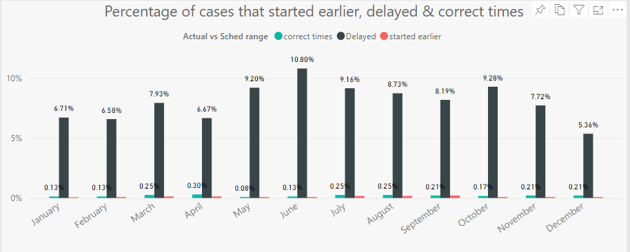
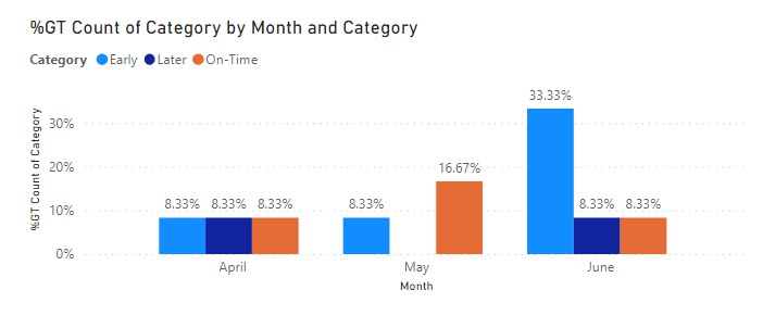
In the first graph, the percentage of cases is divided on the whole.
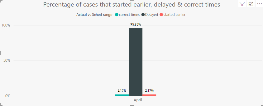
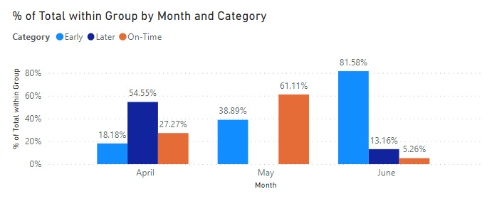
But I am looking for something like the second image for evry month.
Solved! Go to Solution.
- Mark as New
- Bookmark
- Subscribe
- Mute
- Subscribe to RSS Feed
- Permalink
- Report Inappropriate Content
Hi,
You may download my PBI file from here.
Hope this helps.
Regards,
Ashish Mathur
http://www.ashishmathur.com
https://www.linkedin.com/in/excelenthusiasts/
- Mark as New
- Bookmark
- Subscribe
- Mute
- Subscribe to RSS Feed
- Permalink
- Report Inappropriate Content
Sorry it didn't worked for me. Could you please explain the dax formula.
Heer is the sample Data. Due to the security reasons, I cannot share the origincal data but I have made some dummy data which looks similar to the orginical
| Unique ID | ID number | Date of surgical Start | Actual vs Scheduled Range |
| 23159 | 1 | 2/12/2021 | On-time |
| 12359 | 2 | 2/12/2021 | Delayed |
| 56953 | 2 | 12/12/2021 | Delayed |
| 85412 | 3 | 4/11/2021 | Delayed |
| 74569 | 4 | 2/11/2021 | On-time |
| 74523 | 5 | 2/10/2021 | Delayed |
| 74521 | 5 | 2/10/2021 | early |
| 95632 | 6 | 2/10/2021 | early |
| 45231 | 7 | 9/10/2021 | On-time |
| 45284 | 8 | 10/10/2021 | Delayed |
| 54165 | 9 | 12/10/2021 | early |
| 45213 | 9 | 4/16/2021 | Delayed |
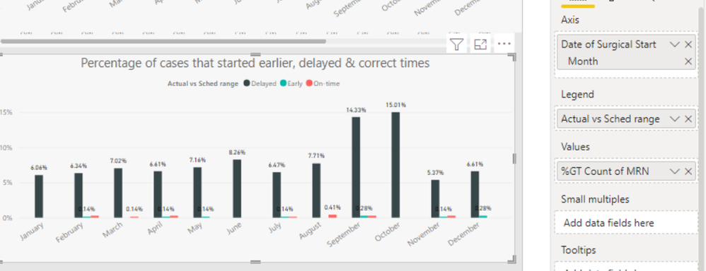
Here is the graph which i am able to get.
In the image, if you see september, 14.33% of delayed, 0.28% of Early & on-time. I want it to be 96.29% of delayed & 1.85% of Early& on-time.
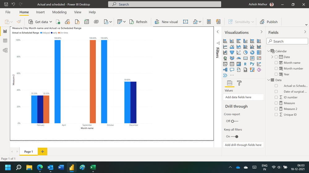
Th output image you have provided is exactly what i am looking for my graph. However, I didn't understand what fields you are using.
Appreciate your help.
- Mark as New
- Bookmark
- Subscribe
- Mute
- Subscribe to RSS Feed
- Permalink
- Report Inappropriate Content
Hi,
You may download my PBI file from here.
Hope this helps.
Regards,
Ashish Mathur
http://www.ashishmathur.com
https://www.linkedin.com/in/excelenthusiasts/
- Mark as New
- Bookmark
- Subscribe
- Mute
- Subscribe to RSS Feed
- Permalink
- Report Inappropriate Content
Without data it is tough to do the measure ... This is what I assume you need and providing the measure details and steps.
Sample data
what you have already is simple clustered column chart, with % of Grand Total chart
What you want is % of Total within Group ... by month and category
a) Measure
% of Total within Group =
VAR _Grp = values(Table3[Date].[MonthNo])
VAR _val = CALCULATE( sum(Table3[Total Entries]), ALLEXCEPT(Table3, Table3[Name]), _Grp)
RETURN divide (sum(Table3[Total Entries]), _val)
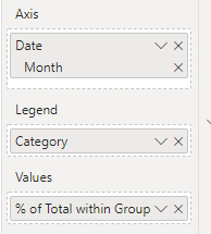
b) clustered column chart
c) output
Hope this helps!
Helpful resources

Microsoft Fabric Learn Together
Covering the world! 9:00-10:30 AM Sydney, 4:00-5:30 PM CET (Paris/Berlin), 7:00-8:30 PM Mexico City

Power BI Monthly Update - April 2024
Check out the April 2024 Power BI update to learn about new features.

| User | Count |
|---|---|
| 114 | |
| 100 | |
| 78 | |
| 75 | |
| 52 |
| User | Count |
|---|---|
| 144 | |
| 109 | |
| 108 | |
| 88 | |
| 61 |
