- Power BI forums
- Updates
- News & Announcements
- Get Help with Power BI
- Desktop
- Service
- Report Server
- Power Query
- Mobile Apps
- Developer
- DAX Commands and Tips
- Custom Visuals Development Discussion
- Health and Life Sciences
- Power BI Spanish forums
- Translated Spanish Desktop
- Power Platform Integration - Better Together!
- Power Platform Integrations (Read-only)
- Power Platform and Dynamics 365 Integrations (Read-only)
- Training and Consulting
- Instructor Led Training
- Dashboard in a Day for Women, by Women
- Galleries
- Community Connections & How-To Videos
- COVID-19 Data Stories Gallery
- Themes Gallery
- Data Stories Gallery
- R Script Showcase
- Webinars and Video Gallery
- Quick Measures Gallery
- 2021 MSBizAppsSummit Gallery
- 2020 MSBizAppsSummit Gallery
- 2019 MSBizAppsSummit Gallery
- Events
- Ideas
- Custom Visuals Ideas
- Issues
- Issues
- Events
- Upcoming Events
- Community Blog
- Power BI Community Blog
- Custom Visuals Community Blog
- Community Support
- Community Accounts & Registration
- Using the Community
- Community Feedback
Register now to learn Fabric in free live sessions led by the best Microsoft experts. From Apr 16 to May 9, in English and Spanish.
- Power BI forums
- Forums
- Get Help with Power BI
- Desktop
- Re: Count of average score - shown as a bar chart
- Subscribe to RSS Feed
- Mark Topic as New
- Mark Topic as Read
- Float this Topic for Current User
- Bookmark
- Subscribe
- Printer Friendly Page
- Mark as New
- Bookmark
- Subscribe
- Mute
- Subscribe to RSS Feed
- Permalink
- Report Inappropriate Content
Count of average score - shown as a bar chart
Hi,
I have a set of data which contians customer satisfaction scores for a range of different locations and I need to create a bar chart which gives a count of locations for each average satisfaction score e.g. 3 locations may have an average score of 80 and 8 locations may have an average score of 95. I would expect to see this as 2 blocks on the graph, one with a height of 8 at the 95 mark and one with a height of 3 at 80.
I would like the x-axis to show average satisfaction scores (as whole numbers between 1-100) and the y-axis to be a count of the number of properties.
Any help would be much appreciated.
Cheers
Paul
Solved! Go to Solution.
- Mark as New
- Bookmark
- Subscribe
- Mute
- Subscribe to RSS Feed
- Permalink
- Report Inappropriate Content
Firstly create a calculate column average to achieve the average value every location:
Average = CALCULATE(AVERAGE(Table1[Satisfaction]), ALLEXCEPT(Table1, Table1[Location]))Then create a measure to achieve the distinct count every average value:
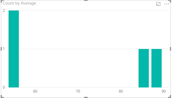
Count = CALCULATE(DISTINCTCOUNT(Table1[Location]), ALLEXCEPT(Table1, Table1[Average]))Finally drag Average to X-axis, Count to Value field, the result is like below:

- Mark as New
- Bookmark
- Subscribe
- Mute
- Subscribe to RSS Feed
- Permalink
- Report Inappropriate Content
Did I answer your question correctly? Mark my answer as a solution!
Proud to be a Datanaut!
- Mark as New
- Bookmark
- Subscribe
- Mute
- Subscribe to RSS Feed
- Permalink
- Report Inappropriate Content
- Mark as New
- Bookmark
- Subscribe
- Mute
- Subscribe to RSS Feed
- Permalink
- Report Inappropriate Content
- Mark as New
- Bookmark
- Subscribe
- Mute
- Subscribe to RSS Feed
- Permalink
- Report Inappropriate Content
Firstly create a calculate column average to achieve the average value every location:
Average = CALCULATE(AVERAGE(Table1[Satisfaction]), ALLEXCEPT(Table1, Table1[Location]))Then create a measure to achieve the distinct count every average value:
Count = CALCULATE(DISTINCTCOUNT(Table1[Location]), ALLEXCEPT(Table1, Table1[Average]))Finally drag Average to X-axis, Count to Value field, the result is like below:

- Mark as New
- Bookmark
- Subscribe
- Mute
- Subscribe to RSS Feed
- Permalink
- Report Inappropriate Content
Helpful resources

Microsoft Fabric Learn Together
Covering the world! 9:00-10:30 AM Sydney, 4:00-5:30 PM CET (Paris/Berlin), 7:00-8:30 PM Mexico City

Power BI Monthly Update - April 2024
Check out the April 2024 Power BI update to learn about new features.

| User | Count |
|---|---|
| 116 | |
| 102 | |
| 78 | |
| 77 | |
| 49 |
| User | Count |
|---|---|
| 145 | |
| 108 | |
| 107 | |
| 89 | |
| 61 |
