- Power BI forums
- Updates
- News & Announcements
- Get Help with Power BI
- Desktop
- Service
- Report Server
- Power Query
- Mobile Apps
- Developer
- DAX Commands and Tips
- Custom Visuals Development Discussion
- Health and Life Sciences
- Power BI Spanish forums
- Translated Spanish Desktop
- Power Platform Integration - Better Together!
- Power Platform Integrations (Read-only)
- Power Platform and Dynamics 365 Integrations (Read-only)
- Training and Consulting
- Instructor Led Training
- Dashboard in a Day for Women, by Women
- Galleries
- Community Connections & How-To Videos
- COVID-19 Data Stories Gallery
- Themes Gallery
- Data Stories Gallery
- R Script Showcase
- Webinars and Video Gallery
- Quick Measures Gallery
- 2021 MSBizAppsSummit Gallery
- 2020 MSBizAppsSummit Gallery
- 2019 MSBizAppsSummit Gallery
- Events
- Ideas
- Custom Visuals Ideas
- Issues
- Issues
- Events
- Upcoming Events
- Community Blog
- Power BI Community Blog
- Custom Visuals Community Blog
- Community Support
- Community Accounts & Registration
- Using the Community
- Community Feedback
Register now to learn Fabric in free live sessions led by the best Microsoft experts. From Apr 16 to May 9, in English and Spanish.
- Power BI forums
- Forums
- Get Help with Power BI
- Desktop
- Re: Count of Type across multiple columns
- Subscribe to RSS Feed
- Mark Topic as New
- Mark Topic as Read
- Float this Topic for Current User
- Bookmark
- Subscribe
- Printer Friendly Page
- Mark as New
- Bookmark
- Subscribe
- Mute
- Subscribe to RSS Feed
- Permalink
- Report Inappropriate Content
Count of Type across multiple columns
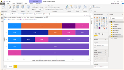
I have 5 columns that I split. The question is "Who explained your roles and responsibilities" I need to be able to show on visual how many of each one is all 5 columns. I was thinking a 100% stacked chart to show ex. 25% human resource, 20% trainer, etc. See screen shot below.
Solved! Go to Solution.
- Mark as New
- Bookmark
- Subscribe
- Mute
- Subscribe to RSS Feed
- Permalink
- Report Inappropriate Content
Hi there
I managed to get something like this using the first few rows of your data.
To get this I had to unpivot the table first so I ended up with a table with just two columns; Attribute (col1, col2 col3 etc.) and Value (trainer, my mom, recruiter etc.)
Next I had to create a measure for each possible value, including blank so you'd need to know every possible answer that people could give. Depending on how the data is collected this may not be possible.
I've added the measures to the value section of the 100% stacked bar visualsation while using the Attribute column for the Axis
- Mark as New
- Bookmark
- Subscribe
- Mute
- Subscribe to RSS Feed
- Permalink
- Report Inappropriate Content
Hi @jcastr02 ,
First you need to go to query editor, choose “unpivot columns”:
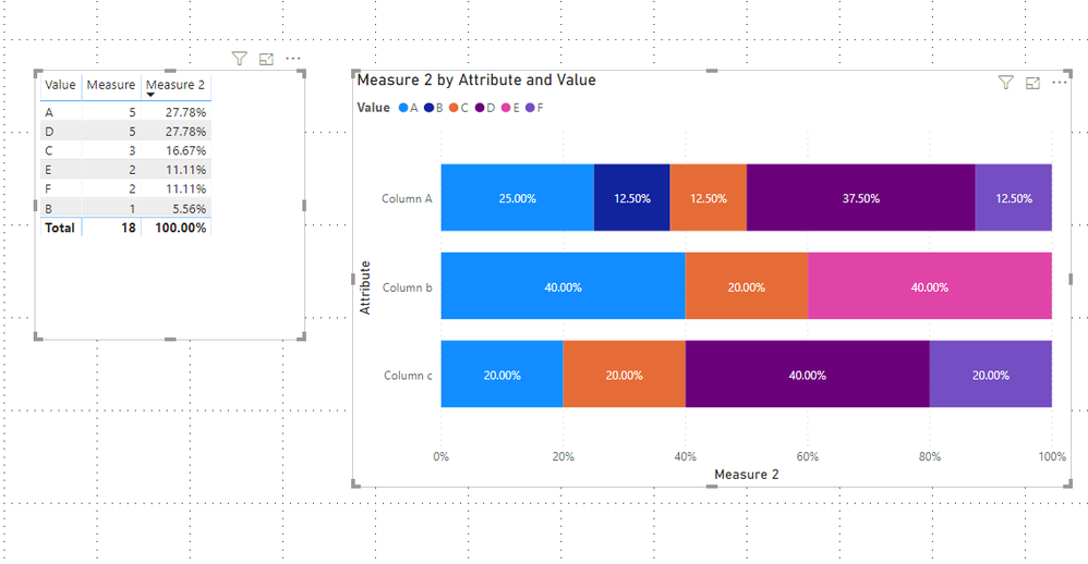
Then, you need to create 2 measures as below :
Measure = COUNT('Table'[Value])Measure 2 = 'Table'[Measure]/CALCULATE(COUNTA('Table'[Value]),ALL('Table'))
Then you will see :
For the related .pbix file,pls click here.
Best Regards,
Kelly
- Mark as New
- Bookmark
- Subscribe
- Mute
- Subscribe to RSS Feed
- Permalink
- Report Inappropriate Content
Hi there
I managed to get something like this using the first few rows of your data.
To get this I had to unpivot the table first so I ended up with a table with just two columns; Attribute (col1, col2 col3 etc.) and Value (trainer, my mom, recruiter etc.)
Next I had to create a measure for each possible value, including blank so you'd need to know every possible answer that people could give. Depending on how the data is collected this may not be possible.
I've added the measures to the value section of the 100% stacked bar visualsation while using the Attribute column for the Axis
Helpful resources

Microsoft Fabric Learn Together
Covering the world! 9:00-10:30 AM Sydney, 4:00-5:30 PM CET (Paris/Berlin), 7:00-8:30 PM Mexico City

Power BI Monthly Update - April 2024
Check out the April 2024 Power BI update to learn about new features.

| User | Count |
|---|---|
| 111 | |
| 95 | |
| 80 | |
| 68 | |
| 59 |
| User | Count |
|---|---|
| 150 | |
| 119 | |
| 104 | |
| 87 | |
| 67 |


