- Power BI forums
- Updates
- News & Announcements
- Get Help with Power BI
- Desktop
- Service
- Report Server
- Power Query
- Mobile Apps
- Developer
- DAX Commands and Tips
- Custom Visuals Development Discussion
- Health and Life Sciences
- Power BI Spanish forums
- Translated Spanish Desktop
- Power Platform Integration - Better Together!
- Power Platform Integrations (Read-only)
- Power Platform and Dynamics 365 Integrations (Read-only)
- Training and Consulting
- Instructor Led Training
- Dashboard in a Day for Women, by Women
- Galleries
- Community Connections & How-To Videos
- COVID-19 Data Stories Gallery
- Themes Gallery
- Data Stories Gallery
- R Script Showcase
- Webinars and Video Gallery
- Quick Measures Gallery
- 2021 MSBizAppsSummit Gallery
- 2020 MSBizAppsSummit Gallery
- 2019 MSBizAppsSummit Gallery
- Events
- Ideas
- Custom Visuals Ideas
- Issues
- Issues
- Events
- Upcoming Events
- Community Blog
- Power BI Community Blog
- Custom Visuals Community Blog
- Community Support
- Community Accounts & Registration
- Using the Community
- Community Feedback
Register now to learn Fabric in free live sessions led by the best Microsoft experts. From Apr 16 to May 9, in English and Spanish.
- Power BI forums
- Forums
- Get Help with Power BI
- Desktop
- Count of New Customers and Count of "13 months" fo...
- Subscribe to RSS Feed
- Mark Topic as New
- Mark Topic as Read
- Float this Topic for Current User
- Bookmark
- Subscribe
- Printer Friendly Page
- Mark as New
- Bookmark
- Subscribe
- Mute
- Subscribe to RSS Feed
- Permalink
- Report Inappropriate Content
Count of New Customers and Count of "13 months" for "Current Year - Quickbooks data
I am beginning to view these as challenges rather than "problems" with reporting. 🙂
So here's a challenge for today:
I have a list of
- New Customers (All customers who are a year or less old)
- Customers 13+ Months Old
Goal of the report - to determine the count of new customers for CURRENT Year AND count of customers who reach the 13+ Status for the CURRENT year. In essence it's a ratio of New to 13+. But I havent quite figured out how to do ratios in Power BI.
Challenge Area- because both of these categories are date based - when I try to add date filters (year, month, week) - it throws the count off.
Here are some screen shots:

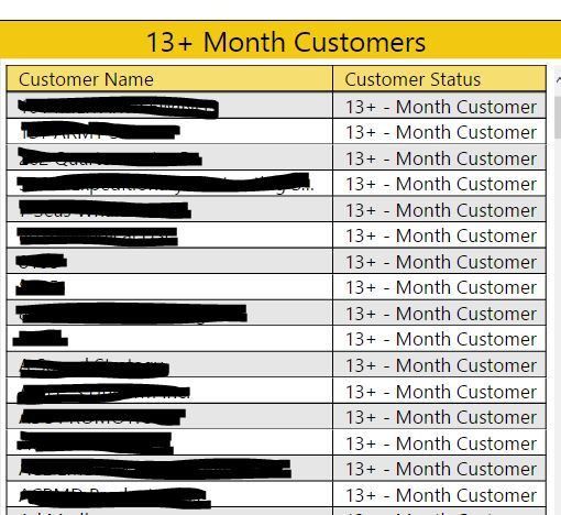
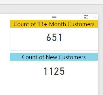
Here are the formulas used to create the Age of the customer and determine their status / type
New Customers (based of Account Time created)
Age of Customer (in Months) = DATEDIFF(Customer[CustomerTimeCreated], TODAY(), MONTH)

#determines age of customer based on CustomerTimeCreated field
New / Old = IF([Age of Customer (in Months)] <= 12, "NEW", "OLD")

#Determined by customer age (in months in this case)
13+ Month Customers (time is based off of LAST Transaction Activity from Customer)
Summary Table = SUMMARIZE('SALES DETAILS', 'SALES DETAILS'[LinkToCustomerID], "Last Transaction", MAX('SALES DETAILS'[SalesTxnTimeCreated]))

#Determines last transaction for each customer
Transaction Age = DATEDIFF('Summary Table'[Last Transaction], TODAY(), DAY)
#Determines age of Last Transaction (in days)Customer Status =
IF('Summary Table'[Transaction Age] <= 329, "Active",
IF('Summary Table'[Transaction Age] = 330, "11-Month Customer",
IF('Summary Table'[Transaction Age] >= 331 && 'Summary Table'[Transaction Age] <= 389, "Inactive",
IF('Summary Table'[Transaction Age] = 390, "13-Month Customer",
IF('Summary Table'[Transaction Age] >= 391 && 'Summary Table'[Transaction Age] <= 720, "13+ - Month Customer")))))
#Creates category for each age "bucket" for transaction age - ultimately determining customer status (i.e. active, inactive, etc...)
EDIT: To make sure I've explained this correctly
I HAVE determined a way to select ONLY the NEW customers created within the CURRENT year -
 Current Year Customers (Age in days) = IF(Year(Customer[CustomerTimeCreated])=YEAR(TODAY()), (DATEDIFF(Customer[CustomerTimeCreated],TODAY(), DAY)), 0)

#Determines new customers for Current YEAR
But I have NOT figured out how to determine the customers that have hit the 13+ month mark WITHIN the CURRENT year yet. And then be able to filter by week, month and current year total.
Solved! Go to Solution.
- Mark as New
- Bookmark
- Subscribe
- Mute
- Subscribe to RSS Feed
- Permalink
- Report Inappropriate Content
I don't know the exact syntax on this, but I think I may be able to help you. I was thinking that if you have the Account Created date, you can figure out the Date of the Account entering the 13+ Month group. For example, you could take the Account Created date and add 365 days. So for an account created on 1/1/2015, they would enter the 13+Month group on 1/2/2016. Now, you can take that date, and check to see if it is in the Current Year. To possibly simplify things, you could probably compare the Year of 13+Month group entry against the Year of Today(), or something similar.
That will givbe you a value to filter on, at the least.
Hope this helps,
Nate
- Mark as New
- Bookmark
- Subscribe
- Mute
- Subscribe to RSS Feed
- Permalink
- Report Inappropriate Content
@heathernicole Very long explanation - hopefully I understood what you are trying to do... ![]()
Create this column in the Summary table - then you'll just need a count of this column
13 Mo Customer in CY Column =
IF (
    'Summary Table'[Last Transaction]
        >= ( DATE ( YEAR ( NOW () ), 1, 1 ) - 391 )
        && 'Summary Table'[Last Transaction]
            <= ( TODAY () - 391 ),
    "13 Mo Customer in CY",
    "Nope"
)
I'm obviously using 391 because this is what you are using as well!
Let me know... fingers crossed ![]()
- Mark as New
- Bookmark
- Subscribe
- Mute
- Subscribe to RSS Feed
- Permalink
- Report Inappropriate Content
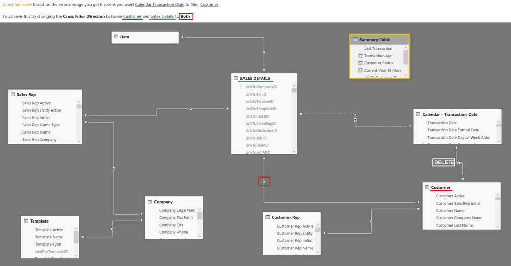
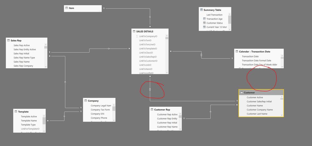
You have a loop, and it is from Sales Details, to Trans Calendar, to Customer and then back to Sales dtails. You have to eliminate that. I really think you can eliminate the link between Customer and the Calendar.
- Mark as New
- Bookmark
- Subscribe
- Mute
- Subscribe to RSS Feed
- Permalink
- Report Inappropriate Content
@heathernicole check this out... this should help you fix it maybe ![]()
http://exceleratorbi.com.au/multiple-relationships-between-tables-in-dax/
So you can use the USERELATIONSHIP function for one of the calculations
No need to start all over ![]()
- Mark as New
- Bookmark
- Subscribe
- Mute
- Subscribe to RSS Feed
- Permalink
- Report Inappropriate Content
@Sean @Nhallquist - Well...
I got it to work somehow... it's amazing what shutting down and getting back on will do. 🙂 Even if it's for a short period...
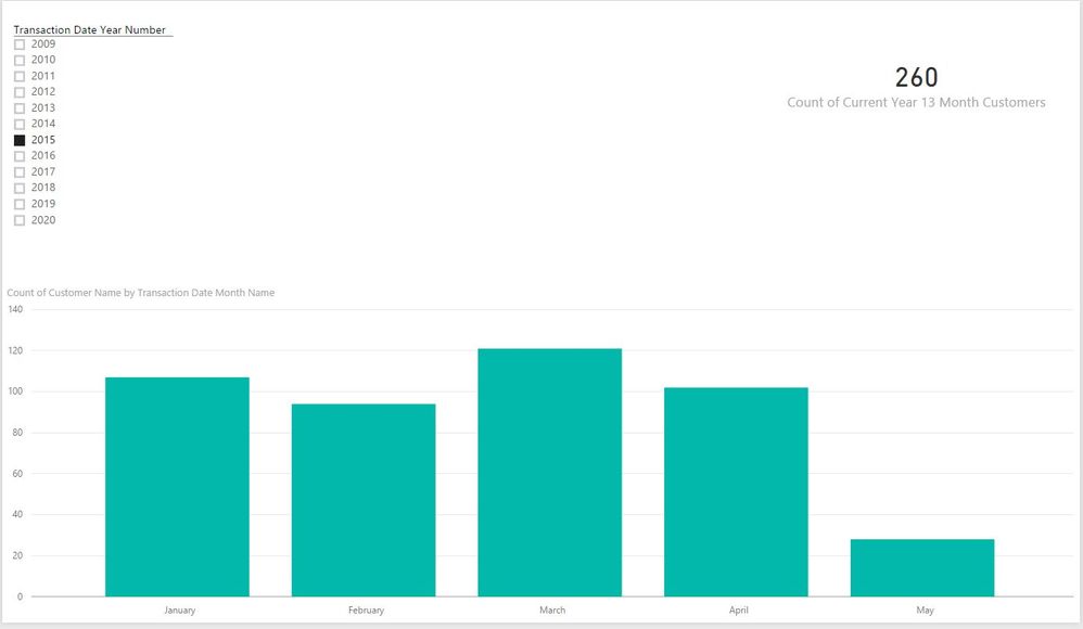
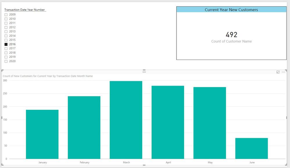
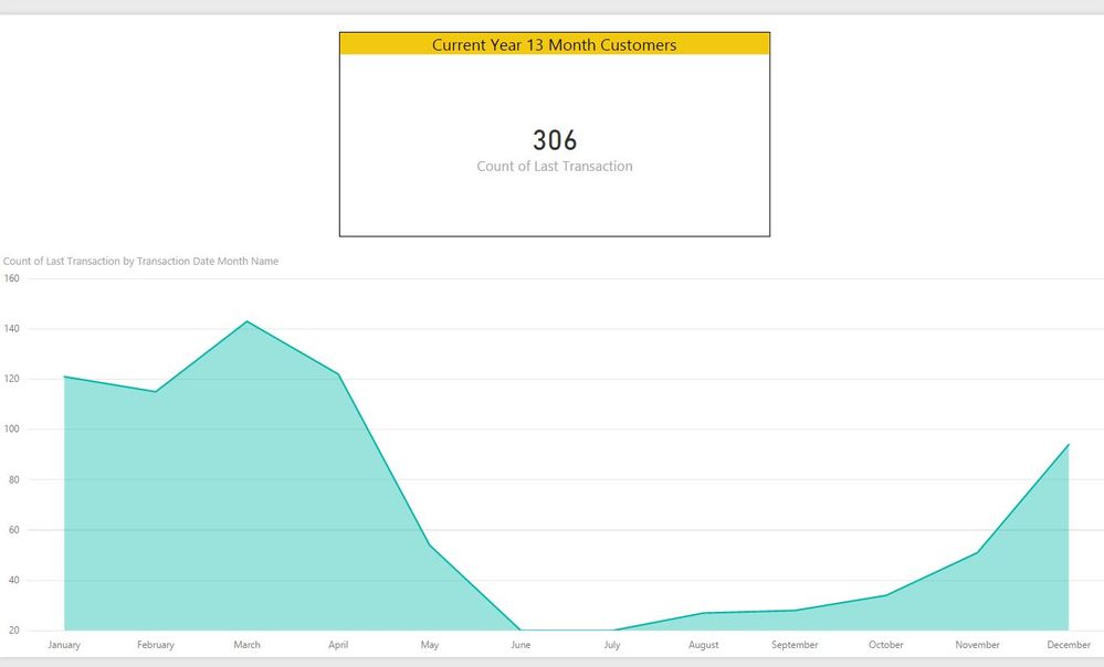
So here's what I've ended up with:
13 Month -
New Customers -
The only thing that may be a little confusing to the end - user is in order to filter correctly - New Customers is filtered by Current Year and 13 month Customers are filtered by Previous Year.
Any thoughts / advice on how to make this report a little more user-friendly. Ideally I could have both sets of information on the same for comparison purposes. But with that funky filter - that will be a little difficult.
THANKS SO MUCH for sticking through this with me! 🙂
- Mark as New
- Bookmark
- Subscribe
- Mute
- Subscribe to RSS Feed
- Permalink
- Report Inappropriate Content
@Nhallquist - was headed in the same direction as you - although more by accident than anything else.
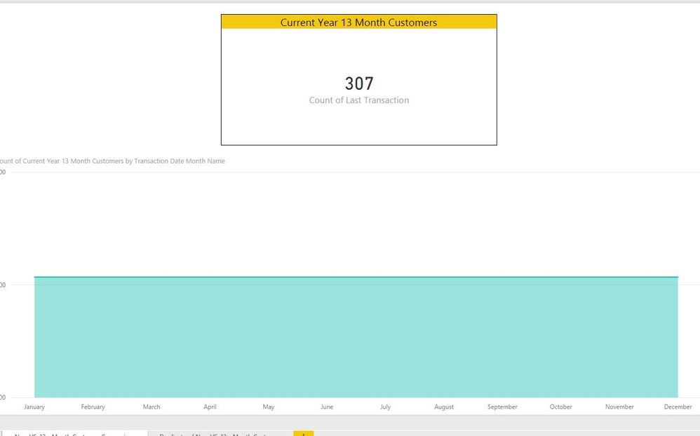
So the 13 month customer chart works well:
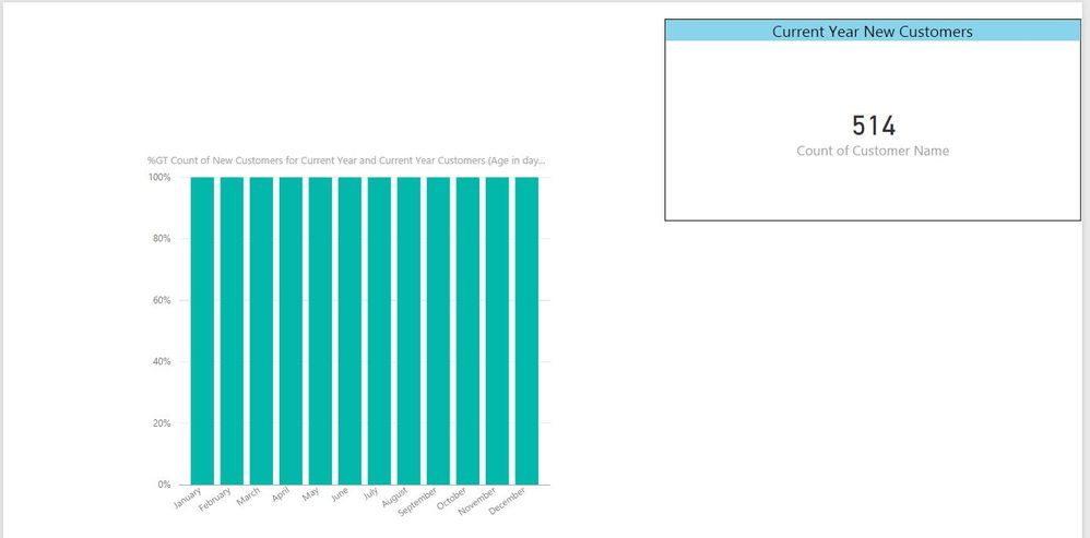
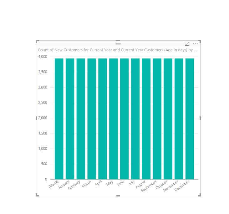
However this is what the New Customer chart is doing - it's not filtering appropriately
- Mark as New
- Bookmark
- Subscribe
- Mute
- Subscribe to RSS Feed
- Permalink
- Report Inappropriate Content
You are looking to chart the % of the Grand Total? Can you post a pic of the chart fields that are being used? I think the % of GT is not set correctly.
- Mark as New
- Bookmark
- Subscribe
- Mute
- Subscribe to RSS Feed
- Permalink
- Report Inappropriate Content
@Nhallquist - no 🙂 - I was playing around with the new feature for a moment. I just want to display New Customers and 13 month customers for the year in a chart for comparison. That's ultimately the only goal at this point for this report - and allow them to see the breakdown per month; per week.
See they have the same result - I just for got to undo the GT
- Mark as New
- Bookmark
- Subscribe
- Mute
- Subscribe to RSS Feed
- Permalink
- Report Inappropriate Content
You'll have to forgive me, I'm a little slow today....
So you are looking to graph the number of new accounts by the accoutn created date. In this case, you can just use the date created, and let PBI create the heirchy for you.
You can have a single calendar manage this for you, but then you'll need to unlink Customers from Sales Details, otherwise you'll have a loop again. I assume that you really need that link though.
- Mark as New
- Bookmark
- Subscribe
- Mute
- Subscribe to RSS Feed
- Permalink
- Report Inappropriate Content
- Mark as New
- Bookmark
- Subscribe
- Mute
- Subscribe to RSS Feed
- Permalink
- Report Inappropriate Content
- Mark as New
- Bookmark
- Subscribe
- Mute
- Subscribe to RSS Feed
- Permalink
- Report Inappropriate Content
Yes, you're right.
The orginial Data Model didn't have this problem. I've decided to start over for this one. So I'm starting with a "fresh" data model. See if I can pinpoint what messes up that relationship; because it's there originally.
- Mark as New
- Bookmark
- Subscribe
- Mute
- Subscribe to RSS Feed
- Permalink
- Report Inappropriate Content
- Mark as New
- Bookmark
- Subscribe
- Mute
- Subscribe to RSS Feed
- Permalink
- Report Inappropriate Content
No - first the 13 month chart was working properly - and the New Customer wasn't - when I made that last change - the 13 month became incorrect and then the New Customer was correct.
I'm not sure what it's issue is. 🙂
- Mark as New
- Bookmark
- Subscribe
- Mute
- Subscribe to RSS Feed
- Permalink
- Report Inappropriate Content
@heathernicole check this out... this should help you fix it maybe ![]()
http://exceleratorbi.com.au/multiple-relationships-between-tables-in-dax/
So you can use the USERELATIONSHIP function for one of the calculations
No need to start all over ![]()
- Mark as New
- Bookmark
- Subscribe
- Mute
- Subscribe to RSS Feed
- Permalink
- Report Inappropriate Content
@Sean @Nhallquist - Well...
I got it to work somehow... it's amazing what shutting down and getting back on will do. 🙂 Even if it's for a short period...
So here's what I've ended up with:
13 Month -
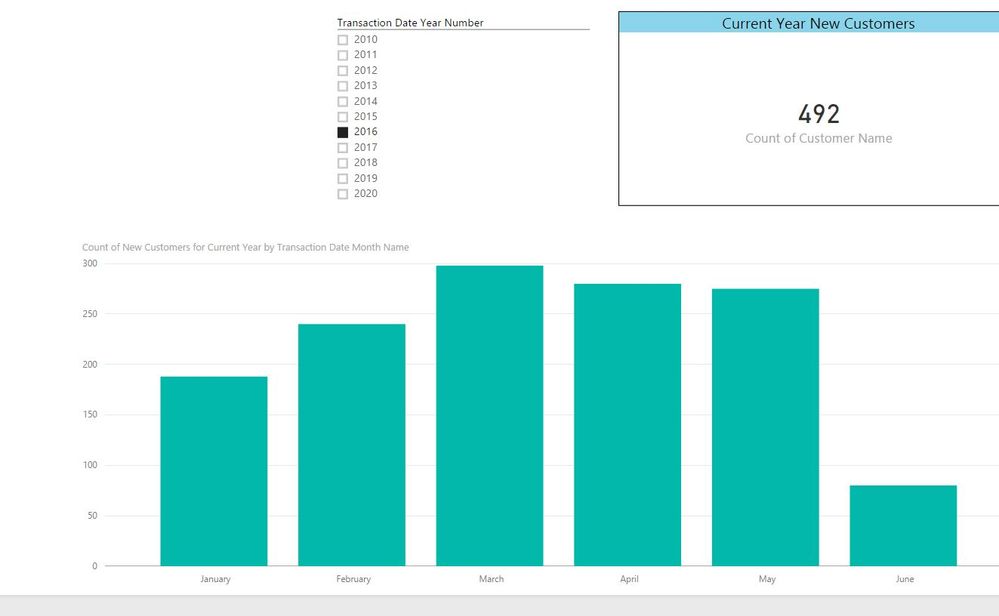
New Customers -
The only thing that may be a little confusing to the end - user is in order to filter correctly - New Customers is filtered by Current Year and 13 month Customers are filtered by Previous Year.
Any thoughts / advice on how to make this report a little more user-friendly. Ideally I could have both sets of information on the same for comparison purposes. But with that funky filter - that will be a little difficult.
THANKS SO MUCH for sticking through this with me! 🙂
- Mark as New
- Bookmark
- Subscribe
- Mute
- Subscribe to RSS Feed
- Permalink
- Report Inappropriate Content
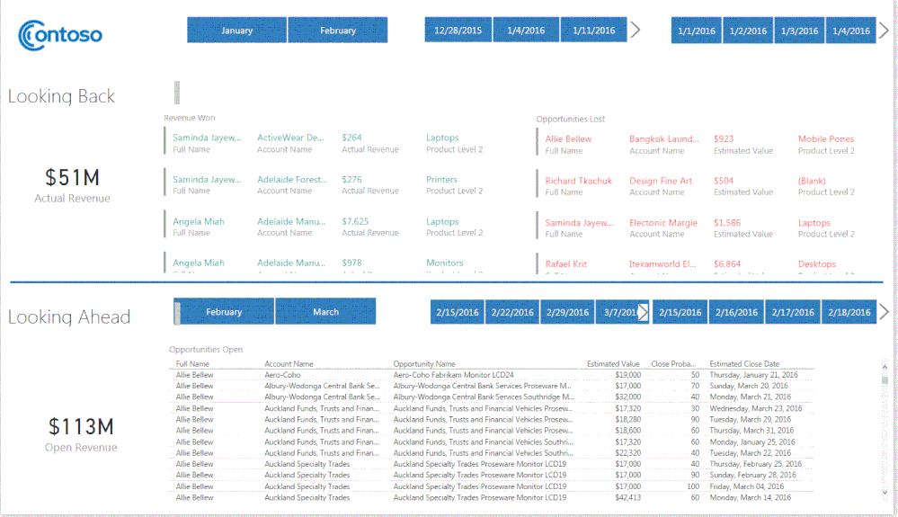
When going through a design iteration, I think about how an enduser might see this. I try to group things that belong together, as closeley as I can. I also try and split the page with New Customers on half, Current on the other half and tuck the slicers in as close to the charts, on the the left side, as tight as you can.
with that said, it would be ideal to post a copy of the app for us to design, or at least a screen shot. in this screen pic I have, see how the creater segmented the two "categories" of info for the users? Think of something like this.
- Mark as New
- Bookmark
- Subscribe
- Mute
- Subscribe to RSS Feed
- Permalink
- Report Inappropriate Content
Here is the final - at least for now - as I get these date filters figured out a little better - I'll update it. 🙂
THANKS SO MUCH! @Nhallquist @Sean
- Mark as New
- Bookmark
- Subscribe
- Mute
- Subscribe to RSS Feed
- Permalink
- Report Inappropriate Content
As you work through your design, be sure to seek inspiration from outside sources. Check out this link to download some templates that you can use for inspiration or to scavenge objects and ideas from.
Looking good so far.....
Nate
- Mark as New
- Bookmark
- Subscribe
- Mute
- Subscribe to RSS Feed
- Permalink
- Report Inappropriate Content
@Nhallquist - Hello! 🙂 I know this is a little late - but you can specify left joins, right joins, inner, etc ... you do that when you do Merge Queries in the Query Mode in the back. 🙂
Was doing a merge and saw the selection. I had forgotten about it. Thanks!
- Mark as New
- Bookmark
- Subscribe
- Mute
- Subscribe to RSS Feed
- Permalink
- Report Inappropriate Content
This is a link to a website that does a good job of walking you through the joins and what each join does. I like to use different join options becuase they not only can help you get data, but they can help cut down the overall size of your data model.
- Mark as New
- Bookmark
- Subscribe
- Mute
- Subscribe to RSS Feed
- Permalink
- Report Inappropriate Content
The challenge is trying to link the sales Detail, Customer, and Trans Calendar all together. You get a loop, and PBI doesn't like that. You could use 2 calendars. You could also use one calendar and just use the Customer Created Date out of the Customer table, without linking it to the Trans Calendar.
If you create your data model by linking the Sales Details to the customers, and the Sales Details to the Calendar, you'll get the one chart that works great already. Then you can create another chart on when the new Customers were created. Then, if you click on a month, you should get all the sales, from new customers that were created in that month, showing you how new Customers preform from that month.
Good luck, let me know if you need any further help.
- Mark as New
- Bookmark
- Subscribe
- Mute
- Subscribe to RSS Feed
- Permalink
- Report Inappropriate Content
- Mark as New
- Bookmark
- Subscribe
- Mute
- Subscribe to RSS Feed
- Permalink
- Report Inappropriate Content
Can you clean up your data model by removing the inactive joins and post another picture?
Helpful resources

Microsoft Fabric Learn Together
Covering the world! 9:00-10:30 AM Sydney, 4:00-5:30 PM CET (Paris/Berlin), 7:00-8:30 PM Mexico City

Power BI Monthly Update - April 2024
Check out the April 2024 Power BI update to learn about new features.

| User | Count |
|---|---|
| 110 | |
| 94 | |
| 80 | |
| 66 | |
| 58 |
| User | Count |
|---|---|
| 150 | |
| 119 | |
| 104 | |
| 87 | |
| 67 |
