- Power BI forums
- Updates
- News & Announcements
- Get Help with Power BI
- Desktop
- Service
- Report Server
- Power Query
- Mobile Apps
- Developer
- DAX Commands and Tips
- Custom Visuals Development Discussion
- Health and Life Sciences
- Power BI Spanish forums
- Translated Spanish Desktop
- Power Platform Integration - Better Together!
- Power Platform Integrations (Read-only)
- Power Platform and Dynamics 365 Integrations (Read-only)
- Training and Consulting
- Instructor Led Training
- Dashboard in a Day for Women, by Women
- Galleries
- Community Connections & How-To Videos
- COVID-19 Data Stories Gallery
- Themes Gallery
- Data Stories Gallery
- R Script Showcase
- Webinars and Video Gallery
- Quick Measures Gallery
- 2021 MSBizAppsSummit Gallery
- 2020 MSBizAppsSummit Gallery
- 2019 MSBizAppsSummit Gallery
- Events
- Ideas
- Custom Visuals Ideas
- Issues
- Issues
- Events
- Upcoming Events
- Community Blog
- Power BI Community Blog
- Custom Visuals Community Blog
- Community Support
- Community Accounts & Registration
- Using the Community
- Community Feedback
Register now to learn Fabric in free live sessions led by the best Microsoft experts. From Apr 16 to May 9, in English and Spanish.
- Power BI forums
- Forums
- Get Help with Power BI
- Desktop
- Count inconsistency in graphic - Clarified Questio...
- Subscribe to RSS Feed
- Mark Topic as New
- Mark Topic as Read
- Float this Topic for Current User
- Bookmark
- Subscribe
- Printer Friendly Page
- Mark as New
- Bookmark
- Subscribe
- Mute
- Subscribe to RSS Feed
- Permalink
- Report Inappropriate Content
Count inconsistency in graphic - Clarified Question
This is a reboot of the question at Re: Count inconsistency in graphic - Microsoft Power BI Community.
The dummy database I gave in my first post wasn’t constructed properly to replicate my problem. The new dummy database is still recording a collection of paintings and the colors found in each. Additionally, it catalogues elements found in the image. There are still 4 tables.
Table 1:
PaintingID | PaintingName |
1 | Painting 1 |
2 | Painting 2 |
3 | Painting 3 |
4 | Painting 4 |
5 | Painting 5 |
Table 2: (this table links together paintings and colors in the painting)
PaintingID | ComponentID |
1 | 1.1 |
1 | 1.1.1 |
1 | 1.2.1 |
1 | 1.2.2 |
1 | 2.1.1 |
2 | 1.1.1 |
2 | 1.1.2 |
2 | 1.2.1 |
2 | 2.2.2 |
2 | 2.2.1 |
3 | 1.1.2 |
3 | 1.1.3 |
3 | 2.1 |
3 | 2.1.1 |
4 | 1.2.1 |
4 | 1.2.2 |
4 | 2.1.1 |
4 | 1.1.3 |
5 | 1.1.1 |
5 | 1.2.2 |
5 | 2.2.1 |
Table 3: Note that SubelementID type 3 and 4 are not used in the example data – they are just there to describe the DB structure
SubelementID | ComponentID | ComponentName |
1 | 1.1 | CoolColors |
1 | 1.1.1 | Blue |
1 | 1.1.2 | Green |
1 | 1.1.3 | Purple |
2 | 1.2 | WarmColors |
2 | 1.2.1 | Red |
2 | 1.2.2 | Orange |
3 | 2.1 | Nature |
3 | 2.1.1 | Mountain |
3 | 2.1.2 | Tree |
4 | 2.2 | Manmade |
4 | 2.2.1 | House |
4 | 2.2.2 | Fence |
Table 4:
SubelementID | Element Type | CategoryName |
1 | 1 | Cool Colors |
2 | 1 | Warm Colors |
3 | 2 | Nature |
4 | 2 | Manmade |
Relationships:
Table1_Painting ID 1: *Table2_PaintingID
Table2_ComponentID *:1 Table3_ComponentID
Table3_SubelementID *:1 Table4_SubelementID
The problem:
I have two figures.
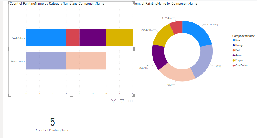
One is working as I would like. It is a doughnut chart with Legend: T3.ComponentName and Values: count of T1.PaintingName
With it I can see the most prevalent Component used in the painting collection.
The purpose of the second figure that I am having an issue with is to see which category is more prevalent. I created a bar chart with Axis: T4.CategoryName, Legend: T3.ComponentName, and Value Count of T1.PaintingName.
The charts I am trying to construct look like this:
The problem is that the program is counting T3.ComponentName and T4.CategoryName differently.
Taking the example of CategoryName = Cool Colors, the chart is trying to display this:
Count of Blue | Count of Green | Count of Purple | Count of Cool Colors (T3.ComponentName) | Count of Cool Colors (T4.CategoryName) |
3 | 2 | 2 | 1 | 5 |
I would like count of Cool Colors (category) to be 8.
How can I fix this? I do not see a way to ask the program to not do a distinct count on CategoryName. Or if there if another display format/chart that would accomplish what I am trying to view better, that sounds good too.
The desired effect is to be able to select the Category label on the bar chart and have the doughnut and card react to get the number of paintings in the category but also reflect the subelement ...
Thank you!
Solved! Go to Solution.
- Mark as New
- Bookmark
- Subscribe
- Mute
- Subscribe to RSS Feed
- Permalink
- Report Inappropriate Content
Hi @Anonymous ,
Here are the steps you can follow:
If you want to use a table to display:
1. Create measure.
count of blue =
var _1=CALCULATE(MAX('Table (3)'[ComponentID]),FILTER(ALL('Table (3)'),'Table (3)'[ComponentName]="Blue"))
return
COUNTX(FILTER(ALL('Table (2)'),'Table (2)'[ComponentID]=_1),'Table (2)'[ComponentID])
count of green =
var _1=CALCULATE(MAX('Table (3)'[ComponentID]),FILTER(ALL('Table (3)'),'Table (3)'[ComponentName]="green"))
return
COUNTX(FILTER(ALL('Table (2)'),'Table (2)'[ComponentID]=_1),'Table (2)'[ComponentID])count of purple =
var _1=CALCULATE(MAX('Table (3)'[ComponentID]),FILTER(ALL('Table (3)'),'Table (3)'[ComponentName]="Purple"))
return
COUNTX(FILTER(ALL('Table (2)'),'Table (2)'[ComponentID]=_1),'Table (2)'[ComponentID])count of coolcolors_T3 =
var _1=CALCULATE(MAX('Table (3)'[ComponentID]),FILTER(ALL('Table (3)'),'Table (3)'[ComponentName]="CoolColors"))
return
COUNTX(FILTER(ALL('Table (2)'),'Table (2)'[ComponentID]=_1),'Table (2)'[ComponentID])count of coolcolors_T4 =
var _coolcolors=CALCULATE(MAX('Table (3)'[ComponentID]),FILTER(ALL('Table (3)'),'Table (3)'[ComponentName]="CoolColors"))
var _blue=CALCULATE(MAX('Table (3)'[ComponentID]),FILTER(ALL('Table (3)'),'Table (3)'[ComponentName]="Blue"))
var _green=CALCULATE(MAX('Table (3)'[ComponentID]),FILTER(ALL('Table (3)'),'Table (3)'[ComponentName]="Green"))
var _purple=CALCULATE(MAX('Table (3)'[ComponentID]),FILTER(ALL('Table (3)'),'Table (3)'[ComponentName]="Purple"))
return
COUNTX(FILTER(ALL('Table (2)'),'Table (2)'[ComponentID]=_coolcolors||'Table (2)'[ComponentID]=_blue||'Table (2)'[ComponentID]=_green||'Table (2)'[ComponentID]=_purple),'Table (2)'[ComponentID])
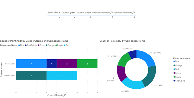
2. Result:
If you want to use stacked bar chart and donut chart to display:
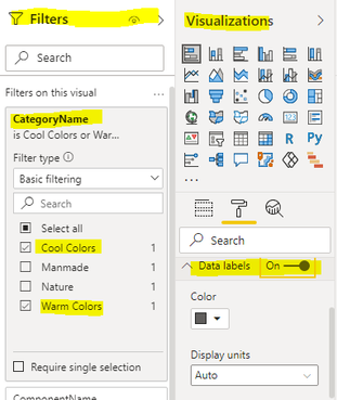
1.Select stacked bar chart, use the filters next to it to filter the CategoryName, select only cool colors and waarm colors, and open the data labels option in visualizations
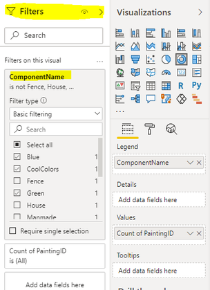
2. Select donut chart, select componentname in filters, and select the required fields
3. Result.
You can downloaded PBIX file from here.
Best Regards,
Liu Yang
If this post helps, then please consider Accept it as the solution to help the other members find it more quickly.
Helpful resources

Microsoft Fabric Learn Together
Covering the world! 9:00-10:30 AM Sydney, 4:00-5:30 PM CET (Paris/Berlin), 7:00-8:30 PM Mexico City

Power BI Monthly Update - April 2024
Check out the April 2024 Power BI update to learn about new features.

| User | Count |
|---|---|
| 110 | |
| 94 | |
| 82 | |
| 66 | |
| 58 |
| User | Count |
|---|---|
| 151 | |
| 121 | |
| 104 | |
| 87 | |
| 67 |


