- Power BI forums
- Updates
- News & Announcements
- Get Help with Power BI
- Desktop
- Service
- Report Server
- Power Query
- Mobile Apps
- Developer
- DAX Commands and Tips
- Custom Visuals Development Discussion
- Health and Life Sciences
- Power BI Spanish forums
- Translated Spanish Desktop
- Power Platform Integration - Better Together!
- Power Platform Integrations (Read-only)
- Power Platform and Dynamics 365 Integrations (Read-only)
- Training and Consulting
- Instructor Led Training
- Dashboard in a Day for Women, by Women
- Galleries
- Community Connections & How-To Videos
- COVID-19 Data Stories Gallery
- Themes Gallery
- Data Stories Gallery
- R Script Showcase
- Webinars and Video Gallery
- Quick Measures Gallery
- 2021 MSBizAppsSummit Gallery
- 2020 MSBizAppsSummit Gallery
- 2019 MSBizAppsSummit Gallery
- Events
- Ideas
- Custom Visuals Ideas
- Issues
- Issues
- Events
- Upcoming Events
- Community Blog
- Power BI Community Blog
- Custom Visuals Community Blog
- Community Support
- Community Accounts & Registration
- Using the Community
- Community Feedback
Register now to learn Fabric in free live sessions led by the best Microsoft experts. From Apr 16 to May 9, in English and Spanish.
- Power BI forums
- Forums
- Get Help with Power BI
- Desktop
- Count Measure category in Donut Chart
- Subscribe to RSS Feed
- Mark Topic as New
- Mark Topic as Read
- Float this Topic for Current User
- Bookmark
- Subscribe
- Printer Friendly Page
- Mark as New
- Bookmark
- Subscribe
- Mute
- Subscribe to RSS Feed
- Permalink
- Report Inappropriate Content
Count Measure category in Donut Chart
Hello,
I have a measure that calculates a yield percentage. I also have a measure that determine the %category (<80%, 80-85% ect).
I mannaged to make a column chart with a colours for each category by creating a measure for every category.
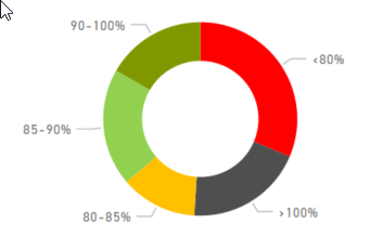
But I also want to show the numbre of object for each category (preferably in a donut chart).
Like this:
This chart has to change depending on the period that is selected on the page.
I have tried some methodes but I can't seem te get the same results as the column chart (with the example above the column chart shows a lot of grey en red and no dark green).
Has anyone an idea how to solve this?
If more information is needed to help, please let me know.
Thanks in advance!
- Mark as New
- Bookmark
- Subscribe
- Mute
- Subscribe to RSS Feed
- Permalink
- Report Inappropriate Content
Sample data and measure calculations to recreate please.
@ me in replies or I'll lose your thread!!!
Instead of a Kudo, please vote for this idea
Become an expert!: Enterprise DNA
External Tools: MSHGQM
YouTube Channel!: Microsoft Hates Greg
Latest book!: The Definitive Guide to Power Query (M)
DAX is easy, CALCULATE makes DAX hard...
- Mark as New
- Bookmark
- Subscribe
- Mute
- Subscribe to RSS Feed
- Permalink
- Report Inappropriate Content
I don't know a easy way to supply sample data.
I have 3 tables;
1: Object information; Id, address, gas_ID, heat_ID
2: RegisterID; gas_ID / heat_ID, address, type (gas or heat) (there is a relationship with Object info based on address)
3: Usage; Date, gas_ID / heat_ID, usage; also a couple of calculated columns to seperate the gas and heat usage
Table 3 has a relationship with table 2 based on gas_ID/heat_ID
In the table 3 I have the following measures:
YieldPercentage = IFERROR( (sum(heat usages)/sum(gas usage));0)
PercentageCategory = if(or(ISBLANK([YieldPercentage]);[Rendement%]=0);"Blank"; if([YieldPercentage]<0,80;"<80%"; if([YieldPercentage]<0,85;"80-85%"; if([YieldPercentage]<0,9;"85-90%"; if([YieldPercentage]<1;"90-100%";">100%")))))
For the column chart I have the following measures:
<80% = IFERROR(if([YieldPercentage]<0,8;[YieldPercentage];0);0)
80-85% = IFERROR(if(and([YieldPercentage]<0,85;[YieldPercentage]>0,8);[YieldPercentage];0);0)
85-90% = IFERROR(if(and([YieldPercentage]<0,9;[YieldPercentage]>0,85);[YieldPercentage];0);0)
90-100% = IFERROR(if(and([YieldPercentage]<1;[YieldPercentage]>0,9);[YieldPercentage];0);0)
>100% = IFERROR(if([YieldPercentage]>1;[YieldPercentage];0);0)
I made a measure for every category so I could determine the colours of the bars.
Please let me know how I can give better/more informatie without showing actual customer data
- Mark as New
- Bookmark
- Subscribe
- Mute
- Subscribe to RSS Feed
- Permalink
- Report Inappropriate Content
Hi @LonnekedeLeeuw,
You can copy your data here, or you can supply data using file as attachments.
Best Regards,
Angelia
Helpful resources

Microsoft Fabric Learn Together
Covering the world! 9:00-10:30 AM Sydney, 4:00-5:30 PM CET (Paris/Berlin), 7:00-8:30 PM Mexico City

Power BI Monthly Update - April 2024
Check out the April 2024 Power BI update to learn about new features.

| User | Count |
|---|---|
| 110 | |
| 97 | |
| 78 | |
| 64 | |
| 55 |
| User | Count |
|---|---|
| 143 | |
| 109 | |
| 89 | |
| 84 | |
| 66 |

