- Power BI forums
- Updates
- News & Announcements
- Get Help with Power BI
- Desktop
- Service
- Report Server
- Power Query
- Mobile Apps
- Developer
- DAX Commands and Tips
- Custom Visuals Development Discussion
- Health and Life Sciences
- Power BI Spanish forums
- Translated Spanish Desktop
- Power Platform Integration - Better Together!
- Power Platform Integrations (Read-only)
- Power Platform and Dynamics 365 Integrations (Read-only)
- Training and Consulting
- Instructor Led Training
- Dashboard in a Day for Women, by Women
- Galleries
- Community Connections & How-To Videos
- COVID-19 Data Stories Gallery
- Themes Gallery
- Data Stories Gallery
- R Script Showcase
- Webinars and Video Gallery
- Quick Measures Gallery
- 2021 MSBizAppsSummit Gallery
- 2020 MSBizAppsSummit Gallery
- 2019 MSBizAppsSummit Gallery
- Events
- Ideas
- Custom Visuals Ideas
- Issues
- Issues
- Events
- Upcoming Events
- Community Blog
- Power BI Community Blog
- Custom Visuals Community Blog
- Community Support
- Community Accounts & Registration
- Using the Community
- Community Feedback
Register now to learn Fabric in free live sessions led by the best Microsoft experts. From Apr 16 to May 9, in English and Spanish.
- Power BI forums
- Forums
- Get Help with Power BI
- Desktop
- Correct format of data for an Area Chart?
- Subscribe to RSS Feed
- Mark Topic as New
- Mark Topic as Read
- Float this Topic for Current User
- Bookmark
- Subscribe
- Printer Friendly Page
- Mark as New
- Bookmark
- Subscribe
- Mute
- Subscribe to RSS Feed
- Permalink
- Report Inappropriate Content
Correct format of data for an Area Chart?
Hi all, I hope you are all safe and well.
Now, my brain won't work, and I can't figure out how to arrange my data to create a an area chart for a hardware roll-out we are doing.
So, as the technicians complete the swap-out of old kit for new, they are adding their name and the date in a spreadsheet that contains all the old kit that needs removing. So I have a column of dates. How do I format that so I can have an area chart showing how many are done on each date?
Thank you.
Solved! Go to Solution.
- Mark as New
- Bookmark
- Subscribe
- Mute
- Subscribe to RSS Feed
- Permalink
- Report Inappropriate Content
Hi @Anonymous
Group your dates to get a count of each date, then create the running total from the grouped count.
Sample PBIX here with dummy data
Regards
Phil
If I answered your question please mark my post as the solution.
If my answer helped solve your problem, give it a kudos by clicking on the Thumbs Up.
Did I answer your question? Then please mark my post as the solution.
If I helped you, click on the Thumbs Up to give Kudos.
Blog :: YouTube Channel :: Connect on Linkedin
Proud to be a Super User!
- Mark as New
- Bookmark
- Subscribe
- Mute
- Subscribe to RSS Feed
- Permalink
- Report Inappropriate Content
Thanks @PhilipTreacy and @v-eqin-msft . However, neither solution addresses the first part of the issue. The data is just dates. Both solutions start with the dates counted up.
You both have tables that will say | 27/10/2020 | 3 |
While I will have:-
27/10/2020
27/10/2020
27/10/2020
28/10/2020
28/10/2020
How can I seach the completed date column to count each date there?
Thanks in advance.
- Mark as New
- Bookmark
- Subscribe
- Mute
- Subscribe to RSS Feed
- Permalink
- Report Inappropriate Content
Hi @Anonymous ,
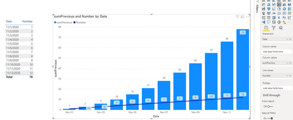
According to my understand, you want to use Line and stacked column chart to see the difference between the value per day and the sum value of the previous day, right?
You could use the following formula:
sumPrevious =
CALCULATE (
    SUM ( 'Table'[Number] ),
    FILTER ( ALL ( 'Table' ), 'Table'[Date] <= MAX ( 'Table'[Date] ) )
)
My visualization looks like this:
Did I answer your question ? Please mark my reply as solution. Thank you very much.
If not, please upload some insensitive data samples and expected output.
Best Regards,
Eyelyn Qin
- Mark as New
- Bookmark
- Subscribe
- Mute
- Subscribe to RSS Feed
- Permalink
- Report Inappropriate Content
Hi @Anonymous
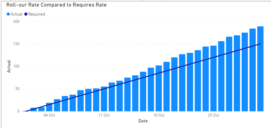
You've asked for an area chart but your image shows a column/line chart?
You also said Here is the graph I want from Excel. but you want this in PBI?
Without any of your data I've created my own to produce this
You can get the PBIX file here with the setup you can copy.
Regards
Phil
If I answered your question please mark my post as the solution.
If my answer helped solve your problem, give it a kudos by clicking on the Thumbs Up.
Did I answer your question? Then please mark my post as the solution.
If I helped you, click on the Thumbs Up to give Kudos.
Blog :: YouTube Channel :: Connect on Linkedin
Proud to be a Super User!
- Mark as New
- Bookmark
- Subscribe
- Mute
- Subscribe to RSS Feed
- Permalink
- Report Inappropriate Content
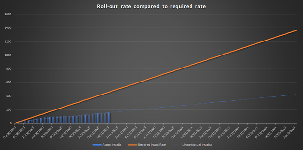
I cannot be any more specific about the dataset just being a column of dates next to each job when it is complete.
The dates column will serve as the X axis, while the Y axis needs to be a running total of the count of each date, so that today's total is added to yesterdays running total.
Here is the graph I want from Excel.
Due to COVID, we are falling far behind.
- Mark as New
- Bookmark
- Subscribe
- Mute
- Subscribe to RSS Feed
- Permalink
- Report Inappropriate Content
Hello @Anonymous,
Can you share the sample data/pbix file along with the expected output as an example?
Cheers!
Vivek
Blog: vivran.in/my-blog
Connect on LinkedIn
Follow on Twitter
Helpful resources

Microsoft Fabric Learn Together
Covering the world! 9:00-10:30 AM Sydney, 4:00-5:30 PM CET (Paris/Berlin), 7:00-8:30 PM Mexico City

Power BI Monthly Update - April 2024
Check out the April 2024 Power BI update to learn about new features.

| User | Count |
|---|---|
| 111 | |
| 100 | |
| 80 | |
| 64 | |
| 58 |
| User | Count |
|---|---|
| 146 | |
| 110 | |
| 93 | |
| 84 | |
| 67 |


