- Power BI forums
- Updates
- News & Announcements
- Get Help with Power BI
- Desktop
- Service
- Report Server
- Power Query
- Mobile Apps
- Developer
- DAX Commands and Tips
- Custom Visuals Development Discussion
- Health and Life Sciences
- Power BI Spanish forums
- Translated Spanish Desktop
- Power Platform Integration - Better Together!
- Power Platform Integrations (Read-only)
- Power Platform and Dynamics 365 Integrations (Read-only)
- Training and Consulting
- Instructor Led Training
- Dashboard in a Day for Women, by Women
- Galleries
- Community Connections & How-To Videos
- COVID-19 Data Stories Gallery
- Themes Gallery
- Data Stories Gallery
- R Script Showcase
- Webinars and Video Gallery
- Quick Measures Gallery
- 2021 MSBizAppsSummit Gallery
- 2020 MSBizAppsSummit Gallery
- 2019 MSBizAppsSummit Gallery
- Events
- Ideas
- Custom Visuals Ideas
- Issues
- Issues
- Events
- Upcoming Events
- Community Blog
- Power BI Community Blog
- Custom Visuals Community Blog
- Community Support
- Community Accounts & Registration
- Using the Community
- Community Feedback
Register now to learn Fabric in free live sessions led by the best Microsoft experts. From Apr 16 to May 9, in English and Spanish.
- Power BI forums
- Forums
- Get Help with Power BI
- Desktop
- Controlling the bubble size in a scatter chart
- Subscribe to RSS Feed
- Mark Topic as New
- Mark Topic as Read
- Float this Topic for Current User
- Bookmark
- Subscribe
- Printer Friendly Page
- Mark as New
- Bookmark
- Subscribe
- Mute
- Subscribe to RSS Feed
- Permalink
- Report Inappropriate Content
Controlling the bubble size in a scatter chart
I cannot get the bubble size to work as required... I have a table that contains the sales of a team:
James | 16
James | 15
James | 14
Bob | 15
Bob | 13
Janet | 20
That can draw me a scatter chart that shows the number of deals and the value of those deals. Perfect.
I then want to create the bubble size based on their current close rate
James | .25
Bob | .5
Janet | .8
So i join the two tables to create a relationship, and then pull the 'CloseRate' to create the bubble size. Therefore showing an indication of their ability to close deals.
However I am forced to select either a Sum, Average etc for the CloseRate and all the values in the chart are the sales. So for example if I select 'Sum of CloseRate' every bubble is the same size and has an value of 1.55 (eg .25+.5+.8).
How can I bring the data into the scatter chart so that I get the correct values assigned to the correct dots?
Thanks
James
Solved! Go to Solution.
- Mark as New
- Bookmark
- Subscribe
- Mute
- Subscribe to RSS Feed
- Permalink
- Report Inappropriate Content
Hi @jamesbr,
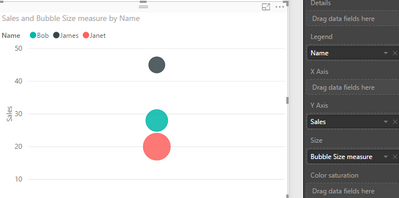
By default, if we drag a column into "Size" section in a scatter chart, it will be aggregated, like Sum, Average, Count, etc. To avoid this beavior, we can add a measure insetad of adding column directly. Below is my test, please review it.
Add a calculated column [Bubble Size] in sales table.
Bubble Size =
LOOKUPVALUE (
    'Bubble Size'[Close Rate],
    'Bubble Size'[Name], 'Sales of team'[Name]
)
Create a measure.
Bubble Size measure =
CALCULATE (
    LASTNONBLANK ( 'Sales of team'[Bubble Size], 1 ),
    ALLEXCEPT ( 'Sales of team', 'Sales of team'[Name] )
)
Add this measure into "Size" section.
Best regards,
Yuliana Gu
If this post helps, then please consider Accept it as the solution to help the other members find it more quickly.
Helpful resources

Microsoft Fabric Learn Together
Covering the world! 9:00-10:30 AM Sydney, 4:00-5:30 PM CET (Paris/Berlin), 7:00-8:30 PM Mexico City

Power BI Monthly Update - April 2024
Check out the April 2024 Power BI update to learn about new features.

| User | Count |
|---|---|
| 111 | |
| 100 | |
| 80 | |
| 64 | |
| 58 |
| User | Count |
|---|---|
| 146 | |
| 110 | |
| 93 | |
| 84 | |
| 67 |


