- Power BI forums
- Updates
- News & Announcements
- Get Help with Power BI
- Desktop
- Service
- Report Server
- Power Query
- Mobile Apps
- Developer
- DAX Commands and Tips
- Custom Visuals Development Discussion
- Health and Life Sciences
- Power BI Spanish forums
- Translated Spanish Desktop
- Power Platform Integration - Better Together!
- Power Platform Integrations (Read-only)
- Power Platform and Dynamics 365 Integrations (Read-only)
- Training and Consulting
- Instructor Led Training
- Dashboard in a Day for Women, by Women
- Galleries
- Community Connections & How-To Videos
- COVID-19 Data Stories Gallery
- Themes Gallery
- Data Stories Gallery
- R Script Showcase
- Webinars and Video Gallery
- Quick Measures Gallery
- 2021 MSBizAppsSummit Gallery
- 2020 MSBizAppsSummit Gallery
- 2019 MSBizAppsSummit Gallery
- Events
- Ideas
- Custom Visuals Ideas
- Issues
- Issues
- Events
- Upcoming Events
- Community Blog
- Power BI Community Blog
- Custom Visuals Community Blog
- Community Support
- Community Accounts & Registration
- Using the Community
- Community Feedback
Register now to learn Fabric in free live sessions led by the best Microsoft experts. From Apr 16 to May 9, in English and Spanish.
- Power BI forums
- Forums
- Get Help with Power BI
- Desktop
- Continuous x-axis with aggregated value
- Subscribe to RSS Feed
- Mark Topic as New
- Mark Topic as Read
- Float this Topic for Current User
- Bookmark
- Subscribe
- Printer Friendly Page
- Mark as New
- Bookmark
- Subscribe
- Mute
- Subscribe to RSS Feed
- Permalink
- Report Inappropriate Content
Continuous x-axis with aggregated value
Hi brilliant Power BI community!
I am currently testing out moving from QlikView to Power BI, but have run into an issue with one of our graphs.
I have information on how many work hours have been logged on different functional locations per year. I want to create a graph showing the distribution of the number of functional locations per amount of work hours per functional location per year. I.e. my data is structured as:
Functional Location | Work Hours | Year
1 24 2013
2 50 2018
1 47 2017
And so forth.
The issue is creating the x-axis. Before, it has been created by making an aggregated array with average amount of work hours a year per functional location, using it as the dimension, and then counting the distinct number of functional locations as the value.
When I do this in Power BI by creating a grouped by table, the graph just seems to load for a long time.
Thank you for any help you can give me!
Let me know if you need extra information, then I can create some dummy data.
- Mark as New
- Bookmark
- Subscribe
- Mute
- Subscribe to RSS Feed
- Permalink
- Report Inappropriate Content
@NinjaEngineer - Yes, additional information and more sample data would be great. Also, if you could provide an example of your expected output that would be very helpful as well. Maybe a screen shot of the current visual?
Please see this post regarding How to Get Your Question Answered Quickly: https://community.powerbi.com/t5/Community-Blog/How-to-Get-Your-Question-Answered-Quickly/ba-p/38490
@ me in replies or I'll lose your thread!!!
Instead of a Kudo, please vote for this idea
Become an expert!: Enterprise DNA
External Tools: MSHGQM
YouTube Channel!: Microsoft Hates Greg
Latest book!: The Definitive Guide to Power Query (M)
DAX is easy, CALCULATE makes DAX hard...
- Mark as New
- Bookmark
- Subscribe
- Mute
- Subscribe to RSS Feed
- Permalink
- Report Inappropriate Content
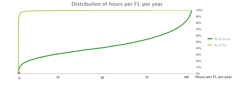
Well i can't show you the actual graph, but I have created a dummy one:
In QlikView, the x-axis dimension is calculated as:
Aggr( Work_Hours/Year, Functional_Location)
While the value expression is then:
Count(DISTINCT Functional_Location)
The expression is aggregated and shown as a percentage (availble functions within QlikView graphs). I can't seem to locate where to attach a file, but the dummy data I was going to send was a table of functional location 1-10 with a random number between 0-100 and a random year between 2010-2019. Each functional location then had three entries in the sheet with random values each time.
Helpful resources

Microsoft Fabric Learn Together
Covering the world! 9:00-10:30 AM Sydney, 4:00-5:30 PM CET (Paris/Berlin), 7:00-8:30 PM Mexico City

Power BI Monthly Update - April 2024
Check out the April 2024 Power BI update to learn about new features.

| User | Count |
|---|---|
| 115 | |
| 100 | |
| 88 | |
| 68 | |
| 61 |
| User | Count |
|---|---|
| 150 | |
| 120 | |
| 100 | |
| 87 | |
| 68 |

