- Power BI forums
- Updates
- News & Announcements
- Get Help with Power BI
- Desktop
- Service
- Report Server
- Power Query
- Mobile Apps
- Developer
- DAX Commands and Tips
- Custom Visuals Development Discussion
- Health and Life Sciences
- Power BI Spanish forums
- Translated Spanish Desktop
- Power Platform Integration - Better Together!
- Power Platform Integrations (Read-only)
- Power Platform and Dynamics 365 Integrations (Read-only)
- Training and Consulting
- Instructor Led Training
- Dashboard in a Day for Women, by Women
- Galleries
- Community Connections & How-To Videos
- COVID-19 Data Stories Gallery
- Themes Gallery
- Data Stories Gallery
- R Script Showcase
- Webinars and Video Gallery
- Quick Measures Gallery
- 2021 MSBizAppsSummit Gallery
- 2020 MSBizAppsSummit Gallery
- 2019 MSBizAppsSummit Gallery
- Events
- Ideas
- Custom Visuals Ideas
- Issues
- Issues
- Events
- Upcoming Events
- Community Blog
- Power BI Community Blog
- Custom Visuals Community Blog
- Community Support
- Community Accounts & Registration
- Using the Community
- Community Feedback
Register now to learn Fabric in free live sessions led by the best Microsoft experts. From Apr 16 to May 9, in English and Spanish.
- Power BI forums
- Forums
- Get Help with Power BI
- Desktop
- Continuous X-axis with monthly labels, daily data ...
- Subscribe to RSS Feed
- Mark Topic as New
- Mark Topic as Read
- Float this Topic for Current User
- Bookmark
- Subscribe
- Printer Friendly Page
- Mark as New
- Bookmark
- Subscribe
- Mute
- Subscribe to RSS Feed
- Permalink
- Report Inappropriate Content
Continuous X-axis with monthly labels, daily data categorised by year (legend)
Hi,
I'd like to display a line chart with side by side comparison of daily quantities for each year, with monthly x-axis labels.
I have a simple table [Date, Quantity] with daily values for several years.
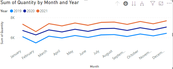
Chart-1
Quantity - Values
Months (Date Hierarchy) - Axis
Years - Legend
In in the chart above, the values are summed up to each month, wheresea instead I'd like to see the Daily values.
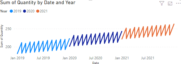
I can display daily values by switching the Axis to Date (rather than Date Hierarchy), but then I'm unable to display Years side by side, instead the whole chart is continuous (and x-axis granularity is not necessary monthly, depends on available size):
Chart-2
Quantity - Values
Date - Axis
Years - Legend
What I would like is the daily values (Y) from Chart-2 in the format (monthly, by year) of Chart-1 (X)
Any ideas?
Regards,
Stefan
Solved! Go to Solution.
- Mark as New
- Bookmark
- Subscribe
- Mute
- Subscribe to RSS Feed
- Permalink
- Report Inappropriate Content
Since none of the ideas reflected what I need, I've posted my own Idea Suggestion:
Please support
- Mark as New
- Bookmark
- Subscribe
- Mute
- Subscribe to RSS Feed
- Permalink
- Report Inappropriate Content
Since none of the ideas reflected what I need, I've posted my own Idea Suggestion:
Please support
- Mark as New
- Bookmark
- Subscribe
- Mute
- Subscribe to RSS Feed
- Permalink
- Report Inappropriate Content
Hi @Anonymous ,
Unfortunately,we can't use the month and year as the axis, but corresponds to the daily value.
What we can do is to drill down to get the daily value.
Best Regards,
Liang
If this post helps, then please consider Accept it as the solution to help the other members find it more quickly.
- Mark as New
- Bookmark
- Subscribe
- Mute
- Subscribe to RSS Feed
- Permalink
- Report Inappropriate Content
Hi @V-lianl-msft ,
thank you for your response. Could work in some cases, but I know for a fact that for our users this won't be accetable.
Especially since this is an exercise to see if we can migrate from Tableau (which can do this) to Power Bi.
Is there a user voice request to have this implemented? (I'm asking because I don't even know how to phraze this 'feature request' correctly)
Regards,
Stefan
- Mark as New
- Bookmark
- Subscribe
- Mute
- Subscribe to RSS Feed
- Permalink
- Report Inappropriate Content
Hi @Anonymous ,
For voice request, please refer to this article to see if it can meet your needs.
https://docs.microsoft.com/en-us/power-bi/consumer/mobile/mobile-apps-ios-qna
Best Regards,
Liang
If this post helps, then please consider Accept it as the solution to help the other members find it more quickly.
- Mark as New
- Bookmark
- Subscribe
- Mute
- Subscribe to RSS Feed
- Permalink
- Report Inappropriate Content
I'm sorry I meant Power Bi Ideas, I thought it's called "user voice requests"
https://ideas.powerbi.com/forums/265200-power-bi-ideas
Any idea what would be a good name for the feature in this thread?
Kind Regards,
Stefan
- Mark as New
- Bookmark
- Subscribe
- Mute
- Subscribe to RSS Feed
- Permalink
- Report Inappropriate Content
Hi @Anonymous ,
Sorry, I misunderstood you before. You can vote for this idea or share your own idea.
Best Regards,
Liang
If this post helps, then please consider Accept it as the solution to help the other members find it more quickly.
Helpful resources

Microsoft Fabric Learn Together
Covering the world! 9:00-10:30 AM Sydney, 4:00-5:30 PM CET (Paris/Berlin), 7:00-8:30 PM Mexico City

Power BI Monthly Update - April 2024
Check out the April 2024 Power BI update to learn about new features.

| User | Count |
|---|---|
| 111 | |
| 100 | |
| 80 | |
| 64 | |
| 58 |
| User | Count |
|---|---|
| 146 | |
| 110 | |
| 93 | |
| 84 | |
| 67 |


