- Power BI forums
- Updates
- News & Announcements
- Get Help with Power BI
- Desktop
- Service
- Report Server
- Power Query
- Mobile Apps
- Developer
- DAX Commands and Tips
- Custom Visuals Development Discussion
- Health and Life Sciences
- Power BI Spanish forums
- Translated Spanish Desktop
- Power Platform Integration - Better Together!
- Power Platform Integrations (Read-only)
- Power Platform and Dynamics 365 Integrations (Read-only)
- Training and Consulting
- Instructor Led Training
- Dashboard in a Day for Women, by Women
- Galleries
- Community Connections & How-To Videos
- COVID-19 Data Stories Gallery
- Themes Gallery
- Data Stories Gallery
- R Script Showcase
- Webinars and Video Gallery
- Quick Measures Gallery
- 2021 MSBizAppsSummit Gallery
- 2020 MSBizAppsSummit Gallery
- 2019 MSBizAppsSummit Gallery
- Events
- Ideas
- Custom Visuals Ideas
- Issues
- Issues
- Events
- Upcoming Events
- Community Blog
- Power BI Community Blog
- Custom Visuals Community Blog
- Community Support
- Community Accounts & Registration
- Using the Community
- Community Feedback
Register now to learn Fabric in free live sessions led by the best Microsoft experts. From Apr 16 to May 9, in English and Spanish.
- Power BI forums
- Forums
- Get Help with Power BI
- Desktop
- Conditional formatting with multiple column/bar va...
- Subscribe to RSS Feed
- Mark Topic as New
- Mark Topic as Read
- Float this Topic for Current User
- Bookmark
- Subscribe
- Printer Friendly Page
- Mark as New
- Bookmark
- Subscribe
- Mute
- Subscribe to RSS Feed
- Permalink
- Report Inappropriate Content
Conditional formatting with multiple column/bar values
Hi,
I'm new with Power bi and i was wondering why power bi let me use conditional formatting in a normal stacked line column chart, but one I add more than one value of my tables to the chart the option of condittional formatting disapears.
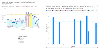
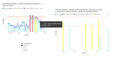
I'm trying to represent in the same chart four measures with theis limits filtering their representationes thanks to a dax filter: the first pict is the visual with all measures (120/140, 40/70...) and the second one is with only one but letting me use conditional formatting.
Is there any way to achive the multiple representation with custom conditional formatting for each column measure? Thanks.
- Mark as New
- Bookmark
- Subscribe
- Mute
- Subscribe to RSS Feed
- Permalink
- Report Inappropriate Content
Hi @mariogmgi2g ,
There are a few considerations to keep in mind when working with conditional table formatting:
- Conditional formatting applies only to the values of Table or Matrix visuals, and doesn't apply to any subtotals, grand totals, or the Total row.
- Any table that doesn't have a grouping is displayed as a single row that doesn't support conditional formatting.
- You can't apply gradient formatting with automatic maximum/minimum values, or rule-based formatting with percentage rules, if your data contains NaN values. NaN means "Not a number," most commonly caused by a divide by zero error. You can use the DIVIDE() DAX function to avoid these errors.
- Conditional formatting needs an aggregation or measure to be applied to the value. That's why you see 'First' or 'Last' in the Color by value example. If you're building your report against an Analysis Service multidimensional cube, you won't be able to use an attribute for conditional formatting unless the cube owner has built a measure that provides the value.
Reference: Use conditional formatting in tables
Best Regards,
Stephen Tao
If this post helps, then please consider Accept it as the solution to help the other members find it more quickly.
- Mark as New
- Bookmark
- Subscribe
- Mute
- Subscribe to RSS Feed
- Permalink
- Report Inappropriate Content
Hi @v-stephen-msft,
In summary, if I have understood correctly, my problem is that I have multiple data represented in the same visual and conditional formatting is only supoerted to one measure, even if I filter data to represent only one measure at the same time, am I correct?
Sorry for my bad english, and thank you very much.
- Mark as New
- Bookmark
- Subscribe
- Mute
- Subscribe to RSS Feed
- Permalink
- Report Inappropriate Content
You are correct on your understanding however there can be some workarounds. What is the type of condittional formatting you need?
Regards
Miguel Félix
Did I answer your question? Mark my post as a solution!
Proud to be a Super User!
Check out my blog: Power BI em Português- Mark as New
- Bookmark
- Subscribe
- Mute
- Subscribe to RSS Feed
- Permalink
- Report Inappropriate Content
If the bar is between the warning and the wrong limit, the bar must be yellow. If the bar is higher than the wrong limit it must be red. Otherwise it must be blue.
Anyway, I was searching for a solution and I think that i can't do nothing to make it works, since as you said Power BI don't support right know conditional formatting for more than two measures in the same visual. Maybe if I normalize them I could do some tweaks, but i don't know...
- Mark as New
- Bookmark
- Subscribe
- Mute
- Subscribe to RSS Feed
- Permalink
- Report Inappropriate Content
Hi @mariogmgi2g ,
Where you abble to look at my solution, did it help, or does it need to be in a different way?
Can you share some sample data.
Regards
Miguel Félix
Did I answer your question? Mark my post as a solution!
Proud to be a Super User!
Check out my blog: Power BI em Português- Mark as New
- Bookmark
- Subscribe
- Mute
- Subscribe to RSS Feed
- Permalink
- Report Inappropriate Content
Is it possible to share a mockup of your data?
Regards
Miguel Félix
Did I answer your question? Mark my post as a solution!
Proud to be a Super User!
Check out my blog: Power BI em Português- Mark as New
- Bookmark
- Subscribe
- Mute
- Subscribe to RSS Feed
- Permalink
- Report Inappropriate Content
Hi @mariogmgi2g ,
This has to do with the setup of the chart when you are using a legend or more than one measure or calculation to make the split between several items the condittional formatting is turn off since each of the categories will have it's own colour.
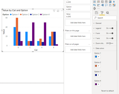
What exactly is your need, do you want to have a single colour for each of your measures? if that is the case you just need to change each one individually on the data colours:
Or do you want to set the limits for each of the measures you have and get different colours depending on the result of the measures?
Regards
Miguel Félix
Did I answer your question? Mark my post as a solution!
Proud to be a Super User!
Check out my blog: Power BI em Português- Mark as New
- Bookmark
- Subscribe
- Mute
- Subscribe to RSS Feed
- Permalink
- Report Inappropriate Content
I have multiple measures and for each of them specific limits and warnings which I have calculated indivuadully. As you said, I need to apply conditional formatting for each measure with a specific rule depending of their calculated limits, and plot them in the same visual that has the custom filter i made, which allows me represent only one of the multimple measures.
I don't know if I have explained myself properly, my english is not as good as it should.
Thank you.
- Mark as New
- Bookmark
- Subscribe
- Mute
- Subscribe to RSS Feed
- Permalink
- Report Inappropriate Content
Hi @mariogmgi2g ,
Not really sure if this is what you need but using a disconnected table with the measure and making them part of the x-axis you are abble to have a single measure to have the condittional formatting working check the image below if this appearance looks good to you or what is missing.
Again if you can share a mockup of your data would be easier to achieve an answer.
Regards
Miguel Félix
Did I answer your question? Mark my post as a solution!
Proud to be a Super User!
Check out my blog: Power BI em Português- Mark as New
- Bookmark
- Subscribe
- Mute
- Subscribe to RSS Feed
- Permalink
- Report Inappropriate Content
Hi Miguel, I was reading the question and looking at your solution and this is exactly what I'm trying to do. I have a clustered bar and line chart with Actuals and Forecast as the bars. I would like to conditionally format the Actuals bar so that is a different color if we're still within the current month. Looks like your solution would work. Could you provide a few more details on making the measures part of the x-axis? Could you provide a sample file? Thanks!
- Mark as New
- Bookmark
- Subscribe
- Mute
- Subscribe to RSS Feed
- Permalink
- Report Inappropriate Content
Hi @rrhascall
Just to have a more clear idea are your actuals and forecast in the same table?
Do you have a calendar table?
Regards
Miguel Félix
Did I answer your question? Mark my post as a solution!
Proud to be a Super User!
Check out my blog: Power BI em Português- Mark as New
- Bookmark
- Subscribe
- Mute
- Subscribe to RSS Feed
- Permalink
- Report Inappropriate Content
Yes, actuals and forecast are in the same table. I am using a calendar table but it is not marked as a date table because I'm only using monthly values (month + year) . PowerBI won't let me mark as a true date table because of non-continguous dates
- Mark as New
- Bookmark
- Subscribe
- Mute
- Subscribe to RSS Feed
- Permalink
- Report Inappropriate Content
Hi @rrhascall ,
There are several ways depending if you have unpivot or not the forecast and actuals values however in this case I'm assuming that you have the table in the following format:
Date - Actuals - Forecast
In this case create a new disconnected table with the actuals and forecast text:
Now add the following two measures:
Actuals / Forecast =
SWITCH (
    SELECTEDVALUE ( Actuals_Forecast[Values] ),
    "Actuals", SUM ( Actuals_Forecast_Values[Actuals] ),
    "Forecast", SUM ( Actuals_Forecast_Values[Forecast] )
)


Formatting Current Month =
SWITCH (
    TRUE (),
    DATE ( YEAR ( MAX ( 'Calendar'[Date] ) ), MONTH ( MAX ( 'Calendar'[Date] ) ), 1 )
        = DATE ( YEAR ( TODAY () ), MONTH ( TODAY () ), 1 )
        && SELECTEDVALUE ( Actuals_Forecast[Values] ) = "Actuals", "#D9B300",
    DATE ( YEAR ( MAX ( 'Calendar'[Date] ) ), MONTH ( MAX ( 'Calendar'[Date] ) ), 1 )
        = DATE ( YEAR ( TODAY () ), MONTH ( TODAY () ), 1 )
        && SELECTEDVALUE ( Actuals_Forecast[Values] ) = "Forecast", "#F0E199",
    SELECTEDVALUE ( Actuals_Forecast[Values] ) = "Forecast", "#A0D1FF",
    "#118DFF"
)
On the Formatting current Month you need to replace the "#000000" by the codes you need for your colouring, I took the liberty of showing both actuals and forescast on different colours for current month if you want to keep the forecast with the same colour has the other months you can delete the second part of the measure:
    DATE ( YEAR ( MAX ( 'Calendar'[Date] ) ), MONTH ( MAX ( 'Calendar'[Date] ) ), 1 )
        = DATE ( YEAR ( TODAY () ), MONTH ( TODAY () ), 1 )
        && SELECTEDVALUE ( Actuals_Forecast[Values] ) = "Forecast", "#F0E199",
Now use the condittional formating using the last measure:
Regards
Miguel Félix
Did I answer your question? Mark my post as a solution!
Proud to be a Super User!
Check out my blog: Power BI em PortuguêsHelpful resources

Microsoft Fabric Learn Together
Covering the world! 9:00-10:30 AM Sydney, 4:00-5:30 PM CET (Paris/Berlin), 7:00-8:30 PM Mexico City

Power BI Monthly Update - April 2024
Check out the April 2024 Power BI update to learn about new features.

| User | Count |
|---|---|
| 108 | |
| 100 | |
| 78 | |
| 64 | |
| 58 |
| User | Count |
|---|---|
| 148 | |
| 111 | |
| 94 | |
| 84 | |
| 67 |


