- Power BI forums
- Updates
- News & Announcements
- Get Help with Power BI
- Desktop
- Service
- Report Server
- Power Query
- Mobile Apps
- Developer
- DAX Commands and Tips
- Custom Visuals Development Discussion
- Health and Life Sciences
- Power BI Spanish forums
- Translated Spanish Desktop
- Power Platform Integration - Better Together!
- Power Platform Integrations (Read-only)
- Power Platform and Dynamics 365 Integrations (Read-only)
- Training and Consulting
- Instructor Led Training
- Dashboard in a Day for Women, by Women
- Galleries
- Community Connections & How-To Videos
- COVID-19 Data Stories Gallery
- Themes Gallery
- Data Stories Gallery
- R Script Showcase
- Webinars and Video Gallery
- Quick Measures Gallery
- 2021 MSBizAppsSummit Gallery
- 2020 MSBizAppsSummit Gallery
- 2019 MSBizAppsSummit Gallery
- Events
- Ideas
- Custom Visuals Ideas
- Issues
- Issues
- Events
- Upcoming Events
- Community Blog
- Power BI Community Blog
- Custom Visuals Community Blog
- Community Support
- Community Accounts & Registration
- Using the Community
- Community Feedback
Register now to learn Fabric in free live sessions led by the best Microsoft experts. From Apr 16 to May 9, in English and Spanish.
- Power BI forums
- Forums
- Get Help with Power BI
- Desktop
- Re: Conditional formatting of region borders on cu...
- Subscribe to RSS Feed
- Mark Topic as New
- Mark Topic as Read
- Float this Topic for Current User
- Bookmark
- Subscribe
- Printer Friendly Page
- Mark as New
- Bookmark
- Subscribe
- Mute
- Subscribe to RSS Feed
- Permalink
- Report Inappropriate Content
Conditional formatting of region borders on custom shape map
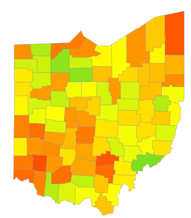
I am working on a custom shape map of the counties in Ohio where I have counties shaded using a 3-color gradient. I would also like to highlight a subset of those counties with a different border color/weight using a Y/N value for each one. Or, I would be open to any other way to highlight one group of counties while keeping the shading consistent across the map. Thanks in advance!
Solved! Go to Solution.
- Mark as New
- Bookmark
- Subscribe
- Mute
- Subscribe to RSS Feed
- Permalink
- Report Inappropriate Content
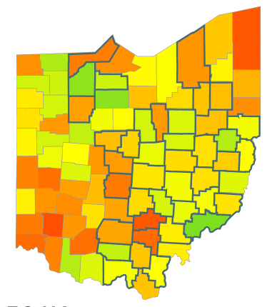
The different border can be setup using a double map with your original underneath and the highlighted counties with different color/width border as an overlay.
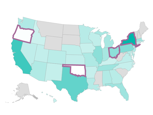
The trouble comes with preserving the original's saturation. There is no option to have a transparent data color, and the Shape Map only allows a filter instead of "highlight" option in Edit Interactions. As a result, when you select a subset based on another visual or Visual Level Filter, the saturation on the overlay map changes to reflect the new aggregate values rather than the original ones. In the screenshot below, Oregon and Oklahoma shouldn't be white based on the original underlay map when all states are considered, but they appear so when weighted against New York and Ohio alone.
- Mark as New
- Bookmark
- Subscribe
- Mute
- Subscribe to RSS Feed
- Permalink
- Report Inappropriate Content
@mikemccaman I would really like to be able to do the same!
Conditional Formatting would be even better (based on a Measure per District)
but I would settle even for only Highlighting the borders of the Counties that make up certain Districts / Divisions in a State?
while at the same time maintaining the colors of each County (based on your primary Measure per County)
If anyone can tell us if this is possible at all it would be @deldersveld
Thanks! ![]()
- Mark as New
- Bookmark
- Subscribe
- Mute
- Subscribe to RSS Feed
- Permalink
- Report Inappropriate Content
The different border can be setup using a double map with your original underneath and the highlighted counties with different color/width border as an overlay.
The trouble comes with preserving the original's saturation. There is no option to have a transparent data color, and the Shape Map only allows a filter instead of "highlight" option in Edit Interactions. As a result, when you select a subset based on another visual or Visual Level Filter, the saturation on the overlay map changes to reflect the new aggregate values rather than the original ones. In the screenshot below, Oregon and Oklahoma shouldn't be white based on the original underlay map when all states are considered, but they appear so when weighted against New York and Ohio alone.
- Mark as New
- Bookmark
- Subscribe
- Mute
- Subscribe to RSS Feed
- Permalink
- Report Inappropriate Content
Thanks, @deldersveld! This got me 95% of the way there. The original saturation is fine, because it's based on a 0-100 scale, not a conditional scale based on the selected counties. The one thing I seem to lose is the ability to select a county that is not part of the overlay or to view tooltips on it, for that matter. Any thoughts on that?
- Mark as New
- Bookmark
- Subscribe
- Mute
- Subscribe to RSS Feed
- Permalink
- Report Inappropriate Content
Unfortunately the ability to select as well as the tooltips will be lost for those polygons since they are filtered out of the overlay. There's no way to get them from the underlay if another map (or other visual) sits on top of it.
Helpful resources

Microsoft Fabric Learn Together
Covering the world! 9:00-10:30 AM Sydney, 4:00-5:30 PM CET (Paris/Berlin), 7:00-8:30 PM Mexico City

Power BI Monthly Update - April 2024
Check out the April 2024 Power BI update to learn about new features.

| User | Count |
|---|---|
| 114 | |
| 101 | |
| 78 | |
| 75 | |
| 49 |
| User | Count |
|---|---|
| 145 | |
| 108 | |
| 107 | |
| 89 | |
| 61 |


