- Power BI forums
- Updates
- News & Announcements
- Get Help with Power BI
- Desktop
- Service
- Report Server
- Power Query
- Mobile Apps
- Developer
- DAX Commands and Tips
- Custom Visuals Development Discussion
- Health and Life Sciences
- Power BI Spanish forums
- Translated Spanish Desktop
- Power Platform Integration - Better Together!
- Power Platform Integrations (Read-only)
- Power Platform and Dynamics 365 Integrations (Read-only)
- Training and Consulting
- Instructor Led Training
- Dashboard in a Day for Women, by Women
- Galleries
- Community Connections & How-To Videos
- COVID-19 Data Stories Gallery
- Themes Gallery
- Data Stories Gallery
- R Script Showcase
- Webinars and Video Gallery
- Quick Measures Gallery
- 2021 MSBizAppsSummit Gallery
- 2020 MSBizAppsSummit Gallery
- 2019 MSBizAppsSummit Gallery
- Events
- Ideas
- Custom Visuals Ideas
- Issues
- Issues
- Events
- Upcoming Events
- Community Blog
- Power BI Community Blog
- Custom Visuals Community Blog
- Community Support
- Community Accounts & Registration
- Using the Community
- Community Feedback
Register now to learn Fabric in free live sessions led by the best Microsoft experts. From Apr 16 to May 9, in English and Spanish.
- Power BI forums
- Forums
- Get Help with Power BI
- Desktop
- Re: Conditional formatting of Matrix based on Tota...
- Subscribe to RSS Feed
- Mark Topic as New
- Mark Topic as Read
- Float this Topic for Current User
- Bookmark
- Subscribe
- Printer Friendly Page
- Mark as New
- Bookmark
- Subscribe
- Mute
- Subscribe to RSS Feed
- Permalink
- Report Inappropriate Content
Conditional formatting of Matrix based on Total average
Hello
I am new to PowerBI and am in the process of migrating old manual reports to it.
One of these reports shows share of sales, by month (column) by product type (rows).
This has a heat map conditional format that compares any given cell (share of sales for a product for a month) to the total share of sales for that product for the total time period reported on. The under-index (lowest) starts from red, progresses to yellow (the same as the average) all the way up to green for the highest over-index against the average. So in the above, for row 1, April sees the highest index of purchases (4.8%) vs the total average for that product of 3.7%.
I have recreated the pivot-table as a matrix, which was simple enough.
But I can't find any way to match the same conditional formatting logic as my original excel pivot.
Is it even possible?
Thanks
Solved! Go to Solution.
- Mark as New
- Bookmark
- Subscribe
- Mute
- Subscribe to RSS Feed
- Permalink
- Report Inappropriate Content
Hi @GarethW ,
First of all let me apologize for the late response I must have missed this post on the multiple notifications I have.
What I think I was abble to get it to work I have created 3 measures (this simplifies the tough process):
% per category/month =
DIVIDE (
    COUNT ( 'Table'[Region] );
    CALCULATE ( COUNT ( 'Table'[Region] ); ALLSELECTED ( 'Table'[Region] ) )
)


% Total/region =
VAR temp_table =
    FILTER (
        SUMMARIZE (
            ALLSELECTED ( 'Table' );
            'Table'[Region];
            "@count"; COUNT ( 'Table'[Region] )
        );
        'Table'[Region] = MAX ( 'Table'[Region] )
    )
VAR total_table =
    SUMMARIZE (
        ALLSELECTED ( 'Table' );
        'Table'[Region];
        "@count"; COUNT ( 'Table'[Region] )
    )
RETURN
    DIVIDE ( SUMX ( temp_table; [@count] ); SUMX ( total_table; [@count] ) )


% variation = [% per category/month]-[% Total/region]
Now use the last measure to create your condittional formatting.
As you can see on the image below the values that are equal to the region total are blank below are red and above are green.
Check also the PBIX file attached.
Once more I'm very sorry for the delay in the answer.
Regards
Miguel Félix
Did I answer your question? Mark my post as a solution!
Proud to be a Super User!
Check out my blog: Power BI em Português- Mark as New
- Bookmark
- Subscribe
- Mute
- Subscribe to RSS Feed
- Permalink
- Report Inappropriate Content
Step 1 :
MAX_VALUE =
VAR m =
CALCULATE (
MAXX ( SUMMARIZE ( Table_NAME,COLUMN_NAME), CALCULATE ( VALUE ) ),
REMOVEFILTERS (COLUMN_NAME )
)
Step 2 : MAX_COLOR= iF(VALUE=[MAX_VALUE],"#FFFF01","")
Step 3 : Using Comnditional Format with filed Value
- Mark as New
- Bookmark
- Subscribe
- Mute
- Subscribe to RSS Feed
- Permalink
- Report Inappropriate Content
Hi @GarethW ,
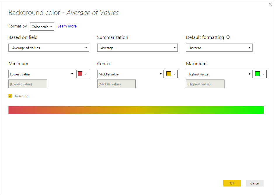
Go to the conditional formatting select the color scale then do it based on value and choose diverging and the colors should give expected result.
I have selected Average on summarization (but can be other as sum or max etc) because it's a simple table if you are using a measure it's not even asked.
Regards,
MFelix
Regards
Miguel Félix
Did I answer your question? Mark my post as a solution!
Proud to be a Super User!
Check out my blog: Power BI em Português- Mark as New
- Bookmark
- Subscribe
- Mute
- Subscribe to RSS Feed
- Permalink
- Report Inappropriate Content
Hi, thanks, but I have tried that and it doesn't work as there is no way for it to use the last 'total' column as a reference.
The actual matrix is based on counts, and the display type was just changed to be based on 'Percentage of Column Total'
What I need to be comparing in the heat map are the percentages being displayed, not the actual counts behind those, as the counts will vary depending on the month, I only care about the relative share for any given month, versus the over all share (which is that final 'Total' column)
- Mark as New
- Bookmark
- Subscribe
- Mute
- Subscribe to RSS Feed
- Permalink
- Report Inappropriate Content
Hi @GarethW ,
Wasn't aware that you had the percentage of column total would though it was a summarization or a measure, you need to change you values in the matrix by the measure below and then use the formatting as refered previously:
Percentage of colum = CALCULATE(COUNT('Table'[Product Type]))/ CALCULATE(COUNT('Table'[Product Type]);ALL('Table'[Product Type]))
Regards,
MFelix
Regards
Miguel Félix
Did I answer your question? Mark my post as a solution!
Proud to be a Super User!
Check out my blog: Power BI em Português- Mark as New
- Bookmark
- Subscribe
- Mute
- Subscribe to RSS Feed
- Permalink
- Report Inappropriate Content
Thank you @MFelix that is making progress, but I still can't get the conditional to work.
I'll give a bit more detail:
My raw data is rows of customer data, each row being a purchase, which has a date, region, etc.
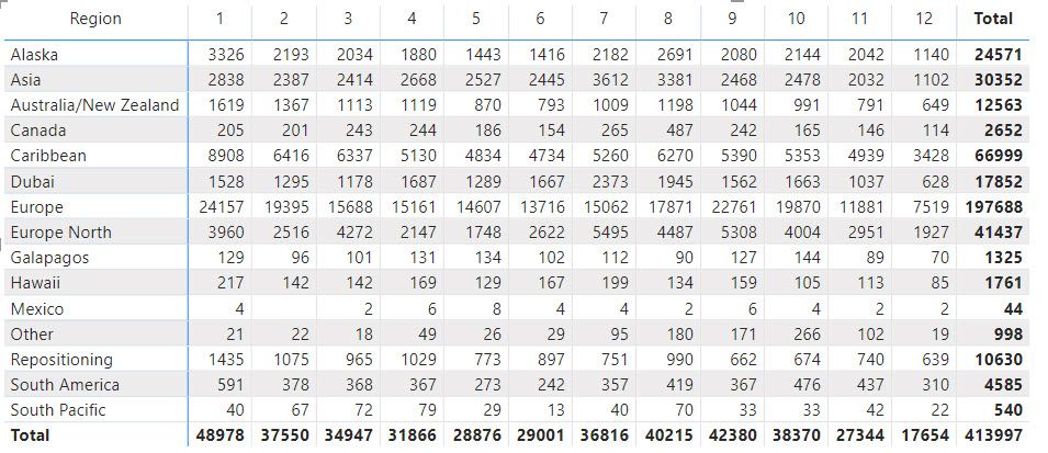
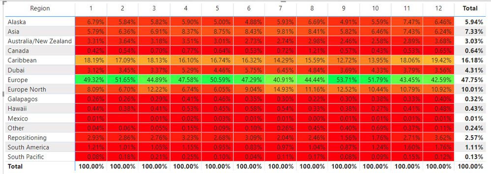
The initial matrix counts the customer ID, by region and month:
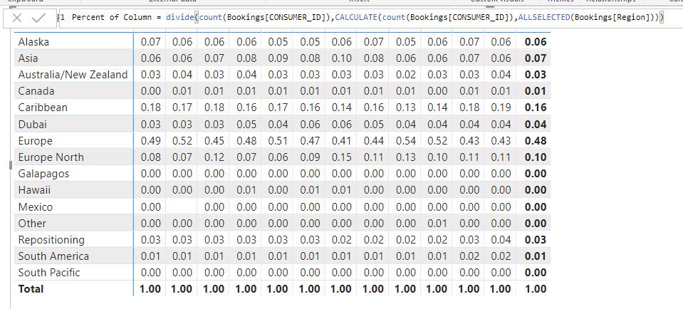
If I then create the measure, it correctly converts the above in to 'percentages' of each column
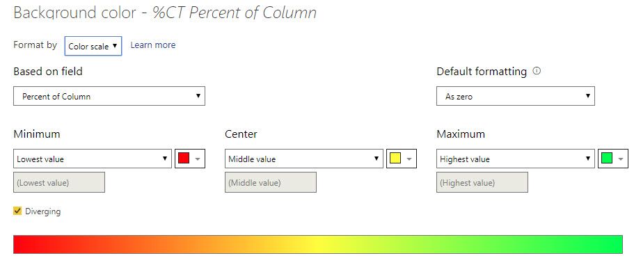
But the conditional formatting still doesn't compare each row & column against the total for the row.
I need each cell for say Europe to only be conditionally formatted against the total for Europe (47.75%) and ignore all the other regions. Then each Europe North cell to be formatted vs 10.01%, etc.
- Mark as New
- Bookmark
- Subscribe
- Mute
- Subscribe to RSS Feed
- Permalink
- Report Inappropriate Content
Hi @GarethW ,
First of all let me apologize for the late response I must have missed this post on the multiple notifications I have.
What I think I was abble to get it to work I have created 3 measures (this simplifies the tough process):
% per category/month =
DIVIDE (
    COUNT ( 'Table'[Region] );
    CALCULATE ( COUNT ( 'Table'[Region] ); ALLSELECTED ( 'Table'[Region] ) )
)


% Total/region =
VAR temp_table =
    FILTER (
        SUMMARIZE (
            ALLSELECTED ( 'Table' );
            'Table'[Region];
            "@count"; COUNT ( 'Table'[Region] )
        );
        'Table'[Region] = MAX ( 'Table'[Region] )
    )
VAR total_table =
    SUMMARIZE (
        ALLSELECTED ( 'Table' );
        'Table'[Region];
        "@count"; COUNT ( 'Table'[Region] )
    )
RETURN
    DIVIDE ( SUMX ( temp_table; [@count] ); SUMX ( total_table; [@count] ) )


% variation = [% per category/month]-[% Total/region]
Now use the last measure to create your condittional formatting.
As you can see on the image below the values that are equal to the region total are blank below are red and above are green.
Check also the PBIX file attached.
Once more I'm very sorry for the delay in the answer.
Regards
Miguel Félix
Did I answer your question? Mark my post as a solution!
Proud to be a Super User!
Check out my blog: Power BI em Português- Mark as New
- Bookmark
- Subscribe
- Mute
- Subscribe to RSS Feed
- Permalink
- Report Inappropriate Content
Hi @MFelix
I was wondering if its possible to change the color for the "ROWS". I mean in your example should be: "Region".
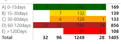
I have this:
and i want to change the color of the rows (I mean the text in the first column, A) 0-15Days.... etc.
Im using matrix chart, if i use table chat, will work, but i need use matrix.
in ther words, i need that the firs row, should be totally green, the secong row yelow and etc
- Mark as New
- Bookmark
- Subscribe
- Mute
- Subscribe to RSS Feed
- Permalink
- Report Inappropriate Content
Hi @Noredlac86 ,
In this case you need to add an additional statment to your calculation in order to check if you are in the line of A, B or C.
You need to create a measure similar to this:
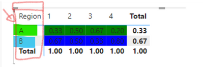
Color coding by row = SWITCH(SELECTEDVALUE('Table'[Region]),
                        "A", "Green",
                        "B", "Blue")
Then on the condittional formatting select the Field value
Result below:
You can also use the HEX codes for the coloring.
Regards
Miguel Félix
Did I answer your question? Mark my post as a solution!
Proud to be a Super User!
Check out my blog: Power BI em Português- Mark as New
- Bookmark
- Subscribe
- Mute
- Subscribe to RSS Feed
- Permalink
- Report Inappropriate Content
Thanks @MFelix for take your time and reply your message however is missing the first column "Region"
How can put the same color for the complete row, including all columns.
- Mark as New
- Bookmark
- Subscribe
- Mute
- Subscribe to RSS Feed
- Permalink
- Report Inappropriate Content
Hi @Noredlac86
On the row header you cannot make the condittional format,
Only workaround is to create a measure with the same value has the row header and use it has the first value of your matrix then hide the row header by decreasing the size of the column
Regards
Miguel Félix
Did I answer your question? Mark my post as a solution!
Proud to be a Super User!
Check out my blog: Power BI em Português- Mark as New
- Bookmark
- Subscribe
- Mute
- Subscribe to RSS Feed
- Permalink
- Report Inappropriate Content
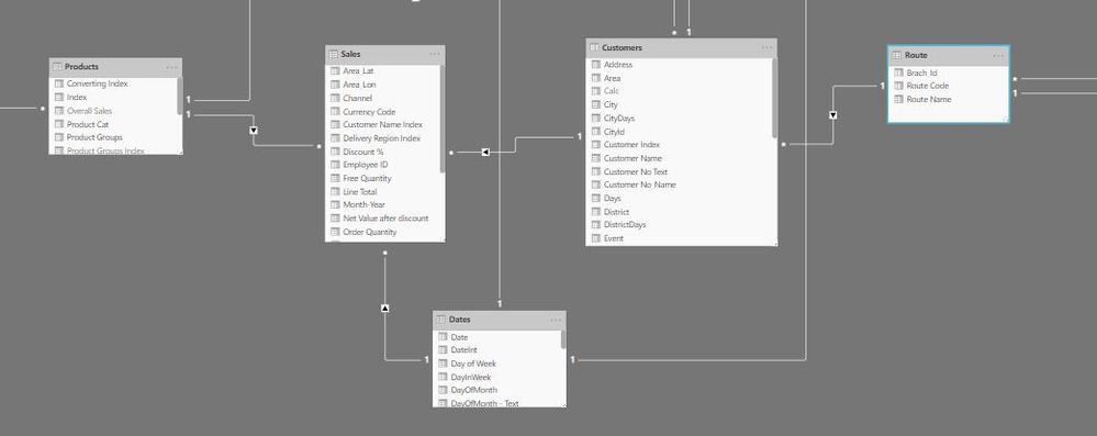
Just to explain my case, please look at the screen-shot below:
Total Quantity = SUMX(Sales,DIVIDE(Sales[Order Quantity],RELATED(Products[Converting Index]),0))
And another Measure to calculate the difference between each quarter and the preceding one as the following:
QTY Quarter Difference = [Total Quantity]-CALCULATE([Total Quantity],DATEADD(Dates[Date],-1,QUARTER))
There is a date table In relationship with (1:m) between Date table and sales table, I need to do a color diverging for (Total Quantity) measure start from the lowest (high red) and (yellow in between) and (high green for the maximum),
Please let me know if you solution fit with the case above on my thread from two perspectives:
1-Dax expression.
2-Use (1) in the conditional formatting.
Thank you
- Mark as New
- Bookmark
- Subscribe
- Mute
- Subscribe to RSS Feed
- Permalink
- Report Inappropriate Content
- Mark as New
- Bookmark
- Subscribe
- Mute
- Subscribe to RSS Feed
- Permalink
- Report Inappropriate Content
Hi @MAAbdullah_47 ,
You want to base the conditional on the Total quantity? for the first line all values compare with 149105.32 is this correct?
Can you share a sample file?
If there is sensitive information you can send it trough private message, or use a mockupfile.
Regards
Miguel Félix
Did I answer your question? Mark my post as a solution!
Proud to be a Super User!
Check out my blog: Power BI em Português- Mark as New
- Bookmark
- Subscribe
- Mute
- Subscribe to RSS Feed
- Permalink
- Report Inappropriate Content
Thank you @MFelix Actually not, I mean to compare Total quantity(TQ) each quarter No with the preceding Quarter (Q(n) vs Q(n-1)) here is an example (refer to the screen-shot) in the first line of the matrix for the customer routs:
In Q1 = 37,722.68
Q2 = 38,859.33
Q3 = 39,038.00
Q4 = 33,484.75
The color diverging should be something like this (Horisintal compare not vertical compare):
Q1 (green +)
Q2(green ++)
Q3(green +++)
Q4(maybe red).
For the data, It is too confidential but I think the structure is common in Retail Industry Please look at the below
Screen-Shot:
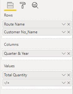
For the setting of the matrix here is the setting:
For the conditional formatting here is the screen-shot that I would like to be :

For the measures, I sent it In my previous post, I hope the Case is more clear now.
Again thank you @MFelix for your help and support.
- Mark as New
- Bookmark
- Subscribe
- Mute
- Subscribe to RSS Feed
- Permalink
- Report Inappropriate Content
Hi @MAAbdullah_47 ,
Taking into consideration that you have a measure taht calculates the difference between quarters that should be the measure you use on your condittional formatting.
Be aware that you do not need to have that measure in the matrix the context will allow to evaluate it even if not in the matrix.
Regards
Miguel Félix
Did I answer your question? Mark my post as a solution!
Proud to be a Super User!
Check out my blog: Power BI em Português- Mark as New
- Bookmark
- Subscribe
- Mute
- Subscribe to RSS Feed
- Permalink
- Report Inappropriate Content
Sorry, @MFelix I didn't Understand your answer could explain with some details?
- Mark as New
- Bookmark
- Subscribe
- Mute
- Subscribe to RSS Feed
- Permalink
- Report Inappropriate Content
You refered that you have a measure that calculates the diference between quarters correct?
If this is true then use thst measure for your conditional formatting.
Regards
Miguel Félix
Did I answer your question? Mark my post as a solution!
Proud to be a Super User!
Check out my blog: Power BI em Português- Mark as New
- Bookmark
- Subscribe
- Mute
- Subscribe to RSS Feed
- Permalink
- Report Inappropriate Content
I need to do the diverging of the color (Horisintally) for the measure (Total quantity) while the conditional formatting do it Vertically this is the problem. You introduced a diverging case (60%) similar to me by comparing the current cell in the same line by the last column (Total) in the same horizontal line, I need to do same but between each cell of (Total Quantity) (Q(n) vs Q(n-1)) I hope the Idea clear.
- Mark as New
- Bookmark
- Subscribe
- Mute
- Subscribe to RSS Feed
- Permalink
- Report Inappropriate Content
Thank you @MFelix I mean the measure that I need to do diverging in color is (Total Quantity), for the difference measure it is easy to do that because it is (+,-) results, the real challenge is on the measure (Total quantity) needs a programmatic solution using (DAX) that's what I'm looking for, did I make the Idea clear?
- Mark as New
- Bookmark
- Subscribe
- Mute
- Subscribe to RSS Feed
- Permalink
- Report Inappropriate Content
Thank you so much @MFelix , Got it I'll try it by tomorrow cuz I'm now back home and if it works I'll give you my thumb👍
Helpful resources

Microsoft Fabric Learn Together
Covering the world! 9:00-10:30 AM Sydney, 4:00-5:30 PM CET (Paris/Berlin), 7:00-8:30 PM Mexico City

Power BI Monthly Update - April 2024
Check out the April 2024 Power BI update to learn about new features.

| User | Count |
|---|---|
| 107 | |
| 98 | |
| 78 | |
| 66 | |
| 53 |
| User | Count |
|---|---|
| 144 | |
| 104 | |
| 100 | |
| 86 | |
| 64 |

