- Power BI forums
- Updates
- News & Announcements
- Get Help with Power BI
- Desktop
- Service
- Report Server
- Power Query
- Mobile Apps
- Developer
- DAX Commands and Tips
- Custom Visuals Development Discussion
- Health and Life Sciences
- Power BI Spanish forums
- Translated Spanish Desktop
- Power Platform Integration - Better Together!
- Power Platform Integrations (Read-only)
- Power Platform and Dynamics 365 Integrations (Read-only)
- Training and Consulting
- Instructor Led Training
- Dashboard in a Day for Women, by Women
- Galleries
- Community Connections & How-To Videos
- COVID-19 Data Stories Gallery
- Themes Gallery
- Data Stories Gallery
- R Script Showcase
- Webinars and Video Gallery
- Quick Measures Gallery
- 2021 MSBizAppsSummit Gallery
- 2020 MSBizAppsSummit Gallery
- 2019 MSBizAppsSummit Gallery
- Events
- Ideas
- Custom Visuals Ideas
- Issues
- Issues
- Events
- Upcoming Events
- Community Blog
- Power BI Community Blog
- Custom Visuals Community Blog
- Community Support
- Community Accounts & Registration
- Using the Community
- Community Feedback
Register now to learn Fabric in free live sessions led by the best Microsoft experts. From Apr 16 to May 9, in English and Spanish.
- Power BI forums
- Forums
- Get Help with Power BI
- Desktop
- Re: Conditional color formatting - overview
- Subscribe to RSS Feed
- Mark Topic as New
- Mark Topic as Read
- Float this Topic for Current User
- Bookmark
- Subscribe
- Printer Friendly Page
- Mark as New
- Bookmark
- Subscribe
- Mute
- Subscribe to RSS Feed
- Permalink
- Report Inappropriate Content
Conditional color formatting - overview
New to Power BI and it seems like there is no real way to do any dynamic color formatting based on a condition.
So if I just want to have my KPI be red if below a certain value and green if above a certain value that is not possible? If not are ther any work arounds to formatting colors in Power BI based on certain conditions.
I really like Power BI for data gathering and modeling but it seems very flawed in its functionality for creating a good UI experience. I am a heavy Qlik user and it seems like there is so much more front end UI functionalityin Qlik - hopefully I am just new and not seeing all the features.
Z
Solved! Go to Solution.
- Mark as New
- Bookmark
- Subscribe
- Mute
- Subscribe to RSS Feed
- Permalink
- Report Inappropriate Content
@Anonymous,
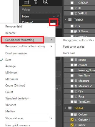
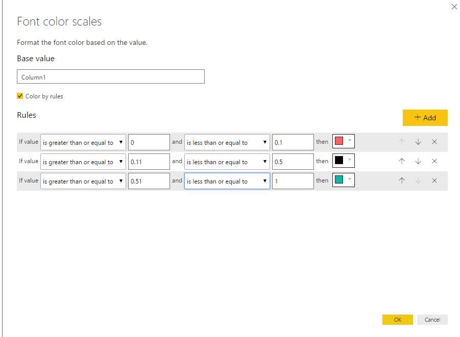
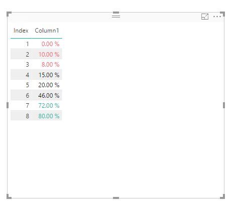
Using conditional formatting feature in Power BI Desktop, you can achieve your requirement. Please review the following screenshots.
Regards,
Lydia
If this post helps, then please consider Accept it as the solution to help the other members find it more quickly.
- Mark as New
- Bookmark
- Subscribe
- Mute
- Subscribe to RSS Feed
- Permalink
- Report Inappropriate Content
Standard KPI doesn't allow you to give the range, you have to probably look for custom KPI visual , here is link to KPI with lot of customization you can do with it.
Subscribe to the @PowerBIHowTo YT channel for an upcoming video on List and Record functions in Power Query!!
Learn Power BI and Fabric - subscribe to our YT channel - Click here: @PowerBIHowTo
If my solution proved useful, I'd be delighted to receive Kudos. When you put effort into asking a question, it's equally thoughtful to acknowledge and give Kudos to the individual who helped you solve the problem. It's a small gesture that shows appreciation and encouragement! ❤
Did I answer your question? Mark my post as a solution. Proud to be a Super User! Appreciate your Kudos 🙂
Feel free to email me with any of your BI needs.
- Mark as New
- Bookmark
- Subscribe
- Mute
- Subscribe to RSS Feed
- Permalink
- Report Inappropriate Content
- Mark as New
- Bookmark
- Subscribe
- Mute
- Subscribe to RSS Feed
- Permalink
- Report Inappropriate Content
Hi,
I'm new on this forum and I hope I'm on the good topic.
I really like Power BI and I would like to show to my team that we should move to Power BI for daily, weely and monthly KPI instead of excel. But we have strict standard for the visual interface for our KPI.
Could you let me know if there is a feature in Power BI to respect the criterias below ? Standard graph or a safe custom one (something official)?
Thank you!
Our KPI shall:
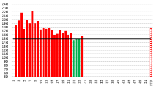
- Data value (count) : Bars
- Objective : Straight line
- If value is lower than objective , the bars shall be red
- If value is higher than objective, the bars shall be green
- Could be also the other way : lower than objective : green and higher than objective : red
ex:
- Mark as New
- Bookmark
- Subscribe
- Mute
- Subscribe to RSS Feed
- Permalink
- Report Inappropriate Content
So, the KPI visual has a Target Goals section in the Fields area. Often, you use an Enter Data query to just create your goals in a wide, single row table and just drag the appropriate column into the field. Or, just create a goal measure like:
My Goal = 37
And use that. You will need something in the Trend Axis field, use any column. If you really do not want any trend axis displayed, create a column like:
My Column = 0
And put that in your Trend Axis.
Note that coditional formatting is available in Tables and Matrix visualizations as well. You can click on the little down arrow for a column or measure in the Fields area and choose "Conditional formatting" if it is a numeric field.
@ me in replies or I'll lose your thread!!!
Instead of a Kudo, please vote for this idea
Become an expert!: Enterprise DNA
External Tools: MSHGQM
YouTube Channel!: Microsoft Hates Greg
Latest book!: The Definitive Guide to Power Query (M)
DAX is easy, CALCULATE makes DAX hard...
- Mark as New
- Bookmark
- Subscribe
- Mute
- Subscribe to RSS Feed
- Permalink
- Report Inappropriate Content
Thanks for the feedback!
So it doesn't look like there is conditional formatting in KPI',s correct?
Z
- Mark as New
- Bookmark
- Subscribe
- Mute
- Subscribe to RSS Feed
- Permalink
- Report Inappropriate Content
KPI by default shows green above a certain value and red below that value. Neutral is Yellow by default. You can change the default settings by using the Format area (paint roller icon) in the Visualizations pane under Color coding. You can change what is good and you can change your good, neutral and bad colors.
If you are talking about the Gauge visual from the other post, then it has different options in the Format area. Under Gauge axis, you can just type in your Max and your Target. You can change the colors under Data colors, etc.
@ me in replies or I'll lose your thread!!!
Instead of a Kudo, please vote for this idea
Become an expert!: Enterprise DNA
External Tools: MSHGQM
YouTube Channel!: Microsoft Hates Greg
Latest book!: The Definitive Guide to Power Query (M)
DAX is easy, CALCULATE makes DAX hard...
- Mark as New
- Bookmark
- Subscribe
- Mute
- Subscribe to RSS Feed
- Permalink
- Report Inappropriate Content
Thanks but how can I change the range...like if I want it specifically 0-10% RED, 11%-50% black, 51%-100% green? I don't see anywhere to change the ranges for each color. Thanks.
- Mark as New
- Bookmark
- Subscribe
- Mute
- Subscribe to RSS Feed
- Permalink
- Report Inappropriate Content
This is exactly what I want but I do not see this selection for KPIs. What visualization are you using?
Thanks for the help,
Z
- Mark as New
- Bookmark
- Subscribe
- Mute
- Subscribe to RSS Feed
- Permalink
- Report Inappropriate Content
That is a Table visualization.
@ me in replies or I'll lose your thread!!!
Instead of a Kudo, please vote for this idea
Become an expert!: Enterprise DNA
External Tools: MSHGQM
YouTube Channel!: Microsoft Hates Greg
Latest book!: The Definitive Guide to Power Query (M)
DAX is easy, CALCULATE makes DAX hard...
- Mark as New
- Bookmark
- Subscribe
- Mute
- Subscribe to RSS Feed
- Permalink
- Report Inappropriate Content
Standard KPI doesn't allow you to give the range, you have to probably look for custom KPI visual , here is link to KPI with lot of customization you can do with it.
Subscribe to the @PowerBIHowTo YT channel for an upcoming video on List and Record functions in Power Query!!
Learn Power BI and Fabric - subscribe to our YT channel - Click here: @PowerBIHowTo
If my solution proved useful, I'd be delighted to receive Kudos. When you put effort into asking a question, it's equally thoughtful to acknowledge and give Kudos to the individual who helped you solve the problem. It's a small gesture that shows appreciation and encouragement! ❤
Did I answer your question? Mark my post as a solution. Proud to be a Super User! Appreciate your Kudos 🙂
Feel free to email me with any of your BI needs.
- Mark as New
- Bookmark
- Subscribe
- Mute
- Subscribe to RSS Feed
- Permalink
- Report Inappropriate Content
@Anonymous,
Using conditional formatting feature in Power BI Desktop, you can achieve your requirement. Please review the following screenshots.
Regards,
Lydia
If this post helps, then please consider Accept it as the solution to help the other members find it more quickly.
- Mark as New
- Bookmark
- Subscribe
- Mute
- Subscribe to RSS Feed
- Permalink
- Report Inappropriate Content
Thanks for your suggestion
That solution is good but not enough. Because the range values are fixed. My question is ¿ Is it posible that the range could be read it from a KPI parameters table where we can make conditions using columns instead of fixed values and some other conditions like dates ? Because some KPIs could be green last year but if I change it with new ranges when I see my dash board I would need to see green last year but may be read this year. Some thing like
year-month of sales month >= KPI.Parameter.Year-MonthValidFrom and
year-month of sales month <= KPI.Parameter.Year-MonthValidTo and
avg(sales) >= KPI.Parameter.StartRange and
avg(sales) <= KPI.Parameter.EndRange and
then
KPI.Parameter.colorcode
Dou you think that Power BI could have some functionality or some thing like that.
I will appreciate your suggestions or opinion
Thanks
- Mark as New
- Bookmark
- Subscribe
- Mute
- Subscribe to RSS Feed
- Permalink
- Report Inappropriate Content
That solution is good but not enough. Because the range values are fixed. My question is ¡ Is it posible that the range could be read it from a KPI parameters table where we can make conditions using columns instead of fixed values and some other conditions like dates because some KPIs could be green last year but if I change it with new ranges when I see my dash board I would need to see green last year but may be read this year. Some thing like
year-month of sales month >= KPI.Parameter.Year-MonthValidFrom and
year-month of sales month <= KPI.Parameter.Year-MonthValidTo and
avg(sales) >= KPI.Parameter.StartRange and
avg(sales) <= KPI.Parameter.EndRange and
then
KPI.Parameter.colorcode
Dou you think that Power BI could have some functionality or some thing like that.
I will appreciate your suggestions or opinion
Thanks
- Mark as New
- Bookmark
- Subscribe
- Mute
- Subscribe to RSS Feed
- Permalink
- Report Inappropriate Content
I have the same issue, for gauges. I'm a novice, and cannot follow the instruction to "Review the following screen shots." I don't know what the screen shots are telling me to do. Believe me, I wich I did!. I need something like the following (I'm making some assumptions about what I THINK the scren shots are saying, but my confidence that I am correct is very low): "1-Highlight the visual you want to conditionally format. 2-Go into Data View. 3-Click "Modeling." 4-Click "New Column." Name it whatever you want. 5-... what do I do next? (if 1-4 are even correct).
I have 14 gauges on one page in a Desktop report. Each gauge is associated with a KPI. The arc in the gauge gets filled with the Actual result for the period (such as month or quarter), and a target is shown by a line going across the arc at the appropriate place. I want to fill the arc with Green, Yellow or Red depending on the result against the target, and depending on the Year and Month a User slects from slicers. A twist is that the target might be different from period to period (for example, the target might be set per month, rising each month to the year-end number in December).
Is this possible? As I said, I'm a novice, but I need to deliver this. I don't know DAX, so I need the specific code, where to put it, step-by step. I realize this is a lot to ask, but if anyone is willing to help, I will certainly appreciate it.
Helpful resources

Microsoft Fabric Learn Together
Covering the world! 9:00-10:30 AM Sydney, 4:00-5:30 PM CET (Paris/Berlin), 7:00-8:30 PM Mexico City

Power BI Monthly Update - April 2024
Check out the April 2024 Power BI update to learn about new features.

| User | Count |
|---|---|
| 111 | |
| 100 | |
| 80 | |
| 64 | |
| 58 |
| User | Count |
|---|---|
| 148 | |
| 111 | |
| 93 | |
| 84 | |
| 66 |


