- Power BI forums
- Updates
- News & Announcements
- Get Help with Power BI
- Desktop
- Service
- Report Server
- Power Query
- Mobile Apps
- Developer
- DAX Commands and Tips
- Custom Visuals Development Discussion
- Health and Life Sciences
- Power BI Spanish forums
- Translated Spanish Desktop
- Power Platform Integration - Better Together!
- Power Platform Integrations (Read-only)
- Power Platform and Dynamics 365 Integrations (Read-only)
- Training and Consulting
- Instructor Led Training
- Dashboard in a Day for Women, by Women
- Galleries
- Community Connections & How-To Videos
- COVID-19 Data Stories Gallery
- Themes Gallery
- Data Stories Gallery
- R Script Showcase
- Webinars and Video Gallery
- Quick Measures Gallery
- 2021 MSBizAppsSummit Gallery
- 2020 MSBizAppsSummit Gallery
- 2019 MSBizAppsSummit Gallery
- Events
- Ideas
- Custom Visuals Ideas
- Issues
- Issues
- Events
- Upcoming Events
- Community Blog
- Power BI Community Blog
- Custom Visuals Community Blog
- Community Support
- Community Accounts & Registration
- Using the Community
- Community Feedback
Register now to learn Fabric in free live sessions led by the best Microsoft experts. From Apr 16 to May 9, in English and Spanish.
- Power BI forums
- Forums
- Get Help with Power BI
- Desktop
- Re: Conditional Formatting based on Average Value ...
- Subscribe to RSS Feed
- Mark Topic as New
- Mark Topic as Read
- Float this Topic for Current User
- Bookmark
- Subscribe
- Printer Friendly Page
- Mark as New
- Bookmark
- Subscribe
- Mute
- Subscribe to RSS Feed
- Permalink
- Report Inappropriate Content
Conditional Formatting based on Average Value of Measure
Hi,
I hope you can help me out with this..
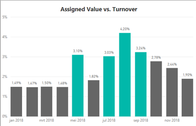
I created a bar chart with for each month the percentage assigend value versus turnover.
But I would like to color the bars if the % is higher than the average %. The bars are now colored if the % > 3%.
The bars are based on the following measure:
Solved! Go to Solution.
- Mark as New
- Bookmark
- Subscribe
- Mute
- Subscribe to RSS Feed
- Permalink
- Report Inappropriate Content
hi, @Anonymous
Is " 3% " the overall average value?
If so, You could try this way:
Add a new average Value measure by ALLSELECTED/ ALL like
NOTE: using ALLSELECTED or ALL depends on whether you will filter date on visual.
NEW Assigned Value versus Turnover 1 =
DIVIDE (
    [Total Assigned Value],
    CALCULATE (
        SUM ( 'Claims&Billing'[Turnover Actuals] ),
        ALLSELECTED ( 'Date'[Date] )
    )
)
OR
NEW Assigned Value versus Turnover 1 =
DIVIDE (
    [Total Assigned Value],
    CALCULATE (
        SUM ( 'Claims&Billing'[Turnover Actuals] ),
        ALL ( 'Date'[Date] )
    )
)
Step2:
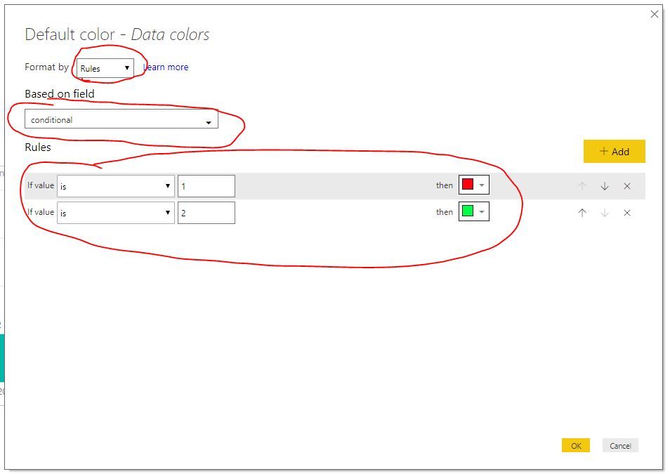
Create a conditional measure like
conditional = IF([Assigned Value versus Turnover]>[NEW Assigned Value versus Turnover 1],1,2)
Step3:
Select bar chart, then click Format->Date colors->Advanced controls
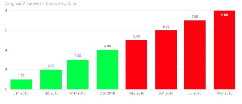
Result:
In my case, the average is 4.5
Best Regards,
Lin
If this post helps, then please consider Accept it as the solution to help the other members find it more quickly.
- Mark as New
- Bookmark
- Subscribe
- Mute
- Subscribe to RSS Feed
- Permalink
- Report Inappropriate Content
How would I achieve this if I just want to conditionally format the totals?
- Mark as New
- Bookmark
- Subscribe
- Mute
- Subscribe to RSS Feed
- Permalink
- Report Inappropriate Content
Hi!
The option "Select bar chart, then click Format->Date colors->Advanced controls" is missing in mine. Do you have any idea why?
Thanks,
Soraia
- Mark as New
- Bookmark
- Subscribe
- Mute
- Subscribe to RSS Feed
- Permalink
- Report Inappropriate Content
hi, @SoraiaT
Please update power bi desktop to the latest version.
In November 2018, this is moved to Date colors from field.
With this upgrade, you’ll notice the color saturation bucket is no longer in the field well. Instead to format, you’ll go to the Data colors card in the formatting pane. Here you can format with the color pickers as normal or select the Advanced controls option to launch the conditional formatting dialog.
https://powerbi.microsoft.com/en-us/blog/power-bi-desktop-november-2018-feature-summary/
Best Regards,
Lin
If this post helps, then please consider Accept it as the solution to help the other members find it more quickly.
- Mark as New
- Bookmark
- Subscribe
- Mute
- Subscribe to RSS Feed
- Permalink
- Report Inappropriate Content
Helpful resources

Microsoft Fabric Learn Together
Covering the world! 9:00-10:30 AM Sydney, 4:00-5:30 PM CET (Paris/Berlin), 7:00-8:30 PM Mexico City

Power BI Monthly Update - April 2024
Check out the April 2024 Power BI update to learn about new features.

| User | Count |
|---|---|
| 107 | |
| 98 | |
| 78 | |
| 66 | |
| 53 |
| User | Count |
|---|---|
| 144 | |
| 104 | |
| 100 | |
| 86 | |
| 64 |


