- Power BI forums
- Updates
- News & Announcements
- Get Help with Power BI
- Desktop
- Service
- Report Server
- Power Query
- Mobile Apps
- Developer
- DAX Commands and Tips
- Custom Visuals Development Discussion
- Health and Life Sciences
- Power BI Spanish forums
- Translated Spanish Desktop
- Power Platform Integration - Better Together!
- Power Platform Integrations (Read-only)
- Power Platform and Dynamics 365 Integrations (Read-only)
- Training and Consulting
- Instructor Led Training
- Dashboard in a Day for Women, by Women
- Galleries
- Community Connections & How-To Videos
- COVID-19 Data Stories Gallery
- Themes Gallery
- Data Stories Gallery
- R Script Showcase
- Webinars and Video Gallery
- Quick Measures Gallery
- 2021 MSBizAppsSummit Gallery
- 2020 MSBizAppsSummit Gallery
- 2019 MSBizAppsSummit Gallery
- Events
- Ideas
- Custom Visuals Ideas
- Issues
- Issues
- Events
- Upcoming Events
- Community Blog
- Power BI Community Blog
- Custom Visuals Community Blog
- Community Support
- Community Accounts & Registration
- Using the Community
- Community Feedback
Register now to learn Fabric in free live sessions led by the best Microsoft experts. From Apr 16 to May 9, in English and Spanish.
- Power BI forums
- Forums
- Get Help with Power BI
- Desktop
- Re: Conditional Formatting bar chart visual breaks...
- Subscribe to RSS Feed
- Mark Topic as New
- Mark Topic as Read
- Float this Topic for Current User
- Bookmark
- Subscribe
- Printer Friendly Page
- Mark as New
- Bookmark
- Subscribe
- Mute
- Subscribe to RSS Feed
- Permalink
- Report Inappropriate Content
Conditional Formatting bar chart visual breaks during filtering
Hello,
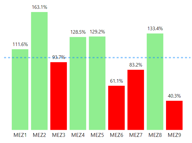
I made a simple bar chart visual showing the Percent to Plan for a picker and conditionally formatted the bars to be green if greater than or equal to 100% and red if below 100%.
The below data is the aggregation of an entire week broken down by work area.
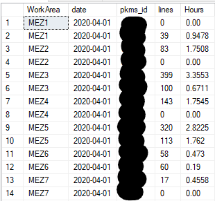
On a separate table on the same page, I have the same data broken up by day and when I click on one of the days, the rest of the data filters accordingly.
This is where my conditional formatting breaks and will show a red bar for a work area that is over 100% or green bar that is less than 100% following the week aggregation value instead of the filtered aggregation for the particular day.
Solved! Go to Solution.
- Mark as New
- Bookmark
- Subscribe
- Mute
- Subscribe to RSS Feed
- Permalink
- Report Inappropriate Content
Yes I found the solve and its actually pretty simple. You need to find the "edit interactions" button which can be found by first clicking on the date table that is doing the filtering. From there you should see the format option appear between "help" and "Data/Drill"
After you click on edit interactions each visual will have a small popup that looks like this(highlighted):
The options that you are given from left to right are filter, highlight, and none. For our purposes, you are going to want to select filter option and then you should see the conditional formatting work with that particular interaction between visuals. You will have to do this with each visual that you want to use as a filter since the default is to highlight instead of filter like we want. Hope that helps.
- Mark as New
- Bookmark
- Subscribe
- Mute
- Subscribe to RSS Feed
- Permalink
- Report Inappropriate Content
@bogilvieiii I'm currently running into the same issue. Did you ever fix yours? I have a bar chart with a measure color conditioning applied to it. When not filtered, it's fine. When filtered, it breaks.
my color conditioning is set up for field value and my field is "color 2" which is below.
- Mark as New
- Bookmark
- Subscribe
- Mute
- Subscribe to RSS Feed
- Permalink
- Report Inappropriate Content
I've tried "SWTICH" too.
- Mark as New
- Bookmark
- Subscribe
- Mute
- Subscribe to RSS Feed
- Permalink
- Report Inappropriate Content
your previous measure works fine no need to change it. Just follow the steps I laid out in my previous reply back to you
- Mark as New
- Bookmark
- Subscribe
- Mute
- Subscribe to RSS Feed
- Permalink
- Report Inappropriate Content
Yes I found the solve and its actually pretty simple. You need to find the "edit interactions" button which can be found by first clicking on the date table that is doing the filtering. From there you should see the format option appear between "help" and "Data/Drill"
After you click on edit interactions each visual will have a small popup that looks like this(highlighted):
The options that you are given from left to right are filter, highlight, and none. For our purposes, you are going to want to select filter option and then you should see the conditional formatting work with that particular interaction between visuals. You will have to do this with each visual that you want to use as a filter since the default is to highlight instead of filter like we want. Hope that helps.
- Mark as New
- Bookmark
- Subscribe
- Mute
- Subscribe to RSS Feed
- Permalink
- Report Inappropriate Content
Oh jesus that was it?! Thanks!!!!
- Mark as New
- Bookmark
- Subscribe
- Mute
- Subscribe to RSS Feed
- Permalink
- Report Inappropriate Content
Hi @bogilvieiii ,
Does that make sense? If so, kindly mark the proper reply as a solution to help others having the similar issue and close the case. If not, let me know and I'll try to help you further.
Best regards
Amy
- Mark as New
- Bookmark
- Subscribe
- Mute
- Subscribe to RSS Feed
- Permalink
- Report Inappropriate Content
Can you share the rule? I prefer create a color measure and use that under conditional formatting by using field and measure
Color sales = if(AVERAGE(Sales[Sales Amount])<170,"green","red")
https://docs.microsoft.com/en-us/power-bi/desktop-conditional-table-formatting#color-by-color-values
Microsoft Power BI Learning Resources, 2023 !!
Learn Power BI - Full Course with Dec-2022, with Window, Index, Offset, 100+ Topics !!
Did I answer your question? Mark my post as a solution! Appreciate your Kudos !! Proud to be a Super User! !!
- Mark as New
- Bookmark
- Subscribe
- Mute
- Subscribe to RSS Feed
- Permalink
- Report Inappropriate Content
Hi @amitchandak
I set the conditional formatting to format by "Field Value" and based it off my "Background Color" which is the following:

Helpful resources

Microsoft Fabric Learn Together
Covering the world! 9:00-10:30 AM Sydney, 4:00-5:30 PM CET (Paris/Berlin), 7:00-8:30 PM Mexico City

Power BI Monthly Update - April 2024
Check out the April 2024 Power BI update to learn about new features.

| User | Count |
|---|---|
| 114 | |
| 101 | |
| 78 | |
| 75 | |
| 49 |
| User | Count |
|---|---|
| 145 | |
| 108 | |
| 107 | |
| 89 | |
| 61 |


