- Power BI forums
- Updates
- News & Announcements
- Get Help with Power BI
- Desktop
- Service
- Report Server
- Power Query
- Mobile Apps
- Developer
- DAX Commands and Tips
- Custom Visuals Development Discussion
- Health and Life Sciences
- Power BI Spanish forums
- Translated Spanish Desktop
- Power Platform Integration - Better Together!
- Power Platform Integrations (Read-only)
- Power Platform and Dynamics 365 Integrations (Read-only)
- Training and Consulting
- Instructor Led Training
- Dashboard in a Day for Women, by Women
- Galleries
- Community Connections & How-To Videos
- COVID-19 Data Stories Gallery
- Themes Gallery
- Data Stories Gallery
- R Script Showcase
- Webinars and Video Gallery
- Quick Measures Gallery
- 2021 MSBizAppsSummit Gallery
- 2020 MSBizAppsSummit Gallery
- 2019 MSBizAppsSummit Gallery
- Events
- Ideas
- Custom Visuals Ideas
- Issues
- Issues
- Events
- Upcoming Events
- Community Blog
- Power BI Community Blog
- Custom Visuals Community Blog
- Community Support
- Community Accounts & Registration
- Using the Community
- Community Feedback
Register now to learn Fabric in free live sessions led by the best Microsoft experts. From Apr 16 to May 9, in English and Spanish.
- Power BI forums
- Forums
- Get Help with Power BI
- Desktop
- Conditional Formatting at Row Level on Matrix
- Subscribe to RSS Feed
- Mark Topic as New
- Mark Topic as Read
- Float this Topic for Current User
- Bookmark
- Subscribe
- Printer Friendly Page
- Mark as New
- Bookmark
- Subscribe
- Mute
- Subscribe to RSS Feed
- Permalink
- Report Inappropriate Content
Conditional Formatting at Row Level on Matrix
Hi
Currently, Conditional formatting is very poor on visuals for Power BI.
To do conditional formatting on matrix, possibilities are weak because I use pivoted data (Attribute, Value)
Attributes can be "K. Visco@C" or "BN" , and Values are all pivoted data
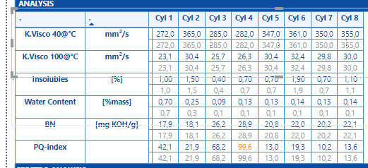
So, we have to create several matrix visuals for each row and then we need to put them under each one. (screenshot)
It could be good to have more specific conditional formatting that acts row by row !
Do you know how I can do it ?
Thanks
- Mark as New
- Bookmark
- Subscribe
- Mute
- Subscribe to RSS Feed
- Permalink
- Report Inappropriate Content
Hi , @augustindelaf
Could you please tell me whether your problem has been solved?
If it is, please mark the helpful replies or add your reply as Answered to close this thread?
Best Regards,
Community Support Team _ Eason
- Mark as New
- Bookmark
- Subscribe
- Mute
- Subscribe to RSS Feed
- Permalink
- Report Inappropriate Content
Not solved
- Mark as New
- Bookmark
- Subscribe
- Mute
- Subscribe to RSS Feed
- Permalink
- Report Inappropriate Content
Not very clear. Can you explain bit more
Microsoft Power BI Learning Resources, 2023 !!
Learn Power BI - Full Course with Dec-2022, with Window, Index, Offset, 100+ Topics !!
Did I answer your question? Mark my post as a solution! Appreciate your Kudos !! Proud to be a Super User! !!
- Mark as New
- Bookmark
- Subscribe
- Mute
- Subscribe to RSS Feed
- Permalink
- Report Inappropriate Content
Hi again @amitchandak
In my matrix, each attribute has a row.
My Conditional formatting must be specific for each attribute.
i.e :
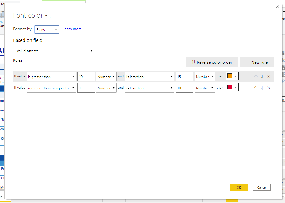
-for 'BN', turn orange if value is between 10 and 15, and red if value < 10.
-for 'Iron', turn orange if value > 100 and red if value >200
-for 'Chromium', turn orange if value > 600
All these attributes have their own rules, and I would like to have one single Matrix that enables me to manage conditional formatting of each row.
But not possible
Then, the solution that I envisionned is to create one matrix for each attribute, and then I am able to set the conditional formatting. (see screenshot, example for 'BN').
My only problem is that it becomes ugly when I export the report as PDF because Matrix visuals are never well aligned as if it was one single Matrix. It would also be more convenient to have one single Matrix.
Is it clear now ?
- Mark as New
- Bookmark
- Subscribe
- Mute
- Subscribe to RSS Feed
- Permalink
- Report Inappropriate Content
Try to create a measure like this
Color Date = if(FIRSTNONBLANK('Date'[date],TODAY()) <today(),"lightgreen","red")As you will display the dim, the firstnonblank will give that value. You should able to add multiple conditions. Use Switch true, if needed
Now in the above UI, use field option and choose this measure.
Appreciate your Kudos. In case, this is the solution you are looking for, mark it as the Solution.
In case it does not help, please provide additional information and mark me with @
Thanks. My Recent Blogs -Decoding Direct Query - Time Intelligence, Winner Coloring on MAP, HR Analytics, Power BI Working with Non-Standard TimeAnd Comparing Data Across Date Ranges
Connect on Linkedin
Microsoft Power BI Learning Resources, 2023 !!
Learn Power BI - Full Course with Dec-2022, with Window, Index, Offset, 100+ Topics !!
Did I answer your question? Mark my post as a solution! Appreciate your Kudos !! Proud to be a Super User! !!
- Mark as New
- Bookmark
- Subscribe
- Mute
- Subscribe to RSS Feed
- Permalink
- Report Inappropriate Content
Hi @amitchandak
Sorry but the solution is not very clear either.
Please, could you provide me with an example, or a sample file ?
Many thanks in advance
BR
Augustin
- Mark as New
- Bookmark
- Subscribe
- Mute
- Subscribe to RSS Feed
- Permalink
- Report Inappropriate Content
This is an overloaded file. Refer page 3 and Search for measure "Color Date"
https://www.dropbox.com/s/unfqa025ca7p3vw/CompareRange_timedim.pbix?dl=0
Microsoft Power BI Learning Resources, 2023 !!
Learn Power BI - Full Course with Dec-2022, with Window, Index, Offset, 100+ Topics !!
Did I answer your question? Mark my post as a solution! Appreciate your Kudos !! Proud to be a Super User! !!
- Mark as New
- Bookmark
- Subscribe
- Mute
- Subscribe to RSS Feed
- Permalink
- Report Inappropriate Content
Thanks.
Could you draw the measure with Switch with BN and Iron please ?
As a reminder :
-for 'BN', turn orange if value is between 10 and 15, and red if value < 10.
-for 'Iron', turn orange if value > 100 and red if value >200
-for 'Chromium', turn orange if value > 600
Then I would be able to do it with other attributes and I could mark you answer as Solution.
Best regards,
Augustin
- Mark as New
- Bookmark
- Subscribe
- Mute
- Subscribe to RSS Feed
- Permalink
- Report Inappropriate Content
Helpful resources

Microsoft Fabric Learn Together
Covering the world! 9:00-10:30 AM Sydney, 4:00-5:30 PM CET (Paris/Berlin), 7:00-8:30 PM Mexico City

Power BI Monthly Update - April 2024
Check out the April 2024 Power BI update to learn about new features.

| User | Count |
|---|---|
| 110 | |
| 94 | |
| 80 | |
| 66 | |
| 58 |
| User | Count |
|---|---|
| 150 | |
| 119 | |
| 104 | |
| 87 | |
| 67 |


