- Power BI forums
- Updates
- News & Announcements
- Get Help with Power BI
- Desktop
- Service
- Report Server
- Power Query
- Mobile Apps
- Developer
- DAX Commands and Tips
- Custom Visuals Development Discussion
- Health and Life Sciences
- Power BI Spanish forums
- Translated Spanish Desktop
- Power Platform Integration - Better Together!
- Power Platform Integrations (Read-only)
- Power Platform and Dynamics 365 Integrations (Read-only)
- Training and Consulting
- Instructor Led Training
- Dashboard in a Day for Women, by Women
- Galleries
- Community Connections & How-To Videos
- COVID-19 Data Stories Gallery
- Themes Gallery
- Data Stories Gallery
- R Script Showcase
- Webinars and Video Gallery
- Quick Measures Gallery
- 2021 MSBizAppsSummit Gallery
- 2020 MSBizAppsSummit Gallery
- 2019 MSBizAppsSummit Gallery
- Events
- Ideas
- Custom Visuals Ideas
- Issues
- Issues
- Events
- Upcoming Events
- Community Blog
- Power BI Community Blog
- Custom Visuals Community Blog
- Community Support
- Community Accounts & Registration
- Using the Community
- Community Feedback
Register now to learn Fabric in free live sessions led by the best Microsoft experts. From Apr 16 to May 9, in English and Spanish.
- Power BI forums
- Forums
- Get Help with Power BI
- Desktop
- Conditional Formatting Line Graphs
- Subscribe to RSS Feed
- Mark Topic as New
- Mark Topic as Read
- Float this Topic for Current User
- Bookmark
- Subscribe
- Printer Friendly Page
- Mark as New
- Bookmark
- Subscribe
- Mute
- Subscribe to RSS Feed
- Permalink
- Report Inappropriate Content
Conditional Formatting Line Graphs
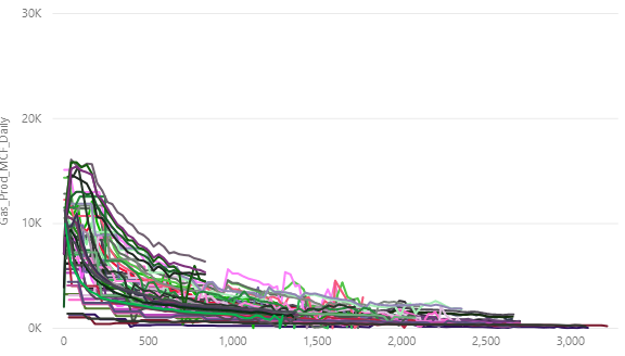
I have a line chart in my dashboard. On the line graph, each line represents one well. This is how I want the data to be segmented. However, I would like to not color each well individually, but to color the wells by operator (i.e. All wells by one operator are one color). Is there a way to tell Power BI to do this?
- Mark as New
- Bookmark
- Subscribe
- Mute
- Subscribe to RSS Feed
- Permalink
- Report Inappropriate Content
Hi @Anonymous ,
I don't quite understand what you want. Please give me a concrete example.
Best Regards,
Icey
- Mark as New
- Bookmark
- Subscribe
- Mute
- Subscribe to RSS Feed
- Permalink
- Report Inappropriate Content
Line graph of production by well. (Each well is a different color). I want to instead to color by a variable I have called "Operator". So essentially I want to keep the well level data graphed, but I want all wells within 1 operator to be the same color. That way the user can visually see the differences in well performance by operator.
- Mark as New
- Bookmark
- Subscribe
- Mute
- Subscribe to RSS Feed
- Permalink
- Report Inappropriate Content
Hi @Anonymous ,
I create an example:
| Operator | Well | Value | Date |
| O1 | W1 | 1 | 1/1/2019 |
| O1 | W1 | 2 | 2/1/2019 |
| O1 | W1 | 3 | 3/1/2019 |
| O1 | W2 | 5 | 1/1/2019 |
| O1 | W2 | 4 | 2/1/2019 |
| O1 | W2 | 6 | 3/1/2019 |
| O1 | W3 | 3 | 1/1/2019 |
| O1 | W3 | 4 | 2/1/2019 |
| O1 | W3 | 5 | 3/1/2019 |
| O2 | W4 | 6 | 1/1/2019 |
| O2 | W4 | 3 | 2/1/2019 |
| O2 | W4 | 5 | 3/1/2019 |
| O2 | W5 | 7 | 1/1/2019 |
| O2 | W5 | 9 | 2/1/2019 |
| O2 | W5 | 5 | 3/1/2019 |
| O2 | W6 | 4 | 1/1/2019 |
| O2 | W6 | 6 | 2/1/2019 |
| O2 | W6 | 2 | 3/1/2019 |
If I don't misunderstand, in this example, what you want to do is to divide the 6 lines into two groups by Operator and lines in each group has the same color. However, I'm afraid that Power BI doesn't support it now.
Maybe you can use Slicer to filter by operators.
And here is a similar idea and you can vote it.
Best Regards,
Icey
If this post helps, then please consider Accept it as the solution to help the other members find it more quickly.
- Mark as New
- Bookmark
- Subscribe
- Mute
- Subscribe to RSS Feed
- Permalink
- Report Inappropriate Content
Unfortunately I have a slicer on already, and that isn't sufficient. I want users to be able to select multiple operators and be able to visually compare the wells between them. I thought there was way to do this with conditional formatting in the newest version of Power BI, but this option appears to be missing.
Helpful resources

Microsoft Fabric Learn Together
Covering the world! 9:00-10:30 AM Sydney, 4:00-5:30 PM CET (Paris/Berlin), 7:00-8:30 PM Mexico City

Power BI Monthly Update - April 2024
Check out the April 2024 Power BI update to learn about new features.

| User | Count |
|---|---|
| 111 | |
| 95 | |
| 80 | |
| 68 | |
| 59 |
| User | Count |
|---|---|
| 150 | |
| 119 | |
| 104 | |
| 87 | |
| 67 |


