- Power BI forums
- Updates
- News & Announcements
- Get Help with Power BI
- Desktop
- Service
- Report Server
- Power Query
- Mobile Apps
- Developer
- DAX Commands and Tips
- Custom Visuals Development Discussion
- Health and Life Sciences
- Power BI Spanish forums
- Translated Spanish Desktop
- Power Platform Integration - Better Together!
- Power Platform Integrations (Read-only)
- Power Platform and Dynamics 365 Integrations (Read-only)
- Training and Consulting
- Instructor Led Training
- Dashboard in a Day for Women, by Women
- Galleries
- Community Connections & How-To Videos
- COVID-19 Data Stories Gallery
- Themes Gallery
- Data Stories Gallery
- R Script Showcase
- Webinars and Video Gallery
- Quick Measures Gallery
- 2021 MSBizAppsSummit Gallery
- 2020 MSBizAppsSummit Gallery
- 2019 MSBizAppsSummit Gallery
- Events
- Ideas
- Custom Visuals Ideas
- Issues
- Issues
- Events
- Upcoming Events
- Community Blog
- Power BI Community Blog
- Custom Visuals Community Blog
- Community Support
- Community Accounts & Registration
- Using the Community
- Community Feedback
Register now to learn Fabric in free live sessions led by the best Microsoft experts. From Apr 16 to May 9, in English and Spanish.
- Power BI forums
- Forums
- Get Help with Power BI
- Desktop
- Re: Conditional Format: Icons for text Values
- Subscribe to RSS Feed
- Mark Topic as New
- Mark Topic as Read
- Float this Topic for Current User
- Bookmark
- Subscribe
- Printer Friendly Page
- Mark as New
- Bookmark
- Subscribe
- Mute
- Subscribe to RSS Feed
- Permalink
- Report Inappropriate Content
Conditional Format: Icons for text Values
Hi! I have two doubts:
1) I have a colum with two TEXT values: Out Performed and Under Permformed. I would like to add a Red arrow for Under Performed, and a Green Arrow for Out Performed. How can I do that?
2) I have a table visual with two columns, both with percentage values. I would like to add a conditional coloured arrow to the first column in comparison to the other one. If percentage Column A y larger than percentage Column B, Green Arrow, otherwise, Red Arrow.
Thank you all!d
Solved! Go to Solution.
- Mark as New
- Bookmark
- Subscribe
- Mute
- Subscribe to RSS Feed
- Permalink
- Report Inappropriate Content
Hi @Anonymous ,
It's suggested to create a measure used as a flag as shown below:
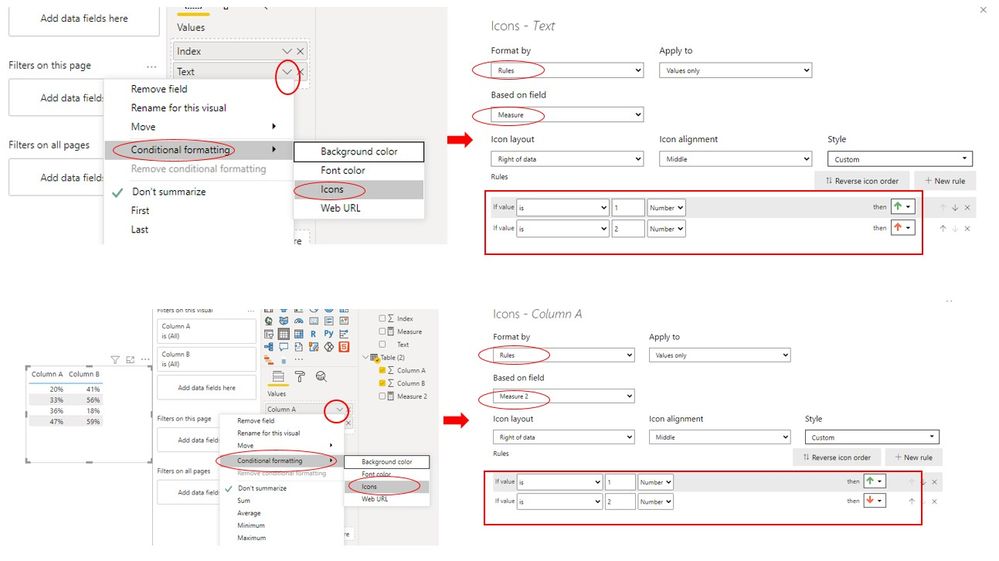
Measure = SWITCH(MAX('Table'[Text]),"Out Performed",1,"Under Permformed",2)Measure 2 = IF(MAX('Table (2)'[Column A]) > MAX('Table (2)'[Column B]),1,2)Then select Icons type under Conditional formatting option --> Format by Rules & Based on Measures -->Add rules like this:
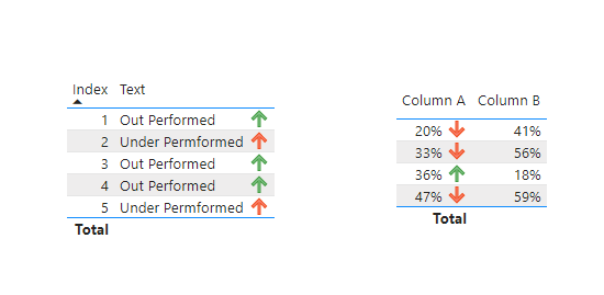
Here is the final output :
Best Regards,
Eyelyn Qin
If this post helps, then please consider Accept it as the solution to help the other members find it more quickly.
- Mark as New
- Bookmark
- Subscribe
- Mute
- Subscribe to RSS Feed
- Permalink
- Report Inappropriate Content
@Anonymous , On is that you can explore icon conditional formatting.
Second, you can create icon measure using unichar and icon color and then put them in new values and conditional format using field value option
examples
/////Arrow
Arrow =
var _change =[Net Sales YTD]-[Net Sales LYTD]
return
SWITCH (
TRUE(),
_change > 0, UNICHAR(9650),
_change = 0, UNICHAR(9654),
_change < 0, UNICHAR(9660)
)
/////Arrow Color
Arrow color =
var _change =[Net Sales YTD]-[Net Sales LYTD]
return
SWITCH (
TRUE(),
_change > 0, "green",
_change = 0, "blue",
_change < 0, "red"
)
Check more details at
https://exceleratorbi.com.au/conditional-formatting-using-icons-in-power-bi/
https://community.powerbi.com/t5/Desktop/FORMAT-icon-set-for-use-in-a-data-card/td-p/811692
https://exceleratorbi.com.au/dax-unichar-function-power-bi/
More on measure color, conditional formating
https://radacad.com/dax-and-conditional-formatting-better-together-find-the-biggest-and-smallest-numbers-in-the-column
https://docs.microsoft.com/en-us/power-bi/desktop-conditional-table-formatting#color-by-color-values
Microsoft Power BI Learning Resources, 2023 !!
Learn Power BI - Full Course with Dec-2022, with Window, Index, Offset, 100+ Topics !!
Did I answer your question? Mark my post as a solution! Appreciate your Kudos !! Proud to be a Super User! !!
Helpful resources

Microsoft Fabric Learn Together
Covering the world! 9:00-10:30 AM Sydney, 4:00-5:30 PM CET (Paris/Berlin), 7:00-8:30 PM Mexico City

Power BI Monthly Update - April 2024
Check out the April 2024 Power BI update to learn about new features.

| User | Count |
|---|---|
| 107 | |
| 98 | |
| 77 | |
| 66 | |
| 53 |
| User | Count |
|---|---|
| 144 | |
| 104 | |
| 100 | |
| 86 | |
| 64 |


