- Power BI forums
- Updates
- News & Announcements
- Get Help with Power BI
- Desktop
- Service
- Report Server
- Power Query
- Mobile Apps
- Developer
- DAX Commands and Tips
- Custom Visuals Development Discussion
- Health and Life Sciences
- Power BI Spanish forums
- Translated Spanish Desktop
- Power Platform Integration - Better Together!
- Power Platform Integrations (Read-only)
- Power Platform and Dynamics 365 Integrations (Read-only)
- Training and Consulting
- Instructor Led Training
- Dashboard in a Day for Women, by Women
- Galleries
- Community Connections & How-To Videos
- COVID-19 Data Stories Gallery
- Themes Gallery
- Data Stories Gallery
- R Script Showcase
- Webinars and Video Gallery
- Quick Measures Gallery
- 2021 MSBizAppsSummit Gallery
- 2020 MSBizAppsSummit Gallery
- 2019 MSBizAppsSummit Gallery
- Events
- Ideas
- Custom Visuals Ideas
- Issues
- Issues
- Events
- Upcoming Events
- Community Blog
- Power BI Community Blog
- Custom Visuals Community Blog
- Community Support
- Community Accounts & Registration
- Using the Community
- Community Feedback
Register now to learn Fabric in free live sessions led by the best Microsoft experts. From Apr 16 to May 9, in English and Spanish.
- Power BI forums
- Forums
- Get Help with Power BI
- Desktop
- Re: Conditinally formated line and bar chart with...
- Subscribe to RSS Feed
- Mark Topic as New
- Mark Topic as Read
- Float this Topic for Current User
- Bookmark
- Subscribe
- Printer Friendly Page
- Mark as New
- Bookmark
- Subscribe
- Mute
- Subscribe to RSS Feed
- Permalink
- Report Inappropriate Content
Conditinally formated line and bar chart with LY and Target
Hello expert comunity,
I am bit struggeling to find a right chart for the Conditionally formated LINE and BAR chart.
Requirements:
- Display an evolution of the KPI over the time.
- CY value should be conditinally formated based on the target achived / not achiever (binary logic)
- Display a target with the label
- Display a data labels for LY and CY values.
My current attempt in the Power BI:
Problems I am facing in Power BI:
- I have to split CY value for 2 measues GREEN and RED in orderd to be able to make conditinal formating. As I did this, there are now 3 measures on the axis insead 2. This is causing unnessesry spacing and issues with data labels.
- Lables for a target are repeted across the time period.
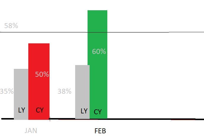
My desired result:
(without CY and LY labeling) this is just for your navigation.
I have also tryied KPI Column chart by MAQ, but it does not have a capabality with LY values.
Looking forward for your suggestions.
Martin
- Mark as New
- Bookmark
- Subscribe
- Mute
- Subscribe to RSS Feed
- Permalink
- Report Inappropriate Content
If you FORMAT your input data to have multiple dimensions based on color needed, you can then use either “Stacked Column Chart” or “Line & Stacked Column Chart”. The primary X axis dimension is Time, then add Secondary X-axis dimension (e.g. Type). Adding TYPE COLOR as the Legend will then produce the graph. Note I added additional Type (z) which is blank for cosmetic spacing. Note also included is a target line by using “Line & Stacked Column”. see example below w/input data & visual settings
- Mark as New
- Bookmark
- Subscribe
- Mute
- Subscribe to RSS Feed
- Permalink
- Report Inappropriate Content
For the color problem, it is not possible to use conditional formatting for line and column chart.
I come up with some ideas to work around this problem, please let me know more about your data so that i can figure out.
Such as:
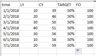
Is your data like this
Then the measure added to Value are like
%FO-CY = MAX([CY])/MAX([FO])

%FO-LY = MAX([LY])/MAX([FO])
Best Regards
Maggie
- Mark as New
- Bookmark
- Subscribe
- Mute
- Subscribe to RSS Feed
- Permalink
- Report Inappropriate Content
- Lables for a target are repeted across the time period.
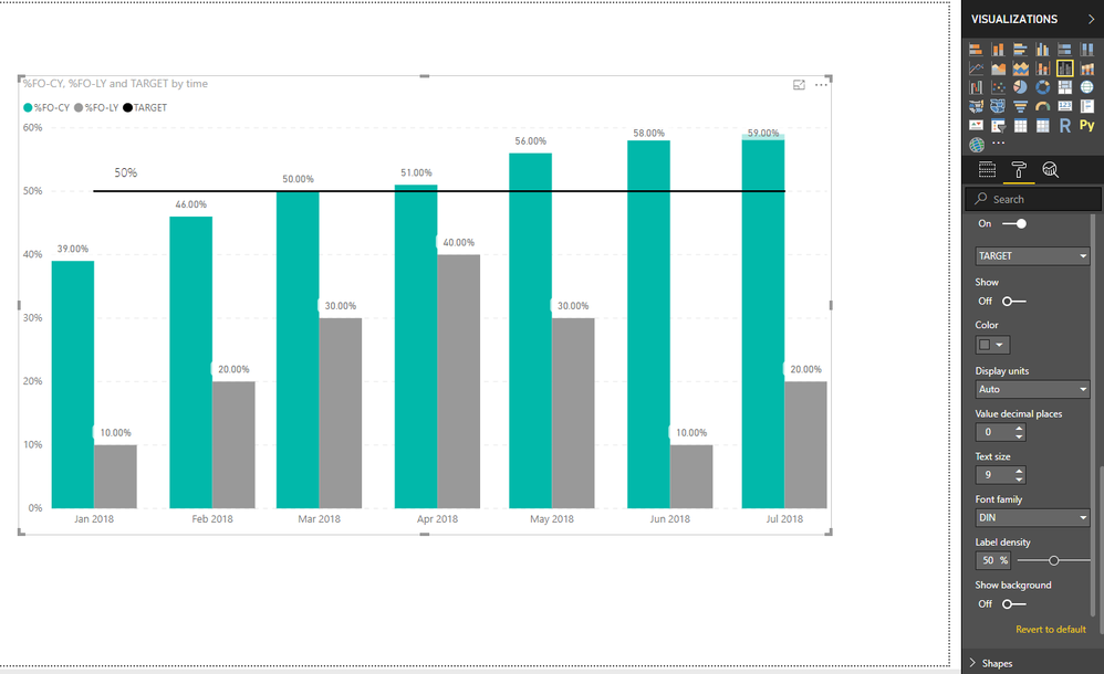
For above requirement, here are two workarounds.
1.In line and column chart, select "Format"->"Data Labels"->"Customize series"->select "Target", then turn off "show" button.
then add a text box with value "50%"
2. change the visual to Clustered column chart, then add a constant line on it with value "50%".
Best Regards
Maggie
Helpful resources

Microsoft Fabric Learn Together
Covering the world! 9:00-10:30 AM Sydney, 4:00-5:30 PM CET (Paris/Berlin), 7:00-8:30 PM Mexico City

Power BI Monthly Update - April 2024
Check out the April 2024 Power BI update to learn about new features.

| User | Count |
|---|---|
| 110 | |
| 97 | |
| 78 | |
| 63 | |
| 55 |
| User | Count |
|---|---|
| 143 | |
| 109 | |
| 89 | |
| 84 | |
| 66 |


