- Power BI forums
- Updates
- News & Announcements
- Get Help with Power BI
- Desktop
- Service
- Report Server
- Power Query
- Mobile Apps
- Developer
- DAX Commands and Tips
- Custom Visuals Development Discussion
- Health and Life Sciences
- Power BI Spanish forums
- Translated Spanish Desktop
- Power Platform Integration - Better Together!
- Power Platform Integrations (Read-only)
- Power Platform and Dynamics 365 Integrations (Read-only)
- Training and Consulting
- Instructor Led Training
- Dashboard in a Day for Women, by Women
- Galleries
- Community Connections & How-To Videos
- COVID-19 Data Stories Gallery
- Themes Gallery
- Data Stories Gallery
- R Script Showcase
- Webinars and Video Gallery
- Quick Measures Gallery
- 2021 MSBizAppsSummit Gallery
- 2020 MSBizAppsSummit Gallery
- 2019 MSBizAppsSummit Gallery
- Events
- Ideas
- Custom Visuals Ideas
- Issues
- Issues
- Events
- Upcoming Events
- Community Blog
- Power BI Community Blog
- Custom Visuals Community Blog
- Community Support
- Community Accounts & Registration
- Using the Community
- Community Feedback
Register now to learn Fabric in free live sessions led by the best Microsoft experts. From Apr 16 to May 9, in English and Spanish.
- Power BI forums
- Forums
- Get Help with Power BI
- Desktop
- Complete Newb question - line chart visual
- Subscribe to RSS Feed
- Mark Topic as New
- Mark Topic as Read
- Float this Topic for Current User
- Bookmark
- Subscribe
- Printer Friendly Page
- Mark as New
- Bookmark
- Subscribe
- Mute
- Subscribe to RSS Feed
- Permalink
- Report Inappropriate Content
Complete Newb question - line chart visual
I have a meter installed on a piece of pipe. I have the data from the meter readings on a monthly basis. For instance meter 1 read 1.003 in Jan, 0.9987 in Feb, 1.000 in march etc. I just want to plot the meter readings on the y-axis and the dates on the x-axis. Then, the meter should not read +/- 0.0025 from any of the previous reading months. I have the data clean and imported, just can't figure out a basic chart. Power BI is very confusing. It originally tried to sum my meter readings and took an hour to figure out how not to sum that column in the table. I essentially want a variance of no more than +/- 0.0025 from the previous months reading AND no more than +/- 0.0025 between any of the readings. I have been using BI for one day. Data from PQ.
- Mark as New
- Bookmark
- Subscribe
- Mute
- Subscribe to RSS Feed
- Permalink
- Report Inappropriate Content
Please provide sanitized sample data that fully covers your issue. I cannot help you without meaningful sample data.
Please paste the data into a table in your post or use one of the file services like OneDrive or Google Drive. I cannot use screenshots of your source data.
Please show the expected outcome based on the sample data you provided. Screenshots of the expected outcome are ok.
https://community.powerbi.com/t5/Community-Blog/How-to-provide-sample-data-in-the-Power-BI-Forum/ba-...
https://community.powerbi.com/t5/Desktop/How-to-Get-Your-Question-Answered-Quickly/m-p/1447523
- Mark as New
- Bookmark
- Subscribe
- Mute
- Subscribe to RSS Feed
- Permalink
- Report Inappropriate Content
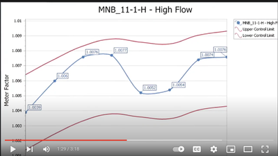
Hi lbendlin, thanks for taking the time to help me. I am looking to plot on a line chart, the "closing date" on the x axis and "meter factor" on the y axis with some sort of visual on the graph when the meter factor, compared to the previous month or any other value in the previous months, present a variance of +/- 0.0025. I would do it for each "meter ID" (211,212,213,291). Since I'm so new, I can't say exactly what that visual would look like as I don't know what I don't know. A graph similar to below with maybe a dot red (instead of blue dot) when the variance is out +/- 0.0025. Ignore the red lines on the screenshot below
Data Table attached.
Thank you very much
- Mark as New
- Bookmark
- Subscribe
- Mute
- Subscribe to RSS Feed
- Permalink
- Report Inappropriate Content
Hi, yes, that graph is what I am trying to make. The meter may not be out of variance currently, but could be in the future. Can you use a lower value, to say +/- 0.0010 for educational purposes and kindly explain how I can do that myself? Note I am looking at the variance from the current reading to the whole series in arrears as well as to just the immediate previous reading, for each meter number.
Thanks for the help.
- Mark as New
- Bookmark
- Subscribe
- Mute
- Subscribe to RSS Feed
- Permalink
- Report Inappropriate Content
I am looking at the variance from the current reading to the whole series in arrears as well as to just the immediate previous reading, for each meter number
Wowowo - That's an entirely different question. Do you want to compare against the average of the arrears, against some sliding window, or the absolute min and max values? How are you planning to visualize the lines? How should the outliers be rendered?
- Mark as New
- Bookmark
- Subscribe
- Mute
- Subscribe to RSS Feed
- Permalink
- Report Inappropriate Content
Hi, I'm sorry. I tried to communicate that in my original post, but maybe not well. I was thinking to make a red dashed line above/below that would show the +/- variance. The earlier closing date and corresponding meter factor would set the absolute boundary of variance after calibration. So, after calibration, it should be nearly 1.0000 and then fluctuate. If that was the case, then high/low would be 1.0025 and 0.9975, absolute value and would not change during the ensuing series. But if in the 5th month of the series after calibration represents the current meter factor with a reading of 1.0020 and the previous month (4th month) meter factor was 0.9990, that would say turn the dot on the graph red instead of being below the red variance lines (as the variance would be +/- > 0.0025 against the previous month). If the meter factor dips below the absolute variance lines, then it could turn the line red instead of the value dot.
I'd have to have a way to reset the calculation when the meter is calibrated, but that would be down the road as I learn how to use PowerBI. In this instance, I'll assume the first meter factor is the calibration value representing the earliest closing date and apply the variance logic to that.
If you wanted to try the logic with a smaller variance to test, that is fine. I hope that makes sense.
- Mark as New
- Bookmark
- Subscribe
- Mute
- Subscribe to RSS Feed
- Permalink
- Report Inappropriate Content
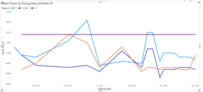
None of your meters seem to exceed the +/- 0.0025 threshold between readings. Please either provide different sample data or specify what your threshold criteria are.
Helpful resources

Microsoft Fabric Learn Together
Covering the world! 9:00-10:30 AM Sydney, 4:00-5:30 PM CET (Paris/Berlin), 7:00-8:30 PM Mexico City

Power BI Monthly Update - April 2024
Check out the April 2024 Power BI update to learn about new features.

| User | Count |
|---|---|
| 114 | |
| 101 | |
| 78 | |
| 75 | |
| 49 |
| User | Count |
|---|---|
| 145 | |
| 108 | |
| 107 | |
| 89 | |
| 61 |


