- Power BI forums
- Updates
- News & Announcements
- Get Help with Power BI
- Desktop
- Service
- Report Server
- Power Query
- Mobile Apps
- Developer
- DAX Commands and Tips
- Custom Visuals Development Discussion
- Health and Life Sciences
- Power BI Spanish forums
- Translated Spanish Desktop
- Power Platform Integration - Better Together!
- Power Platform Integrations (Read-only)
- Power Platform and Dynamics 365 Integrations (Read-only)
- Training and Consulting
- Instructor Led Training
- Dashboard in a Day for Women, by Women
- Galleries
- Community Connections & How-To Videos
- COVID-19 Data Stories Gallery
- Themes Gallery
- Data Stories Gallery
- R Script Showcase
- Webinars and Video Gallery
- Quick Measures Gallery
- 2021 MSBizAppsSummit Gallery
- 2020 MSBizAppsSummit Gallery
- 2019 MSBizAppsSummit Gallery
- Events
- Ideas
- Custom Visuals Ideas
- Issues
- Issues
- Events
- Upcoming Events
- Community Blog
- Power BI Community Blog
- Custom Visuals Community Blog
- Community Support
- Community Accounts & Registration
- Using the Community
- Community Feedback
Register now to learn Fabric in free live sessions led by the best Microsoft experts. From Apr 16 to May 9, in English and Spanish.
- Power BI forums
- Forums
- Get Help with Power BI
- Desktop
- Re: Comparison of time-on-stream data from experim...
- Subscribe to RSS Feed
- Mark Topic as New
- Mark Topic as Read
- Float this Topic for Current User
- Bookmark
- Subscribe
- Printer Friendly Page
- Mark as New
- Bookmark
- Subscribe
- Mute
- Subscribe to RSS Feed
- Permalink
- Report Inappropriate Content
Comparison of time-on-stream data from experiments in one graph
Hello,
I've spent quite a bit of time now trying to find my way into Power BI and I very much enjoy it I have to say. However, I could not find my way around one problem that I encountered. It might be simple... but no googling did help me here yet.
I would like to compare two independent experiments or rather two of the process parameters (e.g. temperature) over the time the experiments were running. E.g.:
Experiment 1
Time on stream from start of exp. [h] | Temperature [°C] |
2 | 57 |
5 | 53 |
8 | 60 |
10 | 62 |
11 | 70 |
Experiment 2
Time-on-stream from start of exp. [h] | Temperature [°C] |
1 | 54 |
4 | 58 |
6 | 50 |
8 | 57 |
13 | 70 |
How can I compare the temperature developments in a single chart/graph so that I only have 1 x-Axis showing me the time-on-stream and 1 y-axis showing me the temperature?
Thank you very much and best regards
Solved! Go to Solution.
- Mark as New
- Bookmark
- Subscribe
- Mute
- Subscribe to RSS Feed
- Permalink
- Report Inappropriate Content
Hi @tomcatoggo ,
If you have your information in Excel then Power BI can do the heavy lifting and make the files all come together in a single table using the option From Folder to get the append of all your data with the experiments names.
The question about what I used was based on you information and you only have the hours in absolute.
Looking at the data you have send out the option and using a scatter chart passes by the option of combining all the files togethers.
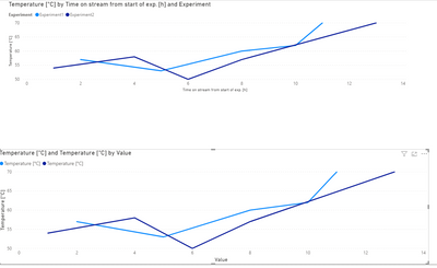
Has you can see in the file attach I made a single table with the two experiments, and ploted the scatter chart has you need:
In this case I have a single file with several pages, but has refered this can be done with multiple files check the links below:
https://docs.microsoft.com/en-us/power-bi/transform-model/desktop-combine-binaries
Regards
Miguel Félix
Did I answer your question? Mark my post as a solution!
Proud to be a Super User!
Check out my blog: Power BI em Português- Mark as New
- Bookmark
- Subscribe
- Mute
- Subscribe to RSS Feed
- Permalink
- Report Inappropriate Content
Hi @tomcatoggo ,
Looking at your data you need I believe that the best option is to append both tables together and have a column identifying the experiment, that way you will have both data in the same chart.
Another options is to create a dimension table with the time on stream to connect both tables and then use it has your x-axis.
As you can see in the file and image below both results are the same.
If you opt by the first option you need to disable the load of original tables to have a single table.
Regards
Miguel Félix
Did I answer your question? Mark my post as a solution!
Proud to be a Super User!
Check out my blog: Power BI em Português- Mark as New
- Bookmark
- Subscribe
- Mute
- Subscribe to RSS Feed
- Permalink
- Report Inappropriate Content
Hi @MFelix,
thank you very much for your reply!
The first option:
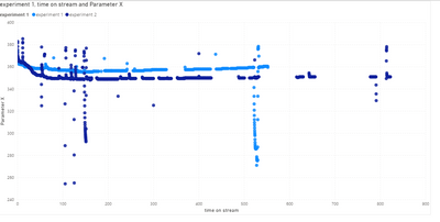
putting it together is actually what I need to avoid. We are talking about log files running over the course of 3-5 years with daily inputs of roughly 60 or so different measured parameters thus resulting in a lot of data... which I handled in Excel so far. My idea is to pre-prepare the log files in a standardized way in excel (as I have them there anyways) and then connect the different log files (each 2+ years) to 1 Power BI file and compare the different parameters based on the runtime. The problem would be that they have individual time stamps as well. So most of the time stamps could not be synchronised between the different experiments.
This also might be the problem regarding option 2 (which you used for the sample file, right?). As far as I can see, the time stamps are defined (as full hours). But as my time stamps can have any (decimal) value, I cannot see how I would do that apart from listing maybe every single second for a duration of about 5 years.
Or do I maybe not understand your second option correctly?
I uploaded an excel file as sample:
https://docs.google.com/spreadsheets/d/1YunT4tcT5aUoc70GXnCiY96mn7bwEQA9xkL-UIYkg_g/edit?usp=sharing
It has 2 sheets, each with one experiment. The Parameter I would like to compare is denoted as "Parameter X" in column D of each sheet. And the "comparison" sheet shows what I am trying ot get with Power BI.
Thanks once more for your help!
- Mark as New
- Bookmark
- Subscribe
- Mute
- Subscribe to RSS Feed
- Permalink
- Report Inappropriate Content
Hi @tomcatoggo ,
If you have your information in Excel then Power BI can do the heavy lifting and make the files all come together in a single table using the option From Folder to get the append of all your data with the experiments names.
The question about what I used was based on you information and you only have the hours in absolute.
Looking at the data you have send out the option and using a scatter chart passes by the option of combining all the files togethers.
Has you can see in the file attach I made a single table with the two experiments, and ploted the scatter chart has you need:
In this case I have a single file with several pages, but has refered this can be done with multiple files check the links below:
https://docs.microsoft.com/en-us/power-bi/transform-model/desktop-combine-binaries
Regards
Miguel Félix
Did I answer your question? Mark my post as a solution!
Proud to be a Super User!
Check out my blog: Power BI em Português- Mark as New
- Bookmark
- Subscribe
- Mute
- Subscribe to RSS Feed
- Permalink
- Report Inappropriate Content
That sounds and looks great!
It would also allow me to add the values of a 3rd or 4th (and so on) experiment by just adding more data to the same table, right? The only important thing would be that it has one identifier as Experiment No. in the first column as far as I understand.
The table will become super long but from what I saw, Power BI will be able to deal with that.
- Mark as New
- Bookmark
- Subscribe
- Mute
- Subscribe to RSS Feed
- Permalink
- Report Inappropriate Content
Yes you are correct just need to identify the experiment and everything will work properly.
Regards
Miguel Félix
Did I answer your question? Mark my post as a solution!
Proud to be a Super User!
Check out my blog: Power BI em Português- Mark as New
- Bookmark
- Subscribe
- Mute
- Subscribe to RSS Feed
- Permalink
- Report Inappropriate Content
@MFelix as I had the chance to try around a bit more end of last week, I wanted to give you the feedback that it works very well. I will hopefully find my way to get the final solution 🙂
Thank you so much!
Helpful resources

Microsoft Fabric Learn Together
Covering the world! 9:00-10:30 AM Sydney, 4:00-5:30 PM CET (Paris/Berlin), 7:00-8:30 PM Mexico City

Power BI Monthly Update - April 2024
Check out the April 2024 Power BI update to learn about new features.

| User | Count |
|---|---|
| 109 | |
| 99 | |
| 77 | |
| 66 | |
| 54 |
| User | Count |
|---|---|
| 144 | |
| 104 | |
| 102 | |
| 87 | |
| 64 |


