- Power BI forums
- Updates
- News & Announcements
- Get Help with Power BI
- Desktop
- Service
- Report Server
- Power Query
- Mobile Apps
- Developer
- DAX Commands and Tips
- Custom Visuals Development Discussion
- Health and Life Sciences
- Power BI Spanish forums
- Translated Spanish Desktop
- Power Platform Integration - Better Together!
- Power Platform Integrations (Read-only)
- Power Platform and Dynamics 365 Integrations (Read-only)
- Training and Consulting
- Instructor Led Training
- Dashboard in a Day for Women, by Women
- Galleries
- Community Connections & How-To Videos
- COVID-19 Data Stories Gallery
- Themes Gallery
- Data Stories Gallery
- R Script Showcase
- Webinars and Video Gallery
- Quick Measures Gallery
- 2021 MSBizAppsSummit Gallery
- 2020 MSBizAppsSummit Gallery
- 2019 MSBizAppsSummit Gallery
- Events
- Ideas
- Custom Visuals Ideas
- Issues
- Issues
- Events
- Upcoming Events
- Community Blog
- Power BI Community Blog
- Custom Visuals Community Blog
- Community Support
- Community Accounts & Registration
- Using the Community
- Community Feedback
Register now to learn Fabric in free live sessions led by the best Microsoft experts. From Apr 16 to May 9, in English and Spanish.
- Power BI forums
- Forums
- Get Help with Power BI
- Desktop
- Re: Comparing this year and last year measure on a...
- Subscribe to RSS Feed
- Mark Topic as New
- Mark Topic as Read
- Float this Topic for Current User
- Bookmark
- Subscribe
- Printer Friendly Page
- Mark as New
- Bookmark
- Subscribe
- Mute
- Subscribe to RSS Feed
- Permalink
- Report Inappropriate Content
Comparing this year and last year measure on a bar chart
Hi,
I'm going to show a meaure values of this year and last year on a bar chart. I created a new measure in PowerBI Desktop with this formula:
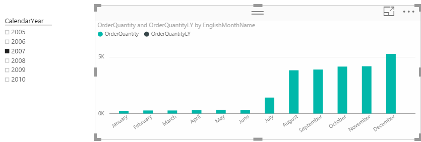
The problem is when I use a Time Slicer and select a year, The calculated measure be disapeared and It sounds the last year data getting filter out from the dataset:
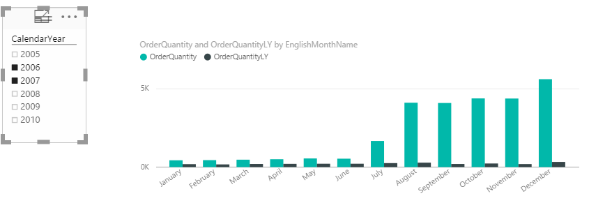
I can see the OrderQuantityLY just when more than 1 year is selected:
Any suggestion?
Thanks,
Ali
Solved! Go to Solution.
- Mark as New
- Bookmark
- Subscribe
- Mute
- Subscribe to RSS Feed
- Permalink
- Report Inappropriate Content
@AliSharifi Create a clustered column chart
In the Axis - enter CalendarMonth (this should be a field from the DimDate table that represents just the months)
In the Legend - enter CalendarYear (again from the DimDate table the field that represents just the years)
this field CalendarYear should be the same field you use for the Slicer
In the Value - enter this measure OrderQuantity = SUM(FactInternetSales[OrderQuantity])
This will create a chart that will show 12 columns - overall totals for Jan thru Dec for all years
Then select as many years in the slicer as you wish - you will get that many columns for each month
this works with line charts too and you can select any years to compare not just consecutive
- Mark as New
- Bookmark
- Subscribe
- Mute
- Subscribe to RSS Feed
- Permalink
- Report Inappropriate Content
I'm glad it is working.
A couple of points.
- You can join on integers, it is just that you can't use the inbuilt time intelligence (something I didn't know until @greggyb mentioned it here). You can of course write a formula using FILTER like I showed earlier. I agree this should be changed and I am sure it will.
- In Power Pivot/Power BI, data type is not very important because Power Pivot manages the compression so well during data load using Run Length Encoding, Dictionary Encoding and Value Encoding. So the byte size of the data type is less important.
- Mark as New
- Bookmark
- Subscribe
- Mute
- Subscribe to RSS Feed
- Permalink
- Report Inappropriate Content
In a clustered column chart with a slicer Calendar Year
Axis
CalendarMonth
Legend
CalendarYear
Value
OrderQuantity = SUM(FactInternetSales[OrderQuantity])
This chart will aggregate your data for ALL your Jan, Feb, etc... Months
but once you select a year or multiple years in the slicer you will get your desired result
- Mark as New
- Bookmark
- Subscribe
- Mute
- Subscribe to RSS Feed
- Permalink
- Report Inappropriate Content
BTW, an equivalent formula that will work on any calendar table could be as follows
Sales LY=calculate(sum(sales[qty]),
     Filter(all(calendar),
         Calendar[date] >= min(calendar[date]) &&
         Calendar[date] <= max(calendar[date])
    )
)
Note 1: notice the use of All(calendar) which removes the filter that Synergised mentioned.
Note 2: this formula is strictly not equivalent. To understand why, read up on PARALLELPERIOD VS SAMEPERIODLASTYEAR.
- Mark as New
- Bookmark
- Subscribe
- Mute
- Subscribe to RSS Feed
- Permalink
- Report Inappropriate Content
I am still learning DAX.. but I would say you are filtering out the data. Your measure needs to run against ALL of your data.
These sites helped me a lot.
http://www.daxpatterns.com/time-patterns/
http://sqldusty.com/2015/09/01/10-dax-calculations-for-your-tabular-or-power-pivot-model-part-1/
http://www.sqlbi.com/articles/custom-year-over-year-calculation-in-dax/
This is my hack.. keep in mind a newbie here. I tried several approaches and finally ended up using the month and year columns in my date table. To test, I just put everything in a grid and just kept playing with the query until the previous period for my data looked correct. I am still struggling with the different contexts the data is in at any given time.
In the query, I have a switch so I can calculate for other time periods (day, week, quarter).. I only included the month one as an example.
PP Application Received Count =
SWITCH (
TRUE,
ISFILTERED ( View_CollegeData[Entry Month] ),
IF ( COUNTROWS ( VALUES(View_CollegeData[Entry Month Of Year])) > 1, blank(),
CALCULATE(SUM(View_CollegeData[Application Received Count]),
FILTER (
ALL(View_CollegeData),
View_CollegeData[Entry Year No]=MAX(View_CollegeData[Entry Year No])-1
&& View_CollegeData[Entry Month Of Year]=MAX(View_CollegeData[Entry Month Of Year])
--note this line is if you have a hierarchy - in my case College / Month you need to filter it to the type
&& CONTAINS (View_CollegeData,View_CollegeData[College Of Interest], View_CollegeData[College Of Interest])
)
)
)
)
I'm sure there is a better way to do this.. but this might give you some ideas on some other things to try. I tried to merge my example with yours but not having much luck so far. I am being reminded yet again its time to leave for dinner... so gotta go...
Good luck!
- Mark as New
- Bookmark
- Subscribe
- Mute
- Subscribe to RSS Feed
- Permalink
- Report Inappropriate Content
Synergised
the built in time intelligence functions automatically handle the current filter context coming from the visualisation. There is no need to remove them manually - provided you follow the rules of a calendar table.
- Mark as New
- Bookmark
- Subscribe
- Mute
- Subscribe to RSS Feed
- Permalink
- Report Inappropriate Content
Totally agree, they should. I guess I haven't found the rules of the date table then. Could you point me to a good reference source for this? I just used the iso date table that was generated when I built my analysis cube - I assumed that would be sufficient for power bi. One thing that might be messing me up is we decided to create a single view for the power bi and Excel folks to access to make sure we are all on the same page and pulling the exact same data. I have seen where the date table and data table are different and then joined (relationship) in power bi.
From my perspective, all the examples on how to use the time functions I have found are extremely simplistic and Excel Power pivot is being used to show them. I ran into the exact issue as this post.. but could not find any complex examples done in power bi showing how to accomplish this scenario.
a. Chart Data is being pre-filtered via a report/page filter and or slicer
b. In my case, I have a grid with a College / Month combo (hierarchy) in the row.
c. Data is displayed in the matrix with totals
d. Matrix grid has an on the fly hierarchy (College/Month)
e. We also start our week on Monday instead of Sunday - which is causing me all kinds of grief in power bi land.
--Actualy for me, the example from the post shows blanks for the rows - but the totals are shown.
LeadPaidLY = Calculate(SUM(View_CollegeData[Lead Paid Count]),PARALLELPERIOD(View_CollegeData[Entry Date], -1, YEAR))
- Mark as New
- Bookmark
- Subscribe
- Mute
- Subscribe to RSS Feed
- Permalink
- Report Inappropriate Content
I have an article in my knowledge base about calendar tables. http://exceleratorbi.com.au/power-pivot-calendar-tables/
Yes an ISO calendar is fine for Power BI. But you can't use the inbuilt time intelligence functions if you use this type of calendar. It is not wrong, just different. So PARALLELPERIOD will not work unless you follow the rules of a standard date table. The alternative is to write your own formula. Not right or wrong, just different and a bit harder to learn. I cover all this in my book Learn to Write DAX.
And for your testing of this formula from this OP, you can't test it properly unless you know the data model. This is why it is best to post full details of your workbook. It is like me saying "I put A1+A2 in my Excel spreadsheet and I got an error. Can someone tell me why?" You really need to know what is in those cells to give a clear answer (of course we could guess that there are text values, but it could because one cell contains a divide by zero error).
- Mark as New
- Bookmark
- Subscribe
- Mute
- Subscribe to RSS Feed
- Permalink
- Report Inappropriate Content
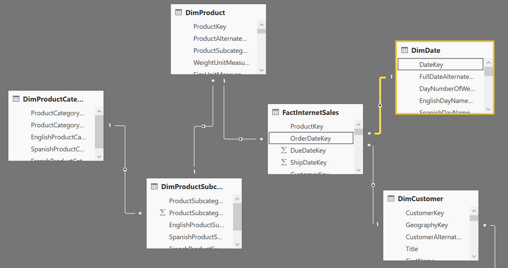
If the data model is correct, then you should see both bars on the first chart. What is the structure of your date table? Is the [fulldatealternatekey] a date column consisting of every single date for the entire 2 year period? This is a mandatory requirement if you want to use the inbuilt time intelligence functions.
- Mark as New
- Bookmark
- Subscribe
- Mute
- Subscribe to RSS Feed
- Permalink
- Report Inappropriate Content
The model is a smaple from AdeventureWorksDW and FullDateAlternatekey is Date containing all date values.
- Mark as New
- Bookmark
- Subscribe
- Mute
- Subscribe to RSS Feed
- Permalink
- Report Inappropriate Content
This is the model:
- Mark as New
- Bookmark
- Subscribe
- Mute
- Subscribe to RSS Feed
- Permalink
- Report Inappropriate Content
@AliSharifi Create a clustered column chart
In the Axis - enter CalendarMonth (this should be a field from the DimDate table that represents just the months)
In the Legend - enter CalendarYear (again from the DimDate table the field that represents just the years)
this field CalendarYear should be the same field you use for the Slicer
In the Value - enter this measure OrderQuantity = SUM(FactInternetSales[OrderQuantity])
This will create a chart that will show 12 columns - overall totals for Jan thru Dec for all years
Then select as many years in the slicer as you wish - you will get that many columns for each month
this works with line charts too and you can select any years to compare not just consecutive
- Mark as New
- Bookmark
- Subscribe
- Mute
- Subscribe to RSS Feed
- Permalink
- Report Inappropriate Content
Thanks Sean, It works. I was thinking same as what I had done with MDX, so here we don't need a new measure and Legend can cover it.
Thank you for your time Matt.
- Mark as New
- Bookmark
- Subscribe
- Mute
- Subscribe to RSS Feed
- Permalink
- Report Inappropriate Content
Sean,
How would you show the monthly percentage of changes for this year compare to the year before?
- Mark as New
- Bookmark
- Subscribe
- Mute
- Subscribe to RSS Feed
- Permalink
- Report Inappropriate Content
I have same question: Once I can get the Year Over Year (YOY) Visuals accomplished, is there a way to display the difference per month YOY.
This would allow to sse the actual numeric + or - (increase or decrease) in sales,, shipments, etc.....
Thanks
Pablo
- Mark as New
- Bookmark
- Subscribe
- Mute
- Subscribe to RSS Feed
- Permalink
- Report Inappropriate Content
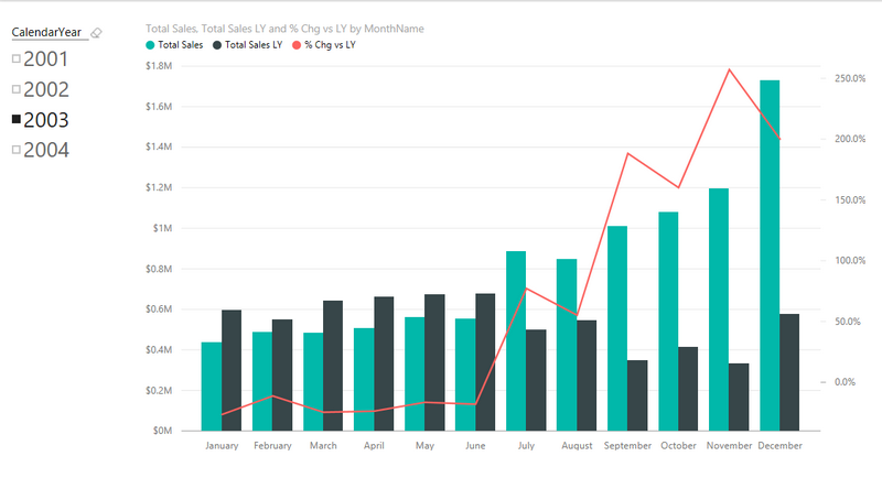
Putting 2 years on the axis works, but is limited in functionality. When you want to do % chg vs LY etc, you really then need to create DAX measures to create a "Total Sales LY" measure that will work on any point in time. In addition to being able to do more advanced calculations such as % chg vs LY, it also means the user only has to select a single time period from the slicer to see what happened this year and last year.
For the benefit of everyone, here is a sample PBIX file I produced for a different purpose
https://www.dropbox.com/s/jkyiavvhbzyqhkw/Adventure%20Works.pbix?dl=1
This file contains a working version of a column chart showing This Year, Last Year and % Chg vs LY (as per @greggyb above, my data model is joined on the date field). If you want to do this type of thing you will need to start to learn some DAX formulas.
The DAX formulas are
Total Sales = sum(Sales[ExtendedAmount])
Total Sales LY = CALCULATE([Total Sales],SAMEPERIODLASTYEAR('Calendar'[Date]))
% Chg vs LY = DIVIDE([Total Sales]-[Total Sales LY],[Total Sales LY])
If you don't want to (or can't) join on the date field, you can use the hand written time intelligence functions that I posted earlier in this thread.
- Mark as New
- Bookmark
- Subscribe
- Mute
- Subscribe to RSS Feed
- Permalink
- Report Inappropriate Content
Matt,
How did you get the % values on the right axis of the visualization?
Regards,
Gus Dahu
- Mark as New
- Bookmark
- Subscribe
- Mute
- Subscribe to RSS Feed
- Permalink
- Report Inappropriate Content
Thank you Matt - this works great. Taking a step further, would you know how to show that similar chart (with this year and prior-year measures, but with the stacked column chart so we can see the breakdown by one dimension (putting that dimension in the legend)?
It seems the stacked column chart only allows one measure, so I can't show both this year and prior year side-by-side.
- Mark as New
- Bookmark
- Subscribe
- Mute
- Subscribe to RSS Feed
- Permalink
- Report Inappropriate Content
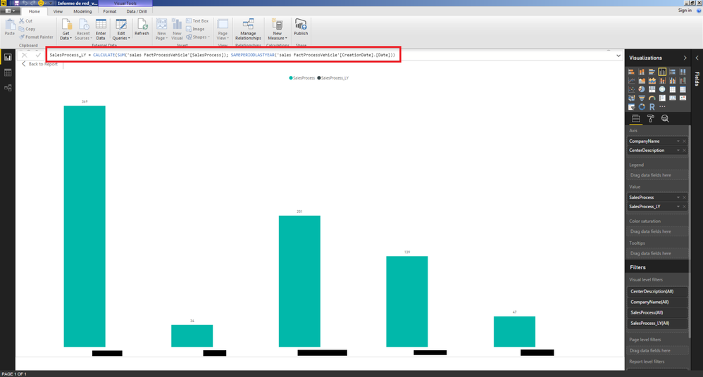
I've got the same problem as my colleagues over here in this post. I'm currently doing some analysis reports for my company and we've got a pretty good datawarehouse but we are always comparing same dates from one year to another, so, as you can see on the screenshot I've got a sum of Sales Processes and a Slicer for dates.
What we want to do is to show sum of sales process of the period selected in the slicer (it could be 15 days, it could be a period of 6 days, 2 months, 2,3 months.... it's not defined) compared with the same period of time but the previous year.
Is there any way to do it? Remember that I want to define the period of time on the slicer, and it's not defined at all, we want to have freedom to choose any period of time (always between the same year obviously)+
I've tried with SAMEPERIODLASTYEAR, PREVIOUSYEAR, ETC, but I've couldn't find the right way....
Thank you all in advance for your help.
Best regards.
- Mark as New
- Bookmark
- Subscribe
- Mute
- Subscribe to RSS Feed
- Permalink
- Report Inappropriate Content
Yes you can do this.
Total Sales = sum(table[Sales])
This first measure will reflect the dates you have selected in your slicer. If you use the new time slicer, you can set a start and end date.
Selected Period =
CALCULATE ( [Total Sales], SAMEPERIODLASTYEAR ( Calendar[Date] ) )
For your L&D, read my new article about time intelligence here http://exceleratorbi.com.au/dax-time-intelligence-beginners/
- Mark as New
- Bookmark
- Subscribe
- Mute
- Subscribe to RSS Feed
- Permalink
- Report Inappropriate Content
Hi @MattAllington,
That's the way I tried before but Idk what isn't working...... please image attached.
- Mark as New
- Bookmark
- Subscribe
- Mute
- Subscribe to RSS Feed
- Permalink
- Report Inappropriate Content
What I wrote and what you have are different. If you want to use inbuilt time intelligence you must use a calendar table. My formula refers to a calendar table but yours does not.
Here are 2 articles you may find useful,
http://exceleratorbi.com.au/power-pivot-calendar-tables/
http://exceleratorbi.com.au/dax-time-intelligence-beginners/
Helpful resources

Microsoft Fabric Learn Together
Covering the world! 9:00-10:30 AM Sydney, 4:00-5:30 PM CET (Paris/Berlin), 7:00-8:30 PM Mexico City

Power BI Monthly Update - April 2024
Check out the April 2024 Power BI update to learn about new features.

| User | Count |
|---|---|
| 107 | |
| 98 | |
| 78 | |
| 65 | |
| 53 |
| User | Count |
|---|---|
| 144 | |
| 103 | |
| 98 | |
| 85 | |
| 64 |

