- Power BI forums
- Updates
- News & Announcements
- Get Help with Power BI
- Desktop
- Service
- Report Server
- Power Query
- Mobile Apps
- Developer
- DAX Commands and Tips
- Custom Visuals Development Discussion
- Health and Life Sciences
- Power BI Spanish forums
- Translated Spanish Desktop
- Power Platform Integration - Better Together!
- Power Platform Integrations (Read-only)
- Power Platform and Dynamics 365 Integrations (Read-only)
- Training and Consulting
- Instructor Led Training
- Dashboard in a Day for Women, by Women
- Galleries
- Community Connections & How-To Videos
- COVID-19 Data Stories Gallery
- Themes Gallery
- Data Stories Gallery
- R Script Showcase
- Webinars and Video Gallery
- Quick Measures Gallery
- 2021 MSBizAppsSummit Gallery
- 2020 MSBizAppsSummit Gallery
- 2019 MSBizAppsSummit Gallery
- Events
- Ideas
- Custom Visuals Ideas
- Issues
- Issues
- Events
- Upcoming Events
- Community Blog
- Power BI Community Blog
- Custom Visuals Community Blog
- Community Support
- Community Accounts & Registration
- Using the Community
- Community Feedback
Register now to learn Fabric in free live sessions led by the best Microsoft experts. From Apr 16 to May 9, in English and Spanish.
- Power BI forums
- Forums
- Get Help with Power BI
- Desktop
- Comparing count of tickets by month between last y...
- Subscribe to RSS Feed
- Mark Topic as New
- Mark Topic as Read
- Float this Topic for Current User
- Bookmark
- Subscribe
- Printer Friendly Page
- Mark as New
- Bookmark
- Subscribe
- Mute
- Subscribe to RSS Feed
- Permalink
- Report Inappropriate Content
Comparing count of tickets by month between last year and this year in column chart
Hi guys,
I'm still a noob, and have looked through the forums and can't seem to find out how to do something you guys will think is relatively simple!
I'm trying to create a graph that shows each month of the year along the x axis. The Y axis will show a count of tickets.
I want to know how to create stacked column chart that shows the number of tickets last year vs tickets this year for each month.
I have a single table that I export from an application. The table has two values that I would use for this:
- Ticket, which is the ticket number
- Entered, which is the date the ticket was entered
I think I need to create a measure or something that shows all 2018 tickets, and another measure that shows all 2019 tickets and then add them both to the value field of a power bi object, but I haven't been able to crack it!
I basically want the following table but instead of $, I want a count of tickets by month for each year.
Solved! Go to Solution.
- Mark as New
- Bookmark
- Subscribe
- Mute
- Subscribe to RSS Feed
- Permalink
- Report Inappropriate Content
@mkranitz Could you show how your data set looks?
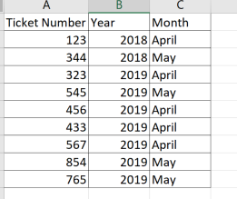
If you had ticket numbers as a field and you can add another field called Year and month from the date column you might have .. so it would look like this..
So you could create a new column in your table and type the DAX as follows:
YEAR = year(Table[Date]) and
MONTH = Month (Table[Date]) to look as the above screenshot
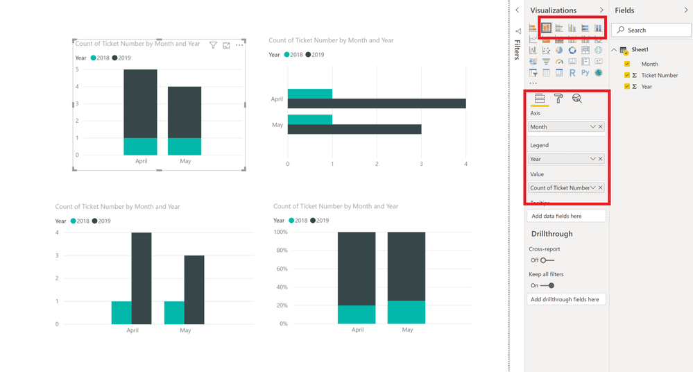
And then you could choose any bargraph type you want in Power BI ( I have just put multiple types for the same data for more visual options!)
- Mark as New
- Bookmark
- Subscribe
- Mute
- Subscribe to RSS Feed
- Permalink
- Report Inappropriate Content
YES!
Your guidance got me where I needed to go ![]()
The stuff I learned while trying to figure out how to do what you suggested was especially helpful!
MANY THANKS 🙂
- Mark as New
- Bookmark
- Subscribe
- Mute
- Subscribe to RSS Feed
- Permalink
- Report Inappropriate Content
Hi Akshaya,
Thank you for your response - it makes perfect sense.
Following are the relevant fields from the table named "Tickets"
A little wrangling and I think I got it! 🙂 🙂
THANK YOU 🙂
Helpful resources

Microsoft Fabric Learn Together
Covering the world! 9:00-10:30 AM Sydney, 4:00-5:30 PM CET (Paris/Berlin), 7:00-8:30 PM Mexico City

Power BI Monthly Update - April 2024
Check out the April 2024 Power BI update to learn about new features.

| User | Count |
|---|---|
| 110 | |
| 100 | |
| 80 | |
| 64 | |
| 58 |
| User | Count |
|---|---|
| 148 | |
| 111 | |
| 94 | |
| 84 | |
| 67 |


