- Power BI forums
- Updates
- News & Announcements
- Get Help with Power BI
- Desktop
- Service
- Report Server
- Power Query
- Mobile Apps
- Developer
- DAX Commands and Tips
- Custom Visuals Development Discussion
- Health and Life Sciences
- Power BI Spanish forums
- Translated Spanish Desktop
- Power Platform Integration - Better Together!
- Power Platform Integrations (Read-only)
- Power Platform and Dynamics 365 Integrations (Read-only)
- Training and Consulting
- Instructor Led Training
- Dashboard in a Day for Women, by Women
- Galleries
- Community Connections & How-To Videos
- COVID-19 Data Stories Gallery
- Themes Gallery
- Data Stories Gallery
- R Script Showcase
- Webinars and Video Gallery
- Quick Measures Gallery
- 2021 MSBizAppsSummit Gallery
- 2020 MSBizAppsSummit Gallery
- 2019 MSBizAppsSummit Gallery
- Events
- Ideas
- Custom Visuals Ideas
- Issues
- Issues
- Events
- Upcoming Events
- Community Blog
- Power BI Community Blog
- Custom Visuals Community Blog
- Community Support
- Community Accounts & Registration
- Using the Community
- Community Feedback
Register now to learn Fabric in free live sessions led by the best Microsoft experts. From Apr 16 to May 9, in English and Spanish.
- Power BI forums
- Forums
- Get Help with Power BI
- Desktop
- Re: Compare values by year in PowerBI Desktop
- Subscribe to RSS Feed
- Mark Topic as New
- Mark Topic as Read
- Float this Topic for Current User
- Bookmark
- Subscribe
- Printer Friendly Page
- Mark as New
- Bookmark
- Subscribe
- Mute
- Subscribe to RSS Feed
- Permalink
- Report Inappropriate Content
Compare values by year in PowerBI Desktop
Hello,
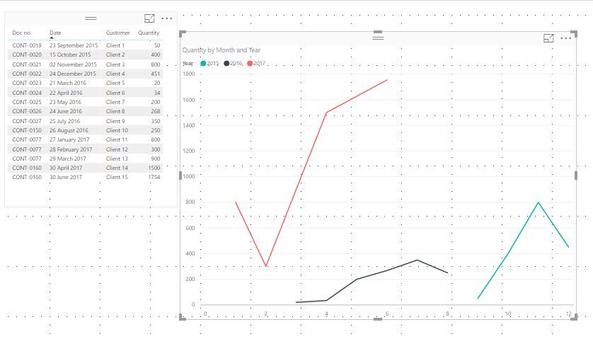
I want to compare values from different periods (years). I want in Line Chart report to compare the values from different years month by month. The important columns are Date and Q-ty.
My data is:
I want to compare these last 3 years in Line Chart or any other which is suitable. The data in lines is just to show how it should looks it is not with real data. I have also a DATE table, if it will be needed.
Thanks in advance!
Solved! Go to Solution.
- Mark as New
- Bookmark
- Subscribe
- Mute
- Subscribe to RSS Feed
- Permalink
- Report Inappropriate Content
Don't know if it is too simplistic, but if you parse the date as 2 added columns (one for year and one for month), then create a line chart with Month as the Axis, Year as the Legend and Quantity as the Value, doesn't that give the effect you are looking for? I didn't add a measure to smooth out the charts, just did the basics and got this:
- Mark as New
- Bookmark
- Subscribe
- Mute
- Subscribe to RSS Feed
- Permalink
- Report Inappropriate Content
Hi @Anonymous,
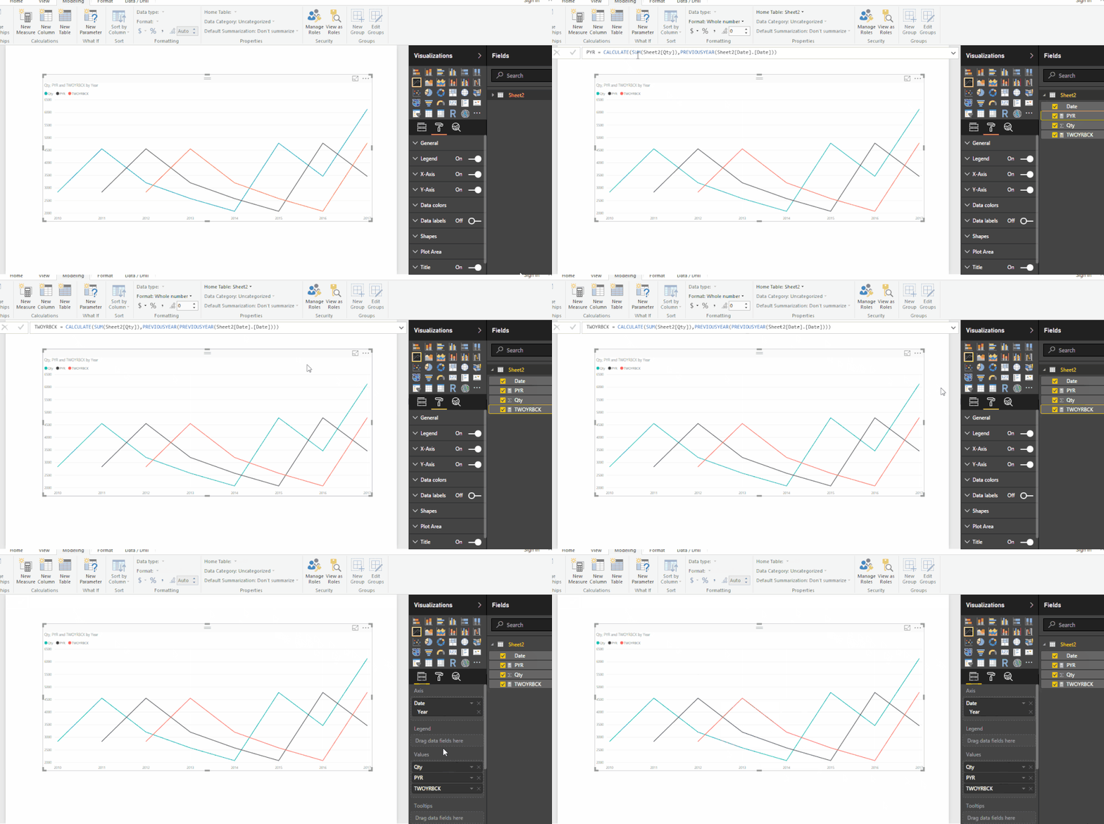
I have created two measure based on what I understand from you,
- PYR - previous year Qty
- TWOYRBCK = Qty 2 years ago
See the gif,
I hope I made it clear.
Regards,
Siva
- Mark as New
- Bookmark
- Subscribe
- Mute
- Subscribe to RSS Feed
- Permalink
- Report Inappropriate Content
@Anonymous,
Have you tried calculated columns?
- Mark as New
- Bookmark
- Subscribe
- Mute
- Subscribe to RSS Feed
- Permalink
- Report Inappropriate Content
Yes , I have tried columns with YEAR() and MONTH(), but I don't know how to compae values from different years on one chart.
- Mark as New
- Bookmark
- Subscribe
- Mute
- Subscribe to RSS Feed
- Permalink
- Report Inappropriate Content
Hi @Anonymous,
I have created two measure based on what I understand from you,
- PYR - previous year Qty
- TWOYRBCK = Qty 2 years ago
See the gif,
I hope I made it clear.
Regards,
Siva
- Mark as New
- Bookmark
- Subscribe
- Mute
- Subscribe to RSS Feed
- Permalink
- Report Inappropriate Content
Hello,
Thanks a lot fort he quick answers. I have tried both methods and both of them worked. I have chosen the first one by shill1000, because it is simpler for manage.
The only difference is that I also have a Date table (the query for the date table is: = Query_Date(#date(2000, 1, 1), #date(2040, 1, 1), null) ), which is related to mine table by column Date and I have used Date[Date] as axis (Date Hierarchy - Month) and Date[Year] as Legend. Q-ty is in Values and it worked fine
Thanks a lot!
- Mark as New
- Bookmark
- Subscribe
- Mute
- Subscribe to RSS Feed
- Permalink
- Report Inappropriate Content
Don't know if it is too simplistic, but if you parse the date as 2 added columns (one for year and one for month), then create a line chart with Month as the Axis, Year as the Legend and Quantity as the Value, doesn't that give the effect you are looking for? I didn't add a measure to smooth out the charts, just did the basics and got this:
Helpful resources

Microsoft Fabric Learn Together
Covering the world! 9:00-10:30 AM Sydney, 4:00-5:30 PM CET (Paris/Berlin), 7:00-8:30 PM Mexico City

Power BI Monthly Update - April 2024
Check out the April 2024 Power BI update to learn about new features.

| User | Count |
|---|---|
| 109 | |
| 98 | |
| 77 | |
| 66 | |
| 54 |
| User | Count |
|---|---|
| 144 | |
| 104 | |
| 100 | |
| 86 | |
| 64 |


