- Power BI forums
- Updates
- News & Announcements
- Get Help with Power BI
- Desktop
- Service
- Report Server
- Power Query
- Mobile Apps
- Developer
- DAX Commands and Tips
- Custom Visuals Development Discussion
- Health and Life Sciences
- Power BI Spanish forums
- Translated Spanish Desktop
- Power Platform Integration - Better Together!
- Power Platform Integrations (Read-only)
- Power Platform and Dynamics 365 Integrations (Read-only)
- Training and Consulting
- Instructor Led Training
- Dashboard in a Day for Women, by Women
- Galleries
- Community Connections & How-To Videos
- COVID-19 Data Stories Gallery
- Themes Gallery
- Data Stories Gallery
- R Script Showcase
- Webinars and Video Gallery
- Quick Measures Gallery
- 2021 MSBizAppsSummit Gallery
- 2020 MSBizAppsSummit Gallery
- 2019 MSBizAppsSummit Gallery
- Events
- Ideas
- Custom Visuals Ideas
- Issues
- Issues
- Events
- Upcoming Events
- Community Blog
- Power BI Community Blog
- Custom Visuals Community Blog
- Community Support
- Community Accounts & Registration
- Using the Community
- Community Feedback
Register now to learn Fabric in free live sessions led by the best Microsoft experts. From Apr 16 to May 9, in English and Spanish.
- Power BI forums
- Forums
- Get Help with Power BI
- Desktop
- Re: Compare two adjacent column in matrix visual b...
- Subscribe to RSS Feed
- Mark Topic as New
- Mark Topic as Read
- Float this Topic for Current User
- Bookmark
- Subscribe
- Printer Friendly Page
- Mark as New
- Bookmark
- Subscribe
- Mute
- Subscribe to RSS Feed
- Permalink
- Report Inappropriate Content
Compare two adjacent column in matrix visual base on selected filter
Hi,
I am new to power bi , i want to compare adjacent columns with each other in Matrix Visualisation based on the BizDate value filters and then mark them with respective colour code on their comparison.
please consider below table as input:
Filter | BizDate | Biz | Count |
A | 20210131 | Prime | 100 |
B | 20210131 | Prime | 101 |
C | 20210131 | Prime | 102 |
D | 20210131 | Prime | 103 |
A | 20210228 | Prime | 105 |
B | 20210228 | Prime | 90 |
C | 20210228 | Prime | 91 |
D | 20210228 | Prime | 92 |
E | 20210331 | Prime | 93 |
A | 20210331 | Prime | 105 |
B | 20210331 | Prime | 80 |
C | 20210331 | Prime | 70 |
D | 20210331 | Prime | 100 |
E | 20210131 | Prime | 90 |
A | 20210131 | Growth | 111 |
B | 20210131 | Growth | 102 |
C | 20210131 | Growth | 103 |
D | 20210228 | Growth | 104 |
E | 20210228 | Growth | 105 |
A | 20210228 | Growth | 100 |
B | 20210228 | Growth | 91 |
C | 20210228 | Growth | 92 |
D | 20210331 | Growth | 93 |
E | 20210331 | Growth | 500 |
A | 20210331 | Growth | 89 |
B | 20210331 | Growth | 90 |
C | 20210331 | Growth | 88 |
D | 20210331 | Growth | 1 |
E | 20210331 | Growth | 2 |
A | 20210431 | Growth | 10 |
B | 20210431 | Growth | 20 |
C | 20210431 | Growth | 30 |
D | 20210431 | Growth | 40 |
E | 20210431 | Growth | 50 |
A | 20210431 | Prime | 50 |
B | 20210431 | Prime | 40 |
C | 20210431 | Prime | 30 |
D | 20210431 | Prime | 20 |
E | 20210431 | Prime | 10 |
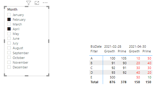
I want output matrix visualization as :
Here i am comparing values like :
- First I need to select filter (slicer) as date after selecting 3 dates - I will compare 20210331(March) Prime values with 20210228 (Feb) Prime values
and base on min and max value on comaprsion i will colour code them.
Same Comparison on Respective Growth Values
Min value - Red Colour
Max Value - Green Colour
Same Value
2.Now i will compare other two adjacent dates 20210228 (Feb) and 20210131 (Jan) and same colour code i will use to compare the min - max value.
Similarly for N th date i will compare it with N-1th Date (adjacent) and so onn..

Solved! Go to Solution.
- Mark as New
- Bookmark
- Subscribe
- Mute
- Subscribe to RSS Feed
- Permalink
- Report Inappropriate Content
Hi @Anonymous ,
Modify the measure:
Color =
var MaxDate =
    CALCULATE(
        MAX('Table'[BizDate]),
        FILTER(
            ALLSELECTED('Table'),
            'Table'[BizDate] < MAX('Table'[BizDate])
        )
    )
var MaxValue =
    CALCULATE(
        MAX('Table'[Count]),
        FILTER(
            ALLSELECTED('Table'),
            'Table'[BizDate] >= MaxDate
            && 'Table'[BizDate] <= MAX('Table'[BizDate])
        ),
        GROUPBY(
            'Table',
            'Table'[Filter],
            'Table'[Biz]
        )
    )
var Result =
    IF(
        MAX('Table'[BizDate]) = MINX(ALLSELECTED('Table'),'Table'[BizDate]),
        "black",
        IF(
            SUM('Table'[Count]) = MaxValue,
            "green",
            "red"
        )
    )
return Result
If the problem is still not resolved, please provide detailed error information or the expected result you expect. Let me know immediately, looking forward to your reply.
Best Regards,
Winniz
If this post helps, then please consider Accept it as the solution to help the other members find it more quickly.
- Mark as New
- Bookmark
- Subscribe
- Mute
- Subscribe to RSS Feed
- Permalink
- Report Inappropriate Content
Hi @Anonymous ,
Try the following formula to create a measure:
Color =
var _max =
    CALCULATE(
        MAX('Table'[Count]),
        FILTER(
            ALL('Table'),
            'Table'[BizDate] >= EOMONTH(MAX('Table'[BizDate]),-1)
            && 'Table'[BizDate] <= MAX('Table'[BizDate])
        ),
        GROUPBY(
            'Table',
            'Table'[Filter],
            'Table'[Biz]
        )
    )
var Result =
    IF(
        MAX('Table'[BizDate]) = MINX(ALLSELECTED('Table'),'Table'[BizDate]),
        "black",
        IF(
            SUM('Table'[Count]) = _max,
            "green",
            "red"
        )
    )
return Result
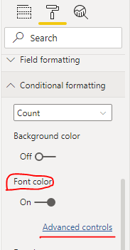
Enable the Font color option and select the created measure Color in the Advanced controls.

If the problem is still not resolved, please provide detailed error information or the expected result you expect. Let me know immediately, looking forward to your reply.
Best Regards,
Winniz
If this post helps, then please consider Accept it as the solution to help the other members find it more quickly.
- Mark as New
- Bookmark
- Subscribe
- Mute
- Subscribe to RSS Feed
- Permalink
- Report Inappropriate Content
Hi @v-kkf-msft ,
Your solution is missing one condition.
Currently your output is comparing the Growth/Prime data with the previous month(according to the calendar), I want this to be dynamic.
It should get compare with the month that i have selected from the slicer not necessary it is just the next previous month.
For example - If i select two month March and april the data is getting comapred coorectly (current output) but If I select the months feb and april only then these two month should get comapre with each other .
So the comaprison should be dynamic with the months i am selecting using the slicer and it should compare itslef with the previous month which is selected by the filter
.
Consider another example -
If I select month Jan , March & April (using slicer)
Then April should comapre with March
and March should comapre with Jan.
Please help me know if you still not able to understand the expected output.
- Mark as New
- Bookmark
- Subscribe
- Mute
- Subscribe to RSS Feed
- Permalink
- Report Inappropriate Content
Hi @Anonymous ,
Modify the measure:
Color =
var MaxDate =
    CALCULATE(
        MAX('Table'[BizDate]),
        FILTER(
            ALLSELECTED('Table'),
            'Table'[BizDate] < MAX('Table'[BizDate])
        )
    )
var MaxValue =
    CALCULATE(
        MAX('Table'[Count]),
        FILTER(
            ALLSELECTED('Table'),
            'Table'[BizDate] >= MaxDate
            && 'Table'[BizDate] <= MAX('Table'[BizDate])
        ),
        GROUPBY(
            'Table',
            'Table'[Filter],
            'Table'[Biz]
        )
    )
var Result =
    IF(
        MAX('Table'[BizDate]) = MINX(ALLSELECTED('Table'),'Table'[BizDate]),
        "black",
        IF(
            SUM('Table'[Count]) = MaxValue,
            "green",
            "red"
        )
    )
return Result
If the problem is still not resolved, please provide detailed error information or the expected result you expect. Let me know immediately, looking forward to your reply.
Best Regards,
Winniz
If this post helps, then please consider Accept it as the solution to help the other members find it more quickly.
- Mark as New
- Bookmark
- Subscribe
- Mute
- Subscribe to RSS Feed
- Permalink
- Report Inappropriate Content
@Anonymous , in case date is coming from date table and row (A,B,C) coming to another dimension table.
You can create a color measure for growth and use that in conditional formatting with field value option
Measure =
Switch( True() ,
[growth] = calculate(minx(values('Date'[Date]),[growth]),allselected(Date)) , "Red",
[growth] = calculate(maxx(values('Date'[Date]),[growth]),allselected(Date)) , "green",
"white"
)
In case date and those value are from same table few changes are required
Measure =
Switch( True() ,
[growth] = calculate(minx(values('Table'[Date]),[growth]),filter(allselected('Table'), 'Table'[Cat] =max('Table'[Cat]))) , "Red",
[growth] = calculate(maxx(values('Table'[Date]),[growth]),filter(allselected('Table'), 'Table'[Cat] =max('Table'[Cat]))) , "green",
"white"
)
Cat is a column for values A,B,C
repeat same for prime
Microsoft Power BI Learning Resources, 2023 !!
Learn Power BI - Full Course with Dec-2022, with Window, Index, Offset, 100+ Topics !!
Did I answer your question? Mark my post as a solution! Appreciate your Kudos !! Proud to be a Super User! !!
Helpful resources

Microsoft Fabric Learn Together
Covering the world! 9:00-10:30 AM Sydney, 4:00-5:30 PM CET (Paris/Berlin), 7:00-8:30 PM Mexico City

Power BI Monthly Update - April 2024
Check out the April 2024 Power BI update to learn about new features.

| User | Count |
|---|---|
| 109 | |
| 98 | |
| 77 | |
| 66 | |
| 54 |
| User | Count |
|---|---|
| 144 | |
| 104 | |
| 100 | |
| 86 | |
| 64 |


