- Power BI forums
- Updates
- News & Announcements
- Get Help with Power BI
- Desktop
- Service
- Report Server
- Power Query
- Mobile Apps
- Developer
- DAX Commands and Tips
- Custom Visuals Development Discussion
- Health and Life Sciences
- Power BI Spanish forums
- Translated Spanish Desktop
- Power Platform Integration - Better Together!
- Power Platform Integrations (Read-only)
- Power Platform and Dynamics 365 Integrations (Read-only)
- Training and Consulting
- Instructor Led Training
- Dashboard in a Day for Women, by Women
- Galleries
- Community Connections & How-To Videos
- COVID-19 Data Stories Gallery
- Themes Gallery
- Data Stories Gallery
- R Script Showcase
- Webinars and Video Gallery
- Quick Measures Gallery
- 2021 MSBizAppsSummit Gallery
- 2020 MSBizAppsSummit Gallery
- 2019 MSBizAppsSummit Gallery
- Events
- Ideas
- Custom Visuals Ideas
- Issues
- Issues
- Events
- Upcoming Events
- Community Blog
- Power BI Community Blog
- Custom Visuals Community Blog
- Community Support
- Community Accounts & Registration
- Using the Community
- Community Feedback
Register now to learn Fabric in free live sessions led by the best Microsoft experts. From Apr 16 to May 9, in English and Spanish.
- Power BI forums
- Forums
- Get Help with Power BI
- Desktop
- Compare % of total from one fiscal year to the nex...
- Subscribe to RSS Feed
- Mark Topic as New
- Mark Topic as Read
- Float this Topic for Current User
- Bookmark
- Subscribe
- Printer Friendly Page
- Mark as New
- Bookmark
- Subscribe
- Mute
- Subscribe to RSS Feed
- Permalink
- Report Inappropriate Content
Compare % of total from one fiscal year to the next
So I have data that include project information - hours worked, application impacted. I want to filter the projects to only include some types and then create a side by side bar graph with axis for the application, legend for fiscal year (comparing last year to this one) and the value percent of total.
I have no issues with the graph when I do it with hours worked and compare quarter to quarter but I want to compare the % for all of last year to the % for this year that is complete
I can not figure out how to write the measure for the % of total. I did write measure for the FY total that works
FY17 Total hours = CALCULATE(sum('Task data'[Hours Worked]),FILTER('Task data',RELATED('Fiscal Year'[Fiscal Year])="FY17")) but I seem to run into issues with filtering when I divide. Any ideas?
- Mark as New
- Bookmark
- Subscribe
- Mute
- Subscribe to RSS Feed
- Permalink
- Report Inappropriate Content
What issues do you get with filtering? Please share sample data of your scenario and post expected result here so that we can provide you appropriate DAX.
Regards,
Lydia Zhang
If this post helps, then please consider Accept it as the solution to help the other members find it more quickly.
- Mark as New
- Bookmark
- Subscribe
- Mute
- Subscribe to RSS Feed
- Permalink
- Report Inappropriate Content
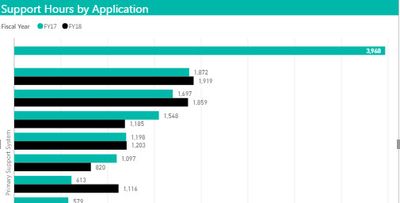
That is an example of what I want.
Here is an example of the summary data that was used above.
| Primary System | Hours Worked FY17 | Hours Worked FY18 |
| Middleware | 15448 | 4300 |
| Ordering Platform | 33180 | 11137 |
| Compliance Center | 8089 | 1948 |
| EDW | 2536 | 766 |
| Infrastructure | 10782 | 3298 |
| Printing App | 14327 | 0 |
| MoveIt | 1335 | 538 |
| Order Generator | 8649 | 2271 |
| Other | 171819 | 42209 |
| Wishbone | 28746 | 7569 |
The raw data include project name, type of project, project manager, Primary system, resource name, hours worked, month worked. I have another table that maps the month to the fiscal year. After I get the FY attached to the hours in excel I just do a pivot table (like above), show rows as % of column, pop it up on a bar chart and poof. I can visually compare the % from the whole of the last fiscal year to the % for just the first quarter of this fiscal year.
In Power BI I can easily create a graph like this showing one FY data by selecting show % of grand total but if I filter to show both years in the data they end up joined together and it won't accept FY in the legend to split them out. I know my data well but I am not a programer so my DAX is weak. I would guess that my DAX would need to select each row that is in FY17 and divide by the total of all the rows in FY17 (and show it as a %) and do it is such a way that any filters or selection that apply on the report work. Sometimes I want to group by the primary system, other times by type of project, etc. THANKS
- Mark as New
- Bookmark
- Subscribe
- Mute
- Subscribe to RSS Feed
- Permalink
- Report Inappropriate Content
@rkcasey,
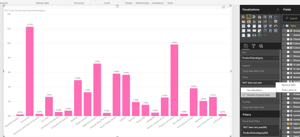
In Power BI Desktop, you can show value as "Pecent of grand total" . If you still get issues, please help to post raw data of your tables.
Regards,
Lydia Zhang
If this post helps, then please consider Accept it as the solution to help the other members find it more quickly.
Helpful resources

Microsoft Fabric Learn Together
Covering the world! 9:00-10:30 AM Sydney, 4:00-5:30 PM CET (Paris/Berlin), 7:00-8:30 PM Mexico City

Power BI Monthly Update - April 2024
Check out the April 2024 Power BI update to learn about new features.

| User | Count |
|---|---|
| 109 | |
| 98 | |
| 77 | |
| 66 | |
| 54 |
| User | Count |
|---|---|
| 144 | |
| 104 | |
| 100 | |
| 86 | |
| 64 |


