- Power BI forums
- Updates
- News & Announcements
- Get Help with Power BI
- Desktop
- Service
- Report Server
- Power Query
- Mobile Apps
- Developer
- DAX Commands and Tips
- Custom Visuals Development Discussion
- Health and Life Sciences
- Power BI Spanish forums
- Translated Spanish Desktop
- Power Platform Integration - Better Together!
- Power Platform Integrations (Read-only)
- Power Platform and Dynamics 365 Integrations (Read-only)
- Training and Consulting
- Instructor Led Training
- Dashboard in a Day for Women, by Women
- Galleries
- Community Connections & How-To Videos
- COVID-19 Data Stories Gallery
- Themes Gallery
- Data Stories Gallery
- R Script Showcase
- Webinars and Video Gallery
- Quick Measures Gallery
- 2021 MSBizAppsSummit Gallery
- 2020 MSBizAppsSummit Gallery
- 2019 MSBizAppsSummit Gallery
- Events
- Ideas
- Custom Visuals Ideas
- Issues
- Issues
- Events
- Upcoming Events
- Community Blog
- Power BI Community Blog
- Custom Visuals Community Blog
- Community Support
- Community Accounts & Registration
- Using the Community
- Community Feedback
Register now to learn Fabric in free live sessions led by the best Microsoft experts. From Apr 16 to May 9, in English and Spanish.
- Power BI forums
- Forums
- Get Help with Power BI
- Desktop
- Compare individuals to the team
- Subscribe to RSS Feed
- Mark Topic as New
- Mark Topic as Read
- Float this Topic for Current User
- Bookmark
- Subscribe
- Printer Friendly Page
- Mark as New
- Bookmark
- Subscribe
- Mute
- Subscribe to RSS Feed
- Permalink
- Report Inappropriate Content
Compare individuals to the team
Hello all,
Here's my goal: I want to show the average time spent in review, testing, and draft for the team as a whole as well as these individual employees. Can I display all of this in one stacked column chart?
Solved! Go to Solution.
- Mark as New
- Bookmark
- Subscribe
- Mute
- Subscribe to RSS Feed
- Permalink
- Report Inappropriate Content
Hi @Anonymous ,
You could try the following steps:
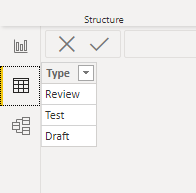
1. Add a table for slicer via Enter data:
2.Create measures for teams and individuals :
team average =
SWITCH(MAX('ForSlicer'[Type]),"Review",CALCULATE(AVERAGE('Table'[Days in review]),ALLEXCEPT('Table','Table'[Manager])),"Test",CALCULATE(AVERAGE('Table'[Days in testing]),ALLEXCEPT('Table','Table'[Manager])),"Draft",CALCULATE(AVERAGE('Table'[Days in draft]),ALLEXCEPT('Table','Table'[Manager])))
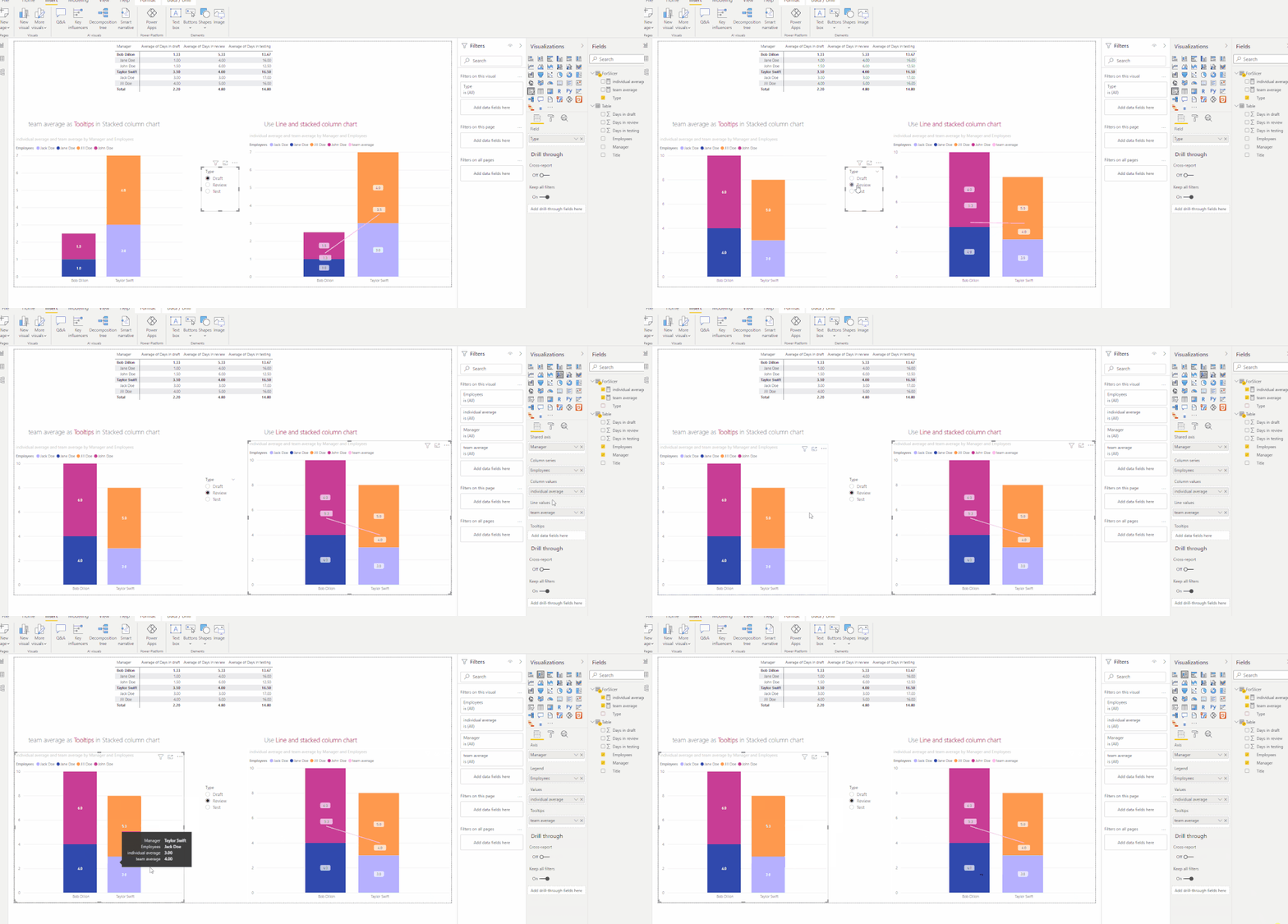
individual average = SWITCH(MAX('ForSlicer'[Type]),"Review",CALCULATE(AVERAGE('Table'[Days in review]),ALLEXCEPT('Table','Table'[Employees])),"Test",CALCULATE(AVERAGE('Table'[Days in testing]),ALLEXCEPT('Table','Table'[Employees])),"Draft",CALCULATE(AVERAGE('Table'[Days in draft]),ALLEXCEPT('Table','Table'[Employees])))Then you could create visuals as shown below:
Best Regards,
Eyelyn Qin
If this post helps, then please consider Accept it as the solution to help the other members find it more quickly.
- Mark as New
- Bookmark
- Subscribe
- Mute
- Subscribe to RSS Feed
- Permalink
- Report Inappropriate Content
- Mark as New
- Bookmark
- Subscribe
- Mute
- Subscribe to RSS Feed
- Permalink
- Report Inappropriate Content
@Anonymous
Yes, you can do that but the technique you have to use is not something that PBI does out of the box. You'll have to put a bit of effort into it. Alberto Ferrari discusses such a technique in his videos on YouTube. You can also find something similar in the materials by The Guy in A Cube (Patrick and Adam) Guy in a Cube - YouTube.
I would give you the exact link but I can't remember it. However, I'm 100% sure they show how to achieve such arrangements.
- Mark as New
- Bookmark
- Subscribe
- Mute
- Subscribe to RSS Feed
- Permalink
- Report Inappropriate Content
@Anonymous
Thank you for pointing me in the direction, but without a specfic location I have still yet to find a solution.
Helpful resources

Microsoft Fabric Learn Together
Covering the world! 9:00-10:30 AM Sydney, 4:00-5:30 PM CET (Paris/Berlin), 7:00-8:30 PM Mexico City

Power BI Monthly Update - April 2024
Check out the April 2024 Power BI update to learn about new features.

| User | Count |
|---|---|
| 107 | |
| 98 | |
| 77 | |
| 66 | |
| 53 |
| User | Count |
|---|---|
| 144 | |
| 104 | |
| 100 | |
| 86 | |
| 64 |


