- Power BI forums
- Updates
- News & Announcements
- Get Help with Power BI
- Desktop
- Service
- Report Server
- Power Query
- Mobile Apps
- Developer
- DAX Commands and Tips
- Custom Visuals Development Discussion
- Health and Life Sciences
- Power BI Spanish forums
- Translated Spanish Desktop
- Power Platform Integration - Better Together!
- Power Platform Integrations (Read-only)
- Power Platform and Dynamics 365 Integrations (Read-only)
- Training and Consulting
- Instructor Led Training
- Dashboard in a Day for Women, by Women
- Galleries
- Community Connections & How-To Videos
- COVID-19 Data Stories Gallery
- Themes Gallery
- Data Stories Gallery
- R Script Showcase
- Webinars and Video Gallery
- Quick Measures Gallery
- 2021 MSBizAppsSummit Gallery
- 2020 MSBizAppsSummit Gallery
- 2019 MSBizAppsSummit Gallery
- Events
- Ideas
- Custom Visuals Ideas
- Issues
- Issues
- Events
- Upcoming Events
- Community Blog
- Power BI Community Blog
- Custom Visuals Community Blog
- Community Support
- Community Accounts & Registration
- Using the Community
- Community Feedback
Register now to learn Fabric in free live sessions led by the best Microsoft experts. From Apr 16 to May 9, in English and Spanish.
- Power BI forums
- Forums
- Get Help with Power BI
- Desktop
- Re: Combo Chart with multiple lines
- Subscribe to RSS Feed
- Mark Topic as New
- Mark Topic as Read
- Float this Topic for Current User
- Bookmark
- Subscribe
- Printer Friendly Page
- Mark as New
- Bookmark
- Subscribe
- Mute
- Subscribe to RSS Feed
- Permalink
- Report Inappropriate Content
Combo Chart with multiple lines
Hi all,
I need your support and would be really grateful if someone is able to help!
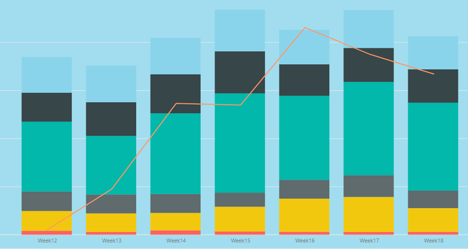
Here the current stand:
So the Bar charts represent the following:
Volumes in absolute numbers for a specific location (for example red is Berlin, yellow is London etc.)
The Line chart represents the performance outcome based on the total volumes for all locations in %.
So lets say the volume for week 12 is 50 000 the total performance for those 50 000 is 90%, HOWEVER the performance % for each location is different. So thats what I want to show - 6 line charts showing the performance % for each location for the given week.
Is this possible?
Many thanks in advance!
- Mark as New
- Bookmark
- Subscribe
- Mute
- Subscribe to RSS Feed
- Permalink
- Report Inappropriate Content
Hi @IPGeorgiev ,
We can use the following steps to meet your requirement.
1. Create measures like this, you can create six measures based on your demands.
A = IF("A" in DISTINCT('Table'[country]),CALCULATE(SUM('Table'[values]),'Table'[country] = "A") / CALCULATE(SUM('Table'[values])))

B = IF("B" in DISTINCT('Table'[country]),CALCULATE(SUM('Table'[values]),'Table'[country] = "B") / CALCULATE(SUM('Table'[values])))

C = IF("C" in DISTINCT('Table'[country]),CALCULATE(SUM('Table'[values]),'Table'[country] = "C") / CALCULATE(SUM('Table'[values])))
2. Then create a line and stacked column chart, and put the measures to line values. The result like this,
If it doesn’t meet your requirement, could you please show the exact expected result based on the table that you have shared?
BTW, pbix as attached.
Best regards,
Community Support Team _ zhenbw
If this post helps, then please consider Accept it as the solution to help the other members find it more quickly.
- Mark as New
- Bookmark
- Subscribe
- Mute
- Subscribe to RSS Feed
- Permalink
- Report Inappropriate Content
HI @v-zhenbw-msft ,
many thanks for the example and the details!
I have actually managed to solve this via quick measure and this is how it looks like:
Measure =
CALCULATE(
	[KPI1%],
	'Table1'[Location] IN { "LocationName" }
)
And I have created 6 measures like this and this actually solved the problem.
Best regards,
Ivan
- Mark as New
- Bookmark
- Subscribe
- Mute
- Subscribe to RSS Feed
- Permalink
- Report Inappropriate Content
You want six line charts or a line chart with 6 lines?
It is likely possible. Please see this post regarding How to Get Your Question Answered Quickly: https://community.powerbi.com/t5/Community-Blog/How-to-Get-Your-Question-Answered-Quickly/ba-p/38490
@ me in replies or I'll lose your thread!!!
Instead of a Kudo, please vote for this idea
Become an expert!: Enterprise DNA
External Tools: MSHGQM
YouTube Channel!: Microsoft Hates Greg
Latest book!: The Definitive Guide to Power Query (M)
DAX is easy, CALCULATE makes DAX hard...
Helpful resources

Microsoft Fabric Learn Together
Covering the world! 9:00-10:30 AM Sydney, 4:00-5:30 PM CET (Paris/Berlin), 7:00-8:30 PM Mexico City

Power BI Monthly Update - April 2024
Check out the April 2024 Power BI update to learn about new features.

| User | Count |
|---|---|
| 113 | |
| 99 | |
| 75 | |
| 73 | |
| 49 |
| User | Count |
|---|---|
| 146 | |
| 108 | |
| 106 | |
| 90 | |
| 62 |


