- Power BI forums
- Updates
- News & Announcements
- Get Help with Power BI
- Desktop
- Service
- Report Server
- Power Query
- Mobile Apps
- Developer
- DAX Commands and Tips
- Custom Visuals Development Discussion
- Health and Life Sciences
- Power BI Spanish forums
- Translated Spanish Desktop
- Power Platform Integration - Better Together!
- Power Platform Integrations (Read-only)
- Power Platform and Dynamics 365 Integrations (Read-only)
- Training and Consulting
- Instructor Led Training
- Dashboard in a Day for Women, by Women
- Galleries
- Community Connections & How-To Videos
- COVID-19 Data Stories Gallery
- Themes Gallery
- Data Stories Gallery
- R Script Showcase
- Webinars and Video Gallery
- Quick Measures Gallery
- 2021 MSBizAppsSummit Gallery
- 2020 MSBizAppsSummit Gallery
- 2019 MSBizAppsSummit Gallery
- Events
- Ideas
- Custom Visuals Ideas
- Issues
- Issues
- Events
- Upcoming Events
- Community Blog
- Power BI Community Blog
- Custom Visuals Community Blog
- Community Support
- Community Accounts & Registration
- Using the Community
- Community Feedback
Register now to learn Fabric in free live sessions led by the best Microsoft experts. From Apr 16 to May 9, in English and Spanish.
- Power BI forums
- Forums
- Get Help with Power BI
- Desktop
- Combining two visuals in single visual
- Subscribe to RSS Feed
- Mark Topic as New
- Mark Topic as Read
- Float this Topic for Current User
- Bookmark
- Subscribe
- Printer Friendly Page
- Mark as New
- Bookmark
- Subscribe
- Mute
- Subscribe to RSS Feed
- Permalink
- Report Inappropriate Content
Combining two visuals in single visual
Hi,
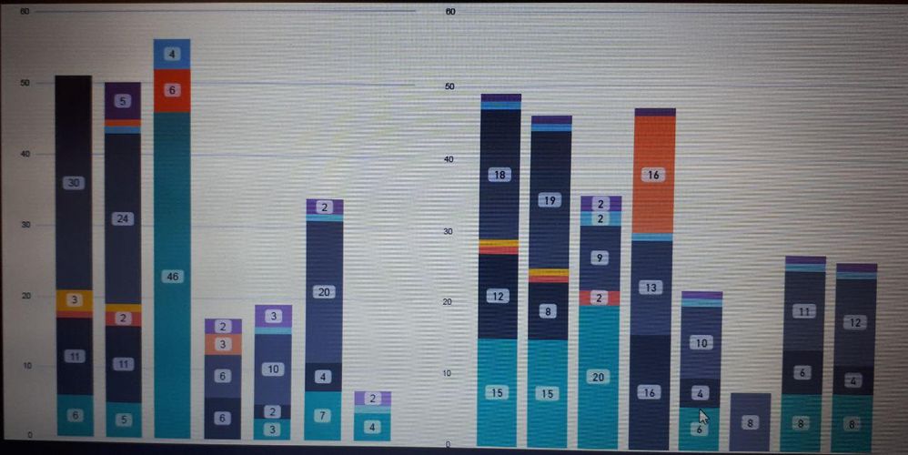
I have two stacked column bar charts as the following, the left one is Actual and the right one is Target. I wanted to combine them in a single visual and show each actual column adjacent to its Target column, how I can do it?
Solved! Go to Solution.
- Mark as New
- Bookmark
- Subscribe
- Mute
- Subscribe to RSS Feed
- Permalink
- Report Inappropriate Content
Hi @Anonymous ,
Sorry for this questions but to help you in the best way we need to understand the result and data you provide, to what I can see from the print the csutom column on the Actuals matches the Team on the target correct?
Is this the X-Axis on your chart?
If yes what composes your categories withing each bar?
Regards,
MFelix
And what are the values you are counting/sum on your values?
Regards
Miguel Félix
Did I answer your question? Mark my post as a solution!
Proud to be a Super User!
Check out my blog: Power BI em Português- Mark as New
- Bookmark
- Subscribe
- Mute
- Subscribe to RSS Feed
- Permalink
- Report Inappropriate Content
@Anonymous ,
You may select Unpivot Columns in Query Editor.
- https://community.powerbi.com/t5/Desktop/matrix-to-table-help/td-p/329415
- https://community.powerbi.com/t5/Desktop/Column-Header-names-should-contain-current-month-dynamically/td-p/289909
If this post helps, then please consider Accept it as the solution to help the other members find it more quickly.
- Mark as New
- Bookmark
- Subscribe
- Mute
- Subscribe to RSS Feed
- Permalink
- Report Inappropriate Content
you may try to use some custom visuals like bullet chart and other available visuals on the marketplace
- Mark as New
- Bookmark
- Subscribe
- Mute
- Subscribe to RSS Feed
- Permalink
- Report Inappropriate Content
@mussaendaThanks, but what is the relationship between bullet chart and combined stacked bar chart really?! I need to have two stacked bar chart in one visual which is my problem now!
- Mark as New
- Bookmark
- Subscribe
- Mute
- Subscribe to RSS Feed
- Permalink
- Report Inappropriate Content
I was just suggesting since bullet chart has target fields. It's up to you if you will try t or not. If it didn't help you, then I apologise. Good luck on combining two stacked bar charts in one visual! Please do let me know if you have found an answer, I would be happy to use it too.
- Mark as New
- Bookmark
- Subscribe
- Mute
- Subscribe to RSS Feed
- Permalink
- Report Inappropriate Content
@MFelix and @v-chuncz-msft , can you please comment if there is a visual to use in combining two stacked column bar charts?
- Mark as New
- Bookmark
- Subscribe
- Mute
- Subscribe to RSS Feed
- Permalink
- Report Inappropriate Content
@Anonymous ,
You may take advantage of Drill down in a visualization in Power BI.
If this post helps, then please consider Accept it as the solution to help the other members find it more quickly.
- Mark as New
- Bookmark
- Subscribe
- Mute
- Subscribe to RSS Feed
- Permalink
- Report Inappropriate Content
@v-chuncz-msft No, I don't want to use drill down since the business users are not comfortable with this option.
Is there any visual like Excel for combinig stacked column charts?
Please reply
- Mark as New
- Bookmark
- Subscribe
- Mute
- Subscribe to RSS Feed
- Permalink
- Report Inappropriate Content
Hi @Anonymous ,
Believe that the best option is as @v-chuncz-msft refered to do a drill down option making the actuals and Budget the last drill down row, then you should place the visual on the lowest level and that would give target next to actuals.
Assuming that you are making this for users to use on the web service if you then disable the drill down buttons then users wouldn't even realized they are looking at a drill down chart.
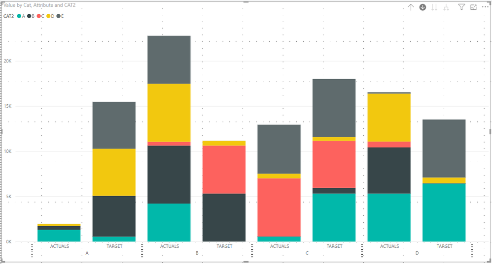
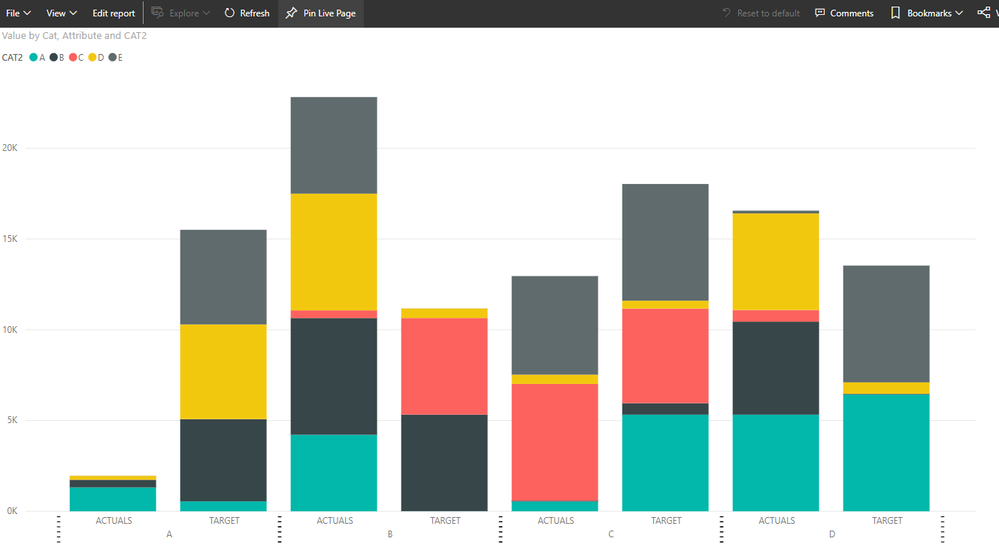
As you can see below on the web service the drill down is not visible, on the desktop the option is visible because it's consider editing mode so you will always see it.
Desktop version:
Web version
See attach the pbix file with the example.
Regards,
MFelix
Regards
Miguel Félix
Did I answer your question? Mark my post as a solution!
Proud to be a Super User!
Check out my blog: Power BI em Português- Mark as New
- Bookmark
- Subscribe
- Mute
- Subscribe to RSS Feed
- Permalink
- Report Inappropriate Content
@MFelixHow I can open your file in the older version of pbix? Since our company policy only let use have the version for Sep2018!
@MFelixThe problem I have is that the Actual and Target visuals are not connected because they come from two naturally different tables(main difference is there is no common unique column between the two tables to let me join them or concatinate them)!
what should I do in this case? How to change my model to connect them?
- Mark as New
- Bookmark
- Subscribe
- Mute
- Subscribe to RSS Feed
- Permalink
- Report Inappropriate Content
Does the tables have any common field? Any connection that allows you to have the actuals related with the target?
You can create a dimension table with unique values that make the relationship.
Can you share a simple mockup of your data?
Regards,
MFelix
Regards
Miguel Félix
Did I answer your question? Mark my post as a solution!
Proud to be a Super User!
Check out my blog: Power BI em Português- Mark as New
- Bookmark
- Subscribe
- Mute
- Subscribe to RSS Feed
- Permalink
- Report Inappropriate Content
@MFelix @v-chuncz-msft and v-lili6-msft
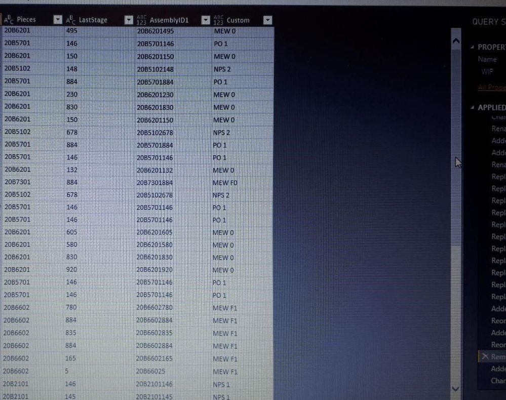
Here I have shared a screenshot of the tables:
Actual:
and below is the Target:
So now you have all the info needed to show the power of your designed tool, MS. POWER BI to let me believe my investment wasn't all in vein!
Please answer!
- Mark as New
- Bookmark
- Subscribe
- Mute
- Subscribe to RSS Feed
- Permalink
- Report Inappropriate Content
Hi @Anonymous ,
Sorry for this questions but to help you in the best way we need to understand the result and data you provide, to what I can see from the print the csutom column on the Actuals matches the Team on the target correct?
Is this the X-Axis on your chart?
If yes what composes your categories withing each bar?
Regards,
MFelix
And what are the values you are counting/sum on your values?
Regards
Miguel Félix
Did I answer your question? Mark my post as a solution!
Proud to be a Super User!
Check out my blog: Power BI em Português- Mark as New
- Bookmark
- Subscribe
- Mute
- Subscribe to RSS Feed
- Permalink
- Report Inappropriate Content
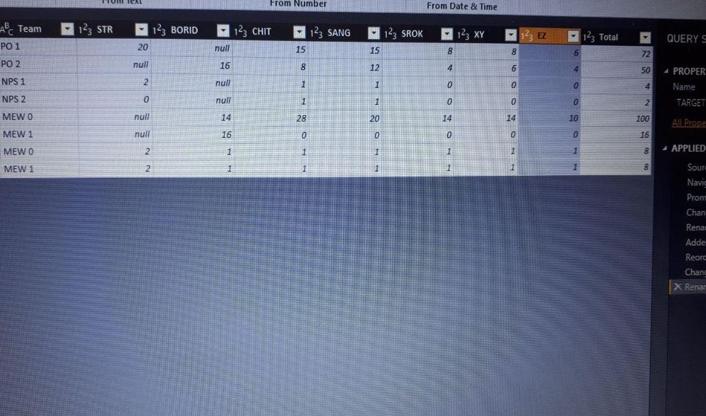
@MFelix no none of them are my X-Axis!
actually the problem is I have to transpose the below matrix to be able to visualize it in the stacked column chart! which is my biggest problem...
What should I do? If there is anyother visual to furnish my need? Please don't repeat your previous solutions!
- Mark as New
- Bookmark
- Subscribe
- Mute
- Subscribe to RSS Feed
- Permalink
- Report Inappropriate Content
Hi @Anonymous ,
To be abble to add two different tables within a single visual (bar chart or other) you need to have columns that relate both of them otherwise or the visuals will give incorrect values, or no values at all, that's why is important to understand how both charts you present on your first post are setup.
Adding to this as @v-chuncz-msft , refers you need to make the unpivot of data.
I apologize for not being abble to be more insightfull with the answers I giving to you however as you may realize if we don't know the exact way you have your data and the ways information relates and the expected output is difficult to give you the right answer at firts attempt.
If you believe that I'm makning to many questions or not understanding your problem exactly I also apologize and if you want I can reference some other users on the community that can try and help you.
Regards,
MFelix
Regards
Miguel Félix
Did I answer your question? Mark my post as a solution!
Proud to be a Super User!
Check out my blog: Power BI em Português- Mark as New
- Bookmark
- Subscribe
- Mute
- Subscribe to RSS Feed
- Permalink
- Report Inappropriate Content
@Anonymous ,
You may select Unpivot Columns in Query Editor.
- https://community.powerbi.com/t5/Desktop/matrix-to-table-help/td-p/329415
- https://community.powerbi.com/t5/Desktop/Column-Header-names-should-contain-current-month-dynamically/td-p/289909
If this post helps, then please consider Accept it as the solution to help the other members find it more quickly.
Helpful resources

Microsoft Fabric Learn Together
Covering the world! 9:00-10:30 AM Sydney, 4:00-5:30 PM CET (Paris/Berlin), 7:00-8:30 PM Mexico City

Power BI Monthly Update - April 2024
Check out the April 2024 Power BI update to learn about new features.

| User | Count |
|---|---|
| 114 | |
| 97 | |
| 86 | |
| 70 | |
| 62 |
| User | Count |
|---|---|
| 151 | |
| 120 | |
| 103 | |
| 87 | |
| 68 |
