- Power BI forums
- Updates
- News & Announcements
- Get Help with Power BI
- Desktop
- Service
- Report Server
- Power Query
- Mobile Apps
- Developer
- DAX Commands and Tips
- Custom Visuals Development Discussion
- Health and Life Sciences
- Power BI Spanish forums
- Translated Spanish Desktop
- Power Platform Integration - Better Together!
- Power Platform Integrations (Read-only)
- Power Platform and Dynamics 365 Integrations (Read-only)
- Training and Consulting
- Instructor Led Training
- Dashboard in a Day for Women, by Women
- Galleries
- Community Connections & How-To Videos
- COVID-19 Data Stories Gallery
- Themes Gallery
- Data Stories Gallery
- R Script Showcase
- Webinars and Video Gallery
- Quick Measures Gallery
- 2021 MSBizAppsSummit Gallery
- 2020 MSBizAppsSummit Gallery
- 2019 MSBizAppsSummit Gallery
- Events
- Ideas
- Custom Visuals Ideas
- Issues
- Issues
- Events
- Upcoming Events
- Community Blog
- Power BI Community Blog
- Custom Visuals Community Blog
- Community Support
- Community Accounts & Registration
- Using the Community
- Community Feedback
Register now to learn Fabric in free live sessions led by the best Microsoft experts. From Apr 16 to May 9, in English and Spanish.
- Power BI forums
- Forums
- Get Help with Power BI
- Desktop
- Combining two Line and Stacked column charts
- Subscribe to RSS Feed
- Mark Topic as New
- Mark Topic as Read
- Float this Topic for Current User
- Bookmark
- Subscribe
- Printer Friendly Page
- Mark as New
- Bookmark
- Subscribe
- Mute
- Subscribe to RSS Feed
- Permalink
- Report Inappropriate Content
Combining two Line and Stacked column charts
Hi All,
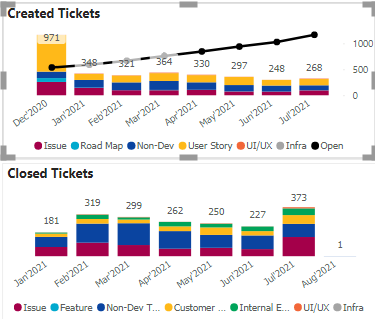
Just wanted to know if theres a possibility that I can combine two line and stacked column charts and show the data.
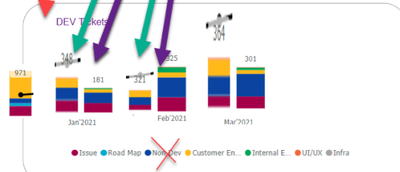
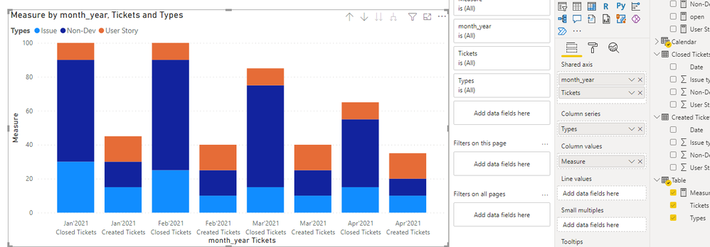
I have created the above two seperate charts and now business wants to see it together like below:
The closed and created tickets side by side.
But i'm not sure if its possible as I cant see any visualisation supporting this.
Do let me know if there's any visual to show the data this way or any work around.
Please note: All the fields in both the visuals are measures created.
Regards,
Himanshu
Solved! Go to Solution.
- Mark as New
- Bookmark
- Subscribe
- Mute
- Subscribe to RSS Feed
- Permalink
- Report Inappropriate Content
Hi @Anonymous ,
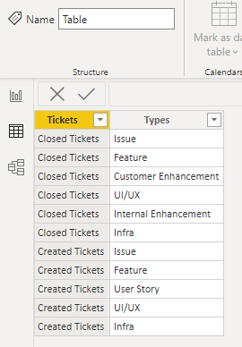
Try to create a new table:
Then create measure:
Combine =
var tab =
FILTER(
    ALLSELECTED('devops-query-spr2'),
    'devops-query-spr2'[Closed Month'Year] = MAX('devops-query-spr2'[Month'Year])
)
RETURN
IF(
    MAX('Table'[Tickets]) = "Created Tickets",
    SWITCH(
        MAX('Table'[Types]),
        "Issue", [Issue],
        "Feature", [Feature],
        "User Story", [User Story],
        "UI/UX", [UI/UX count],
        "Infra", SUM('devops-query-spr2'[Infrastructure])
    ),
    SWITCH(
        MAX('Table'[Types]),
        "Issue", CALCULATE( [Closed Issue], tab ),
        "Feature", CALCULATE( [Closed Feature], tab ),
        "Customer Enhancement", CALCULATE( [closed Customer Enhancement], tab ),
        "Internal Enhancement", CALCULATE( [Closed Internal Enhancement], tab ),
        "UI/UX", CALCULATE( [Closed UI/UX count], tab ),
        "Infra", CALCULATE( [closed Infrastructure], tab )
    )
)
If the problem is still not resolved, please provide detailed error information or the expected result you expect. Let me know immediately, looking forward to your reply.
Best Regards,
Winniz
If this post helps, then please consider Accept it as the solution to help the other members find it more quickly.
- Mark as New
- Bookmark
- Subscribe
- Mute
- Subscribe to RSS Feed
- Permalink
- Report Inappropriate Content
Hi @Anonymous ,
Does your table have the following column containing tickets types?
If so, you can try to add the column to the X-axis of the chart and drill down.
If the problem is still not resolved, please provide detailed error information or the expected result you expect. Let me know immediately, looking forward to your reply.
Best Regards,
Winniz
If this post helps, then please consider Accept it as the solution to help the other members find it more quickly.
- Mark as New
- Bookmark
- Subscribe
- Mute
- Subscribe to RSS Feed
- Permalink
- Report Inappropriate Content
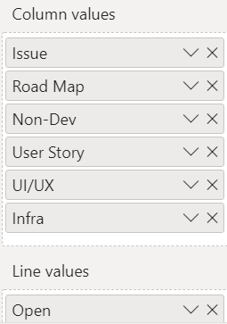
@v-kkf-msft No i dont have any column as Status rather i have created measures for different ticket types like Non-Dev, Issue etc for both closed and created.
I have two date tables in my data so i've created a DAX date table to sync both and i dont think there's any visual where i can put all the measures together (both created and closed)
- Mark as New
- Bookmark
- Subscribe
- Mute
- Subscribe to RSS Feed
- Permalink
- Report Inappropriate Content
Hi @Anonymous ,
There are two ways you can try.
1. Append two tables.
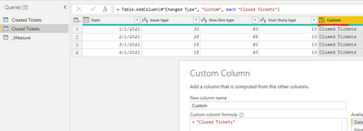
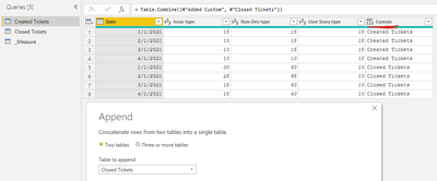
- Add custom columns to table Created Tickets and table Closed Tickets, then append two tables. This gives us the same column("Status") as in the previous reply.
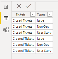
2. Add a new table, like this:
Then create measure:
Measure =
IF(
    MAX('Table'[Tickets]) = "Created Tickets",
    SWITCH(
        MAX('Table'[Types]),
        "Issue", SUM('Created Tickets'[Issue type]),
        "Non-Dev", SUM('Created Tickets'[Non-Dev type]),
        "User Story", SUM('Created Tickets'[User Story type])
    ),
    SWITCH(
        MAX('Table'[Types]),
        "Issue", SUM('Closed Tickets'[Issue type]),
        "Non-Dev",SUM('Closed Tickets'[Non-Dev type]),
        "User Story",SUM('Closed Tickets'[User Story type])
    )
)
If the problem is still not resolved, please provide detailed error information or the expected result you expect. Let me know immediately, looking forward to your reply.
Best Regards,
Winniz
If this post helps, then please consider Accept it as the solution to help the other members find it more quickly.
- Mark as New
- Bookmark
- Subscribe
- Mute
- Subscribe to RSS Feed
- Permalink
- Report Inappropriate Content
@v-kkf-msft I tried but its not working for me as the ticket types are measures for me and you have used them as column in your file.
Please use the below link to download the sample pbix file. You'll find the measures and the graphs n the report. Do let me know if its possible to merge the closed and open tickets.
I have merged 1 which is Non-Dev tickets and thats also in the file but i want to merge all.
https://drive.google.com/file/d/1mfC6eO3yD8NM5SdxdgehrVr09xhs0SHk/view?usp=sharing
- Mark as New
- Bookmark
- Subscribe
- Mute
- Subscribe to RSS Feed
- Permalink
- Report Inappropriate Content
Hi @Anonymous ,
Try to create a new table:
Then create measure:
Combine =
var tab =
FILTER(
    ALLSELECTED('devops-query-spr2'),
    'devops-query-spr2'[Closed Month'Year] = MAX('devops-query-spr2'[Month'Year])
)
RETURN
IF(
    MAX('Table'[Tickets]) = "Created Tickets",
    SWITCH(
        MAX('Table'[Types]),
        "Issue", [Issue],
        "Feature", [Feature],
        "User Story", [User Story],
        "UI/UX", [UI/UX count],
        "Infra", SUM('devops-query-spr2'[Infrastructure])
    ),
    SWITCH(
        MAX('Table'[Types]),
        "Issue", CALCULATE( [Closed Issue], tab ),
        "Feature", CALCULATE( [Closed Feature], tab ),
        "Customer Enhancement", CALCULATE( [closed Customer Enhancement], tab ),
        "Internal Enhancement", CALCULATE( [Closed Internal Enhancement], tab ),
        "UI/UX", CALCULATE( [Closed UI/UX count], tab ),
        "Infra", CALCULATE( [closed Infrastructure], tab )
    )
)
If the problem is still not resolved, please provide detailed error information or the expected result you expect. Let me know immediately, looking forward to your reply.
Best Regards,
Winniz
If this post helps, then please consider Accept it as the solution to help the other members find it more quickly.
- Mark as New
- Bookmark
- Subscribe
- Mute
- Subscribe to RSS Feed
- Permalink
- Report Inappropriate Content
@v-kkf-msft can you help me with one last thing, i want the created tickets to be in first and then the closed tickets in my graph? Should I change the measure created?
- Mark as New
- Bookmark
- Subscribe
- Mute
- Subscribe to RSS Feed
- Permalink
- Report Inappropriate Content
- Mark as New
- Bookmark
- Subscribe
- Mute
- Subscribe to RSS Feed
- Permalink
- Report Inappropriate Content
two options come to mind. One crazy one - superposition both charts, make the background and legend etc. of the "top" one transparent, and play with the spacing between the bars.
The other one is more reasonable - use Charticulator to create your own custom visual.
Third option is to use a table visual instead and see if that is sufficient to tell the story.
Helpful resources

Microsoft Fabric Learn Together
Covering the world! 9:00-10:30 AM Sydney, 4:00-5:30 PM CET (Paris/Berlin), 7:00-8:30 PM Mexico City

Power BI Monthly Update - April 2024
Check out the April 2024 Power BI update to learn about new features.

| User | Count |
|---|---|
| 114 | |
| 100 | |
| 81 | |
| 70 | |
| 62 |
| User | Count |
|---|---|
| 148 | |
| 116 | |
| 104 | |
| 90 | |
| 65 |
