- Power BI forums
- Updates
- News & Announcements
- Get Help with Power BI
- Desktop
- Service
- Report Server
- Power Query
- Mobile Apps
- Developer
- DAX Commands and Tips
- Custom Visuals Development Discussion
- Health and Life Sciences
- Power BI Spanish forums
- Translated Spanish Desktop
- Power Platform Integration - Better Together!
- Power Platform Integrations (Read-only)
- Power Platform and Dynamics 365 Integrations (Read-only)
- Training and Consulting
- Instructor Led Training
- Dashboard in a Day for Women, by Women
- Galleries
- Community Connections & How-To Videos
- COVID-19 Data Stories Gallery
- Themes Gallery
- Data Stories Gallery
- R Script Showcase
- Webinars and Video Gallery
- Quick Measures Gallery
- 2021 MSBizAppsSummit Gallery
- 2020 MSBizAppsSummit Gallery
- 2019 MSBizAppsSummit Gallery
- Events
- Ideas
- Custom Visuals Ideas
- Issues
- Issues
- Events
- Upcoming Events
- Community Blog
- Power BI Community Blog
- Custom Visuals Community Blog
- Community Support
- Community Accounts & Registration
- Using the Community
- Community Feedback
Register now to learn Fabric in free live sessions led by the best Microsoft experts. From Apr 16 to May 9, in English and Spanish.
- Power BI forums
- Forums
- Get Help with Power BI
- Desktop
- Combine two, essentially similar yet disparate que...
- Subscribe to RSS Feed
- Mark Topic as New
- Mark Topic as Read
- Float this Topic for Current User
- Bookmark
- Subscribe
- Printer Friendly Page
- Mark as New
- Bookmark
- Subscribe
- Mute
- Subscribe to RSS Feed
- Permalink
- Report Inappropriate Content
Combine two, essentially similar yet disparate queries to display in one chart
Hi. I've posted this already in an existing question of mine, but fear it's lost in the wash so asking again. I'm still new to PBI and my SQL is adequate but not expert by any stretch, and I'm in need of help.
I have two queries: one showing all interactions recorded for an individual over a time frame, and another showing the number of staff that were at work over the same time frame.
Query 1 - individual interactions
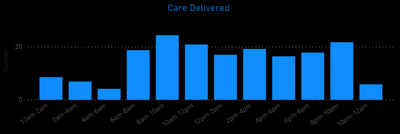
Duration is a Duration datatype, showing minutes. "Slot" is a conditional column that assigns 12-2am, 2am-4am, 4am-6am......8pm-10pm, 10pm-12am depending on the interaction Date and Time. Slot is then set to sort by Custom, which is another conditional column that shows 1 - 12 depending on the two-hour Slot, in order for it to show in the right order on the chart.
Query 2 - staff on duty
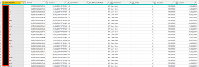
There is no data I can utilise that says "between 10pm and 12am, X staff were on duty". I only have start date/time, finish date/time. With the help of others, I created a query that shows me this data:
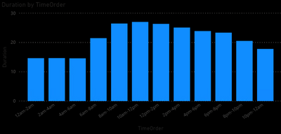
TimeOrder is a conditional column that says ie 'if [HourPeriod] = "0-1" then "12am-2am"', all the way through to 23-0. This was done to make the data similar to Query 1. Order is a sorting column that converts 12am-2am = 1, 2am-4am=2 etc so that it too displays properly on the chart. (I still think it's rubbish that PBI cannot account for these without silly workarounds, but there we go). I added another custom column, Custom, to convert the date from Started but really this serves no purpose.
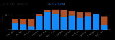
This produces similiar charts which align well and give data that is meaningful to me:
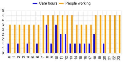
However, I want to combine the two as such:
I do not know how to do this effectively as I am not skilled enough to work it out. Does anyone have any ideas?
- Mark as New
- Bookmark
- Subscribe
- Mute
- Subscribe to RSS Feed
- Permalink
- Report Inappropriate Content
Hi @Anonymous ,
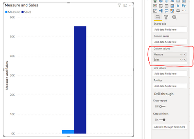
Try something like this:
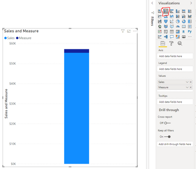
Create a Line and Clustered column chart.
Move your both metrics "Care Hours" and "People Working" to the COLUMN VALUES.
For refrence, I am attaching a chart for the same:
Let me know if this helps:
Thanks,
Pragati
- Mark as New
- Bookmark
- Subscribe
- Mute
- Subscribe to RSS Feed
- Permalink
- Report Inappropriate Content
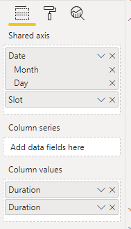
Thank you. I've done this. I also had to put some shared axis information on:
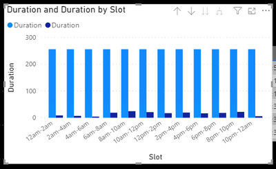
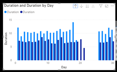
The date hierarchy is from the individual interactions query, and both column values are set to Sum. This is what I get:
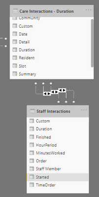
The taller columns is for the staff interactions data. I'm obvioulsy still missing something here. I have also got the following relationships defined as without them, nothing is particularly meanginful:
Slot is linked to TimeOrder. Date is to Custom in SI. Duration is to Duration.
At "Day" level in the hierchy, I get this:
Still confused!
- Mark as New
- Bookmark
- Subscribe
- Mute
- Subscribe to RSS Feed
- Permalink
- Report Inappropriate Content
Hi @Anonymous ,
You will have to be little clear on what is your confusion.
The chart shows what you were trying to achieve.
Also, why there are 3 INACTIVE relationships between these 2 tables. There should always be atleast one ACTIVE relationships between 2 tables.
Thanks,
Pragati
- Mark as New
- Bookmark
- Subscribe
- Mute
- Subscribe to RSS Feed
- Permalink
- Report Inappropriate Content
This is where I say my naivety comes in. I set them up and it said that they were active?
What I am after is this (I've stacked the originals on top of each other, and changed the colour)
Apologies for the noobiness, but I'm doing the best I can!
- Mark as New
- Bookmark
- Subscribe
- Mute
- Subscribe to RSS Feed
- Permalink
- Report Inappropriate Content
- Mark as New
- Bookmark
- Subscribe
- Mute
- Subscribe to RSS Feed
- Permalink
- Report Inappropriate Content
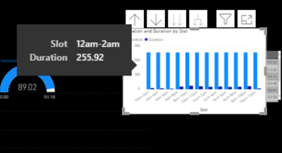
Sorry. My issue isn't really that they're on top of each other or side by side. I get that both of these configurations would work. My issue is that the data isn't right in this view.
Ie 12-2am, is about 7hr for care interactions, and about 15hrs for staff hours. Not 255
- Mark as New
- Bookmark
- Subscribe
- Mute
- Subscribe to RSS Feed
- Permalink
- Report Inappropriate Content
I believe I'm stumbled upon the cause. In Power Query it's a Duration, but in Dax it shows as a decimal. For some reason I don't quite understand, whichever chart I use (care interactions or staff on duty), the 'foreign' total I want to include to show hours worked vs interactions time taken displays correctly, the other is just a total of those decimal figures.
Does anyone know how to get past what feels like a bug, but probably isn't, by converting this to something or using a new column to allow the chart to use the data as Duration so that it displays correctly?
- Mark as New
- Bookmark
- Subscribe
- Mute
- Subscribe to RSS Feed
- Permalink
- Report Inappropriate Content
Hi @Anonymous ,
Please check if this post could meet your requirement: Chelsie Eiden's Duration.
Best Regards,
Icey
If this post helps, then please consider Accept it as the solution to help the other members find it more quickly.
Helpful resources

Microsoft Fabric Learn Together
Covering the world! 9:00-10:30 AM Sydney, 4:00-5:30 PM CET (Paris/Berlin), 7:00-8:30 PM Mexico City

Power BI Monthly Update - April 2024
Check out the April 2024 Power BI update to learn about new features.

| User | Count |
|---|---|
| 114 | |
| 99 | |
| 83 | |
| 70 | |
| 61 |
| User | Count |
|---|---|
| 149 | |
| 114 | |
| 107 | |
| 89 | |
| 67 |

