- Power BI forums
- Updates
- News & Announcements
- Get Help with Power BI
- Desktop
- Service
- Report Server
- Power Query
- Mobile Apps
- Developer
- DAX Commands and Tips
- Custom Visuals Development Discussion
- Health and Life Sciences
- Power BI Spanish forums
- Translated Spanish Desktop
- Power Platform Integration - Better Together!
- Power Platform Integrations (Read-only)
- Power Platform and Dynamics 365 Integrations (Read-only)
- Training and Consulting
- Instructor Led Training
- Dashboard in a Day for Women, by Women
- Galleries
- Community Connections & How-To Videos
- COVID-19 Data Stories Gallery
- Themes Gallery
- Data Stories Gallery
- R Script Showcase
- Webinars and Video Gallery
- Quick Measures Gallery
- 2021 MSBizAppsSummit Gallery
- 2020 MSBizAppsSummit Gallery
- 2019 MSBizAppsSummit Gallery
- Events
- Ideas
- Custom Visuals Ideas
- Issues
- Issues
- Events
- Upcoming Events
- Community Blog
- Power BI Community Blog
- Custom Visuals Community Blog
- Community Support
- Community Accounts & Registration
- Using the Community
- Community Feedback
Register now to learn Fabric in free live sessions led by the best Microsoft experts. From Apr 16 to May 9, in English and Spanish.
- Power BI forums
- Forums
- Get Help with Power BI
- Desktop
- Re: Combine Table & Stacked Bar Chart
- Subscribe to RSS Feed
- Mark Topic as New
- Mark Topic as Read
- Float this Topic for Current User
- Bookmark
- Subscribe
- Printer Friendly Page
- Mark as New
- Bookmark
- Subscribe
- Mute
- Subscribe to RSS Feed
- Permalink
- Report Inappropriate Content
Combine Table & Stacked Bar Chart
All,
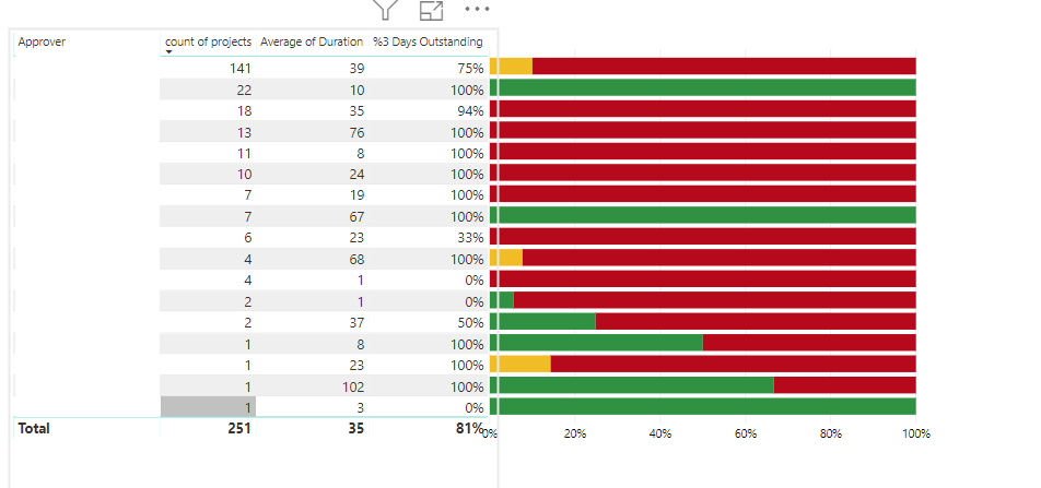
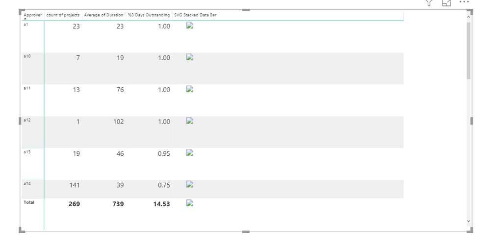
I have a requirement to develop a report like below. Just removed the approver name due to security reason, think of some names under Approver.
This is not a single chart, i just added 2 charts table & stacked bar chart and applied 'sent back' for stacked bar chart. I have 3 slicers.
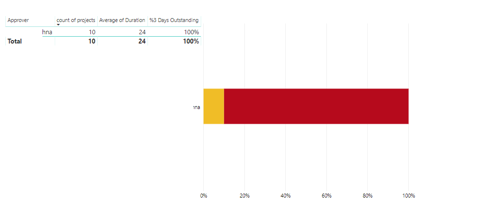
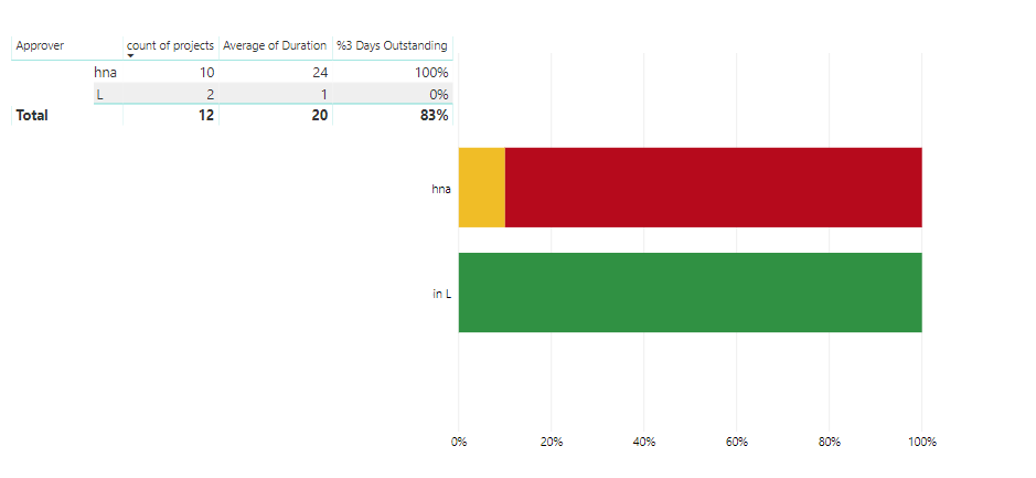
If i select only one or two names then the report looks like this.
But i am looking to align this bar straight to the name instead of shrinking to its entire size. is it possible?
- Mark as New
- Bookmark
- Subscribe
- Mute
- Subscribe to RSS Feed
- Permalink
- Report Inappropriate Content
There is a 'data bars' option for matrix visualizations that people have used to create condensed bar charts like what you show. However, I do not believe that solution works for stacked bar charts. You could possibly do it with an SVG graphic. Like this for example: https://community.powerbi.com/t5/Quick-Measures-Gallery/SVG-Microchart-Harveyball-and-Harveybox/td-p...
If you provide sample data I could give this a whirl, it has been awhile since I created an SVG graphic so could be fun. Please see this post regarding How to Get Your Question Answered Quickly: https://community.powerbi.com/t5/Community-Blog/How-to-Get-Your-Question-Answered-Quickly/ba-p/38490
The most important parts are:
1. Sample data as text, use the table tool in the editing bar
2. Expected output from sample data
3. Explanation in words of how to get from 1. to 2.
@ me in replies or I'll lose your thread!!!
Instead of a Kudo, please vote for this idea
Become an expert!: Enterprise DNA
External Tools: MSHGQM
YouTube Channel!: Microsoft Hates Greg
Latest book!: The Definitive Guide to Power Query (M)
DAX is easy, CALCULATE makes DAX hard...
- Mark as New
- Bookmark
- Subscribe
- Mute
- Subscribe to RSS Feed
- Permalink
- Report Inappropriate Content
I didnt see 'Data bar' option in the Matrix visual. is this introduced in the latest version? I'm using quite old version for now.
2.71 (July 2019 Version) - Have to upgrade
Please find below the sample data. There is a custom column created for Age Group.
| Approver | count of projects | Average of Duration | %3 Days Outstanding |
| a1 | 23 | 23 | 100% |
| a2 | 1 | 102 | 100% |
| a3 | 2 | 1 | 0% |
| a4 | 4 | 68 | 100% |
| a5 | 1 | 8 | 100% |
| a6 | 1 | 23 | 100% |
| a7 | 11 | 8 | 100% |
| a8 | 22 | 10 | 100% |
| a9 | 4 | 1 | 0% |
| a10 | 7 | 19 | 100% |
| a11 | 13 | 76 | 100% |
| a12 | 1 | 102 | 100% |
| a13 | 19 | 46 | 95% |
| a14 | 141 | 39 | 75% |
| a15 | 2 | 37 | 50% |
| a16 | 9 | 69 | 100% |
| a17 | 6 | 23 | 33% |
| a18 | 1 | 81 | 100% |
| a19 | 1 | 3 | 0% |
- Mark as New
- Bookmark
- Subscribe
- Mute
- Subscribe to RSS Feed
- Permalink
- Report Inappropriate Content
It looks like SVG can be the solution for this, but it is bit complex to understand for me (As a beginer to PowerBI)
How about using R for this scenario?
- Mark as New
- Bookmark
- Subscribe
- Mute
- Subscribe to RSS Feed
- Permalink
- Report Inappropriate Content
@Anonymous - It is under Conditional Formatting oddly enough.
@ me in replies or I'll lose your thread!!!
Instead of a Kudo, please vote for this idea
Become an expert!: Enterprise DNA
External Tools: MSHGQM
YouTube Channel!: Microsoft Hates Greg
Latest book!: The Definitive Guide to Power Query (M)
DAX is easy, CALCULATE makes DAX hard...
- Mark as New
- Bookmark
- Subscribe
- Mute
- Subscribe to RSS Feed
- Permalink
- Report Inappropriate Content
Yes, I Can see that option, but it looks like it will not fulfil my requirement.
- Mark as New
- Bookmark
- Subscribe
- Mute
- Subscribe to RSS Feed
- Permalink
- Report Inappropriate Content
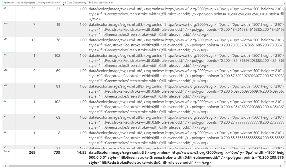
OK this was what I was able to pull together. It's rough and needs work. I couldn't understand how the Age Group column factored in to this so I just kind of went with some data. I'll give you the code. It "works", it's not what I would call pretty. Attached a PBIX but you won't be able to open it unless you upgrade to April 2020.
SVG Stacked Data Bar =
    VAR __Table = 'Table'
    VAR __Total = MAX('Table'[Average of Duration]) + MAX('Table'[count of projects])
    VAR __Color1 = IF(MAX('Table'[Average of Duration]) > MAX('Table'[count of projects]),"Red","Green")
    VAR __Color2 = IF(MAX('Table'[Average of Duration]) > MAX('Table'[count of projects]),"Green","Red")
    VAR __Min = MIN(MAX('Table'[Average of Duration]),MAX('Table'[count of projects]))
    VAR __ShapeWidth2 = __Min / __Total * 500
    VAR __header = "data:image/svg+xml;utf8," &
              "<svg xmlns='http://www.w3.org/2000/svg' x='0px' y='0px' width='" & "500" & "' height='210'>"
    VAR __footer = "</svg>"
    VAR __shapeTextSquare1 = "<polygon points=""0,200 " & "500" & ",200 " & "500" & ",0 0,0"" style=""fill:" & __Color1 & ";stroke:" & __Color1 & ";stroke-width:0;fill-rule:evenodd;"" />"
    VAR __shapeTextSquare2 = "<polygon points=""0,200 " & __ShapeWidth2 & ",200 " & __ShapeWidth2 & ",0 0,0"" style=""fill:" & __Color2 & ";stroke:" & __Color2 & ";stroke-width:0;fill-rule:evenodd;"" />"
    VAR __SVG = __header & __shapeTextSquare1 & __shapeTextSquare2 & __footer
RETURN
    __SVG
@ me in replies or I'll lose your thread!!!
Instead of a Kudo, please vote for this idea
Become an expert!: Enterprise DNA
External Tools: MSHGQM
YouTube Channel!: Microsoft Hates Greg
Latest book!: The Definitive Guide to Power Query (M)
DAX is easy, CALCULATE makes DAX hard...
- Mark as New
- Bookmark
- Subscribe
- Mute
- Subscribe to RSS Feed
- Permalink
- Report Inappropriate Content
I just created a new measure and applied your code. I am getting the text only instead of bars.
- Mark as New
- Bookmark
- Subscribe
- Mute
- Subscribe to RSS Feed
- Permalink
- Report Inappropriate Content
- Mark as New
- Bookmark
- Subscribe
- Mute
- Subscribe to RSS Feed
- Permalink
- Report Inappropriate Content
Another trick, if your rows come out really really tall, you can edit the Image Height in the Grid area of the visual.
@ me in replies or I'll lose your thread!!!
Instead of a Kudo, please vote for this idea
Become an expert!: Enterprise DNA
External Tools: MSHGQM
YouTube Channel!: Microsoft Hates Greg
Latest book!: The Definitive Guide to Power Query (M)
DAX is easy, CALCULATE makes DAX hard...
- Mark as New
- Bookmark
- Subscribe
- Mute
- Subscribe to RSS Feed
- Permalink
- Report Inappropriate Content
Oh, sorry @Anonymous - you need to set the Data Category for the measure/column to Image URL. Click on the measure/column and then click on the Measure Tools or Column Tools. Change the Date Category to Image URL.
@ me in replies or I'll lose your thread!!!
Instead of a Kudo, please vote for this idea
Become an expert!: Enterprise DNA
External Tools: MSHGQM
YouTube Channel!: Microsoft Hates Greg
Latest book!: The Definitive Guide to Power Query (M)
DAX is easy, CALCULATE makes DAX hard...
- Mark as New
- Bookmark
- Subscribe
- Mute
- Subscribe to RSS Feed
- Permalink
- Report Inappropriate Content
@Greg_Deckler , I am not seeing any image now. I followed your options. I changed like Model --> Selected 'SVG' column --> Advanced --> Data Category --> Image URL
- Mark as New
- Bookmark
- Subscribe
- Mute
- Subscribe to RSS Feed
- Permalink
- Report Inappropriate Content
I referred few other posts here and found the issue.
data:
I changed it to data:
- Mark as New
- Bookmark
- Subscribe
- Mute
- Subscribe to RSS Feed
- Permalink
- Report Inappropriate Content
It is fine, but i am looking for 3 colors based on 'Age Group'. I just implemented in the actual report, but i am getting 'MAX function only accepts a column reference as the argument number 1".
- Mark as New
- Bookmark
- Subscribe
- Mute
- Subscribe to RSS Feed
- Permalink
- Report Inappropriate Content
I tried my level best to bring the expected result.
SVG Stacked Data Bar =
VAR __Table = 'my'
VAR __Color1 = IF (AVERAGE(my[<3 age group])=1,"Green","Yellow") VAR __Color2 = IF (AVERAGE(my[<3 age group])=1,"Yellow","Green")
VAR __ShapeWidth2 = count(my[ProjectID])*500
VAR __header = "data: image/svg+xml;utf8," &
"<svg xmlns='http://www.w3.org/2000/svg' x='0px' y='0px' width='" & "500" & "' height='210'>"
VAR __footer = "</svg>"
VAR __shapeTextSquare1 = "<polygon points=""0,200 " & "500" & ",200 " & "500" & ",0 0,0"" style=""fill:" & __Color1 & ";stroke:" & __Color1 & ";stroke-width:0;fill-rule:evenodd;"" />"
VAR __shapeTextSquare2 = "<polygon points=""0,200 " & __ShapeWidth2 & ",200 " & __ShapeWidth2 & ",0 0,0"" style=""fill:" & __Color2 & ";stroke:" & __Color2 & ";stroke-width:0;fill-rule:evenodd;"" />"
VAR __SVG = __header & __shapeTextSquare1 & __shapeTextSquare2 & __footer
RETURN
__SVG
- Mark as New
- Bookmark
- Subscribe
- Mute
- Subscribe to RSS Feed
- Permalink
- Report Inappropriate Content
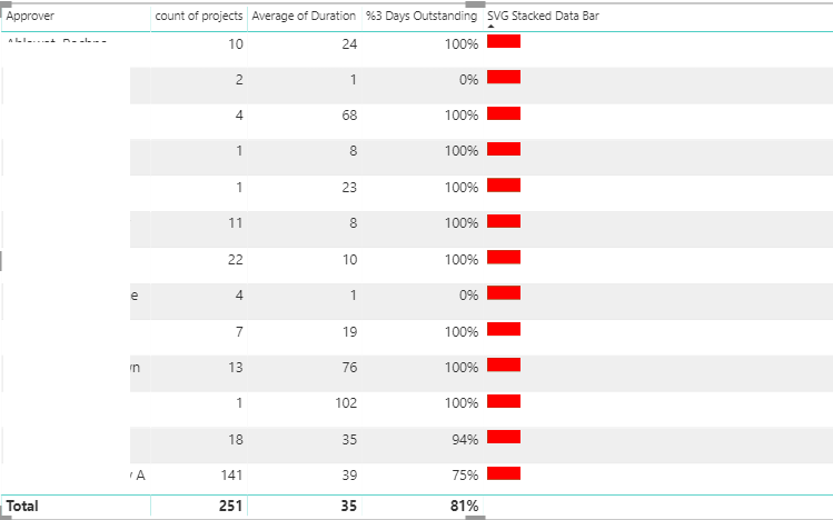
i'm getting like above which is not correct.
'Age Group' is not applied, BAR length is also very small.
- Mark as New
- Bookmark
- Subscribe
- Mute
- Subscribe to RSS Feed
- Permalink
- Report Inappropriate Content
- Mark as New
- Bookmark
- Subscribe
- Mute
- Subscribe to RSS Feed
- Permalink
- Report Inappropriate Content
It's going to be next to impossible to troubleshoot this without the data @Anonymous - can you share the PBIX or a representative sample?
@ me in replies or I'll lose your thread!!!
Instead of a Kudo, please vote for this idea
Become an expert!: Enterprise DNA
External Tools: MSHGQM
YouTube Channel!: Microsoft Hates Greg
Latest book!: The Definitive Guide to Power Query (M)
DAX is easy, CALCULATE makes DAX hard...
- Mark as New
- Bookmark
- Subscribe
- Mute
- Subscribe to RSS Feed
- Permalink
- Report Inappropriate Content
Please find the mock data.
| Approver | ProjectID | Duration |
| a1 | p1 | 2 |
| a1 | p2 | 4 |
| a1 | p3 | 10 |
| a2 | l1 | 1 |
| a2 | l2 | 1 |
| a2 | l3 | 1 |
| a3 | f1 | 15 |
| a3 | f2 | 15 |
| a3 | f3 | 20 |
| a3 | f4 | 20 |
Calcuated Columns/Measures:
projects>3 days = IF (my[Duration] >3, 1, 0)
- Mark as New
- Bookmark
- Subscribe
- Mute
- Subscribe to RSS Feed
- Permalink
- Report Inappropriate Content
@Greg_Deckler , is the same data help you to bring the expected result? can you help me on this ?
- Mark as New
- Bookmark
- Subscribe
- Mute
- Subscribe to RSS Feed
- Permalink
- Report Inappropriate Content
@Anonymous - Sorry, lost track of this thread. Let me take a look at the data you provided and see what I can create.
@ me in replies or I'll lose your thread!!!
Instead of a Kudo, please vote for this idea
Become an expert!: Enterprise DNA
External Tools: MSHGQM
YouTube Channel!: Microsoft Hates Greg
Latest book!: The Definitive Guide to Power Query (M)
DAX is easy, CALCULATE makes DAX hard...
Helpful resources

Microsoft Fabric Learn Together
Covering the world! 9:00-10:30 AM Sydney, 4:00-5:30 PM CET (Paris/Berlin), 7:00-8:30 PM Mexico City

Power BI Monthly Update - April 2024
Check out the April 2024 Power BI update to learn about new features.

| User | Count |
|---|---|
| 111 | |
| 95 | |
| 80 | |
| 68 | |
| 59 |
| User | Count |
|---|---|
| 150 | |
| 119 | |
| 104 | |
| 87 | |
| 67 |
