- Power BI forums
- Updates
- News & Announcements
- Get Help with Power BI
- Desktop
- Service
- Report Server
- Power Query
- Mobile Apps
- Developer
- DAX Commands and Tips
- Custom Visuals Development Discussion
- Health and Life Sciences
- Power BI Spanish forums
- Translated Spanish Desktop
- Power Platform Integration - Better Together!
- Power Platform Integrations (Read-only)
- Power Platform and Dynamics 365 Integrations (Read-only)
- Training and Consulting
- Instructor Led Training
- Dashboard in a Day for Women, by Women
- Galleries
- Community Connections & How-To Videos
- COVID-19 Data Stories Gallery
- Themes Gallery
- Data Stories Gallery
- R Script Showcase
- Webinars and Video Gallery
- Quick Measures Gallery
- 2021 MSBizAppsSummit Gallery
- 2020 MSBizAppsSummit Gallery
- 2019 MSBizAppsSummit Gallery
- Events
- Ideas
- Custom Visuals Ideas
- Issues
- Issues
- Events
- Upcoming Events
- Community Blog
- Power BI Community Blog
- Custom Visuals Community Blog
- Community Support
- Community Accounts & Registration
- Using the Community
- Community Feedback
Register now to learn Fabric in free live sessions led by the best Microsoft experts. From Apr 16 to May 9, in English and Spanish.
- Power BI forums
- Forums
- Get Help with Power BI
- Desktop
- Re: Combine 2 Stacked BAR CHARTS to show.
- Subscribe to RSS Feed
- Mark Topic as New
- Mark Topic as Read
- Float this Topic for Current User
- Bookmark
- Subscribe
- Printer Friendly Page
- Mark as New
- Bookmark
- Subscribe
- Mute
- Subscribe to RSS Feed
- Permalink
- Report Inappropriate Content
Combine 2 Stacked BAR CHARTS to show.
Hello there,
Is there any possibility to combine 2 Stacked BAR CHART so for example it will laiase together for example if 1 bar total is 10 and the other bar is 5. "The bar with 5" will be shown smaller than 10.
The thing is , we cannot have clustered and stacked bar charts together-
Can you please help?
Thank you,
Ahmet
Solved! Go to Solution.
- Mark as New
- Bookmark
- Subscribe
- Mute
- Subscribe to RSS Feed
- Permalink
- Report Inappropriate Content
Hi , @Anonymous
As of now ,PowerBI doesn’t support Stacked Clustered Column Chart, you can vote for this idea.
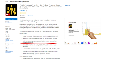
As a workaround ,you can try this custom visuals (you can only try the visual for free for a period of time)
https://appsource.microsoft.com/en-us/product/power-bi-visuals/WA104381944?tab=Overview
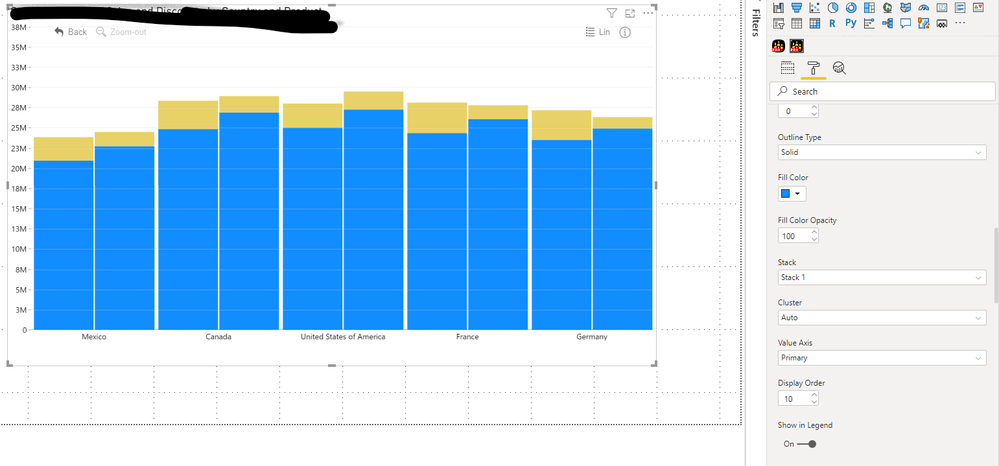
This is the actual visualization I made:
Best Regards,
Community Support Team _ Eason
If this post helps, then please consider Accept it as the solution to help the other members find it more quickly.
- Mark as New
- Bookmark
- Subscribe
- Mute
- Subscribe to RSS Feed
- Permalink
- Report Inappropriate Content
Hi,
Late reply I know 😆
As far as I know this is still not possible natively in power bi with the basic visualisations. However, one of those visualisation options is R, where this is possible.
The sort of circumstance where you may want this is where one bar is ALWAYS going to greater than or equal to another (for instance, criminal charges should always be less than or equal to criminal instances) or when one bar represents a target, and the other progress toward that target, in which case the progress bar might surpass the target bar. In both cases I think this is a nice, concise way to represent the data.
Using ggplot2 I have been able to achieve this in two ways. Converting to plotly and straight up trying it with plotly did not work, so if anyone knows how to do that, let me know! With ggplot2,
1. With data in wide format try something like
dataset %>% ggplot(aes(x = category)) + geom_col(aes(y = target), fill = "colour of your choice") + geom_col(aes(y = progress),fill = "colour of your choice")
2. With data in long format it is easier and provides a legend, so this is preferable. Here "type" is the extra column where you distinguish between the types of instances of "value". In the example above the "type" column with be many rows of fields called "instances" and many rows of fields called "charges".
dataset %>% ggplot(aes(x = category, y = value, fill = "type"))
I hope this gives someone a headstart on how to do this.
Drew
- Mark as New
- Bookmark
- Subscribe
- Mute
- Subscribe to RSS Feed
- Permalink
- Report Inappropriate Content
Hi , @Anonymous
As of now ,PowerBI doesn’t support Stacked Clustered Column Chart, you can vote for this idea.
As a workaround ,you can try this custom visuals (you can only try the visual for free for a period of time)
https://appsource.microsoft.com/en-us/product/power-bi-visuals/WA104381944?tab=Overview
This is the actual visualization I made:
Best Regards,
Community Support Team _ Eason
If this post helps, then please consider Accept it as the solution to help the other members find it more quickly.
- Mark as New
- Bookmark
- Subscribe
- Mute
- Subscribe to RSS Feed
- Permalink
- Report Inappropriate Content
@Anonymous , refer if these can help
https://community.powerbi.com/t5/Desktop/Double-Stacked-Column-Chart-Combination-of-Stacked-and-Column/td-p/456690
https://www.defteam.com/stacked-clustered-bar-chart/
There is an idea for that
https://ideas.powerbi.com/ideas/idea/?ideaid=db76a137-4324-4d6c-b5c5-cb85f9b6950a
Microsoft Power BI Learning Resources, 2023 !!
Learn Power BI - Full Course with Dec-2022, with Window, Index, Offset, 100+ Topics !!
Did I answer your question? Mark my post as a solution! Appreciate your Kudos !! Proud to be a Super User! !!
- Mark as New
- Bookmark
- Subscribe
- Mute
- Subscribe to RSS Feed
- Permalink
- Report Inappropriate Content
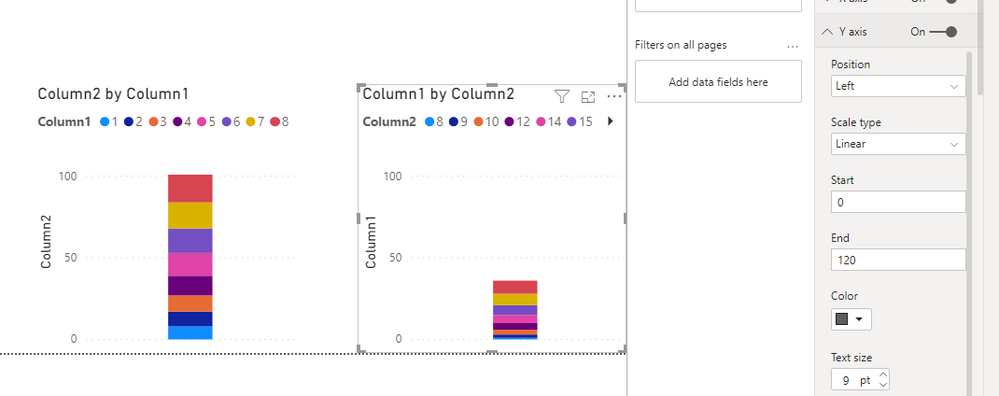
I'm not certain that I'm understanding you correctly, but is your issue that the scale of the bars is the same even through the values are different?
If that is the case you can manually change the Y-axis range in the formatting field:
Let me know how it goes,
J
Connect on LinkedIn
Helpful resources

Microsoft Fabric Learn Together
Covering the world! 9:00-10:30 AM Sydney, 4:00-5:30 PM CET (Paris/Berlin), 7:00-8:30 PM Mexico City

Power BI Monthly Update - April 2024
Check out the April 2024 Power BI update to learn about new features.

| User | Count |
|---|---|
| 114 | |
| 100 | |
| 75 | |
| 73 | |
| 49 |
| User | Count |
|---|---|
| 145 | |
| 109 | |
| 109 | |
| 90 | |
| 64 |
