- Power BI forums
- Updates
- News & Announcements
- Get Help with Power BI
- Desktop
- Service
- Report Server
- Power Query
- Mobile Apps
- Developer
- DAX Commands and Tips
- Custom Visuals Development Discussion
- Health and Life Sciences
- Power BI Spanish forums
- Translated Spanish Desktop
- Power Platform Integration - Better Together!
- Power Platform Integrations (Read-only)
- Power Platform and Dynamics 365 Integrations (Read-only)
- Training and Consulting
- Instructor Led Training
- Dashboard in a Day for Women, by Women
- Galleries
- Community Connections & How-To Videos
- COVID-19 Data Stories Gallery
- Themes Gallery
- Data Stories Gallery
- R Script Showcase
- Webinars and Video Gallery
- Quick Measures Gallery
- 2021 MSBizAppsSummit Gallery
- 2020 MSBizAppsSummit Gallery
- 2019 MSBizAppsSummit Gallery
- Events
- Ideas
- Custom Visuals Ideas
- Issues
- Issues
- Events
- Upcoming Events
- Community Blog
- Power BI Community Blog
- Custom Visuals Community Blog
- Community Support
- Community Accounts & Registration
- Using the Community
- Community Feedback
Register now to learn Fabric in free live sessions led by the best Microsoft experts. From Apr 16 to May 9, in English and Spanish.
- Power BI forums
- Forums
- Get Help with Power BI
- Desktop
- Column chart help
- Subscribe to RSS Feed
- Mark Topic as New
- Mark Topic as Read
- Float this Topic for Current User
- Bookmark
- Subscribe
- Printer Friendly Page
- Mark as New
- Bookmark
- Subscribe
- Mute
- Subscribe to RSS Feed
- Permalink
- Report Inappropriate Content
Column chart help
Hello everyone,
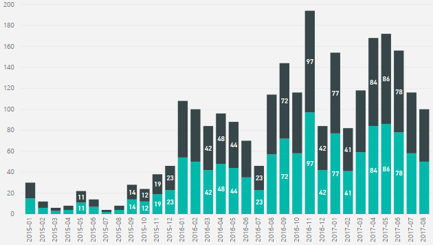
I'm making Power BI graphs with data from a Sharepoint list, in which I have customers who are subscribed to a service. The service has a contract start date, and I want to make a column chart that shows the number of clients created per month.
I have made calculated columns based on the date the contract is set to start, to show the month and year (since I added all the data from excel, the created date is obviously unusable), and the column chart works. With one set of dates. However, if the customer chooses to extend their contract, I would like to archive the old start date in a seperate Sharepoint column, with its own calculated column to show the year and month of the old start date.
Otherwise, it'll either look as if there were no customers 2 years ago, or very little activity right now, because all the customers who extend will show as new customers, or old customers from years ago. However, I can't make it show the data right. Without a Created date to use, my axis is based on the current calculated column (month+year), same as my value, and so it ends up showing the same number of clients for the archived calculated column (my archived clients) as for the current calculated column (my current clients). I want it to look more or less the way it does now, but with accurate numbers for my archived clients.
I'm sure there's an incredibly obvious solution I'm not seeing, but it seems quicker to ask for help.
EDIT: Oh, and ideally, I'd have a slicer that could turn on or off one of the values, letting me toggle between both and one of them.
Solved! Go to Solution.
- Mark as New
- Bookmark
- Subscribe
- Mute
- Subscribe to RSS Feed
- Permalink
- Report Inappropriate Content
Based on your description, it sounds like a typical "slow changing dimension" scenario.
It's better to keep all start date into one column, then add "End Date" column, and a "Status" column to tag which entry is Current. For more details, please refer to articles below:
PowerPivot and the Slowly Changing Dimensions
Regards,
Helpful resources

Microsoft Fabric Learn Together
Covering the world! 9:00-10:30 AM Sydney, 4:00-5:30 PM CET (Paris/Berlin), 7:00-8:30 PM Mexico City

Power BI Monthly Update - April 2024
Check out the April 2024 Power BI update to learn about new features.

| User | Count |
|---|---|
| 113 | |
| 97 | |
| 79 | |
| 73 | |
| 56 |
| User | Count |
|---|---|
| 145 | |
| 105 | |
| 104 | |
| 90 | |
| 63 |

