- Power BI forums
- Updates
- News & Announcements
- Get Help with Power BI
- Desktop
- Service
- Report Server
- Power Query
- Mobile Apps
- Developer
- DAX Commands and Tips
- Custom Visuals Development Discussion
- Health and Life Sciences
- Power BI Spanish forums
- Translated Spanish Desktop
- Power Platform Integration - Better Together!
- Power Platform Integrations (Read-only)
- Power Platform and Dynamics 365 Integrations (Read-only)
- Training and Consulting
- Instructor Led Training
- Dashboard in a Day for Women, by Women
- Galleries
- Community Connections & How-To Videos
- COVID-19 Data Stories Gallery
- Themes Gallery
- Data Stories Gallery
- R Script Showcase
- Webinars and Video Gallery
- Quick Measures Gallery
- 2021 MSBizAppsSummit Gallery
- 2020 MSBizAppsSummit Gallery
- 2019 MSBizAppsSummit Gallery
- Events
- Ideas
- Custom Visuals Ideas
- Issues
- Issues
- Events
- Upcoming Events
- Community Blog
- Power BI Community Blog
- Custom Visuals Community Blog
- Community Support
- Community Accounts & Registration
- Using the Community
- Community Feedback
Register now to learn Fabric in free live sessions led by the best Microsoft experts. From Apr 16 to May 9, in English and Spanish.
- Power BI forums
- Forums
- Get Help with Power BI
- Desktop
- Column Filtering
- Subscribe to RSS Feed
- Mark Topic as New
- Mark Topic as Read
- Float this Topic for Current User
- Bookmark
- Subscribe
- Printer Friendly Page
- Mark as New
- Bookmark
- Subscribe
- Mute
- Subscribe to RSS Feed
- Permalink
- Report Inappropriate Content
Column Filtering
Hello, I would like to set up a slicer that turns on/off differnt columns in graphs ( across the report).
My current example is that I have 7 columns $ ammount graphed along the Y axis vs. Months along the x axis.
I want my user to be able to select which columns they want to see graphed and which ones they don't want to see with the click of a button.
Any thoughts/suggestions are appreciated! thank you.
- Mark as New
- Bookmark
- Subscribe
- Mute
- Subscribe to RSS Feed
- Permalink
- Report Inappropriate Content
Hi @sdukes ,
Please refer to the video.
Power BI - Dynamic Columns in a Table
Best regards,
Lionel Chen
If this post helps, then please consider Accept it as the solution to help the other members find it more quickly.
- Mark as New
- Bookmark
- Subscribe
- Mute
- Subscribe to RSS Feed
- Permalink
- Report Inappropriate Content
Thank you for your response - this is deifinitely helpful but what I am looking for is a little more dynamic.. I will update if I find a solution!
Shmuel
- Mark as New
- Bookmark
- Subscribe
- Mute
- Subscribe to RSS Feed
- Permalink
- Report Inappropriate Content
Hi @Greg_Deckler ,
I remember you have an answer to this question, but I can't find it, maybe you can help him.
Best regards,
Lionel Chen
If this post helps, then please consider Accept it as the solution to help the other members find it more quickly.
- Mark as New
- Bookmark
- Subscribe
- Mute
- Subscribe to RSS Feed
- Permalink
- Report Inappropriate Content
@sdukes , I doubt easily possible. Bookmark is on option. Second, in each measure, you check if they are selected they display value or display blank()
Refer: https://radacad.com/bookmarks-and-buttons-making-power-bi-charts-even-more-interactive
This one is Choose measure but you have to use like a switch value or blank
Microsoft Power BI Learning Resources, 2023 !!
Learn Power BI - Full Course with Dec-2022, with Window, Index, Offset, 100+ Topics !!
Did I answer your question? Mark my post as a solution! Appreciate your Kudos !! Proud to be a Super User! !!
- Mark as New
- Bookmark
- Subscribe
- Mute
- Subscribe to RSS Feed
- Permalink
- Report Inappropriate Content
What I'm getting from this is that if I can set up an equation that is based on a slicer or a table or something else (bookmarks, etc.)
and the equation is something like:
if(isSelected("ColumnName") = False)
value of new column = 0
end
so that any time something is not selected the column value is 0, and it won't overcrowd the graph.
I'm not exactly certain how to design the isSelected aspect, but this should work.
- Mark as New
- Bookmark
- Subscribe
- Mute
- Subscribe to RSS Feed
- Permalink
- Report Inappropriate Content
Hi @sdukes ,
Has your problem been solved?
Maybe you can do like this.
1. Create a measure.
Measure =
IF(
    ISFILTERED('Table'[Column]),
    1,0
)
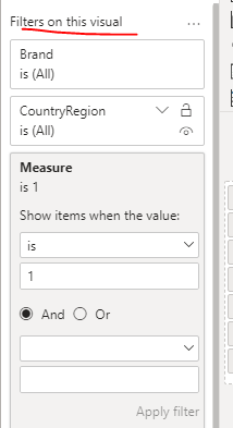
2. Add this measure to the filter.
When measure is 1, if this column is not added to the chart, the chart is blank,
The visual will be blank if the column is not added to the visual when the measure is 1.
Best regards,
Lionel Chen
If this post helps, then please consider Accept it as the solution to help the other members find it more quickly.
- Mark as New
- Bookmark
- Subscribe
- Mute
- Subscribe to RSS Feed
- Permalink
- Report Inappropriate Content
Lionel,
Thank you again for another nice solution - I really got my hopes up for this one..
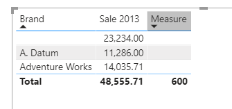
The goal I'm trying to accomplish differently, is that when isfiltered fails, it turns off the whole visual - I just want it to turn off that specifc column within the visual.
Thanks again,
Shmuel
- Mark as New
- Bookmark
- Subscribe
- Mute
- Subscribe to RSS Feed
- Permalink
- Report Inappropriate Content
Hi @sdukes ,
Or like this?😂
Please refer to my .pbix file.
Measure =
IF(
    ISFILTERED(Sales[Brand]),
    BLANK(),
    SUM(Sales[Sale 2015])
)
Best regards,
Lionel Chen
If this post helps, then please consider Accept it as the solution to help the other members find it more quickly.
Helpful resources

Microsoft Fabric Learn Together
Covering the world! 9:00-10:30 AM Sydney, 4:00-5:30 PM CET (Paris/Berlin), 7:00-8:30 PM Mexico City

Power BI Monthly Update - April 2024
Check out the April 2024 Power BI update to learn about new features.

| User | Count |
|---|---|
| 114 | |
| 100 | |
| 81 | |
| 70 | |
| 62 |
| User | Count |
|---|---|
| 148 | |
| 116 | |
| 104 | |
| 90 | |
| 65 |


