- Power BI forums
- Updates
- News & Announcements
- Get Help with Power BI
- Desktop
- Service
- Report Server
- Power Query
- Mobile Apps
- Developer
- DAX Commands and Tips
- Custom Visuals Development Discussion
- Health and Life Sciences
- Power BI Spanish forums
- Translated Spanish Desktop
- Power Platform Integration - Better Together!
- Power Platform Integrations (Read-only)
- Power Platform and Dynamics 365 Integrations (Read-only)
- Training and Consulting
- Instructor Led Training
- Dashboard in a Day for Women, by Women
- Galleries
- Community Connections & How-To Videos
- COVID-19 Data Stories Gallery
- Themes Gallery
- Data Stories Gallery
- R Script Showcase
- Webinars and Video Gallery
- Quick Measures Gallery
- 2021 MSBizAppsSummit Gallery
- 2020 MSBizAppsSummit Gallery
- 2019 MSBizAppsSummit Gallery
- Events
- Ideas
- Custom Visuals Ideas
- Issues
- Issues
- Events
- Upcoming Events
- Community Blog
- Power BI Community Blog
- Custom Visuals Community Blog
- Community Support
- Community Accounts & Registration
- Using the Community
- Community Feedback
Register now to learn Fabric in free live sessions led by the best Microsoft experts. From Apr 16 to May 9, in English and Spanish.
- Power BI forums
- Forums
- Get Help with Power BI
- Desktop
- Re: Column Chart Query
- Subscribe to RSS Feed
- Mark Topic as New
- Mark Topic as Read
- Float this Topic for Current User
- Bookmark
- Subscribe
- Printer Friendly Page
- Mark as New
- Bookmark
- Subscribe
- Mute
- Subscribe to RSS Feed
- Permalink
- Report Inappropriate Content
Column Chart Query
Hey Power Users,
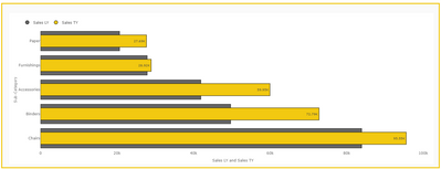
I am comparatively new to Power BI and would lilke to explore the complete functionality and capabilites. I have a question regarding bar graphs. I want to display multiple values on a the same bar graph on the same bar. For example lets say Sales from last year and this year. I want to display these values on the same bar graph on a single bar rather than having two bars for each year. Is there any solution to this. I want something like this: (The bars represent sales from current year and the teal lines represent sales from last year)
Please help me to understand if this is possible in Power BI. Thank you beautiful people!!!
Solved! Go to Solution.
- Mark as New
- Bookmark
- Subscribe
- Mute
- Subscribe to RSS Feed
- Permalink
- Report Inappropriate Content
Hi @sufiyanakhtar ,
I have created a simple sample. Please refer to my pbix file to see if it helps you.
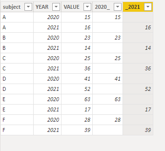
Split the years if they are in the same column.
Then choose the line and stacked column chart.
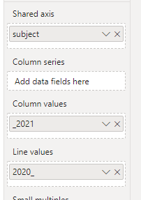
Then Place the corresponding column in the appropriate position.
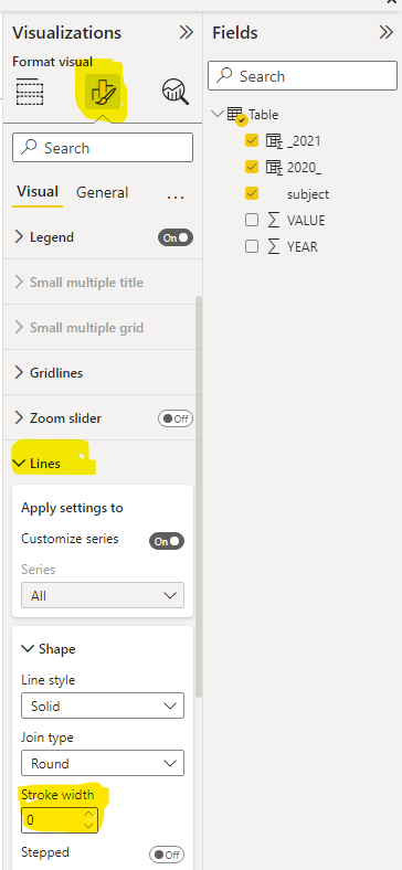
Then enable the Markers and adjust the Marker size.
Finally, change the Stroke width to 0.
If I have misunderstood your meaning, please provide your pbix file without privacy information and desired output.
Best Regards
Community Support Team _ Polly
If this post helps, then please consider Accept it as the solution to help the other members find it more quickly.
- Mark as New
- Bookmark
- Subscribe
- Mute
- Subscribe to RSS Feed
- Permalink
- Report Inappropriate Content
A better way could be to use an overlap chart or lipstick column chart to get the same results
- Mark as New
- Bookmark
- Subscribe
- Mute
- Subscribe to RSS Feed
- Permalink
- Report Inappropriate Content
Hi @sufiyanakhtar ,
I have created a simple sample. Please refer to my pbix file to see if it helps you.
Split the years if they are in the same column.
Then choose the line and stacked column chart.
Then Place the corresponding column in the appropriate position.
Then enable the Markers and adjust the Marker size.
Finally, change the Stroke width to 0.
If I have misunderstood your meaning, please provide your pbix file without privacy information and desired output.
Best Regards
Community Support Team _ Polly
If this post helps, then please consider Accept it as the solution to help the other members find it more quickly.
- Mark as New
- Bookmark
- Subscribe
- Mute
- Subscribe to RSS Feed
- Permalink
- Report Inappropriate Content
@sufiyanakhtar , Cluster line visual, Put one of them on line. Enable Marker(Under shape) and make the width of line 0 under shape, That should give you this visual
Microsoft Power BI Learning Resources, 2023 !!
Learn Power BI - Full Course with Dec-2022, with Window, Index, Offset, 100+ Topics !!
Did I answer your question? Mark my post as a solution! Appreciate your Kudos !! Proud to be a Super User! !!
Helpful resources

Microsoft Fabric Learn Together
Covering the world! 9:00-10:30 AM Sydney, 4:00-5:30 PM CET (Paris/Berlin), 7:00-8:30 PM Mexico City

Power BI Monthly Update - April 2024
Check out the April 2024 Power BI update to learn about new features.

| User | Count |
|---|---|
| 110 | |
| 94 | |
| 80 | |
| 66 | |
| 58 |
| User | Count |
|---|---|
| 150 | |
| 119 | |
| 104 | |
| 87 | |
| 67 |


