- Power BI forums
- Updates
- News & Announcements
- Get Help with Power BI
- Desktop
- Service
- Report Server
- Power Query
- Mobile Apps
- Developer
- DAX Commands and Tips
- Custom Visuals Development Discussion
- Health and Life Sciences
- Power BI Spanish forums
- Translated Spanish Desktop
- Power Platform Integration - Better Together!
- Power Platform Integrations (Read-only)
- Power Platform and Dynamics 365 Integrations (Read-only)
- Training and Consulting
- Instructor Led Training
- Dashboard in a Day for Women, by Women
- Galleries
- Community Connections & How-To Videos
- COVID-19 Data Stories Gallery
- Themes Gallery
- Data Stories Gallery
- R Script Showcase
- Webinars and Video Gallery
- Quick Measures Gallery
- 2021 MSBizAppsSummit Gallery
- 2020 MSBizAppsSummit Gallery
- 2019 MSBizAppsSummit Gallery
- Events
- Ideas
- Custom Visuals Ideas
- Issues
- Issues
- Events
- Upcoming Events
- Community Blog
- Power BI Community Blog
- Custom Visuals Community Blog
- Community Support
- Community Accounts & Registration
- Using the Community
- Community Feedback
Register now to learn Fabric in free live sessions led by the best Microsoft experts. From Apr 16 to May 9, in English and Spanish.
- Power BI forums
- Forums
- Get Help with Power BI
- Desktop
- Re: Column Chart Legend Order - reversed
- Subscribe to RSS Feed
- Mark Topic as New
- Mark Topic as Read
- Float this Topic for Current User
- Bookmark
- Subscribe
- Printer Friendly Page
- Mark as New
- Bookmark
- Subscribe
- Mute
- Subscribe to RSS Feed
- Permalink
- Report Inappropriate Content
Column Chart Legend Order - reversed
Hi Power BI Experts,
I have a silly question, the resolution is probably very easy, but I am missing something.
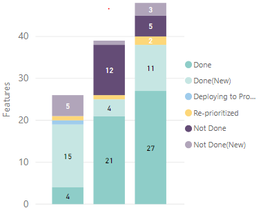
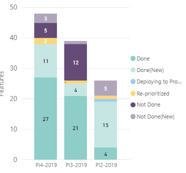
The thing is I want to have my right-placed legend ordered in proper way and the only thing I could accomplish at the moment is to have it reversed:
As you can see on the legend the label Done is on the top, while in the chart it's on the bottom. I used the Sort by Column option with previously created Sort column (the workaround from many solutions found on this forum). What am I doing wrong? If I reverse the Sort column, everything reverses, so again the label Done in legent is on the bottom, while on the chart is on the top.
Could you please advise?
Thanks in advance!
Karol
Solved! Go to Solution.
- Mark as New
- Bookmark
- Subscribe
- Mute
- Subscribe to RSS Feed
- Permalink
- Report Inappropriate Content
Hi @Anonymous ,
I apologize for my previous misunderstanding of your question.
I did not find a direct solution. But there is a workaround:
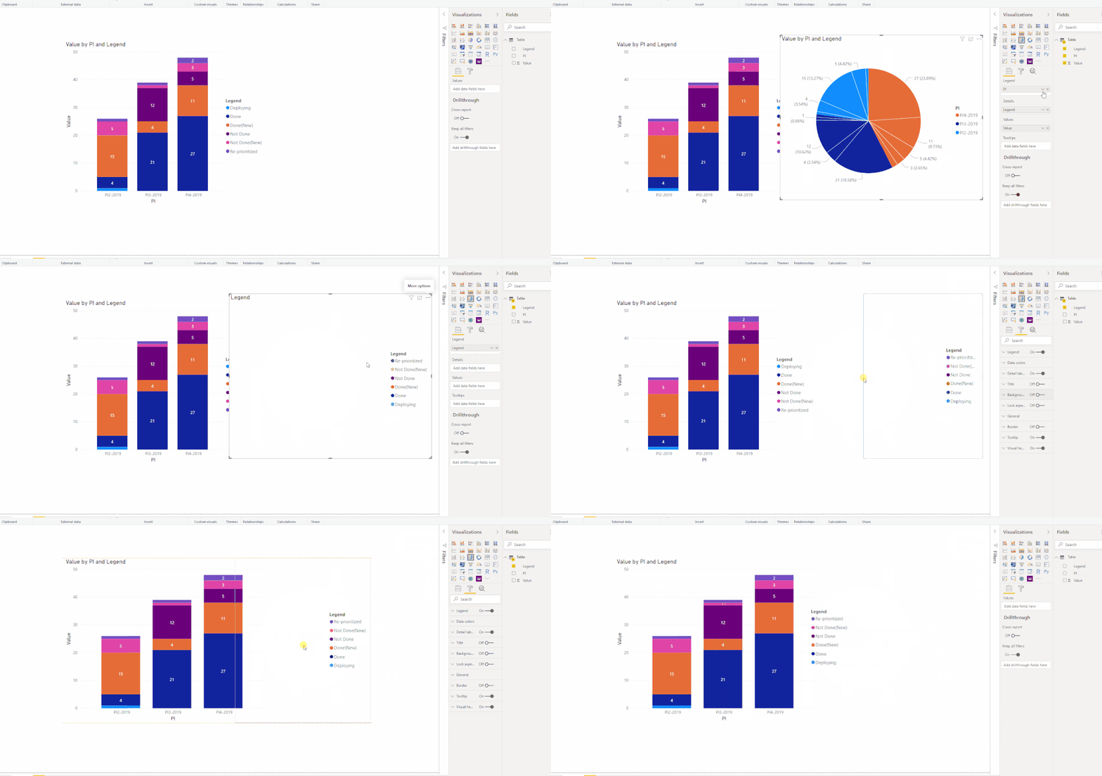
1. Copy your Stacked Column Chart and convert it into a Pie Chart.
2. Then click the "..." and choose to sort Z-A of your Pie Chart legend.
3. Keep only the legend of the Pie Chart.
4. For the two charts, turn the background off.
5. Put the Pie Chart behind the Stacked Column Chart.
Best Regards,
Icey
If this post helps, then please consider Accept it as the solution to help the other members find it more quickly.
- Mark as New
- Bookmark
- Subscribe
- Mute
- Subscribe to RSS Feed
- Permalink
- Report Inappropriate Content
- Mark as New
- Bookmark
- Subscribe
- Mute
- Subscribe to RSS Feed
- Permalink
- Report Inappropriate Content
@Anonymous if you click on 3 dots on top right corner of the visual, what is the sort order there? Can you double check that?
Subscribe to the @PowerBIHowTo YT channel for an upcoming video on List and Record functions in Power Query!!
Learn Power BI and Fabric - subscribe to our YT channel - Click here: @PowerBIHowTo
If my solution proved useful, I'd be delighted to receive Kudos. When you put effort into asking a question, it's equally thoughtful to acknowledge and give Kudos to the individual who helped you solve the problem. It's a small gesture that shows appreciation and encouragement! ❤
Did I answer your question? Mark my post as a solution. Proud to be a Super User! Appreciate your Kudos 🙂
Feel free to email me with any of your BI needs.
- Mark as New
- Bookmark
- Subscribe
- Mute
- Subscribe to RSS Feed
- Permalink
- Report Inappropriate Content
@parry2k The sort order under those three dots impacts Y axis, not the values inside each bar. What I am trying to achieve is to have the same order inside each bar (on X axis) as is in the legend.
- Mark as New
- Bookmark
- Subscribe
- Mute
- Subscribe to RSS Feed
- Permalink
- Report Inappropriate Content
@Anonymous not necessarily, can you expand sort order of those 3 dots and share what it is?
Subscribe to the @PowerBIHowTo YT channel for an upcoming video on List and Record functions in Power Query!!
Learn Power BI and Fabric - subscribe to our YT channel - Click here: @PowerBIHowTo
If my solution proved useful, I'd be delighted to receive Kudos. When you put effort into asking a question, it's equally thoughtful to acknowledge and give Kudos to the individual who helped you solve the problem. It's a small gesture that shows appreciation and encouragement! ❤
Did I answer your question? Mark my post as a solution. Proud to be a Super User! Appreciate your Kudos 🙂
Feel free to email me with any of your BI needs.
- Mark as New
- Bookmark
- Subscribe
- Mute
- Subscribe to RSS Feed
- Permalink
- Report Inappropriate Content
@parry2k Sorry my bad, I confused the axis. What I meant is that those three dots are changing order of the bars on X axis, and I want to change categories order inside each bar to be matching with the legend.
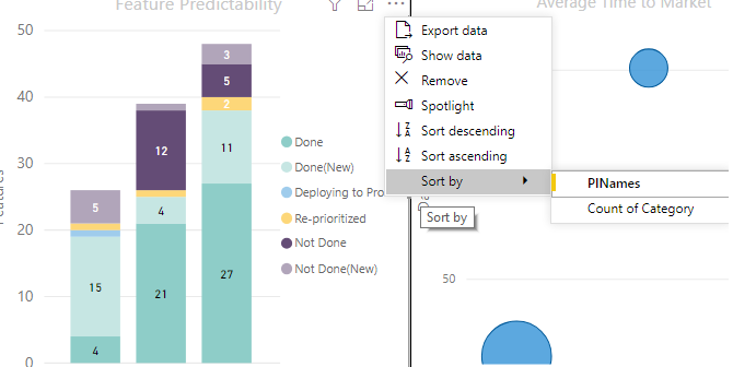
Here are the options I have under three dots:
Here is what happens to the visualization when I change for example order to descending and sort by Count of Category:
Here is what I mean. You can see that on the legend, color representing Done is on the top, while in the bar it is on the bottom. So either Done label in the legend should be on the bottom or color representing category Done should be on the top.
I have sorted it using adittional "Sort" column workaround (https://www.seerinteractive.com/blog/reorder-powerbi-legend/).
- Mark as New
- Bookmark
- Subscribe
- Mute
- Subscribe to RSS Feed
- Permalink
- Report Inappropriate Content
Hi @Anonymous ,
Glad to hear that you have solved your problem. Please accept your reply as a solution so that people who may have the same question can get the solution directly.
Best Regards,
Icey
If this post helps, then please consider Accept it as the solution to help the other members find it more quickly.
- Mark as New
- Bookmark
- Subscribe
- Mute
- Subscribe to RSS Feed
- Permalink
- Report Inappropriate Content
I don't understand, how is my problem solved? I don't see any solution after my last post...
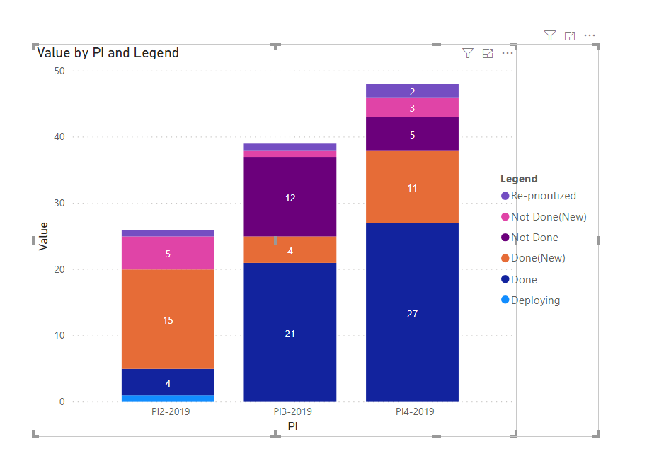
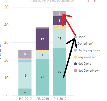
Let me describe the problem once more. I want to have legend in the same orders as the colors inside each bar as shown on the picture below:
The picture shows how it looks now. You can see (marked with black line) that value "Done", so blue color, is in the bottom inside bar while it is on the top in the legend (the blue circle with label "Done" is on the top). You can also see that every color is in reverted order in the legend (light-purple is on top in the bars, while it is in the bottom in the legend, then purple is the second one from the top in the bar, and second-last in the legend and so on...).
The red line shows how it should be. The blue color representing "Done" should be either on the top inside the bar (because it is on the top in the legend) or on the bottom in the legend (because it is on the bottom inside a bar).
It is just about changing order of the legend, it should be basic functionality, I just can't find it anywhere...
Please let me know if my issue is still hard to understand, I will try to explain it once more...
BR, Karol
- Mark as New
- Bookmark
- Subscribe
- Mute
- Subscribe to RSS Feed
- Permalink
- Report Inappropriate Content
@Anonymous sounds good. it is sorted out. I was going to head to that kinda solution.
Subscribe to the @PowerBIHowTo YT channel for an upcoming video on List and Record functions in Power Query!!
Learn Power BI and Fabric - subscribe to our YT channel - Click here: @PowerBIHowTo
If my solution proved useful, I'd be delighted to receive Kudos. When you put effort into asking a question, it's equally thoughtful to acknowledge and give Kudos to the individual who helped you solve the problem. It's a small gesture that shows appreciation and encouragement! ❤
Did I answer your question? Mark my post as a solution. Proud to be a Super User! Appreciate your Kudos 🙂
Feel free to email me with any of your BI needs.
Helpful resources

Microsoft Fabric Learn Together
Covering the world! 9:00-10:30 AM Sydney, 4:00-5:30 PM CET (Paris/Berlin), 7:00-8:30 PM Mexico City

Power BI Monthly Update - April 2024
Check out the April 2024 Power BI update to learn about new features.

| User | Count |
|---|---|
| 110 | |
| 99 | |
| 80 | |
| 64 | |
| 57 |
| User | Count |
|---|---|
| 145 | |
| 110 | |
| 91 | |
| 84 | |
| 66 |
