- Power BI forums
- Updates
- News & Announcements
- Get Help with Power BI
- Desktop
- Service
- Report Server
- Power Query
- Mobile Apps
- Developer
- DAX Commands and Tips
- Custom Visuals Development Discussion
- Health and Life Sciences
- Power BI Spanish forums
- Translated Spanish Desktop
- Power Platform Integration - Better Together!
- Power Platform Integrations (Read-only)
- Power Platform and Dynamics 365 Integrations (Read-only)
- Training and Consulting
- Instructor Led Training
- Dashboard in a Day for Women, by Women
- Galleries
- Community Connections & How-To Videos
- COVID-19 Data Stories Gallery
- Themes Gallery
- Data Stories Gallery
- R Script Showcase
- Webinars and Video Gallery
- Quick Measures Gallery
- 2021 MSBizAppsSummit Gallery
- 2020 MSBizAppsSummit Gallery
- 2019 MSBizAppsSummit Gallery
- Events
- Ideas
- Custom Visuals Ideas
- Issues
- Issues
- Events
- Upcoming Events
- Community Blog
- Power BI Community Blog
- Custom Visuals Community Blog
- Community Support
- Community Accounts & Registration
- Using the Community
- Community Feedback
Register now to learn Fabric in free live sessions led by the best Microsoft experts. From Apr 16 to May 9, in English and Spanish.
- Power BI forums
- Forums
- Get Help with Power BI
- Desktop
- Column Chart - Change axis to quarter but keep mon...
- Subscribe to RSS Feed
- Mark Topic as New
- Mark Topic as Read
- Float this Topic for Current User
- Bookmark
- Subscribe
- Printer Friendly Page
- Mark as New
- Bookmark
- Subscribe
- Mute
- Subscribe to RSS Feed
- Permalink
- Report Inappropriate Content
Column Chart - Change axis to quarter but keep monthly colums
I wanted to simulate in a column stacked chart a target vs realized quarterly evolution of Gross Margin as shown below.
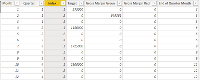
To do this, I had to create 3 calculated columns:
Target - populates only months 1, 4, 7 and 10
Gross Margin Red - takes realized gross margin only when it is below target, if not zero, and populates only months 2, 5, 8 and 11
Gross Margin Green - takes realized gross margin when it is above target, zero otherwise, populating also months 2, 5, 8 and 11
For Months 3, 6, 9 and 12, all calculated columns will return zero.
These columns were used then in a stacked column chart, as referred, with monthly values, but the idea is to look in fact a clustered columns chart representing the quarters, with a space between the cluster (achieved by having just zeros in months 3, 6, 9 and 12). It works quite fine, I can even emulate conditional formating for realized gross margin. The only downside is the fact I see the axis in months. I would like to see quarters, and only once per quarter.
Any ideas on how to do it?
Solved! Go to Solution.
- Mark as New
- Bookmark
- Subscribe
- Mute
- Subscribe to RSS Feed
- Permalink
- Report Inappropriate Content
Hi @JotaL
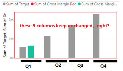
Sorry for not very clear about result you want, do you mean you want the Stacked column chart to show like this?
if so, i'm afraid this is impossible.
Best Regards,
Community Support Team _ Tang
If this post helps, please consider Accept it as the solution to help the other members find it more quickly.
- Mark as New
- Bookmark
- Subscribe
- Mute
- Subscribe to RSS Feed
- Permalink
- Report Inappropriate Content
Thank you. It is exactly what i was looking for. I guess I will have to some manual tweaking.
Helpful resources

Microsoft Fabric Learn Together
Covering the world! 9:00-10:30 AM Sydney, 4:00-5:30 PM CET (Paris/Berlin), 7:00-8:30 PM Mexico City

Power BI Monthly Update - April 2024
Check out the April 2024 Power BI update to learn about new features.

| User | Count |
|---|---|
| 114 | |
| 99 | |
| 83 | |
| 70 | |
| 60 |
| User | Count |
|---|---|
| 150 | |
| 115 | |
| 104 | |
| 89 | |
| 65 |


