- Power BI forums
- Updates
- News & Announcements
- Get Help with Power BI
- Desktop
- Service
- Report Server
- Power Query
- Mobile Apps
- Developer
- DAX Commands and Tips
- Custom Visuals Development Discussion
- Health and Life Sciences
- Power BI Spanish forums
- Translated Spanish Desktop
- Power Platform Integration - Better Together!
- Power Platform Integrations (Read-only)
- Power Platform and Dynamics 365 Integrations (Read-only)
- Training and Consulting
- Instructor Led Training
- Dashboard in a Day for Women, by Women
- Galleries
- Community Connections & How-To Videos
- COVID-19 Data Stories Gallery
- Themes Gallery
- Data Stories Gallery
- R Script Showcase
- Webinars and Video Gallery
- Quick Measures Gallery
- 2021 MSBizAppsSummit Gallery
- 2020 MSBizAppsSummit Gallery
- 2019 MSBizAppsSummit Gallery
- Events
- Ideas
- Custom Visuals Ideas
- Issues
- Issues
- Events
- Upcoming Events
- Community Blog
- Power BI Community Blog
- Custom Visuals Community Blog
- Community Support
- Community Accounts & Registration
- Using the Community
- Community Feedback
Register now to learn Fabric in free live sessions led by the best Microsoft experts. From Apr 16 to May 9, in English and Spanish.
- Power BI forums
- Forums
- Get Help with Power BI
- Desktop
- Re: Colour the visual based on slicer selection
- Subscribe to RSS Feed
- Mark Topic as New
- Mark Topic as Read
- Float this Topic for Current User
- Bookmark
- Subscribe
- Printer Friendly Page
- Mark as New
- Bookmark
- Subscribe
- Mute
- Subscribe to RSS Feed
- Permalink
- Report Inappropriate Content
Colour the visual based on slicer selection
Hello,
I have a dataset with information regarding transaction data.
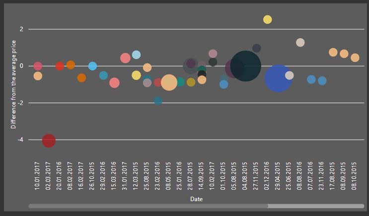
I created a scatter plot which shows how the price of the products diverged from the average price for the particular product:
The dots are now coloured according to the product code. I also have an adjacent table where the basic statistics for each products are specified - average price, standard deviation etc. Once you select a certain product code, the visual looks like this:
The aim of this visualisation is to spot the price outliers for each product - as you can see above, almost every product was purchased for the value similar to the average, while for one transaction - the price exceeded the average 2x.
I would now like to get to the cause of the outlier - for this, I would like to have an adjacent slicer, on the selection of which the colouring of the bubbles would be changed - for instance, if I chose the "Contractor" in the slicer, I would like for the bubbles' colours' to be based on the different contractors (this way I could see if for instance the one outlier was caused by the fact that a different contractor was used). Then, if I chose "country", the bubbles would be coloured by the country of goods dispatch - again, if the one outlier was coloured differently, this would explain why the products were purchased with such price disrepancy.
I would like to compare the bubbles under several categories - such as contractors, countries, product category, purchase teams and so on.
Is this obtainable using measures/bookmarks/...?
Thanks in advance.
Solved! Go to Solution.
- Mark as New
- Bookmark
- Subscribe
- Mute
- Subscribe to RSS Feed
- Permalink
- Report Inappropriate Content
I think I phrased my question in a wrong way - anyways I found a solution using bookmarks:
Unfortunately, a bookmark removes the filter previously applied to the plot - however as I understand, for now this appears to be the only solution.
- Mark as New
- Bookmark
- Subscribe
- Mute
- Subscribe to RSS Feed
- Permalink
- Report Inappropriate Content
Check, if this can help
Appreciate your Kudos. In case, this is the solution you are looking for, mark it as the Solution. In case it does not help, please provide additional information and mark me with @
Thanks.
My Recent Blog - https://community.powerbi.com/t5/Community-Blog/Comparing-Data-Across-Date-Ranges/ba-p/823601
Microsoft Power BI Learning Resources, 2023 !!
Learn Power BI - Full Course with Dec-2022, with Window, Index, Offset, 100+ Topics !!
Did I answer your question? Mark my post as a solution! Appreciate your Kudos !! Proud to be a Super User! !!
- Mark as New
- Bookmark
- Subscribe
- Mute
- Subscribe to RSS Feed
- Permalink
- Report Inappropriate Content
Unfortunately, I have researched this issue a bit before and came across this post. I think the solution would not work in my case, as I would need to create several different columns with the hex codes. Due to this, it would not be possible to assign the conditional colouring of the visual to a column, since there would be several columns with the hex codes for categories.
Anyways, thanks for the input!
- Mark as New
- Bookmark
- Subscribe
- Mute
- Subscribe to RSS Feed
- Permalink
- Report Inappropriate Content
I think I phrased my question in a wrong way - anyways I found a solution using bookmarks:
Unfortunately, a bookmark removes the filter previously applied to the plot - however as I understand, for now this appears to be the only solution.
Helpful resources

Microsoft Fabric Learn Together
Covering the world! 9:00-10:30 AM Sydney, 4:00-5:30 PM CET (Paris/Berlin), 7:00-8:30 PM Mexico City

Power BI Monthly Update - April 2024
Check out the April 2024 Power BI update to learn about new features.

| User | Count |
|---|---|
| 111 | |
| 95 | |
| 77 | |
| 68 | |
| 54 |
| User | Count |
|---|---|
| 144 | |
| 105 | |
| 102 | |
| 89 | |
| 63 |


